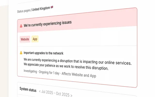
Preview image. Unlock full-res
Engineering blueprint on stark white
Color palette
Brand accents, decorative iconography, visual highlights
Orange decorative accent for icons, marks, and small graphic details. Use as a supporting accent, not as a status color
Highlighting text, decorative illustration fill, borders
Page backgrounds, card surfaces, default UI element fill
Button backgrounds, subtle background differentiation
Primary text, borders, iconography
Secondary text, subtle borders, iconography
Decorative graphical elements (background type, illustrations)
Subtle dividers, image box shadows
Faint dividers, image box shadows
Typography
- Weights
- 400, 700
- Sizes
- 16px, 19px, 24px, 32px
- Line height
- 1.2
- Letter spacing
- normal
- Fallback
- serif
Primary headings, body text, and links – a classic serif choice that grounds the technical content with a sense of established authority rather than modern digital slickness.
- Weights
- 400
- Sizes
- 13px
- Line height
- 1.2
- Letter spacing
- normal
- Fallback
- sans-serif
Used for smaller functional text such as button labels and navigation, providing a universally legible sans-serif counterpoint to the serif body.
Spacing & shape
Elevation
Components
Standard interactive button, filled with Platinum Mist (#efefef) and Ink Black (#000000) text. Has a sharp 0px border-radius and minimal 1px vertical, 6px horizontal padding. No border or shadow.
A transparent card with no background color (rgba(0, 0, 0, 0)), 0px border-radius, and no box-shadow. Used for seamless content integration.
A card with a very slight translucent black background (rgba(0, 0, 0, 0.15)), 0px border-radius, and no box-shadow. Provides a subtle visual separation without strong outlines.
Guidelines
- Prioritize Times serif for all long-form content and primary headings to maintain a traditional, authoritative voice.
- Use Arial sans-serif exclusively for small functional text like button labels and navigation items, at a size of 13px with normal letter spacing.
- Employ Ink Black (#000000) as the default color for all text, borders, and iconography unless a specific accent is required.
- Apply Platinum Mist (#efefef) for interactive button backgrounds, ensuring text remains Ink Black for maximum contrast.
- Maintain a strict 0px border-radius across all components (buttons, cards) to promote a sharp, angular aesthetic.
- Utilize 16px as the primary element gap for vertical and horizontal spacing between content blocks and interactive elements.
- Reserve Flamingo Orange (#f25533) and Vivid Hue (#f1641e) for brand accents and visual highlights, not for general UI elements like buttons or text.
- Avoid using rounded corners; maintain the 0px border-radius for all elements.
- Do not introduce new primary colors; stick to the defined neutral palette with specific semantic and brand accents.
- Refrain from heavy drop shadows or elaborate elevation. Subtle box-shadows should be minimal and used sparingly, as seen on images.
- Do not deviate from the specified serif and sans-serif font assignments; mixing them freely will disrupt the visual rhythm.
- Avoid large, impactful background imagery on content sections; the system favors stark white space and clear typography.
- Do not use accent colors for primary CTA backgrounds where a neutral background is defined; accents are for visual punctuation.
- Do not introduce extra padding on cards; maintain the 0px padding for a dense, content-focused presentation.
About this system
ShowHide
Incident.io presents a utilitarian, text-heavy interface on a bright canvas, prioritizing clarity and directness over decorative elements. Its visual identity relies on strong typographic contrast and a minimal use of color, primarily reserving a vivid orange for attention-grabbing accents or brand indicators. Components are lightweight with sharp corners, reflecting an engineering-focused approach to design where function dictates form.
The page maintains a centered max-width content area, providing a structured, contained experience without full-bleed elements dominating the display. The hero section often features a centered headline over a plain background. Section rhythm is marked by consistent vertical spacing (section gap of 40px), maintaining visual separation. Content is arranged in alternating text-left/visual-right patterns or simple centered stacks for clarity. Grid usage is implied for feature listings or team showcases, leveraging the consistent element gap for column spacing. The layout prioritizes information density and readability over expansive visual gestures. Navigation is a standard top bar, likely with a sticky behavior, and a clear, minimal structure.
The site uses a mix of utilitarian visuals: primarily product screenshots or internal tool interfaces, often presented without heavy styling. When present, abstract graphics or icons are flat, typically filled with brand accents like Flamingo Orange or Ink Black, occasionally lightened by Desert Sand. Photography is absent. Icons, when visible, are filled and have a moderate stroke weight, serving an explanatory or decorative role rather than a functional one. Imagery is used to break up text-heavy sections or to illustrate concepts, occupying a moderate visual space. The overall density is text-dominant.
Reminiscent of Linear, Figma, Vercel, Sentry.
# Incident — Style Reference
> Engineering blueprint on stark white

**Theme:** light

**Site:** https://incident.io

Incident.io presents a utilitarian, text-heavy interface on a bright canvas, prioritizing clarity and directness over decorative elements. Its visual identity relies on strong typographic contrast and a minimal use of color, primarily reserving a vivid orange for attention-grabbing accents or brand indicators. Components are lightweight with sharp corners, reflecting an engineering-focused approach to design where function dictates form.

## Tokens — Colors

| Name | Value | Token | Role |
|------|------|------|------|
| Flamingo Orange | `#f25533` | `--color-flamingo-orange` | Brand accents, decorative iconography, visual highlights |
| Alert Red | `#ff492c` | `--color-alert-red` | Orange decorative accent for icons, marks, and small graphic details. Use as a supporting accent, not as a status color |
| Vivid Hue | `#f1641e` | `--color-vivid-hue` | Highlighting text, decorative illustration fill, borders |
| Canvas White | `#ffffff` | `--color-canvas-white` | Page backgrounds, card surfaces, default UI element fill |
| Platinum Mist | `#efefef` | `--color-platinum-mist` | Button backgrounds, subtle background differentiation |
| Ink Black | `#000000` | `--color-ink-black` | Primary text, borders, iconography |
| Deep Graphite | `#161618` | `--color-deep-graphite` | Secondary text, subtle borders, iconography |
| Desert Sand | `#e4d9c8` | `--color-desert-sand` | Decorative graphical elements (background type, illustrations) |
| Light Gray Divider | `#dadada` | `--color-light-gray-divider` | Subtle dividers, image box shadows |
| Medium Gray Divider | `#cccccc` | `--color-medium-gray-divider` | Faint dividers, image box shadows |

## Tokens — Typography

### Times
- **Substitute:** serif
- **Weights:** 400, 700
- **Sizes:** 16px, 19px, 24px, 32px
- **Line height:** 1.2
- **Letter spacing:** normal
- **Role:** Primary headings, body text, and links – a classic serif choice that grounds the technical content with a sense of established authority rather than modern digital slickness.

### Arial
- **Substitute:** sans-serif
- **Weights:** 400
- **Sizes:** 13px
- **Line height:** 1.2
- **Letter spacing:** normal
- **Role:** Used for smaller functional text such as button labels and navigation, providing a universally legible sans-serif counterpoint to the serif body.

## Tokens — Type Scale

Major Third (1.25) from 16px base.

| Role | Size | Line height | Letter spacing |
|------|------|------|------|
| body | 16px | 1.2 | — |
| subheading | 19px | 1.2 | — |
| heading | 24px | 1.2 | — |
| display | 32px | 1.2 | — |

## Tokens — Spacing

- **Section gap:** 40px
- **Card padding:** 0px
- **Element gap:** 16px

## Tokens — Radius

- **all:** 0px

## Tokens — Elevation

- **Image:** `rgba(22, 22, 24, 0.02) 0px 8px 15px -3px, rgba(22, 22, 24, 0.04) 0px 4px 6px -2px`

## Layout

The page maintains a centered max-width content area, providing a structured, contained experience without full-bleed elements dominating the display. The hero section often features a centered headline over a plain background. Section rhythm is marked by consistent vertical spacing (section gap of 40px), maintaining visual separation. Content is arranged in alternating text-left/visual-right patterns or simple centered stacks for clarity. Grid usage is implied for feature listings or team showcases, leveraging the consistent element gap for column spacing. The layout prioritizes information density and readability over expansive visual gestures. Navigation is a standard top bar, likely with a sticky behavior, and a clear, minimal structure.

## Imagery

The site uses a mix of utilitarian visuals: primarily product screenshots or internal tool interfaces, often presented without heavy styling. When present, abstract graphics or icons are flat, typically filled with brand accents like Flamingo Orange or Ink Black, occasionally lightened by Desert Sand. Photography is absent. Icons, when visible, are filled and have a moderate stroke weight, serving an explanatory or decorative role rather than a functional one. Imagery is used to break up text-heavy sections or to illustrate concepts, occupying a moderate visual space. The overall density is text-dominant.

## Components

### Default Button
*Interactive element*

Standard interactive button, filled with Platinum Mist (#efefef) and Ink Black (#000000) text. Has a sharp 0px border-radius and minimal 1px vertical, 6px horizontal padding. No border or shadow.

### Ghost Card
*Container, content grouping*

A transparent card with no background color (rgba(0, 0, 0, 0)), 0px border-radius, and no box-shadow. Used for seamless content integration.

### Subtle Background Card
*Container, content grouping*

A card with a very slight translucent black background (rgba(0, 0, 0, 0.15)), 0px border-radius, and no box-shadow. Provides a subtle visual separation without strong outlines.

## Guidelines

### Do

- Prioritize Times serif for all long-form content and primary headings to maintain a traditional, authoritative voice.
- Use Arial sans-serif exclusively for small functional text like button labels and navigation items, at a size of 13px with normal letter spacing.
- Employ Ink Black (#000000) as the default color for all text, borders, and iconography unless a specific accent is required.
- Apply Platinum Mist (#efefef) for interactive button backgrounds, ensuring text remains Ink Black for maximum contrast.
- Maintain a strict 0px border-radius across all components (buttons, cards) to promote a sharp, angular aesthetic.
- Utilize 16px as the primary element gap for vertical and horizontal spacing between content blocks and interactive elements.
- Reserve Flamingo Orange (#f25533) and Vivid Hue (#f1641e) for brand accents and visual highlights, not for general UI elements like buttons or text.

### Don't

- Avoid using rounded corners; maintain the 0px border-radius for all elements.
- Do not introduce new primary colors; stick to the defined neutral palette with specific semantic and brand accents.
- Refrain from heavy drop shadows or elaborate elevation. Subtle box-shadows should be minimal and used sparingly, as seen on images.
- Do not deviate from the specified serif and sans-serif font assignments; mixing them freely will disrupt the visual rhythm.
- Avoid large, impactful background imagery on content sections; the system favors stark white space and clear typography.
- Do not use accent colors for primary CTA backgrounds where a neutral background is defined; accents are for visual punctuation.
- Do not introduce extra padding on cards; maintain the 0px padding for a dense, content-focused presentation.

## Agent Prompt Guide

Quick Color Reference:
- text: #000000
- background: #ffffff
- border: #000000
- accent: #f25533
- primary action: no distinct CTA color

Example Component Prompts:
- Create a status alert banner: Alert Red (#ff492c) background with Ink Black (#000000) text (16px Times, weight 400). Maintain 0px radius, with 16px internal padding.
- Design a primary navigation link: Ink Black (#000000) text (16px Times, weight 400) on a Canvas White (#ffffff) background, with a subtle 2px outset Ink Black (#000000) border on hover.
- Build a feature card with a subtle background: Subtle Background (rgba(0, 0, 0, 0.15)) fill, 0px border-radius, and no shadow. Title in Ink Black (#000000) at 19px Times, weight 700. Body text in Ink Black (#000000) at 16px Times, weight 400.
- Construct a ghost button: Transparent background with Ink Black (#000000) text (13px Arial, weight 400). Apply a 2px outset Ink Black (#000000) border, 0px border-radius, and 1px vertical, 6px horizontal padding.
More like this








Keep what you find
A free account saves references to boards and can send you a weekly email of picks based on what you save.
To see every result, go Pro.