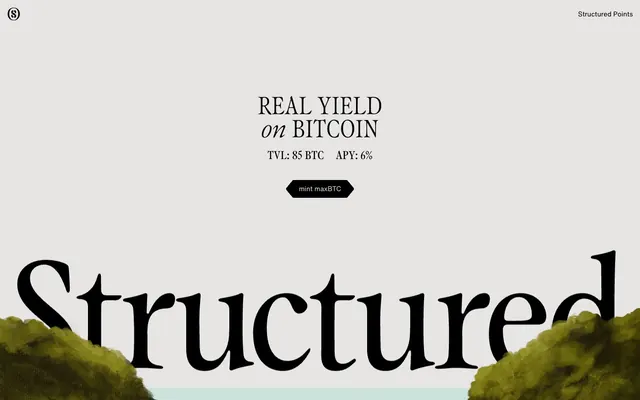
Preview image. Unlock full-res
Classical art gallery
Color palette
Page background, footer background, primary large surface background
Primary text, heading text, critical UI elements, background for elevated modals, outlined button borders
Secondary text on dark backgrounds, ghost button text on dark backgrounds
Card backgrounds, section dividers, other background layers
Subtle border colors, background for subtle secondary sections
Icon fills, subtle background accents
Tertiary text on very dark backgrounds, subtle border elements
Placeholder backgrounds for imagery
Typography
- Weights
- 400, 500
- Sizes
- 16px, 24px, 34px, 52px, 94px, 374px
- Line height
- 0.84, 1, 1.1, 1.33, 1.5
- Letter spacing
- -0.0090em for large display text, -0.0050em for medium, -0.0010em for smaller sizes
- Fallback
- Playfair Display or Lora (though Davinci's sharp serifs and specific tracking are key)
Captivating serif headlines and titles. Its distinct character and spacing at large sizes provide a sense of established gravitas and artistic flair, contrasting with the utilitarian sans-serif for body copy.
- Weights
- 400, 500
- Sizes
- 9px, 12px, 15px, 16px, 22px, 24px, 26px, 43px
- Line height
- 1.25, 1.5
- Letter spacing
- normal
- Fallback
- Inter or Helvetica Neue
Compact and precise sans-serif for all body text, navigation, and functional UI elements. It provides readability and a modern counterpoint to the decorative serif, handling dense information efficiently.
Spacing & shape
Components
Text only, no background or border. Uses Off-White Text (#dfdcd5) color on dark backgrounds, or Black Ink (#000000) on light backgrounds. No padding, 0px border-radius, Helvetica Now typeface. For example, 'Structured Points' link.
Background is transparent (rgba(0, 0, 0, 0)), text color is Off-White Text (#dfdcd5). Has a 1px solid border in the same Off-White Text color. 0px border-radius. Helvetica Now typeface. Example: '+ -' button.
Background is transparent (rgba(0, 0, 0, 0)), text and border color is Black Ink (#000000). 0px border-radius. Helvetica Now typeface. Example: 'Cookie Preferences' button.
Background is Black Ink (#000000), text is Off-White Text (#dfdcd5). Has a 9px border-radius and 32px vertical padding, 60px horizontal padding. Font is Helvetica Now. Example: 'mint maxBTC' button.
Background is Slate Surface (#c4c3b6) with 0px border-radius and no box-shadow. Padding is 0px internally. Content within the card dictates spacing and layout. Used for the 'Real BTC yield' feature blocks.
Background is Black Ink (#000000) with 9px border-radius and no box-shadow. Contains an internal padding of 32px vertical and 60px horizontal. Uses Off-White Text for content.
Guidelines
- Use Davinci for all prominent headlines and titles, ensuring letter-spacing is precisely adjusted according to the scale: -0.0090em for largest, -0.0050em for medium, -0.0010em for smaller titles.
- Employ Helvetica Now for all body text, functional UI elements, and navigation links. Maintain its natural letter-spacing ('normal') for maximum readability.
- Maintain a primary achromatic palette using Greige Canvas (#ebebeb) for page backgrounds, Black Ink (#000000) for text, and Slate Surface (#c4c3b6) for card-like elements.
- Apply 0px border-radius to all interactive ghost buttons and 9px border-radius to subtle action tags for textural contrast.
- Utilize rich, classical illustrations as primary visual elements, framed against the muted UI to draw focus and provide brand character.
- Structure content with ample negative space. Prioritize an elementGap of 6px and cardPadding of 18px to maintain an open and organized feel.
- Ensure UI controls and interactive text (e.g., 'mint maxBTC') stand out by using Black Ink (#000000) text on light backgrounds or Off-White Text (#dfdcd5) on dark backgrounds, often with a matching border for ghost buttons.
- Avoid using highly saturated or vibrant colors for primary UI elements; reserve these for imagery and content, if at all.
- Do not introduce sharp corners on major content cards; the system prefers 9px corner radius where appropriate for grouping content.
- Refrain from using heavy shadows or complex elevation; the design system leans towards flat interfaces and subtle visual hierarchy.
- Do not deviate from Davinci's or Helvetica Now's assigned roles; mixing their usage will undermine the established typographic contrast.
- Do not use generic, modern stock photography; visuals should align with the classical, painterly aesthetic of the illustrations.
- Avoid dense, information-heavy blocks of text without sufficient line-height; prioritize the established line-heights for legibility.
About this system
ShowHide
Structured presents a brand identity rooted in classical artistry, juxtaposing vintage-inspired illustrations with modern, refined typography. The visual system features large, serif headlines that command attention but are carefully tracked for legibility, paired with compact, utilitarian sans-serif body text. A largely achromatic palette of muted greys and blacks provides a sophisticated backdrop, allowing the rich, painterly imagery to provide the primary visual interest. Surfaces are flat and borderless, emphasizing the content within a contained, almost gallery-like presentation.
The page primarily uses a max-width contained layout, centered on the screen, though the top hero section appears full-bleed or very wide, bleeding into the edges of the browser with large background illustrations. The hero features a large, centered headline, setting a theatrical tone. Sections flow with consistent vertical spacing, often alternating between very dark and very light backgrounds. Content is frequently presented in a centered stack, but also utilizes a 3-column grid for feature articulation, where each column typically contains an illustration above a text block. Navigation is minimal, consisting of a top-right header for links.
The site heavily relies on classical, painterly illustrations. These images are often full-bleed or contained within circular masks, acting as a primary decorative and atmospheric element rather than strictly explanatory. They feature intricate detail, naturalistic lighting, and a subdued, earthy color palette, reminiscent of old master paintings. Photography is absent. Icons, when present, are minimal vector outlines, often incorporating a subtle geometric or abstract quality, designed not to compete with the rich illustrations.
Reminiscent of Axiom Space, Unit.co, Arc Browser, Superhuman.
# Structured — Style Reference
> Classical art gallery

**Theme:** light

**Site:** https://structured.money

Structured presents a brand identity rooted in classical artistry, juxtaposing vintage-inspired illustrations with modern, refined typography. The visual system features large, serif headlines that command attention but are carefully tracked for legibility, paired with compact, utilitarian sans-serif body text. A largely achromatic palette of muted greys and blacks provides a sophisticated backdrop, allowing the rich, painterly imagery to provide the primary visual interest. Surfaces are flat and borderless, emphasizing the content within a contained, almost gallery-like presentation.

## Tokens — Colors

| Name | Value | Token | Role |
|------|------|------|------|
| Greige Canvas | `#ebebeb` | `--color-greige-canvas` | Page background, footer background, primary large surface background |
| Black Ink | `#000000` | `--color-black-ink` | Primary text, heading text, critical UI elements, background for elevated modals, outlined button borders |
| Off-White Text | `#dfdcd5` | `--color-off-white-text` | Secondary text on dark backgrounds, ghost button text on dark backgrounds |
| Slate Surface | `#c4c3b6` | `--color-slate-surface` | Card backgrounds, section dividers, other background layers |
| Smoke Grey | `#e7e5e4` | `--color-smoke-grey` | Subtle border colors, background for subtle secondary sections |
| Warm Accent Grey | `#595855` | `--color-warm-accent-grey` | Icon fills, subtle background accents |
| White Highlight | `#ffffff` | `--color-white-highlight` | Tertiary text on very dark backgrounds, subtle border elements |
| Midtone Image Grey | `#808080` | `--color-midtone-image-grey` | Placeholder backgrounds for imagery |

## Tokens — Typography

### Davinci
- **Substitute:** Playfair Display or Lora (though Davinci's sharp serifs and specific tracking are key)
- **Weights:** 400, 500
- **Sizes:** 16px, 24px, 34px, 52px, 94px, 374px
- **Line height:** 0.84, 1, 1.1, 1.33, 1.5
- **Letter spacing:** -0.0090em for large display text, -0.0050em for medium, -0.0010em for smaller sizes
- **Role:** Captivating serif headlines and titles. Its distinct character and spacing at large sizes provide a sense of established gravitas and artistic flair, contrasting with the utilitarian sans-serif for body copy.

### Helvetica Now
- **Substitute:** Inter or Helvetica Neue
- **Weights:** 400, 500
- **Sizes:** 9px, 12px, 15px, 16px, 22px, 24px, 26px, 43px
- **Line height:** 1.25, 1.5
- **Letter spacing:** normal
- **Role:** Compact and precise sans-serif for all body text, navigation, and functional UI elements. It provides readability and a modern counterpoint to the decorative serif, handling dense information efficiently.

## Tokens — Type Scale

| Role | Size | Line height | Letter spacing |
|------|------|------|------|
| caption | 16px | 1.1 | — |
| body-sm | 24px | 1.1 | — |
| body | 34px | 1.1 | — |
| body-lg | 52px | 1.1 | — |
| heading-sm | 94px | 1.1 | — |
| heading | 374px | 1.1 | — |

## Tokens — Spacing

- **Section gap:** 25px
- **Card padding:** 18px
- **Element gap:** 6px

## Tokens — Radius

- **Buttons:** 0px
- **Cards:** 9px
- **decorativeElements:** 28.8px
- **inlineElements:** 2px

## Layout

The page primarily uses a max-width contained layout, centered on the screen, though the top hero section appears full-bleed or very wide, bleeding into the edges of the browser with large background illustrations. The hero features a large, centered headline, setting a theatrical tone. Sections flow with consistent vertical spacing, often alternating between very dark and very light backgrounds. Content is frequently presented in a centered stack, but also utilizes a 3-column grid for feature articulation, where each column typically contains an illustration above a text block. Navigation is minimal, consisting of a top-right header for links.

## Imagery

The site heavily relies on classical, painterly illustrations. These images are often full-bleed or contained within circular masks, acting as a primary decorative and atmospheric element rather than strictly explanatory. They feature intricate detail, naturalistic lighting, and a subdued, earthy color palette, reminiscent of old master paintings. Photography is absent. Icons, when present, are minimal vector outlines, often incorporating a subtle geometric or abstract quality, designed not to compete with the rich illustrations.

## Components

### Ghost Navigation Link
*Primary navigation elements in header/footer*

Text only, no background or border. Uses Off-White Text (#dfdcd5) color on dark backgrounds, or Black Ink (#000000) on light backgrounds. No padding, 0px border-radius, Helvetica Now typeface. For example, 'Structured Points' link.

### Action Button Dark
*Call to action button, ghost style*

Background is transparent (rgba(0, 0, 0, 0)), text color is Off-White Text (#dfdcd5). Has a 1px solid border in the same Off-White Text color. 0px border-radius. Helvetica Now typeface. Example: '+ -' button.

### Action Button Light
*Call to action button, ghost style for light backgrounds*

Background is transparent (rgba(0, 0, 0, 0)), text and border color is Black Ink (#000000). 0px border-radius. Helvetica Now typeface. Example: 'Cookie Preferences' button.

### Subtle Action Tag
*Small, interactive information tags*

Background is Black Ink (#000000), text is Off-White Text (#dfdcd5). Has a 9px border-radius and 32px vertical padding, 60px horizontal padding. Font is Helvetica Now. Example: 'mint maxBTC' button.

### Feature Card
*Display individual features or content blocks*

Background is Slate Surface (#c4c3b6) with 0px border-radius and no box-shadow. Padding is 0px internally. Content within the card dictates spacing and layout. Used for the 'Real BTC yield' feature blocks.

### Feature Highlight Card
*Elevated card for prominent features*

Background is Black Ink (#000000) with 9px border-radius and no box-shadow. Contains an internal padding of 32px vertical and 60px horizontal. Uses Off-White Text for content.

## Guidelines

### Do

- Use Davinci for all prominent headlines and titles, ensuring letter-spacing is precisely adjusted according to the scale: -0.0090em for largest, -0.0050em for medium, -0.0010em for smaller titles.
- Employ Helvetica Now for all body text, functional UI elements, and navigation links. Maintain its natural letter-spacing ('normal') for maximum readability.
- Maintain a primary achromatic palette using Greige Canvas (#ebebeb) for page backgrounds, Black Ink (#000000) for text, and Slate Surface (#c4c3b6) for card-like elements.
- Apply 0px border-radius to all interactive ghost buttons and 9px border-radius to subtle action tags for textural contrast.
- Utilize rich, classical illustrations as primary visual elements, framed against the muted UI to draw focus and provide brand character.
- Structure content with ample negative space. Prioritize an elementGap of 6px and cardPadding of 18px to maintain an open and organized feel.
- Ensure UI controls and interactive text (e.g., 'mint maxBTC') stand out by using Black Ink (#000000) text on light backgrounds or Off-White Text (#dfdcd5) on dark backgrounds, often with a matching border for ghost buttons.

### Don't

- Avoid using highly saturated or vibrant colors for primary UI elements; reserve these for imagery and content, if at all.
- Do not introduce sharp corners on major content cards; the system prefers 9px corner radius where appropriate for grouping content.
- Refrain from using heavy shadows or complex elevation; the design system leans towards flat interfaces and subtle visual hierarchy.
- Do not deviate from Davinci's or Helvetica Now's assigned roles; mixing their usage will undermine the established typographic contrast.
- Do not use generic, modern stock photography; visuals should align with the classical, painterly aesthetic of the illustrations.
- Avoid dense, information-heavy blocks of text without sufficient line-height; prioritize the established line-heights for legibility.

## Agent Prompt Guide

Quick Color Reference:
text: #000000
background: #ebebeb
border: #000000
accent: no distinct accent color
primary action: no distinct CTA color

Example Component Prompts:
Create a hero section: Greige Canvas background (or full-bleed classical illustration). Centered headline 'REAL YIELD on BITCOIN' using Davinci, weight 400, size 94px, color Black Ink, letter-spacing -0.0090em. Below, a Subtle Action Tag: Black Ink background, Off-White Text (#dfdcd5), 9px border-radius, 32px vertical padding, 60px horizontal padding, 'mint maxBTC' text in Helvetica Now.

Create a feature section with three Feature Cards: Slate Surface background (#c4c3b6), 0px border-radius. Each card should feature a distinct classical illustration. Below each image, a heading in Davinci, weight 400, size 24px, Black Ink, letter-spacing -0.0050em. Body text in Helvetica Now, weight 400, size 16px, Black Ink.

Generate a ghost navigation button for the header: Black Ink (#000000) text color and 1px border. Background transparent. 0px border-radius. Text 'Structured Points' in Helvetica Now, weight 400, with no padding or explicit dimensions, fitting seamlessly into the header.
More like this









Keep what you find
A free account saves references to boards and can send you a weekly email of picks based on what you save.
To see every result, go Pro.