Preview image. Unlock full-res
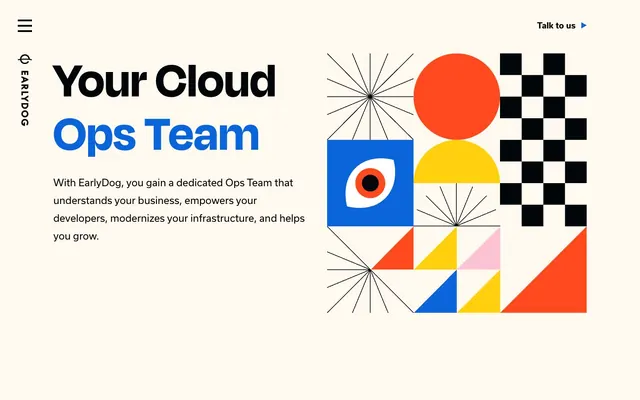
Academic-chic abstract playground
Color palette
Accent for selected headings, navigation highlights, footer backgrounds, and code snippets — creates a focal point against neutrals
Illustrative accent color
Illustrative accent color
Illustrative accent color
Page backgrounds, card surfaces, ghost button backgrounds, default text for dark surfaces
Primary text, headings, outlined button borders, filled button backgrounds, structural borders
Typography
- Weights
- 400, 700
- Sizes
- 16px, 18px, 22px
- Line height
- 1, 1.78, 1.82
- Letter spacing
- normal
- Fallback
- system-ui
Body copy, navigation links, secondary text, and button labels — a versatile workhorse font for clarity.
- Weights
- 700
- Sizes
- 52px, 80px, 116px
- Line height
- 1.03, 1.1, 1.23
- Letter spacing
- -0.019em at 116px, -0.013em at 80px, -0.009em at 52px
- Fallback
- Montserrat
Dominant headlines and large feature titles — the bold weight and tight tracking create a distinct, impactful statement.
Spacing & shape
Components
Background: Canvas Parchment (#fff9f0), Text: Midnight Ink (#000609), Border: 3px solid Midnight Ink (#000609), Radius: 9999px. Padding: 20px vertical, 29.6px horizontal. Font: usual 700.
Background: Midnight Ink (#000609), Text: Canvas Parchment (#fff9f0), Border: 3px solid Midnight Ink (#000609), Radius: 9999px. Padding: 14.4px vertical, 29.6px horizontal. Font: usual 700.
Background: transparent (no fill). No border or shadow. Radius: 0px. Padding top/bottom: 120px.
Text: Midnight Ink (#000609). Hover/Active state for 'Talk to us' has Electric Blue (#0a65db) text with a subtle underline effect.
Guidelines
- Use Canvas Parchment (#fff9f0) as the primary background color for all main page content.
- Apply Midnight Ink (#000609) for all primary text and main headings.
- Utilize degular-display at weight 700 for all headlines, adjusting letter-spacing according to size (e.g., -0.019em at 116px).
- Always use a 9999px border-radius for buttons to achieve the signature pill shape.
- Maintain a spacious layout with 96px vertical section gaps and 16px horizontal element gaps between content blocks.
- Incorporate Electric Blue (#0a65db) as a functional accent color for interactive elements and key brand highlights.
- Do not use subtle drop shadows; visual elevation is primarily achieved through high-contrast borders or color blocks.
- Avoid using multiple font families or weights beyond 'usual' 400/700 and 'degular-display' 700.
- Do not introduce new primary UI colors; adhere strictly to Canvas Parchment, Midnight Ink, and Electric Blue for functional elements.
- Do not use generic square or rounded-10px-radius buttons; all interactive buttons should be pill-shaped with 9999px radius.
- Avoid dense or cramped content; prioritize generous spacing for an open and breathable feel.
About this system
ShowHide
EarlyDog uses a playful, academic-chic visual system, balancing structured, bold typography with abstract, geometric illustrations on a warm, off-white canvas. The design features a high-contrast mono palette centered around a deep charcoal and an electric blue, punctuated by a set of vibrant, almost primary, accent colors in its graphic elements. Components are lightweight and confident, favoring high-radius outlines over heavy fills, creating an open and agile feel.
The page primarily uses a max-width contained layout, though specific section cards expand to fill the available width (but still contain content). The hero section features a large, centered headline on the left, balanced by a bold abstract illustration on the right. Subsequent sections follow a consistent rhythm of alternating text-left/visual-right patterns or centered content stacks. Vertical spacing between sections is generous at 96px, creating a clear visual hierarchy. Navigation is a minimalist top bar with a hamburger menu for mobile and a 'Talk to us' button.
This design heavily features abstract, geometric illustrations. These are flat, vector-based, and composed of basic shapes (circles, squares, triangles, lines) in a vibrant, primary-like color palette (Vivid Orange, Sunshine Yellow, Bubblegum Pink, and Electric Blue, with some black lines). They serve a decorative and atmospheric role, adding a playful and dynamic energy to the page without being literal product showcases. Icons are minimal, outlined, and monochromatic (Midnight Ink). Imagery is contained within content blocks rather than full-bleed.
Reminiscent of Sanity.io, Supabase, Vercel, Linear.
# Earlydog — Style Reference
> Academic-chic abstract playground

**Theme:** light

**Site:** https://www.earlydog.com

EarlyDog uses a playful, academic-chic visual system, balancing structured, bold typography with abstract, geometric illustrations on a warm, off-white canvas. The design features a high-contrast mono palette centered around a deep charcoal and an electric blue, punctuated by a set of vibrant, almost primary, accent colors in its graphic elements. Components are lightweight and confident, favoring high-radius outlines over heavy fills, creating an open and agile feel.

## Tokens — Colors

| Name | Value | Token | Role |
|------|------|------|------|
| Electric Blue | `#0a65db` | `--color-electric-blue` | Accent for selected headings, navigation highlights, footer backgrounds, and code snippets — creates a focal point against neutrals |
| Vivid Orange | `#ff6600` | `--color-vivid-orange` | Illustrative accent color |
| Sunshine Yellow | `#f5c500` | `--color-sunshine-yellow` | Illustrative accent color |
| Bubblegum Pink | `#f8b7d0` | `--color-bubblegum-pink` | Illustrative accent color |
| Canvas Parchment | `#fff9f0` | `--color-canvas-parchment` | Page backgrounds, card surfaces, ghost button backgrounds, default text for dark surfaces |
| Midnight Ink | `#000609` | `--color-midnight-ink` | Primary text, headings, outlined button borders, filled button backgrounds, structural borders |

## Tokens — Typography

### usual
- **Substitute:** system-ui
- **Weights:** 400, 700
- **Sizes:** 16px, 18px, 22px
- **Line height:** 1, 1.78, 1.82
- **Letter spacing:** normal
- **Role:** Body copy, navigation links, secondary text, and button labels — a versatile workhorse font for clarity.

### degular-display
- **Substitute:** Montserrat
- **Weights:** 700
- **Sizes:** 52px, 80px, 116px
- **Line height:** 1.03, 1.1, 1.23
- **Letter spacing:** -0.019em at 116px, -0.013em at 80px, -0.009em at 52px
- **Role:** Dominant headlines and large feature titles — the bold weight and tight tracking create a distinct, impactful statement.

## Tokens — Type Scale

Perfect Fifth (1.5) from 16px base.

| Role | Size | Line height | Letter spacing |
|------|------|------|------|
| body | 16px | 1.78 | — |
| body-lg | 18px | 1.82 | — |
| subheading | 22px | 1 | — |
| headline-sm | 52px | 1.1 | -0.009em |
| headline | 80px | 1.03 | -0.013em |
| display | 116px | 1.23 | -0.019em |

## Tokens — Spacing

- **Section gap:** 96px
- **Card padding:** 30px
- **Element gap:** 16px

## Tokens — Radius

- **Buttons:** 9999px

## Layout

The page primarily uses a max-width contained layout, though specific section cards expand to fill the available width (but still contain content). The hero section features a large, centered headline on the left, balanced by a bold abstract illustration on the right. Subsequent sections follow a consistent rhythm of alternating text-left/visual-right patterns or centered content stacks. Vertical spacing between sections is generous at 96px, creating a clear visual hierarchy. Navigation is a minimalist top bar with a hamburger menu for mobile and a 'Talk to us' button.

## Imagery

This design heavily features abstract, geometric illustrations. These are flat, vector-based, and composed of basic shapes (circles, squares, triangles, lines) in a vibrant, primary-like color palette (Vivid Orange, Sunshine Yellow, Bubblegum Pink, and Electric Blue, with some black lines). They serve a decorative and atmospheric role, adding a playful and dynamic energy to the page without being literal product showcases. Icons are minimal, outlined, and monochromatic (Midnight Ink). Imagery is contained within content blocks rather than full-bleed.

## Components

### Ghost Button
*Secondary action or navigational control*

Background: Canvas Parchment (#fff9f0), Text: Midnight Ink (#000609), Border: 3px solid Midnight Ink (#000609), Radius: 9999px. Padding: 20px vertical, 29.6px horizontal. Font: usual 700.

### Filled Button
*Primary Call-to-action*

Background: Midnight Ink (#000609), Text: Canvas Parchment (#fff9f0), Border: 3px solid Midnight Ink (#000609), Radius: 9999px. Padding: 14.4px vertical, 29.6px horizontal. Font: usual 700.

### Section Card (Ghost)
*Structural container for main content sections*

Background: transparent (no fill). No border or shadow. Radius: 0px. Padding top/bottom: 120px.

### Header Navigation Item
*Primary navigation links*

Text: Midnight Ink (#000609). Hover/Active state for 'Talk to us' has Electric Blue (#0a65db) text with a subtle underline effect.

## Guidelines

### Do

- Use Canvas Parchment (#fff9f0) as the primary background color for all main page content.
- Apply Midnight Ink (#000609) for all primary text and main headings.
- Utilize degular-display at weight 700 for all headlines, adjusting letter-spacing according to size (e.g., -0.019em at 116px).
- Always use a 9999px border-radius for buttons to achieve the signature pill shape.
- Maintain a spacious layout with 96px vertical section gaps and 16px horizontal element gaps between content blocks.
- Incorporate Electric Blue (#0a65db) as a functional accent color for interactive elements and key brand highlights.

### Don't

- Do not use subtle drop shadows; visual elevation is primarily achieved through high-contrast borders or color blocks.
- Avoid using multiple font families or weights beyond 'usual' 400/700 and 'degular-display' 700.
- Do not introduce new primary UI colors; adhere strictly to Canvas Parchment, Midnight Ink, and Electric Blue for functional elements.
- Do not use generic square or rounded-10px-radius buttons; all interactive buttons should be pill-shaped with 9999px radius.
- Avoid dense or cramped content; prioritize generous spacing for an open and breathable feel.

## Agent Prompt Guide

Quick Color Reference:
text: #000609
background: #fff9f0
border: #000609
accent: #0a65db
primary action: no distinct CTA color

Example Component Prompts:
1. Create a Ghost Button: background #fff9f0, text #000609, border 3px solid #000609, 9999px radius, 20px vertical padding, 29.6px horizontal padding, usual font 700.
2. Create a Filled Button: background #000609, text #fff9f0, border 3px solid #000609, 9999px radius, 14.4px vertical padding, 29.6px horizontal padding, usual font 700.
3. Create a Primary Headline: 'Your Cloud Ops Team' using degular-display font, 80px size, 700 weight, #000609 color, and -0.013em letter-spacing.
4. Create a Body Text Block: using 'normal' font, 16px size, 400 weight, #000609 color, and 1.78 line-height.
More like this









Keep what you find
A free account saves references to boards and can send you a weekly email of picks based on what you save.
To see every result, go Pro.