Preview image. Unlock full-res
calm clinical canvas
Color palette
Primary brand color for calls to action, text, and critical icons — grounding the UI with a sense of growth and reliability
Soft background for informational cards and sections, introducing a gentle, almost pastel tint to the UI planes
Cool, muted background for secondary cards and sections, offering visual separation without overwhelming the primary content
Lightest green surface, used for subtle card backgrounds or layered elements, providing a hint of color
Another very light green surface, subtly differentiating stacked cards or sections
Background for page surfaces and pristine component backdrops, providing a clean, bright foundation
Default boundary and separator color, used for hairline borders and inactive states, maintaining visual separation with minimal distraction
Primary text color for navigation and core content, providing strong contrast against light backgrounds
Secondary text and link color for less prominent information, like image captions or muted links
Typography
- Weights
- 300, 400
- Sizes
- 12px, 14px, 18px, 23px, 28px, 56px
- Line height
- 1, 1.3, 1.5
- Letter spacing
- -0.0300em
- Fallback
- Inter
The workhorse sans-serif for most body text, links, buttons, and detailed interface elements. Its refined simplicity supports a clinical tone without feeling sterile.
- Weights
- 300
- Sizes
- 40px, 74px
- Line height
- 1.05, 1.35
- Letter spacing
- -0.0300em, -0.0100em
- Fallback
- Playfair Display
Used exclusively for large, impactful headings. Its light weight (300) for such prominent sizes creates an authoritative yet approachable voice, suggesting wisdom through understatement rather than volume.
Spacing & shape
Components
Solid Forest Green background (#0f3e17), Cream Canvas text (#fffefc), 14px rounded corners, with generous 14px vertical and 21px horizontal padding. Delivers a confident and prominent interaction point.
Solid Forest Green background (#0f3e17), Cream Canvas text (#fffefc), 14px radius. Features expansive 42px padding on all sides, drawing significant attention to critical actions.
Mint Glaze background (#b1dbb8), no box shadow, 14px rounded corners. Offers 42px of internal padding.
Slate Mist background (#b6ced5), no box shadow, 14px rounded corners. Offers 42px of internal padding.
Keylime Wash background (#e1f4df), no box shadow, 14px rounded corners. Offers 70px of internal padding for a spacious feel.
Cream Canvas background (#fffefc), Forest Green text (#0f3e17), with maximum border-radius (999px) for a pill shape. Contains 9px vertical and 14px horizontal padding.
Guidelines
- Use Forest Green (#0f3e17) exclusively for primary action buttons and core brand elements to maintain its impact.
- Apply 14px border-radius to all cards and most buttons for a consistent soft, approachable aesthetic.
- Ensure all text content defaults to Suisseintl for readability and consistency, varying only weight and size.
- Utilize Faire Octave at weight 300 for major headlines (40px, 74px) to convey understated authority.
- Employ Cream Canvas (#fffefc) as the primary background for detailed UI elements, balancing against chromatic cards.
- Maintain a comfortable density with 21px for element gaps and 42px for card and section padding.
- Use Border Grey (#e5e7eb) for all neutral borders and dividers to keep the interface light and airy.
- Do not introduce new chromatic colors outside of the defined green and blue accents to preserve the muted palette.
- Avoid harsh shadows or strong elevation; surfaces should feel flat and distinct through color changes, not depth.
- Do not use multiple font families for body text or interface elements; Suisseintl serves this purpose exclusively.
- Never use full black (#000000) for text; opt for Ink Text (#222222) or Dark Charcoal (#333333) for softer contrast.
- Do not deviate from the established border-radius values across component types.
- Avoid compacting content; err on the side of generous element and padding values to maintain the comfortable density.
- Do not use generic system fonts when Suisseintl or Faire Octave are available; these are critical for brand identity.
About this system
ShowHide
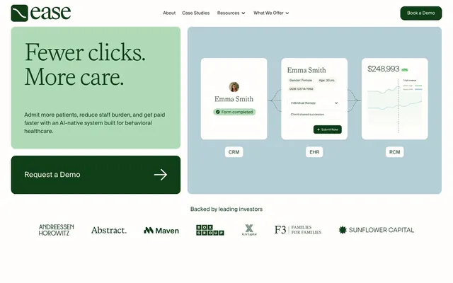
Ease Health employs a grounded, clinical yet approachable aesthetic, balancing a muted green-blue palette with abundant whitespace. The design emphasizes clarity through distinct surface levels, subtle typography, and a signature deep forest green for primary actions, contrasting with the soft, almost pastel backgrounds. Components are clean and substantial, featuring generous padding and distinctive rounded corners, giving the interface a calm, trustworthy, and organized feel.
The page uses a maximum-width contained layout, centering content within a white canvas. The hero section features a split layout: a bold green content block on the left with a large headline, contrasted by a light blue canvas on the right presenting stacked product visuals. Sections below alternate between full-width content blocks and contained layouts, often with alternating two-column layouts (text left, image right, or vice-versa). Vertical rhythm is established through generous and consistent section gaps, giving content ample breathing room. The navigation is a sticky top bar with a primary 'Book a Demo' button.
Imagery is functional and product-focused, featuring clean product screenshots of UI elements and interface cards. These visuals often overlap or are presented as distinct, rounded-corner elements against tinted backgrounds. Text-based icons are minimal. Visuals serve to explain product features rather than create abstract atmosphere, maintaining a high-fidelity, clear display of the software's capabilities.
Reminiscent of Alinea, Elation Health, Klang.ai, Notion.
# Ease Health — Style Reference
> calm clinical canvas

**Theme:** light

**Site:** https://easehealth.com

Ease Health employs a grounded, clinical yet approachable aesthetic, balancing a muted green-blue palette with abundant whitespace. The design emphasizes clarity through distinct surface levels, subtle typography, and a signature deep forest green for primary actions, contrasting with the soft, almost pastel backgrounds. Components are clean and substantial, featuring generous padding and distinctive rounded corners, giving the interface a calm, trustworthy, and organized feel.

## Tokens — Colors

| Name | Value | Token | Role |
|------|------|------|------|
| Forest Green | `#0f3e17` | `--color-forest-green` | Primary brand color for calls to action, text, and critical icons — grounding the UI with a sense of growth and reliability |
| Mint Glaze | `#b1dbb8` | `--color-mint-glaze` | Soft background for informational cards and sections, introducing a gentle, almost pastel tint to the UI planes |
| Slate Mist | `#b6ced5` | `--color-slate-mist` | Cool, muted background for secondary cards and sections, offering visual separation without overwhelming the primary content |
| Keylime Wash | `#e1f4df` | `--color-keylime-wash` | Lightest green surface, used for subtle card backgrounds or layered elements, providing a hint of color |
| Mint Kiss | `#cfe7d3` | `--color-mint-kiss` | Another very light green surface, subtly differentiating stacked cards or sections |
| Cream Canvas | `#fffefc` | `--color-cream-canvas` | Background for page surfaces and pristine component backdrops, providing a clean, bright foundation |
| Border Grey | `#e5e7eb` | `--color-border-grey` | Default boundary and separator color, used for hairline borders and inactive states, maintaining visual separation with minimal distraction |
| Ink Text | `#222222` | `--color-ink-text` | Primary text color for navigation and core content, providing strong contrast against light backgrounds |
| Dark Charcoal | `#333333` | `--color-dark-charcoal` | Secondary text and link color for less prominent information, like image captions or muted links |

## Tokens — Typography

### Suisseintl
- **Substitute:** Inter
- **Weights:** 300, 400
- **Sizes:** 12px, 14px, 18px, 23px, 28px, 56px
- **Line height:** 1, 1.3, 1.5
- **Letter spacing:** -0.0300em
- **Role:** The workhorse sans-serif for most body text, links, buttons, and detailed interface elements. Its refined simplicity supports a clinical tone without feeling sterile.

### Faire Octave
- **Substitute:** Playfair Display
- **Weights:** 300
- **Sizes:** 40px, 74px
- **Line height:** 1.05, 1.35
- **Letter spacing:** -0.0300em, -0.0100em
- **Role:** Used exclusively for large, impactful headings. Its light weight (300) for such prominent sizes creates an authoritative yet approachable voice, suggesting wisdom through understatement rather than volume.

## Tokens — Type Scale

| Role | Size | Line height | Letter spacing |
|------|------|------|------|
| caption | 12px | 1.5 | -0.36px |
| body | 14px | 1.5 | -0.42px |
| body-lg | 18px | 1.5 | -0.54px |
| subheading | 23px | 1.3 | -0.69px |
| heading-sm | 28px | 1.3 | -0.84px |
| heading | 40px | 1.05 | -0.4px |
| display | 56px | 1 | -1.68px |
| display-lg | 74px | 1.05 | -0.74px |

## Tokens — Spacing

- **Section gap:** 42px
- **Card padding:** 42px
- **Element gap:** 21px

## Tokens — Radius

- **Buttons:** 14px
- **Cards:** 14px
- **badges:** 999px
- **nav:** 7px

## Layout

The page uses a maximum-width contained layout, centering content within a white canvas. The hero section features a split layout: a bold green content block on the left with a large headline, contrasted by a light blue canvas on the right presenting stacked product visuals. Sections below alternate between full-width content blocks and contained layouts, often with alternating two-column layouts (text left, image right, or vice-versa). Vertical rhythm is established through generous and consistent section gaps, giving content ample breathing room. The navigation is a sticky top bar with a primary 'Book a Demo' button.

## Imagery

Imagery is functional and product-focused, featuring clean product screenshots of UI elements and interface cards. These visuals often overlap or are presented as distinct, rounded-corner elements against tinted backgrounds. Text-based icons are minimal. Visuals serve to explain product features rather than create abstract atmosphere, maintaining a high-fidelity, clear display of the software's capabilities.

## Components

### Primary Action Button (Filled)
*Main call-to-action button, conveying primary user interaction.*

Solid Forest Green background (#0f3e17), Cream Canvas text (#fffefc), 14px rounded corners, with generous 14px vertical and 21px horizontal padding. Delivers a confident and prominent interaction point.

### Large Action Button
*Prominent full-block call-to-action for key feature sections.*

Solid Forest Green background (#0f3e17), Cream Canvas text (#fffefc), 14px radius. Features expansive 42px padding on all sides, drawing significant attention to critical actions.

### Content Card (Mint Glaze)
*General purpose container for information or features, with a refreshing tint.*

Mint Glaze background (#b1dbb8), no box shadow, 14px rounded corners. Offers 42px of internal padding.

### Content Card (Slate Mist)
*Alternative general purpose container, providing subtle visual distinction.*

Slate Mist background (#b6ced5), no box shadow, 14px rounded corners. Offers 42px of internal padding.

### Content Card (Keylime Wash)
*Lightest card background for sub-sections or layered content.*

Keylime Wash background (#e1f4df), no box shadow, 14px rounded corners. Offers 70px of internal padding for a spacious feel.

### Pill Badge
*Used for categorization or brief status indicators.*

Cream Canvas background (#fffefc), Forest Green text (#0f3e17), with maximum border-radius (999px) for a pill shape. Contains 9px vertical and 14px horizontal padding.

## Guidelines

### Do

- Use Forest Green (#0f3e17) exclusively for primary action buttons and core brand elements to maintain its impact.
- Apply 14px border-radius to all cards and most buttons for a consistent soft, approachable aesthetic.
- Ensure all text content defaults to Suisseintl for readability and consistency, varying only weight and size.
- Utilize Faire Octave at weight 300 for major headlines (40px, 74px) to convey understated authority.
- Employ Cream Canvas (#fffefc) as the primary background for detailed UI elements, balancing against chromatic cards.
- Maintain a comfortable density with 21px for element gaps and 42px for card and section padding.
- Use Border Grey (#e5e7eb) for all neutral borders and dividers to keep the interface light and airy.

### Don't

- Do not introduce new chromatic colors outside of the defined green and blue accents to preserve the muted palette.
- Avoid harsh shadows or strong elevation; surfaces should feel flat and distinct through color changes, not depth.
- Do not use multiple font families for body text or interface elements; Suisseintl serves this purpose exclusively.
- Never use full black (#000000) for text; opt for Ink Text (#222222) or Dark Charcoal (#333333) for softer contrast.
- Do not deviate from the established border-radius values across component types.
- Avoid compacting content; err on the side of generous element and padding values to maintain the comfortable density.
- Do not use generic system fonts when Suisseintl or Faire Octave are available; these are critical for brand identity.

## Agent Prompt Guide

Quick Color Reference:
text: #222222
background: #fffefc
border: #e5e7eb
accent: #b1dbb8
primary action: #0f3e17 (filled action)

Example Component Prompts:
1. Create a Primary Action Button: #0f3e17 background, #fffefc text, 9999px radius, compact pill padding. Use this filled treatment for the main CTA.
2. Design a feature card: Mint Glaze background (#b1dbb8), 14px radius, 42px padding. Title 'AI-Powered Documentation' using Suisseintl weight 400 at 28px, #0f3e17. Body copy 'Reduce administrative burden…' using Suisseintl weight 300 at 18px, #333333. Includes a small checked icon (Forest Green, 0f3e17).
3. Generate a testimonial section: Cream Canvas background (#fffefc). Headline 'What healthcare providers say' using Faire Octave weight 300 at 40px, #0f3e17, letter-spacing -0.4px. Display a Pill Badge 'Broad clinical support', Cream Canvas background (#fffefc), Forest Green text (#0f3e17).
More like this









Keep what you find
A free account saves references to boards and can send you a weekly email of picks based on what you save.
To see every result, go Pro.