Preview image. Unlock full-res
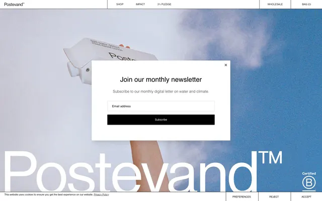
Architectural blueprint on stark white canvas
Color palette
Page backgrounds, card surfaces, form input backgrounds, navigation text. Provides a clean, expansive base
Primary text, headings, buttons, borders, and navigation elements. Creates strong contrast and visual anchors
Subtle background for secondary sections or cards, offering a slight visual break from pure white without introducing color
Secondary text, muted borders, and less prominent UI elements. Offers a softer contrast than Midnight Ink while maintaining readability
Hairline borders for inputs and fine dividers, adding minimal separation
Typography
- Weights
- 400, 700
- Sizes
- 10px, 12px, 16px, 32px, 56px, 80px
- Line height
- 1, 1.2, 1.4
- Letter spacing
- -0.0100em
- Fallback
- Inter
Primary typeface for headings, body text, navigation, and button labels. Its clean, geometric form supports the site's structured aesthetic, with a slightly condensed feel at certain sizes.
- Weights
- 300, 400
- Sizes
- 13px, 16px, 30px
- Line height
- 1, 1.54, 1.6
- Letter spacing
- 0.0060em, 0.0080em
- Fallback
- Arial
Used for input fields and specific body text. Integrates a classic, readable sans-serif for functional text elements, presenting a lighter touch at weight 300.
Spacing & shape
Components
Solid Midnight Ink background, Canvas White text. No border-radius, 12px vertical padding, 20px horizontal padding. Font: Nimbus Sans D OT, weight 400.
Transparent background, Midnight Ink text and a 1px Midnight Ink top border for subtle separation. No border-radius, 0px vertical padding, 20px horizontal padding. Font: Nimbus Sans D OT, weight 400.
Transparent background, Midnight Ink text. No padding, no borders, no border-radius. Font: Nimbus Sans D OT, weight 400.
Transparent background, no borders, no shadows, 0px radius. No internal padding defined, relies on content spacing.
Whisper Gray background, no borders, no shadows, 0px radius. No internal padding defined, relies on content spacing.
Canvas White background, no borders, no shadows, 0px radius. Includes 20px padding on all sides. Font: Nimbus Sans D OT.
Transparent background, Midnight Ink text, Border Silver 1px top border. No radius. 12px vertical padding, 20px horizontal padding. Font: Helvetica, weight 400.
Canvas White background with no borders or shadows, 0px radius. Contains a heading, body copy, an input field (Form Input Field), and a Primary Filled Button.
Guidelines
- Maintain a strict 0px border-radius across all components to preserve the rectilinear aesthetic.
- Use Midnight Ink (#000000) for all primary text, headings, and borders to ensure strong contrast on Canvas White (#ffffff) backgrounds.
- Utilize Whisper Gray (#f0f1ef) sparingly for subtle background differentiation in secondary content areas, not as a primary accent color.
- Apply 1px borders using Midnight Ink (#000000) for grid lines and key navigation separators, emphasizing structure.
- Prioritize text and button padding of 12px vertical and 20px horizontal to maintain consistent information density.
- Employ Nimbus Sans D OT for all prominent text elements and maintain Helvetica for functional input fields.
- Ensure all interactive elements have a clear visual state (e.g., color change on hover/focus) as elevation is absent.
- Do not introduce any rounded corners; maintain hard edges for all elements.
- Avoid using drop shadows or complex elevation techniques; rely on stark borders and background color changes for visual hierarchy.
- Do not introduce additional vibrant colors; stick to the monochrome palette with minimal semantic color usage.
- Never use less than a 20px element gap between major content blocks to preserve a sense of comfortable density.
- Do not use generic system borders for inputs; always specify a Border Silver (#d7d7d7) 1px border at the top.
- Avoid decorative imagery that competes with the strict grid and monochrome aesthetic; imagery should be contained or stark.
About this system
ShowHide
Postevand presents a stark, almost architectural aesthetic using monochrome tones, precise typography, and a grid-based layout. The primary canvas is bright white, often overlaid with fine black lines, creating a blueprint-like impression. Components are flat and boxy, emphasizing content and function over decorative elements, with a notable absence of shadows or rounded corners. The visual system feels grounded and serious, utilizing strong contrast and clear visual hierarchy for a direct and impactful user experience.
The page structure follows a max-width contained model, centered on the screen, though the hero section can be full-bleed. The hero pattern often involves a large visual (photography) with minimal text overlaid or positioned clearly. Sections maintain a consistent vertical rhythm, primarily using a 60px section gap. Content is arranged in alternating patterns, such as text on one side and imagery/product on the other, or stacked centered blocks. A strong underlying grid is evident through the use of fine 1px Midnight Ink borders, which sometimes define content areas or act as visual dividers. The navigation is a minimalist top bar, likely sticky, with simple text links and a 'Bag' indicator. The overall density is comfortable, with ample white space.
This site predominantly features high-contrast product photography, often tightly cropped or floating against a white background or atmospheric sky. Product images showcase the packaging itself with clean lines and minimal distractions. There are also abstract background images (like blue sky with clouds) used as hero elements, providing atmospheric context. Icons, where present, appear to be outlined and monochromatic (Midnight Ink). Imagery serves to illustrate product details and create a restrained, clean atmosphere, rather than providing extensive lifestyle context.
Reminiscent of Aarke, Aesop, B&O (Bang & Olufsen), Vitsoe.
# Postevand — Style Reference
> Architectural blueprint on stark white canvas

**Theme:** light

**Site:** https://postevand.com

Postevand presents a stark, almost architectural aesthetic using monochrome tones, precise typography, and a grid-based layout. The primary canvas is bright white, often overlaid with fine black lines, creating a blueprint-like impression. Components are flat and boxy, emphasizing content and function over decorative elements, with a notable absence of shadows or rounded corners. The visual system feels grounded and serious, utilizing strong contrast and clear visual hierarchy for a direct and impactful user experience.

## Tokens — Colors

| Name | Value | Token | Role |
|------|------|------|------|
| Canvas White | `#ffffff` | `--color-canvas-white` | Page backgrounds, card surfaces, form input backgrounds, navigation text. Provides a clean, expansive base |
| Midnight Ink | `#000000` | `--color-midnight-ink` | Primary text, headings, buttons, borders, and navigation elements. Creates strong contrast and visual anchors |
| Whisper Gray | `#f0f1ef` | `--color-whisper-gray` | Subtle background for secondary sections or cards, offering a slight visual break from pure white without introducing color |
| Ash Slate | `#333333` | `--color-ash-slate` | Secondary text, muted borders, and less prominent UI elements. Offers a softer contrast than Midnight Ink while maintaining readability |
| Border Silver | `#d7d7d7` | `--color-border-silver` | Hairline borders for inputs and fine dividers, adding minimal separation |

## Tokens — Typography

### Nimbus Sans D OT
- **Substitute:** Inter
- **Weights:** 400, 700
- **Sizes:** 10px, 12px, 16px, 32px, 56px, 80px
- **Line height:** 1, 1.2, 1.4
- **Letter spacing:** -0.0100em
- **Role:** Primary typeface for headings, body text, navigation, and button labels. Its clean, geometric form supports the site's structured aesthetic, with a slightly condensed feel at certain sizes.

### Helvetica
- **Substitute:** Arial
- **Weights:** 300, 400
- **Sizes:** 13px, 16px, 30px
- **Line height:** 1, 1.54, 1.6
- **Letter spacing:** 0.0060em, 0.0080em
- **Role:** Used for input fields and specific body text. Integrates a classic, readable sans-serif for functional text elements, presenting a lighter touch at weight 300.

## Tokens — Type Scale

| Role | Size | Line height | Letter spacing |
|------|------|------|------|
| caption | 10px | 1 | — |
| body | 16px | 1.4 | -0.16px |
| subheading | 32px | 1.2 | -0.32px |
| heading | 56px | 1.2 | -0.56px |
| display | 80px | 1.2 | -0.8px |

## Tokens — Spacing

- **Section gap:** 60px
- **Card padding:** 20px
- **Element gap:** 20px

## Tokens — Radius

- **all:** 0px

## Layout

The page structure follows a max-width contained model, centered on the screen, though the hero section can be full-bleed. The hero pattern often involves a large visual (photography) with minimal text overlaid or positioned clearly. Sections maintain a consistent vertical rhythm, primarily using a 60px section gap. Content is arranged in alternating patterns, such as text on one side and imagery/product on the other, or stacked centered blocks. A strong underlying grid is evident through the use of fine 1px Midnight Ink borders, which sometimes define content areas or act as visual dividers. The navigation is a minimalist top bar, likely sticky, with simple text links and a 'Bag' indicator. The overall density is comfortable, with ample white space.

## Imagery

This site predominantly features high-contrast product photography, often tightly cropped or floating against a white background or atmospheric sky. Product images showcase the packaging itself with clean lines and minimal distractions. There are also abstract background images (like blue sky with clouds) used as hero elements, providing atmospheric context. Icons, where present, appear to be outlined and monochromatic (Midnight Ink). Imagery serves to illustrate product details and create a restrained, clean atmosphere, rather than providing extensive lifestyle context.

## Components

### Primary Filled Button
*Submit actions, main calls to action.*

Solid Midnight Ink background, Canvas White text. No border-radius, 12px vertical padding, 20px horizontal padding. Font: Nimbus Sans D OT, weight 400.

### Ghost Header Button
*Header links and navigation elements.*

Transparent background, Midnight Ink text and a 1px Midnight Ink top border for subtle separation. No border-radius, 0px vertical padding, 20px horizontal padding. Font: Nimbus Sans D OT, weight 400.

### Text Link Button
*Inline actions and secondary navigation at the bottom of sections.*

Transparent background, Midnight Ink text. No padding, no borders, no border-radius. Font: Nimbus Sans D OT, weight 400.

### Default Card
*Content grouping without visual emphasis.*

Transparent background, no borders, no shadows, 0px radius. No internal padding defined, relies on content spacing.

### Subtle Section Card
*Grouping related content with a slight background distinction.*

Whisper Gray background, no borders, no shadows, 0px radius. No internal padding defined, relies on content spacing.

### Elevated Content Card
*Promising focused content or interactive elements, visually separating from the background.*

Canvas White background, no borders, no shadows, 0px radius. Includes 20px padding on all sides. Font: Nimbus Sans D OT.

### Form Input Field
*User input fields.*

Transparent background, Midnight Ink text, Border Silver 1px top border. No radius. 12px vertical padding, 20px horizontal padding. Font: Helvetica, weight 400.

### Newsletter Modal
*Interstitials for user engagement.*

Canvas White background with no borders or shadows, 0px radius. Contains a heading, body copy, an input field (Form Input Field), and a Primary Filled Button.

## Guidelines

### Do

- Maintain a strict 0px border-radius across all components to preserve the rectilinear aesthetic.
- Use Midnight Ink (#000000) for all primary text, headings, and borders to ensure strong contrast on Canvas White (#ffffff) backgrounds.
- Utilize Whisper Gray (#f0f1ef) sparingly for subtle background differentiation in secondary content areas, not as a primary accent color.
- Apply 1px borders using Midnight Ink (#000000) for grid lines and key navigation separators, emphasizing structure.
- Prioritize text and button padding of 12px vertical and 20px horizontal to maintain consistent information density.
- Employ Nimbus Sans D OT for all prominent text elements and maintain Helvetica for functional input fields.
- Ensure all interactive elements have a clear visual state (e.g., color change on hover/focus) as elevation is absent.

### Don't

- Do not introduce any rounded corners; maintain hard edges for all elements.
- Avoid using drop shadows or complex elevation techniques; rely on stark borders and background color changes for visual hierarchy.
- Do not introduce additional vibrant colors; stick to the monochrome palette with minimal semantic color usage.
- Never use less than a 20px element gap between major content blocks to preserve a sense of comfortable density.
- Do not use generic system borders for inputs; always specify a Border Silver (#d7d7d7) 1px border at the top.
- Avoid decorative imagery that competes with the strict grid and monochrome aesthetic; imagery should be contained or stark.

## Agent Prompt Guide

Quick Color Reference:
- text: #000000
- background: #ffffff
- border: #000000
- accent: no distinct accent color
- primary action: no distinct CTA color

Example Component Prompts:
- Create a 'Subscribe' button: #000000 background, #ffffff text, 0px radius, 12px 20px padding, Nimbus Sans D OT font, weight 400.
No distinct primary action color was observed; use the extracted neutral button treatments instead of inventing a filled CTA color.
- Create a product card: #ffffff background, 20px padding all sides, 0px radius, no shadow. This card should contain a headline (Nimbus Sans D OT, 32px, lh 1.2), a product image, and a Text Link Button.
More like this









Keep what you find
A free account saves references to boards and can send you a weekly email of picks based on what you save.
To see every result, go Pro.