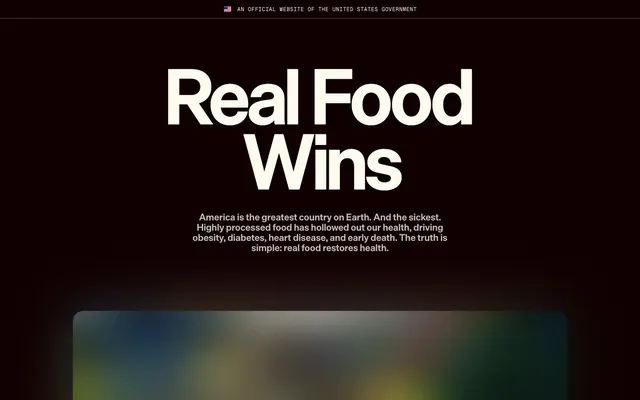
Preview image. Unlock full-res
Stark Manifesto on Creamy Canvas
Color palette
Red wash for highlight backgrounds, decorative bands, and soft emphasis behind content. Use as a supporting accent, not as a status color
Red wash for highlight backgrounds, decorative bands, and soft emphasis behind content. Use as a supporting accent, not as a status color
Red wash for highlight backgrounds, decorative bands, and soft emphasis behind content. Use as a supporting accent, not as a status color
Primary text, heading text, accent for borders and outlines, background for certain interactive elements
Primary background for cards and interactive components
Light text on dark surfaces, inverse labels, and high-contrast captions. Do not promote it to the primary CTA color
Dominant page background, providing a subtle off-white canvas
Subtle borders and dividers, indicating structural separation
Subtle shadow color for elevated elements, adding depth without heaviness
Secondary text for less prominent information, maintaining legibility against light backgrounds
Subtle background for UI elements, supporting a muted visual hierarchy
Typography
- Weights
- 700
- Sizes
- 32px, 44px, 48px, 96px, 115px, 144px, 155px, 170px
- Line height
- 0.84, 0.86, 0.92, 0.95, 0.96, 1.02, 1.04
- Letter spacing
- normal
- Fallback
- Bebas Neue
Display headlines and large section titles. Its bold, condensed nature demands attention, creating a powerful, declarative statement. The extremely tight line height ensures words appear as blocks of impact.
- Weights
- 400, 500, 600, 700
- Sizes
- 11px, 12px, 14px, 16px, 33px
- Line height
- 0.98, 1.1, 1.18, 1.2, 1.4, 1.5
- Letter spacing
- -0.0300em at 33px, -0.0200em at 16px and below
- Fallback
- Inter
Body text, navigation, and button labels. Its versatility in weights allows for clear hierarchy in functional elements, with subtle negative letter spacing for a compact, refined feel.
- Weights
- 500, 700
- Sizes
- 14px, 16px, 19px, 21px, 24px, 26px, 31px
- Line height
- 0.92, 0.95, 0.96, 1.1, 1.18, 1.2, 1.24, 1.5
- Letter spacing
- -0.0190em
- Fallback
- Open Sans
Subheadings and supporting statements, bridging the gap between large display type and body text. The tight tracking maintains a composed and serious tone.
- Weights
- 400, 700
- Sizes
- 12px, 16px
- Line height
- 1.18, 1.3, 1.4
- Letter spacing
- 0.0600em
- Fallback
- Space Mono
Small, technical information or emphasized quotes where a distinct, spaced-out monospaced character is desired.
Spacing & shape
Elevation
Components
Filled with Buttermilk (#fdfbee) background, Midnight Ink (#110000) text and border. Features highly rounded corners at 40px radius and generous horizontal padding of 22-28px and vertical of 18px. Typographically, uses Die Grotesk A for clarity and directness.
Transparent background with Midnight Ink (#110000) text. No visible border or padding beyond intrinsic text box. Used for subtle actions or navigation within text. Radius 0px.
Transparent background with Paper White (#ffffff) text. No explicit border, but a thin white line underneath indicates interaction. Padding 0px top/bottom, 6px right/left. Radius 0px.
Buttermilk (#fdfbee) background with 16px border-radius. Padding of 24px vertically and 32px horizontally. No shadow.
Paper White (#ffffff) background with 24px border-radius. Elevated with a dual shadow: rgba(0, 0, 0, 0.1) 0px 10px 40px 0px, rgba(0, 0, 0, 0.1) 0px 20px 60px -10px. Padding 24px all sides.
Buttermilk (#fdfbee) background with 12px 12px 0px 0px border-radius (rounded top corners, square bottom). No padding or shadow, indicating it's a structural element for content below.
Used within media elements. Has a background color of rgba(0, 0, 0, 0) and text color of Midnight Ink (#110000). A 50% border radius implies a circular shape for play icons or specific controls. No padding.
Guidelines
- Use Midnight Ink (#110000) as the primary text color and for most interactive elements that are not primary CTA.
- Apply Light Linen (#f3f0d6) as the default background for large page sections to maintain a consistent neutral base.
- Render large headlines (96px and above) with Die Grotesk D, weight 700, and a line height between 0.84 and 0.96 for maximum impact.
- Employ the Pill Button with Buttermilk background and 40px border-radius for primary calls to action, ensuring an approachable yet distinct interactive element.
- Utilize Warning Red (#d50000) strictly for data visualization, warning indicators, or to highlight critical factual elements, never as a general accent.
- Maintain comfortable spacing between elements with a base unit of 4px and elemental gaps typically at 24px.
- Elevate critical content cards with Paper White background and the specific dual shadow: rgba(0,0,0,0.1) 0px 10px 40px 0px, rgba(0,0,0,0.1) 0px 20px 60px -10px.
- Avoid generic, non-brand specific imagery or illustrations; stick to hard-hitting data visualizations or minimal, focused product shots.
- Do not introduce additional bold accent colors; the system relies on the stark black/white/red contrast.
- Refrain from using thin weights for body text; maintain a minimum of Die Grotesk A 400 for legibility and presence.
- Never overcrowd sections with too much text; leverage the impactful display typography to convey messages concisely.
- Do not use subtle, muted interactive states for primary actions; primary actions should always be clearly distinct in color and shape.
- Avoid excessive use of elevation; reserve shadows for critical interactive cards to maintain visual clarity and weight.
- Do not use standard 4px or 8px border radii for buttons; always use the distinct 40px pill shape or ghost styles.
About this system
ShowHide
Eat Real Food uses a high-contrast, text-dominant visual system, evoking authority and directness. Dark charcoal text on light, almost creamy backgrounds creates a stark, legible interface. Typography is the primary visual driver, featuring prominent, oversized headlines and deliberate letter spacing. The system is largely monochrome, punctuated by a vivid red that acts as a symbolic warning and highlight for critical data points, reinforcing the urgent message of the content.
The page maintains a centered, contained layout for primary content, often with no explicit max-width that makes the text feel expansive. Hero sections can be full-bleed with centered headlines over dark backgrounds. Content sections display a consistent vertical rhythm. Information is generally presented in centered stacks for prominent statements or simple multi-column grids for data and supporting details. Navigation is a minimal top bar, with prominent site branding on the left and primary navigation links taking secondary visual presence. The layout emphasizes direct communication over complex visual arrangements, prioritizing reading flow.
Imagery is functional and direct, primarily focusing on data visualizations, abstract graphics, or highly relevant product (food-related) imagery where applicable. Photography is minimal, if present, and likely cropped tightly without lifestyle context. Icons are simple, outlined or filled, mostly monochrome and used sparingly for clarity. The overall density is text-dominant, with images serving to support factual claims rather than create atmosphere.
Reminiscent of The 1619 Project, AIGA (American Institute of Graphic Arts), Everytown for Gun Safety.
# Eat Real Food — Style Reference
> Stark Manifesto on Creamy Canvas

**Theme:** light

**Site:** https://realfood.gov

Eat Real Food uses a high-contrast, text-dominant visual system, evoking authority and directness. Dark charcoal text on light, almost creamy backgrounds creates a stark, legible interface. Typography is the primary visual driver, featuring prominent, oversized headlines and deliberate letter spacing. The system is largely monochrome, punctuated by a vivid red that acts as a symbolic warning and highlight for critical data points, reinforcing the urgent message of the content.

## Tokens — Colors

| Name | Value | Token | Role |
|------|------|------|------|
| Warning Red | `#d50000` | `--color-warning-red` | Red wash for highlight backgrounds, decorative bands, and soft emphasis behind content. Use as a supporting accent, not as a status color |
| Alert Red 1 | `#920000` | `--color-alert-red-1` | Red wash for highlight backgrounds, decorative bands, and soft emphasis behind content. Use as a supporting accent, not as a status color |
| Alert Red 2 | `#b50000` | `--color-alert-red-2` | Red wash for highlight backgrounds, decorative bands, and soft emphasis behind content. Use as a supporting accent, not as a status color |
| Midnight Ink | `#110000` | `--color-midnight-ink` | Primary text, heading text, accent for borders and outlines, background for certain interactive elements |
| Buttermilk | `#fdfbee` | `--color-buttermilk` | Primary background for cards and interactive components |
| Paper White | `#ffffff` | `--color-paper-white` | Light text on dark surfaces, inverse labels, and high-contrast captions. Do not promote it to the primary CTA color |
| Light Linen | `#f3f0d6` | `--color-light-linen` | Dominant page background, providing a subtle off-white canvas |
| Silver Mist | `#e5e5e5` | `--color-silver-mist` | Subtle borders and dividers, indicating structural separation |
| Ash Shadow | `#d2d0c6` | `--color-ash-shadow` | Subtle shadow color for elevated elements, adding depth without heaviness |
| Muted Stone | `#8d7d7d` | `--color-muted-stone` | Secondary text for less prominent information, maintaining legibility against light backgrounds |
| Pale Gray | `#bebcb3` | `--color-pale-gray` | Subtle background for UI elements, supporting a muted visual hierarchy |

## Tokens — Typography

### Die Grotesk D
- **Substitute:** Bebas Neue
- **Weights:** 700
- **Sizes:** 32px, 44px, 48px, 96px, 115px, 144px, 155px, 170px
- **Line height:** 0.84, 0.86, 0.92, 0.95, 0.96, 1.02, 1.04
- **Letter spacing:** normal
- **Role:** Display headlines and large section titles. Its bold, condensed nature demands attention, creating a powerful, declarative statement. The extremely tight line height ensures words appear as blocks of impact.

### Die Grotesk A
- **Substitute:** Inter
- **Weights:** 400, 500, 600, 700
- **Sizes:** 11px, 12px, 14px, 16px, 33px
- **Line height:** 0.98, 1.1, 1.18, 1.2, 1.4, 1.5
- **Letter spacing:** -0.0300em at 33px, -0.0200em at 16px and below
- **Role:** Body text, navigation, and button labels. Its versatility in weights allows for clear hierarchy in functional elements, with subtle negative letter spacing for a compact, refined feel.

### Die Grotesk B
- **Substitute:** Open Sans
- **Weights:** 500, 700
- **Sizes:** 14px, 16px, 19px, 21px, 24px, 26px, 31px
- **Line height:** 0.92, 0.95, 0.96, 1.1, 1.18, 1.2, 1.24, 1.5
- **Letter spacing:** -0.0190em
- **Role:** Subheadings and supporting statements, bridging the gap between large display type and body text. The tight tracking maintains a composed and serious tone.

### Geist Mono
- **Substitute:** Space Mono
- **Weights:** 400, 700
- **Sizes:** 12px, 16px
- **Line height:** 1.18, 1.3, 1.4
- **Letter spacing:** 0.0600em
- **Role:** Small, technical information or emphasized quotes where a distinct, spaced-out monospaced character is desired.

## Tokens — Type Scale

Golden Ratio (1.618) from 14px base.

| Role | Size | Line height | Letter spacing |
|------|------|------|------|
| body | 14px | 1.5 | -0.28px |
| heading-sm | 24px | 1.24 | -0.456px |
| heading | 33px | 1.1 | -0.99px |
| heading-lg | 48px | 0.95 | — |
| display | 96px | 0.92 | — |

## Tokens — Spacing

- **Section gap:** 80px
- **Card padding:** 24px
- **Element gap:** 24px

## Tokens — Radius

- **Buttons:** 40px
- **Cards:** 16px
- **Images:** 24px
- **highlightCards:** 12px 12px 0px 0px
- **interactive:** 24px

## Tokens — Elevation

- **Elevated Card:** `rgba(0, 0, 0, 0.1) 0px 10px 40px 0px, rgba(0, 0, 0, 0.1) 0px 20px 60px -10px`
- **Link with shadow:** `rgba(0, 0, 0, 0.1) 0px 12px 24px 0px`

## Layout

The page maintains a centered, contained layout for primary content, often with no explicit max-width that makes the text feel expansive. Hero sections can be full-bleed with centered headlines over dark backgrounds. Content sections display a consistent vertical rhythm. Information is generally presented in centered stacks for prominent statements or simple multi-column grids for data and supporting details. Navigation is a minimal top bar, with prominent site branding on the left and primary navigation links taking secondary visual presence. The layout emphasizes direct communication over complex visual arrangements, prioritizing reading flow.

## Imagery

Imagery is functional and direct, primarily focusing on data visualizations, abstract graphics, or highly relevant product (food-related) imagery where applicable. Photography is minimal, if present, and likely cropped tightly without lifestyle context. Icons are simple, outlined or filled, mostly monochrome and used sparingly for clarity. The overall density is text-dominant, with images serving to support factual claims rather than create atmosphere.

## Components

### Pill Button
*Primary Call to Action*

Filled with Buttermilk (#fdfbee) background, Midnight Ink (#110000) text and border. Features highly rounded corners at 40px radius and generous horizontal padding of 22-28px and vertical of 18px. Typographically, uses Die Grotesk A for clarity and directness.

### Ghost Text Button
*Secondary Action or Navigation*

Transparent background with Midnight Ink (#110000) text. No visible border or padding beyond intrinsic text box. Used for subtle actions or navigation within text. Radius 0px.

### Navigation Link
*Global Navigation Link*

Transparent background with Paper White (#ffffff) text. No explicit border, but a thin white line underneath indicates interaction. Padding 0px top/bottom, 6px right/left. Radius 0px.

### Standard Card
*Content container for articles or features*

Buttermilk (#fdfbee) background with 16px border-radius. Padding of 24px vertically and 32px horizontally. No shadow.

### Elevated Card
*Prominent content container*

Paper White (#ffffff) background with 24px border-radius. Elevated with a dual shadow: rgba(0, 0, 0, 0.1) 0px 10px 40px 0px, rgba(0, 0, 0, 0.1) 0px 20px 60px -10px. Padding 24px all sides.

### Tab Header Card
*Tab or section header for grouped content*

Buttermilk (#fdfbee) background with 12px 12px 0px 0px border-radius (rounded top corners, square bottom). No padding or shadow, indicating it's a structural element for content below.

### Video Player Button
*Inline media control*

Used within media elements. Has a background color of rgba(0, 0, 0, 0) and text color of Midnight Ink (#110000). A 50% border radius implies a circular shape for play icons or specific controls. No padding.

## Guidelines

### Do

- Use Midnight Ink (#110000) as the primary text color and for most interactive elements that are not primary CTA.
- Apply Light Linen (#f3f0d6) as the default background for large page sections to maintain a consistent neutral base.
- Render large headlines (96px and above) with Die Grotesk D, weight 700, and a line height between 0.84 and 0.96 for maximum impact.
- Employ the Pill Button with Buttermilk background and 40px border-radius for primary calls to action, ensuring an approachable yet distinct interactive element.
- Utilize Warning Red (#d50000) strictly for data visualization, warning indicators, or to highlight critical factual elements, never as a general accent.
- Maintain comfortable spacing between elements with a base unit of 4px and elemental gaps typically at 24px.
- Elevate critical content cards with Paper White background and the specific dual shadow: rgba(0,0,0,0.1) 0px 10px 40px 0px, rgba(0,0,0,0.1) 0px 20px 60px -10px.

### Don't

- Avoid generic, non-brand specific imagery or illustrations; stick to hard-hitting data visualizations or minimal, focused product shots.
- Do not introduce additional bold accent colors; the system relies on the stark black/white/red contrast.
- Refrain from using thin weights for body text; maintain a minimum of Die Grotesk A 400 for legibility and presence.
- Never overcrowd sections with too much text; leverage the impactful display typography to convey messages concisely.
- Do not use subtle, muted interactive states for primary actions; primary actions should always be clearly distinct in color and shape.
- Avoid excessive use of elevation; reserve shadows for critical interactive cards to maintain visual clarity and weight.
- Do not use standard 4px or 8px border radii for buttons; always use the distinct 40px pill shape or ghost styles.

## Agent Prompt Guide

Quick Color Reference:
text: #110000
background: #f3f0d6
border: #e5e5e5
accent: no distinct accent color
primary action: #110000 (filled action)

Example Component Prompts:
Create a hero statement: Light Linen (#f3f0d6) page background, centered, with Die Grotesk D 144px bold text 'Real Food Wins' in Midnight Ink (#110000), line-height 0.86. Below it, add a Die Grotesk A 33px text block, weight 400, color Midnight Ink (#110000), letter-spacing -0.99px, with 40px vertical padding.

Create a Pill Button: Buttermilk (#fdfbee) background, Midnight Ink (#110000) text and 1px border. Font is Die Grotesk A, 18px, weight 500. Border radius 40px, padding top/bottom 18px, left 28px, right 22px. Text 'Learn More'.

Create an Elevated Card: Paper White (#ffffff) background, 24px border-radius. Shadow: rgba(0,0,0,0.1) 0px 10px 40px 0px, rgba(0,0,0,0.1) 0px 20px 60px -10px. Inner padding 24px all sides. Headline Die Grotesk B 31px, weight 700, color Midnight Ink (#110000), letter-spacing -0.589px. Body text Die Grotesk A 16px, weight 400, color Midnight Ink (#110000).
More like this









Keep what you find
A free account saves references to boards and can send you a weekly email of picks based on what you save.
To see every result, go Pro.