Preview image. Unlock full-res
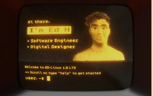
Retro terminal interface.
Color palette
Primary accent color for text highlights, active states, and border outlines for highlighted elements and actionable items. Its muted warmth brings a vintage glow
Neutral button treatment for secondary actions and selected controls.
Secondary text and border color, used for high-contrast details and specific navigation elements, reinforcing the monochrome digital display feel
Subtle background for specific sections or element shadows, adding depth while retaining the overall desaturated warmth
Typography
- Weights
- 400, 700
- Sizes
- 12px, 18px
- Line height
- 1.2, 1.5
- Letter spacing
- normal
- Fallback
- IBM Plex Mono
Primary text font for body content, links, and general UI where a monospace, code-like aesthetic is desired. It contributes to the vintage computing atmosphere.
- Weights
- 400, 700
- Sizes
- 22px, 36px
- Line height
- 1.2
- Letter spacing
- normal
- Fallback
- Press Start 2P
Headline and navigational font, providing a distinct pixelated character that is central to the retro-digital brand identity. Its larger sizes make it legible despite the blocky aesthetic.
Spacing & shape
Elevation
Components
Features a 'System Gray' background with 'Vanilla Dust' text, creating an inverted terminal selection visual. The button has sharp 0px corners and a 1px 'Vanilla Dust' border, with padding of 4px vertical and 24px horizontal. It casts a layered shadow: a 1px 'Vanilla Dust' offset followed by a 4px offset 'System Gray' (25% opacity), giving a distinct pixel-art depth.
A 'System Gray' background element for listing projects or portfolio items. It uses a 1px dashed border of 'System Gray' for structure and employs a layered shadow: a 1px 1px 'Vanilla Dust' offset and a 4px 4px 'System Gray' (25% opacity) offset, creating a distinctive 'stamped' appearance.
Used between content sections. The divider is a 1px dashed line in 'System Gray', reinforcing the terminal interface aesthetic.
Navigation items are rendered in 'Pixel Black' with 'public-pixel' font. On hover or active, they feature a 1px solid 'Pixel Black' border to highlight selection, maintaining the stark, digital interaction style.
Small labels for skills or technologies. They have a 'System Gray' background with a 1px dashed 'System Gray' border and 'Vanilla Dust' text (font 'chill', 12px). Padding is 4px horizontal and 2px vertical, with 0px border-radius for sharp edges, casting a 1px 'Vanilla Dust' and 4px 'System Gray' shadow.
Guidelines
- Always use the 'public-pixel' font for headings and primary navigational texts to maintain the distinct retro-digital identity.
- Implement the layered shadow effect (1px 'Vanilla Dust' offset, then 4px 'System Gray' offset) for all interactive clickable elements to simulate a three-dimensional, 'stamped' look.
- Utilize 1px dashed borders of 'System Gray' extensively as visual dividers and content outlines to reinforce the terminal aesthetic.
- Prioritize 'System Gray' for backgrounds and 'Vanilla Dust' for text accents and outlines, creating a high-contrast vintage display.
- Maintain a compact density with element gaps typically at 16px to reflect the information-dense nature of classic terminal interfaces.
- Employ 0px border-radius for all UI elements, ensuring sharp, blocky edges consistent with pixel-art visuals.
- Avoid soft, diffused shadows or glows; stick to sharp, layered offset shadows for depth.
- Do not introduce rounded corners; all interface elements must have a 0px border-radius.
- Refrain from using gradients or subtle color transitions; elements should have solid, distinct fill and border colors.
- Do not use generic sans-serif or serif fonts for primary text; 'chill' and 'public-pixel' define the brand's typographic voice.
- Avoid vibrant or highly saturated colors outside of the defined 'Vanilla Dust' accent, to preserve the muted, vintage palette.
- Do not use expansive white space between sections; maintain a relatively compact vertical rhythm with consistent section gaps of 32px.
About this system
ShowHide
The Ed Hinrichsen site evokes a retro-computing aesthetic with a warm, desaturated orange and dark gray palette, accented by pixel-art typography and blocky shadow effects. Its visual language prioritizes a 'terminal' feel, using dashed borders as dividers and relying on a muted background color to ground content. Interactions are highlighted by direct, sharp shadows rather than soft glows, lending a tactile, almost stamped appearance to elements.
The page primarily uses a contained layout, with content centered. The hero section features a prominent 3D render of a retro computer, with critical information displayed on its screen in the signature terminal style. Subsequent sections alternate between centered stacks of content and implicit two-column layouts where text is juxtaposed with imagery (often product screenshots). Vertical rhythmic spacing appears consistent, primarily driven by 32px section gaps and extensive use of dashed dividers. Navigation is a minimal top-left icon menu, supplemented by prominent 'Projects' and 'About' sections.
The site uses a mix of highly stylized 3D renders of retro computing equipment (e.g., the CRT monitor and keyboard) and pixelated iconography. The product imagery consists of tightly cropped, high-fidelity screenshots, often contained within a 'terminal' frame. All visuals are integrated to support a consistent vintage technology aesthetic, acting as both decorative atmosphere and explanatory content. Imagery density is moderate, with visuals often anchoring sections rather than being purely illustrative.
Reminiscent of Figma, Github, Terminal.com, Stripe.
# Ed Hinrichsen — Style Reference
> Retro terminal interface.

**Theme:** light

**Site:** https://www.edwardh.io

The Ed Hinrichsen site evokes a retro-computing aesthetic with a warm, desaturated orange and dark gray palette, accented by pixel-art typography and blocky shadow effects. Its visual language prioritizes a 'terminal' feel, using dashed borders as dividers and relying on a muted background color to ground content. Interactions are highlighted by direct, sharp shadows rather than soft glows, lending a tactile, almost stamped appearance to elements.

## Tokens — Colors

| Name | Value | Token | Role |
|------|------|------|------|
| Vanilla Dust | `#f6d4b1` | `--color-vanilla-dust` | Primary accent color for text highlights, active states, and border outlines for highlighted elements and actionable items. Its muted warmth brings a vintage glow |
| System Gray | `#525252` | `--color-system-gray` | Neutral button treatment for secondary actions and selected controls. |
| Pixel Black | `#000000` | `--color-pixel-black` | Secondary text and border color, used for high-contrast details and specific navigation elements, reinforcing the monochrome digital display feel |
| Warm Sand | `#cdb499` | `--color-warm-sand` | Subtle background for specific sections or element shadows, adding depth while retaining the overall desaturated warmth |

## Tokens — Typography

### chill
- **Substitute:** IBM Plex Mono
- **Weights:** 400, 700
- **Sizes:** 12px, 18px
- **Line height:** 1.2, 1.5
- **Letter spacing:** normal
- **Role:** Primary text font for body content, links, and general UI where a monospace, code-like aesthetic is desired. It contributes to the vintage computing atmosphere.

### public-pixel
- **Substitute:** Press Start 2P
- **Weights:** 400, 700
- **Sizes:** 22px, 36px
- **Line height:** 1.2
- **Letter spacing:** normal
- **Role:** Headline and navigational font, providing a distinct pixelated character that is central to the retro-digital brand identity. Its larger sizes make it legible despite the blocky aesthetic.

## Tokens — Spacing

- **Section gap:** 32px
- **Card padding:** 8px
- **Element gap:** 16px

## Tokens — Radius

- **Default:** 0px
- **Buttons:** 0px

## Tokens — Elevation

- **Project Card:** `rgb(246, 212, 177) 1px 1px 0px 0px, rgba(82, 82, 82, 0.25) 4px 4px 0px 0px`
- **Image/Other Elements:** `rgb(246, 212, 177) 1px 1px 0px 0px, rgba(82, 82, 82, 0.25) 6px 6px 0px 0px`
- **Button:** `rgba(82, 82, 82, 0.25) 6px 6px 0px 0px`

## Layout

The page primarily uses a contained layout, with content centered. The hero section features a prominent 3D render of a retro computer, with critical information displayed on its screen in the signature terminal style. Subsequent sections alternate between centered stacks of content and implicit two-column layouts where text is juxtaposed with imagery (often product screenshots). Vertical rhythmic spacing appears consistent, primarily driven by 32px section gaps and extensive use of dashed dividers. Navigation is a minimal top-left icon menu, supplemented by prominent 'Projects' and 'About' sections.

## Imagery

The site uses a mix of highly stylized 3D renders of retro computing equipment (e.g., the CRT monitor and keyboard) and pixelated iconography. The product imagery consists of tightly cropped, high-fidelity screenshots, often contained within a 'terminal' frame. All visuals are integrated to support a consistent vintage technology aesthetic, acting as both decorative atmosphere and explanatory content. Imagery density is moderate, with visuals often anchoring sections rather than being purely illustrative.

## Components

### Outlined Terminal Button
*Primary Call to Action*

Features a 'System Gray' background with 'Vanilla Dust' text, creating an inverted terminal selection visual. The button has sharp 0px corners and a 1px 'Vanilla Dust' border, with padding of 4px vertical and 24px horizontal. It casts a layered shadow: a 1px 'Vanilla Dust' offset followed by a 4px offset 'System Gray' (25% opacity), giving a distinct pixel-art depth.

### Project Card
*Content Display Card*

A 'System Gray' background element for listing projects or portfolio items. It uses a 1px dashed border of 'System Gray' for structure and employs a layered shadow: a 1px 1px 'Vanilla Dust' offset and a 4px 4px 'System Gray' (25% opacity) offset, creating a distinctive 'stamped' appearance.

### Dashed Divider
*Visual Separator*

Used between content sections. The divider is a 1px dashed line in 'System Gray', reinforcing the terminal interface aesthetic.

### Page Header Nav Item
*Navigation Link*

Navigation items are rendered in 'Pixel Black' with 'public-pixel' font. On hover or active, they feature a 1px solid 'Pixel Black' border to highlight selection, maintaining the stark, digital interaction style.

### Tag / Skill Badge
*Categorization Label*

Small labels for skills or technologies. They have a 'System Gray' background with a 1px dashed 'System Gray' border and 'Vanilla Dust' text (font 'chill', 12px). Padding is 4px horizontal and 2px vertical, with 0px border-radius for sharp edges, casting a 1px 'Vanilla Dust' and 4px 'System Gray' shadow.

## Guidelines

### Do

- Always use the 'public-pixel' font for headings and primary navigational texts to maintain the distinct retro-digital identity.
- Implement the layered shadow effect (1px 'Vanilla Dust' offset, then 4px 'System Gray' offset) for all interactive clickable elements to simulate a three-dimensional, 'stamped' look.
- Utilize 1px dashed borders of 'System Gray' extensively as visual dividers and content outlines to reinforce the terminal aesthetic.
- Prioritize 'System Gray' for backgrounds and 'Vanilla Dust' for text accents and outlines, creating a high-contrast vintage display.
- Maintain a compact density with element gaps typically at 16px to reflect the information-dense nature of classic terminal interfaces.
- Employ 0px border-radius for all UI elements, ensuring sharp, blocky edges consistent with pixel-art visuals.

### Don't

- Avoid soft, diffused shadows or glows; stick to sharp, layered offset shadows for depth.
- Do not introduce rounded corners; all interface elements must have a 0px border-radius.
- Refrain from using gradients or subtle color transitions; elements should have solid, distinct fill and border colors.
- Do not use generic sans-serif or serif fonts for primary text; 'chill' and 'public-pixel' define the brand's typographic voice.
- Avoid vibrant or highly saturated colors outside of the defined 'Vanilla Dust' accent, to preserve the muted, vintage palette.
- Do not use expansive white space between sections; maintain a relatively compact vertical rhythm with consistent section gaps of 32px.

## Agent Prompt Guide

Quick Color Reference:
text: #525252
background: #525252
border: #525252
accent: #f6d4b1
primary action: #f6d4b1 (outlined action border)

Example Component Prompts:
Create an 'Outlined Terminal Button': background #525252, text #f6d4b1 (chill font, weight 400, 18px), 1px solid border #f6d4b1, padding 4px 24px, 0px border-radius, box-shadow rgb(246, 212, 177) 1px 1px 0px 0px, rgba(82, 82, 82, 0.25) 4px 4px 0px 0px.
Create a 'Project Card': background #525252, text #525252 (chill font, weight 400, 18px), 1px dashed border #525252, padding 8px, 0px border-radius, box-shadow rgb(246, 212, 177) 1px 1px 0px 0px, rgba(82, 82, 82, 0.25) 4px 4px 0px 0px.
Create a 'Tag / Skill Badge': background #525252, text #f6d4b1 (chill font, weight 400, 12px), 1px dashed border #525252, padding 2px 4px, 0px border-radius.
Create a 'Heading 1' element: text #f6d4b1 (public-pixel font, weight 400, 36px), background #525252, 0px border-radius, letter-spacing normal, line-height 1.2.
More like this









Keep what you find
A free account saves references to boards and can send you a weekly email of picks based on what you save.
To see every result, go Pro.