Preview image. Unlock full-res
Deep charcoal precision
Color palette
Primary action buttons, interactive highlights, product accent details— a vivid pop against the dark palette
Interactive link text, active state borders— provides a secondary vibrant accent for navigation elements
Orange supporting accent for decorative details and low-frequency emphasis. Do not promote it to the primary CTA color
Page backgrounds, prominent card surfaces, primary dark canvas
Light neutral action fill for buttons on dark surfaces.
Muted text, secondary body copy, subtle borders for inactive elements
Button text on light backgrounds, ghost button borders, deeper shadow effects
Typography
- Weights
- 400
- Sizes
- 16px
- Line height
- 1.2
- Fallback
- Times New Roman
Standard body text and longer descriptive paragraphs. The classic serif grounds the futuristic product in timeless readability.
- Weights
- 200, 400
- Sizes
- 16px, 24px, 26px, 28px, 42px, 68px, 86px
- Line height
- 1, 1.06, 1.08, 1.14, 1.2, 1.31, 1.33
- Letter spacing
- normal
- Fallback
- Montserrat
Prominent headings and UI elements. At larger sizes, the varied weights create dynamic visual hierarchy and a distinct brand voice.
- Weights
- 400
- Sizes
- 32px, 42px
- Line height
- 1.2
- Letter spacing
- -0.062em at 32px, -0.048em at 42px
- Fallback
- Lato
Key headlines and product feature titles. The subtle negative letter-spacing contributes to a refined, architectural feel, giving space without feeling sparse.
Spacing & shape
Elevation
Components
Filled with Power Orange (#f45500), Vanilla Ice (#ffffff) text, with a 16px border-radius and minimal 1px vertical padding and 16px horizontal padding. Features a subtle orange shadow rgba(245, 86, 0, 0.6) 0px 0px 30px 0px.
Filled with Vanilla Ice (#ffffff), Obsidian (#000000) text, with a 20px border-radius and 0px vertical padding and 16px horizontal padding. Features a soft white shadow rgba(255, 255, 255, 0.3) 0px 0px 30px 0px.
Filled with Power Orange (#f45500), Vanilla Ice (#ffffff) text, with a 20px border-radius and 1px vertical padding and 6px horizontal padding.
Defined by a Carbon (#202020) background, 20px border-radius, with 0 padding internally, leveraging imagery and adjacent text for content. Borderless and shadowless.
Transparent background with 0px border-radius and 24px padding. No shadows or borders, maintaining a seamless visual flow.
Guidelines
- Use Carbon (#202020) as the dominant background color for most sections to maintain the dark theme.
- Apply Power Orange (#f45500) exclusively for primary calls-to-action and key interactive accents.
- Prioritize GT-Flexa for all headings and UI elements that require a distinct brand voice.
- Employ Tobias-light with negative letter-spacing for large, impactful headlines to create a sense of elegant precision.
- Utilize 20px border-radius for cards and content containers, and 16px for primary action buttons.
- Maintain a comfortable density with element gaps of 4px and section gaps of 48px.
- Ensure all interactive text and links use Electric Violet (#9e9eff) for recognition, only if they are true interactive links. Vanilla Ice (#ffffff) should be used for static link-like text.
- Do not introduce new vibrant colors outside of Power Orange and Electric Violet for interaction or branding.
- Avoid using serif typography for UI elements or headings; reserve Times for body content only.
- Do not deviate from the established 20px and 16px border-radii for cards and buttons respectively.
- Refrain from adding arbitrary shadows or borders to elements; elevation is used sparingly and deliberately.
- Do not use Electric Violet for button backgrounds; it is primarily for links and borders.
- Avoid excessive spacing or padding that breaks the comfortable density; stick to 4px multiples for consistency.
- Do not use pure black (#000000) as a background unless specifically for text on a white element or as a deep accent shade.
About this system
ShowHide
The Electronic Materials Office design system presents a future-forward, material-focused aesthetic: deep charcoal surfaces provide a sophisticated backdrop for precise typography. A single vibrant orange acts as a focused accent, guiding user interaction and highlighting key product details. The overall experience is one of refined minimalism, emphasizing form and function through limited color, structured spacing, and highly legible text.
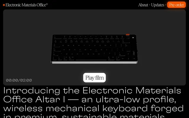
The page primarily uses a full-bleed layout on a dark background, interspersed with content sections that maintain a visual max-width for readability, even if technically full-bleed. The hero section features a centered product visual over a dark background. Sections alternate between centered content stacks and dynamic arrangements of text and product imagery within a grid-like structure. There's a consistent vertical rhythm created by the 48px section gap, providing ample breathing room. Navigation is minimal, featuring a discreet top bar with essential links and a prominent 'Pre-order' button.
This system primarily uses high-fidelity product photography of the keyboard, tightly cropped and presented on a Carbon (#202020) background. The visuals are clean, showcasing the product's materiality and design. There are also abstract illustrations of keycaps that maintain a flat, geometric style. Icons, when present, are outlined and monochromatic. Imagery serves to showcase the product's features and aesthetics rather than providing atmosphere, maintaining a product-focused, almost studio-shot quality.
Reminiscent of Keychron, teenage engineering, Apple (accessories), Grovemade.
# Electronic Materials Office® — Style Reference
> Deep charcoal precision

**Theme:** dark

**Site:** https://electronicmaterialsoffice.com

The Electronic Materials Office design system presents a future-forward, material-focused aesthetic: deep charcoal surfaces provide a sophisticated backdrop for precise typography. A single vibrant orange acts as a focused accent, guiding user interaction and highlighting key product details. The overall experience is one of refined minimalism, emphasizing form and function through limited color, structured spacing, and highly legible text.

## Tokens — Colors

| Name | Value | Token | Role |
|------|------|------|------|
| Power Orange | `#f45500` | `--color-power-orange` | Primary action buttons, interactive highlights, product accent details— a vivid pop against the dark palette |
| Electric Violet | `#9e9eff` | `--color-electric-violet` | Interactive link text, active state borders— provides a secondary vibrant accent for navigation elements |
| Dark Umber | `#933400` | `--color-dark-umber` | Orange supporting accent for decorative details and low-frequency emphasis. Do not promote it to the primary CTA color |
| Carbon | `#202020` | `--color-carbon` | Page backgrounds, prominent card surfaces, primary dark canvas |
| Vanilla Ice | `#FFFFFF` | `--color-vanilla-ice` | Light neutral action fill for buttons on dark surfaces. |
| Ash | `#9d9d9d` | `--color-ash` | Muted text, secondary body copy, subtle borders for inactive elements |
| Obsidian | `#000000` | `--color-obsidian` | Button text on light backgrounds, ghost button borders, deeper shadow effects |

## Tokens — Typography

### Times
- **Substitute:** Times New Roman
- **Weights:** 400
- **Sizes:** 16px
- **Line height:** 1.2
- **Role:** Standard body text and longer descriptive paragraphs. The classic serif grounds the futuristic product in timeless readability.

### GT-Flexa
- **Substitute:** Montserrat
- **Weights:** 200, 400
- **Sizes:** 16px, 24px, 26px, 28px, 42px, 68px, 86px
- **Line height:** 1, 1.06, 1.08, 1.14, 1.2, 1.31, 1.33
- **Letter spacing:** normal
- **Role:** Prominent headings and UI elements. At larger sizes, the varied weights create dynamic visual hierarchy and a distinct brand voice.

### Tobias-light
- **Substitute:** Lato
- **Weights:** 400
- **Sizes:** 32px, 42px
- **Line height:** 1.2
- **Letter spacing:** -0.062em at 32px, -0.048em at 42px
- **Role:** Key headlines and product feature titles. The subtle negative letter-spacing contributes to a refined, architectural feel, giving space without feeling sparse.

## Tokens — Type Scale

Augmented Fourth (1.414) from 16px base.

| Role | Size | Line height | Letter spacing |
|------|------|------|------|
| body | 16px | 1.2 | — |
| subheading | 24px | 1.06 | — |
| heading-sm | 32px | 1.2 | -0.62px |
| heading | 42px | 1.2 | -0.48px |
| heading-lg | 68px | 1.31 | — |
| display | 86px | 1.33 | — |

## Tokens — Spacing

- **Section gap:** 48px
- **Card padding:** 24px
- **Element gap:** 4px

## Tokens — Radius

- **Buttons:** 16px
- **Cards:** 20px
- **elements:** 20px

## Tokens — Elevation

- **Primary Action Button:** `rgba(245, 86, 0, 0.6) 0px 0px 30px 0px`
- **Play Film Button:** `rgba(255, 255, 255, 0.3) 0px 0px 30px 0px`

## Layout

The page primarily uses a full-bleed layout on a dark background, interspersed with content sections that maintain a visual max-width for readability, even if technically full-bleed. The hero section features a centered product visual over a dark background. Sections alternate between centered content stacks and dynamic arrangements of text and product imagery within a grid-like structure. There's a consistent vertical rhythm created by the 48px section gap, providing ample breathing room. Navigation is minimal, featuring a discreet top bar with essential links and a prominent 'Pre-order' button.

## Imagery

This system primarily uses high-fidelity product photography of the keyboard, tightly cropped and presented on a Carbon (#202020) background. The visuals are clean, showcasing the product's materiality and design. There are also abstract illustrations of keycaps that maintain a flat, geometric style. Icons, when present, are outlined and monochromatic. Imagery serves to showcase the product's features and aesthetics rather than providing atmosphere, maintaining a product-focused, almost studio-shot quality.

## Components

### Primary Action Button (Pre-order)
*Main call-to-action button, driving conversions.*

Filled with Power Orange (#f45500), Vanilla Ice (#ffffff) text, with a 16px border-radius and minimal 1px vertical padding and 16px horizontal padding. Features a subtle orange shadow rgba(245, 86, 0, 0.6) 0px 0px 30px 0px.

### Play Film Button
*Secondary action button, typically embedded in rich media sections.*

Filled with Vanilla Ice (#ffffff), Obsidian (#000000) text, with a 20px border-radius and 0px vertical padding and 16px horizontal padding. Features a soft white shadow rgba(255, 255, 255, 0.3) 0px 0px 30px 0px.

### Compact Accent Button
*Small, functional button for specific actions like 'Pre-order' in the header.*

Filled with Power Orange (#f45500), Vanilla Ice (#ffffff) text, with a 20px border-radius and 1px vertical padding and 6px horizontal padding.

### Product Feature Card
*Displays key features or specifications with an associated visual.*

Defined by a Carbon (#202020) background, 20px border-radius, with 0 padding internally, leveraging imagery and adjacent text for content. Borderless and shadowless.

### Transparent Card
*Used for content overlays or sections that should blend with the background.*

Transparent background with 0px border-radius and 24px padding. No shadows or borders, maintaining a seamless visual flow.

## Guidelines

### Do

- Use Carbon (#202020) as the dominant background color for most sections to maintain the dark theme.
- Apply Power Orange (#f45500) exclusively for primary calls-to-action and key interactive accents.
- Prioritize GT-Flexa for all headings and UI elements that require a distinct brand voice.
- Employ Tobias-light with negative letter-spacing for large, impactful headlines to create a sense of elegant precision.
- Utilize 20px border-radius for cards and content containers, and 16px for primary action buttons.
- Maintain a comfortable density with element gaps of 4px and section gaps of 48px.
- Ensure all interactive text and links use Electric Violet (#9e9eff) for recognition, only if they are true interactive links. Vanilla Ice (#ffffff) should be used for static link-like text.

### Don't

- Do not introduce new vibrant colors outside of Power Orange and Electric Violet for interaction or branding.
- Avoid using serif typography for UI elements or headings; reserve Times for body content only.
- Do not deviate from the established 20px and 16px border-radii for cards and buttons respectively.
- Refrain from adding arbitrary shadows or borders to elements; elevation is used sparingly and deliberately.
- Do not use Electric Violet for button backgrounds; it is primarily for links and borders.
- Avoid excessive spacing or padding that breaks the comfortable density; stick to 4px multiples for consistency.
- Do not use pure black (#000000) as a background unless specifically for text on a white element or as a deep accent shade.

## Agent Prompt Guide

primary action: #f45500 (filled action)
Create a Primary Action Button: #f45500 background, #000000 text, 9999px radius, compact pill padding. Use this filled treatment for the main CTA.

Create a hero section: background Carbon (#202020). Headline 'Introducing the Altar I' using Tobias-light weight 400, size 86px, line-height 1.33, letter-spacing -0.48px, color Vanilla Ice (#FFFFFF).

Generate a featured product card: A 20px rounded Carbon (#202020) background, with an internal image taking up the top 75% height. Below the image, add a GT-Flexa weight 400, size 24px title 'Keycaps' in Vanilla Ice (#FFFFFF), and a Times weight 400, size 16px description 'Novel key shape' in Ash (#9d9d9d), all with 24px padding within the card.
More like this









Keep what you find
A free account saves references to boards and can send you a weekly email of picks based on what you save.
To see every result, go Pro.