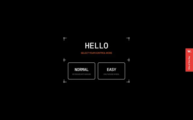
Preview image. Unlock full-res
Minimalist digital console.
Color palette
Subtle instruction text, highlights, low-prominence accents
Page background, button text on outlined buttons
Primary text, outlined button borders, decorative framework lines
Secondary helper text, subtle borders
Typography
- Weights
- 500
- Sizes
- 10px, 12px, 16px
- Line height
- 1, 1.2, 1.4
- Letter spacing
- normal
- Fallback
- Helvetica Neue
Body text and navigation elements. Its crisp, modern lines provide legibility against dark backgrounds.
- Weights
- 500
- Sizes
- 30px, 60px
- Line height
- 1.2, 1.3
- Letter spacing
- -0.0200em
- Fallback
- Staatliches
Strong, attention-grabbing headlines. The tight tracking at larger sizes creates a condensed, impactful presence.
- Weights
- 400
- Sizes
- 13px
- Line height
- 1.2
- Letter spacing
- normal
- Fallback
- Arial
Button subtext and secondary labels, offering clear readability at smaller sizes.
Spacing & shape
Components
Features a 10px borderRadius, 2px Ghost White border, Midnight Void background, and Midnight Void text. Padding is 30px on all sides. Internal text uses Arial 13px weight 400.
Uses IPM font at 60px size, weight 500, with -0.0200em letter-spacing and Ghost White color.
Styled with Accent Orange, using neue-haas-grotesk-display font at 16px size, weight 500.
Appears below button labels; uses Arial 13px, weight 400, Muted Ash color.
Guidelines
- Maintain a primary contrast ratio of Ghost White (#ffffff) text on Midnight Void (#000000) backgrounds.
- Use IPM font only for headlines and large display text, applying -0.0200em letter-spacing.
- Apply 10px border-radius to all buttons and similar interactive containers.
- Ensure horizontal and vertical spacing around main content blocks respects the 'spacious' density, with section gaps between 156px and 280px.
- Define interactive elements with a 2px Ghost White border over a Midnight Void background.
- Reserve Accent Orange (#ff5c00) for subtle instructional text or small, non-primary highlights.
- Use Muted Ash (#666666) exclusively for secondary, low-prominence text, like helper or descriptive labels.
- Do not introduce new background colors; maintain the #000000 dominant canvas.
- Avoid using bold or heavy font weights; the system relies on lighter weights for a structured feel.
- Do not deviate from the outlined button style; avoid solid filled buttons.
- Prevent excessive use of Accent Orange; it is a highlight, not a primary color.
- Do not overcrowd sections; the design relies on spacious layouts and generous use of negative space.
- Avoid decorative imagery that breaks from the stark, high-contrast aesthetic; prefer purely functional or technical visuals.
- Do not use letter-spacing on neue-haas-grotesk-display or Arial; only IPM headlines feature tracking.
About this system
ShowHide
This design system presents a stark, high-contrast digital interface. Dominated by deep black backgrounds and crisp white text, it leverages an accent orange purely for subtle guidance and status. Interaction elements are clearly defined by white outline borders, maintaining the minimalist aesthetic. Typography combines a structured, technical display font with a more flexible body font to create hierarchy within this constrained palette. The overall impression is one of precise control and focused functionality within a dark, almost console-like environment.
The page maintains a centered, contained layout, with content focused in the middle of the screen against a full-bleed Midnight Void background. The hero section features a prominent, centered headline with a secondary instruction line. Interactive elements, such as buttons, are also centrally aligned, arranged horizontally. Vertical rhythm is established through significant top and bottom margins on the main content block, creating ample whitespace and a spacious density. Navigation appears to be minimal, suggested by a small 'W.' icon and 'Site of the Day' label in the top right, hinting at off-canvas or minimal global controls.
The visual language is strictly UI-focused, devoid of photography or complex illustrations. It features simple, geometric outline graphics (like the corner brackets) which serve a decorative and structural purpose, echoing a technical blueprint or digital interface. Icons are implied to be minimalist and outlined, consistent with the overall aesthetic. Imagery plays a purely decorative atmospheric role, enhancing the 'digital console' feel without conveying specific content.
Reminiscent of Aerolab, Bruno (personal site), Locomotive, Akufen (agency).
# Virtual — Style Reference
> Minimalist digital console.

**Theme:** dark

**Site:** https://virtual.plus-ex.com/showroom

This design system presents a stark, high-contrast digital interface. Dominated by deep black backgrounds and crisp white text, it leverages an accent orange purely for subtle guidance and status. Interaction elements are clearly defined by white outline borders, maintaining the minimalist aesthetic. Typography combines a structured, technical display font with a more flexible body font to create hierarchy within this constrained palette. The overall impression is one of precise control and focused functionality within a dark, almost console-like environment.

## Tokens — Colors

| Name | Value | Token | Role |
|------|------|------|------|
| Accent Orange | `#ff5c00` | `--color-accent-orange` | Subtle instruction text, highlights, low-prominence accents |
| Midnight Void | `#000000` | `--color-midnight-void` | Page background, button text on outlined buttons |
| Ghost White | `#ffffff` | `--color-ghost-white` | Primary text, outlined button borders, decorative framework lines |
| Muted Ash | `#666666` | `--color-muted-ash` | Secondary helper text, subtle borders |

## Tokens — Typography

### neue-haas-grotesk-display
- **Substitute:** Helvetica Neue
- **Weights:** 500
- **Sizes:** 10px, 12px, 16px
- **Line height:** 1, 1.2, 1.4
- **Letter spacing:** normal
- **Role:** Body text and navigation elements. Its crisp, modern lines provide legibility against dark backgrounds.

### IPM
- **Substitute:** Staatliches
- **Weights:** 500
- **Sizes:** 30px, 60px
- **Line height:** 1.2, 1.3
- **Letter spacing:** -0.0200em
- **Role:** Strong, attention-grabbing headlines. The tight tracking at larger sizes creates a condensed, impactful presence.

### Arial
- **Substitute:** Arial
- **Weights:** 400
- **Sizes:** 13px
- **Line height:** 1.2
- **Letter spacing:** normal
- **Role:** Button subtext and secondary labels, offering clear readability at smaller sizes.

## Tokens — Type Scale

| Role | Size | Line height | Letter spacing |
|------|------|------|------|
| caption | 10px | 1 | — |
| heading | 30px | 1.2 | -0.6px |
| display | 60px | 1.3 | -1.2px |

## Tokens — Spacing

- **Card padding:** 30px
- **Element gap:** 10px

## Tokens — Radius

- **Buttons:** 10px

## Layout

The page maintains a centered, contained layout, with content focused in the middle of the screen against a full-bleed Midnight Void background. The hero section features a prominent, centered headline with a secondary instruction line. Interactive elements, such as buttons, are also centrally aligned, arranged horizontally. Vertical rhythm is established through significant top and bottom margins on the main content block, creating ample whitespace and a spacious density. Navigation appears to be minimal, suggested by a small 'W.' icon and 'Site of the Day' label in the top right, hinting at off-canvas or minimal global controls.

## Imagery

The visual language is strictly UI-focused, devoid of photography or complex illustrations. It features simple, geometric outline graphics (like the corner brackets) which serve a decorative and structural purpose, echoing a technical blueprint or digital interface. Icons are implied to be minimalist and outlined, consistent with the overall aesthetic. Imagery plays a purely decorative atmospheric role, enhancing the 'digital console' feel without conveying specific content.

## Components

### Outlined Button
*Primary interaction element for choices.*

Features a 10px borderRadius, 2px Ghost White border, Midnight Void background, and Midnight Void text. Padding is 30px on all sides. Internal text uses Arial 13px weight 400.

### Hero Headline
*Main page title.*

Uses IPM font at 60px size, weight 500, with -0.0200em letter-spacing and Ghost White color.

### Instruction Text
*Guidance or secondary hierarchy within sections.*

Styled with Accent Orange, using neue-haas-grotesk-display font at 16px size, weight 500.

### Button Subtext
*Contextual information for interactive elements.*

Appears below button labels; uses Arial 13px, weight 400, Muted Ash color.

## Guidelines

### Do

- Maintain a primary contrast ratio of Ghost White (#ffffff) text on Midnight Void (#000000) backgrounds.
- Use IPM font only for headlines and large display text, applying -0.0200em letter-spacing.
- Apply 10px border-radius to all buttons and similar interactive containers.
- Ensure horizontal and vertical spacing around main content blocks respects the 'spacious' density, with section gaps between 156px and 280px.
- Define interactive elements with a 2px Ghost White border over a Midnight Void background.
- Reserve Accent Orange (#ff5c00) for subtle instructional text or small, non-primary highlights.
- Use Muted Ash (#666666) exclusively for secondary, low-prominence text, like helper or descriptive labels.

### Don't

- Do not introduce new background colors; maintain the #000000 dominant canvas.
- Avoid using bold or heavy font weights; the system relies on lighter weights for a structured feel.
- Do not deviate from the outlined button style; avoid solid filled buttons.
- Prevent excessive use of Accent Orange; it is a highlight, not a primary color.
- Do not overcrowd sections; the design relies on spacious layouts and generous use of negative space.
- Avoid decorative imagery that breaks from the stark, high-contrast aesthetic; prefer purely functional or technical visuals.
- Do not use letter-spacing on neue-haas-grotesk-display or Arial; only IPM headlines feature tracking.

## Agent Prompt Guide

Quick Color Reference:
text: #ffffff
background: #000000
border: #ffffff
accent: #ff5c00
primary action: no distinct CTA color

Example Component Prompts:
Create a Hero Section: Midnight Void background. Headline "HELLO" IPM 60px weight 500, #ffffff, letter-spacing -1.2px. Subtext "SELECT YOUR CONTROL MODE" neue-haas-grotesk-display 16px weight 500, #ff5c00. Two outlined buttons below, each 10px radius, 2px #ffffff border, 30px padding. Button label IPM 30px weight 500, #000000. Button subtext Arial 13px weight 400, #666666.
Create an Outlined Button: 10px radius, 2px #ffffff border, 30px padding. Label text IPM 30px weight 500, #000000. Helper text Arial 13px weight 400, #666666.
More like this








Keep what you find
A free account saves references to boards and can send you a weekly email of picks based on what you save.
To see every result, go Pro.