Preview image. Unlock full-res
Minimalist Dark Canvas
Color palette
Page backgrounds, large decorative fills
Hairline borders, dividers, input outlines, and card edges on light surfaces. Do not promote it to the primary CTA color
Decorative strokes, secondary graphic elements
Button background for primary actions, subtle elevation surface
Muted link text color, secondary borders
Typography
- Weights
- 400
- Sizes
- 16px, 20px, 24px, 40px
- Line height
- 1.13, 1.15, 1.25, 1.3, 1.33
- Fallback
- system-ui, sans-serif
All textual content, from body text to prominent headlines, using varying sizes to establish hierarchy without additional typefaces or weights. All letterspacing is normal, supporting legibility in a content-focused display.
Spacing & shape
Components
A filled button with 'Muted Ash' background and 'Ghost White' text. Features a 10px border-radius, giving it a soft, approachable feel against the dark canvas. Padding is generous at 0px vertical and 60px horizontal, creating an emphasized yet understated clickable area.
Text-only 'Ghost White' links for navigation and secondary information. Used for social media links and external resources. No distinctive background or border, relying on color and context for interaction cues.
Uses Roboto at 40px with a lineHeight of 1.13, in 'Ghost White' color. Set centered on the dark background, it establishes a commanding but not overwhelming presence due to its default weight and tight leading.
Uses Roboto at 24px with a lineHeight of 1.33, in 'Ghost White' color. Slightly smaller than the primary, it provides hierarchical distinction while maintaining prominence.
Guidelines
- Always use 'Midnight Void' (#000000) for primary page and section backgrounds.
- Utilize 'Ghost White' (#ffffff) for all primary text content and logo elements.
- Apply 'Muted Ash' (#4d4d4d) as the background color for all primary action buttons, combined with 'Ghost White' (#ffffff) text.
- Ensure all primary button elements incorporate a 10px border-radius.
- Maintain a default letter-spacing for all typography, regardless of size or role, to preserve textual clarity.
- Employ 40px vertical spacing for significant content breaks between sections to ensure comfortable density.
- Use 8px as the base unit for inter-element spacing and small horizontal gaps.
- Avoid introducing additional font families or weights beyond Roboto weight 400.
- Do not use saturated or vivid colors; adhere strictly to the achromatic palette with 'Midnight Void' and shades of gray and white.
- Refrain from using complex shadow effects or strong elevations; rely on subtle background color shifts for surface distinction.
- Do not deviate from the default 10px border-radius for buttons or the 16px radius for other prominent elements.
- Avoid left-aligning headings; all key textual content should be centered.
- Do not use gradients; the design relies on solid colors and minimalist flat surfaces.
- Do not use images as prominent page backgrounds; stick to solid 'Midnight Void'.
About this system
ShowHide
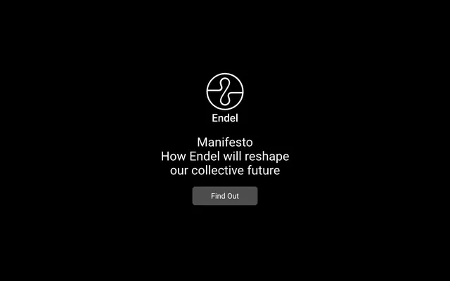
Endel Manifesto presents a stark, almost monastic dark mode experience, prioritizing content over visual flourish. The design employs a monochrome palette with abundant black space, utilizing white text and subtle gray accents to guide focus. Typography is minimal and direct, ensuring clarity against the deep background, while interactive elements are sparingly introduced with soft, rounded edges to avoid disruption.
The page uses a full-bleed layout, dominated by a 'Midnight Void' background. All content is centrally aligned horizontally. The hero section features the logo, brand name, and primary headline centered on a black canvas, followed by a centered 'Manifesto Button'. Sections are visually delineated by consistent vertical spacing of 40px, but no hard dividers or alternating background colors. Information is presented in single-column text blocks, creating a focused, linear reading experience. Navigation links are minimal, presented as 'Ghost Link' text elements.
This design largely eschews traditional imagery in favor of a pure UI aesthetic. The primary visual elements are the Endel logo, which is a minimalist white outline on a black background. When present, graphics are abstract, using simple lines and shapes in white or steel gray to provide subtle visual interest without distracting from text. The density is extremely low, with imagery serving purely decorative or iconic roles, never as content or product showcases. There is no photography or complex illustration present.
Reminiscent of Calm (website), Brain.fm, Breethe, Apple (specific marketing pages).
# Endel Manifesto — Style Reference
> Minimalist Dark Canvas

**Theme:** dark

**Site:** https://manifesto.endel.io

Endel Manifesto presents a stark, almost monastic dark mode experience, prioritizing content over visual flourish. The design employs a monochrome palette with abundant black space, utilizing white text and subtle gray accents to guide focus. Typography is minimal and direct, ensuring clarity against the deep background, while interactive elements are sparingly introduced with soft, rounded edges to avoid disruption.

## Tokens — Colors

| Name | Value | Token | Role |
|------|------|------|------|
| Midnight Void | `#000000` | `--color-midnight-void` | Page backgrounds, large decorative fills |
| Ghost White | `#ffffff` | `--color-ghost-white` | Hairline borders, dividers, input outlines, and card edges on light surfaces. Do not promote it to the primary CTA color |
| Steel Gray | `#636363` | `--color-steel-gray` | Decorative strokes, secondary graphic elements |
| Muted Ash | `#4d4d4d` | `--color-muted-ash` | Button background for primary actions, subtle elevation surface |
| Soft Fog | `#6f6f6f` | `--color-soft-fog` | Muted link text color, secondary borders |

## Tokens — Typography

### Roboto
- **Substitute:** system-ui, sans-serif
- **Weights:** 400
- **Sizes:** 16px, 20px, 24px, 40px
- **Line height:** 1.13, 1.15, 1.25, 1.3, 1.33
- **Role:** All textual content, from body text to prominent headlines, using varying sizes to establish hierarchy without additional typefaces or weights. All letterspacing is normal, supporting legibility in a content-focused display.

## Tokens — Type Scale

Perfect Fourth (1.333) from 16px base.

| Role | Size | Line height | Letter spacing |
|------|------|------|------|
| body | 16px | 1.25 | — |
| subheading | 20px | 1.15 | — |
| heading | 24px | 1.33 | — |
| display | 40px | 1.13 | — |

## Tokens — Spacing

- **Section gap:** 40px
- **Card padding:** 20px
- **Element gap:** 8px

## Tokens — Radius

- **Buttons:** 10px
- **other:** 16px

## Layout

The page uses a full-bleed layout, dominated by a 'Midnight Void' background. All content is centrally aligned horizontally. The hero section features the logo, brand name, and primary headline centered on a black canvas, followed by a centered 'Manifesto Button'. Sections are visually delineated by consistent vertical spacing of 40px, but no hard dividers or alternating background colors. Information is presented in single-column text blocks, creating a focused, linear reading experience. Navigation links are minimal, presented as 'Ghost Link' text elements.

## Imagery

This design largely eschews traditional imagery in favor of a pure UI aesthetic. The primary visual elements are the Endel logo, which is a minimalist white outline on a black background. When present, graphics are abstract, using simple lines and shapes in white or steel gray to provide subtle visual interest without distracting from text. The density is extremely low, with imagery serving purely decorative or iconic roles, never as content or product showcases. There is no photography or complex illustration present.

## Components

### Manifesto Button
*Primary Call to Action*

A filled button with 'Muted Ash' background and 'Ghost White' text. Features a 10px border-radius, giving it a soft, approachable feel against the dark canvas. Padding is generous at 0px vertical and 60px horizontal, creating an emphasized yet understated clickable area.

### Ghost Link
*Navigation and Ancillary Links*

Text-only 'Ghost White' links for navigation and secondary information. Used for social media links and external resources. No distinctive background or border, relying on color and context for interaction cues.

### Primary Headline
*Main page titles and key statements*

Uses Roboto at 40px with a lineHeight of 1.13, in 'Ghost White' color. Set centered on the dark background, it establishes a commanding but not overwhelming presence due to its default weight and tight leading.

### Secondary Headline
*Sub-headings or descriptive text related to main titles*

Uses Roboto at 24px with a lineHeight of 1.33, in 'Ghost White' color. Slightly smaller than the primary, it provides hierarchical distinction while maintaining prominence.

## Guidelines

### Do

- Always use 'Midnight Void' (#000000) for primary page and section backgrounds.
- Utilize 'Ghost White' (#ffffff) for all primary text content and logo elements.
- Apply 'Muted Ash' (#4d4d4d) as the background color for all primary action buttons, combined with 'Ghost White' (#ffffff) text.
- Ensure all primary button elements incorporate a 10px border-radius.
- Maintain a default letter-spacing for all typography, regardless of size or role, to preserve textual clarity.
- Employ 40px vertical spacing for significant content breaks between sections to ensure comfortable density.
- Use 8px as the base unit for inter-element spacing and small horizontal gaps.

### Don't

- Avoid introducing additional font families or weights beyond Roboto weight 400.
- Do not use saturated or vivid colors; adhere strictly to the achromatic palette with 'Midnight Void' and shades of gray and white.
- Refrain from using complex shadow effects or strong elevations; rely on subtle background color shifts for surface distinction.
- Do not deviate from the default 10px border-radius for buttons or the 16px radius for other prominent elements.
- Avoid left-aligning headings; all key textual content should be centered.
- Do not use gradients; the design relies on solid colors and minimalist flat surfaces.
- Do not use images as prominent page backgrounds; stick to solid 'Midnight Void'.

## Agent Prompt Guide

Quick Color Reference:
text: #ffffff
background: #000000
border: #ffffff
accent: no distinct accent color
primary action: no distinct CTA color

Example Component Prompts:
1. Create a primary headline: Text 'Manifesto' in Roboto weight 400, size 40px, lineHeight 1.13, color 'Ghost White' (#ffffff), centered.
2. Create a 'Find Out' button: Background 'Muted Ash' (#4d4d4d), text 'Find Out' in Roboto weight 400, size 16px, color 'Ghost White' (#ffffff). Border-radius 10px. Horizontal padding 60px.
3. Create a secondary headline: Text 'How Endel will reshape our collective future' in Roboto weight 400, size 24px, lineHeight 1.33, color 'Ghost White' (#ffffff), centered.
More like this









Keep what you find
A free account saves references to boards and can send you a weekly email of picks based on what you save.
To see every result, go Pro.