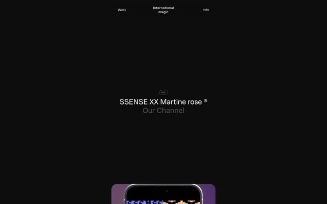
Preview image. Unlock full-res
Midnight Terminal, Pixelated Echoes
Color palette
Page background, primary surface, deep shadow base
Primary text, element borders, hero section text
Muted body text, secondary link color, subtle borders
Secondary text, subheadings, decorative element borders
Button text (on dark bg), ghost button borders, hover states
Badge borders
Subtle button background
Badge text
Typography
- Weights
- 400, 475, 500, 550, 650
- Sizes
- 10px, 11px, 15px, 16px, 32px, 96px
- Line height
- 1, 1.1, 1.2, 1.25, 1.4, 1.6
- Letter spacing
- -0.017em at 96px, 0.025em at 10px
- Fallback
- Inter
The primary typeface for all content, from badges to display headlines. Its range of weights and precise letter-spacing on larger sizes contributes to the compact yet clear aesthetic, while high feature settings enable specific typographic nuances like ordinal numbers and stylistic alternates.
Spacing & shape
Elevation
Components
Text in Porcelain (#ebebeb) on a transparent background, with a 1px Porcelain (#ebebeb) border, and a 16px radius. Padding is 0px top/bottom, 20px left/right.
Background in Shadowened Clay (#585858), text in Midnight Ink (#0a0a0a), with a 9999px (pill) border-radius. Padding is 0px top/bottom, 24px left/right.
Background is transparent, text in Faded Silver (#707070), with a 1px Muted Slate (#616161) border and a 9999px (pill) border-radius. Padding is 0px top/bottom, 8px left/right.
Guidelines
- Prioritize Midnight Ink (#0a0a0a) for all primary backgrounds and surfaces to maintain the dark theme.
- Use Ghost White (#f7f7f7) for primary text and significant text elements like headings.
- Apply Wand UI Pro for all typography, ensuring font feature settings 'ordn' and 'ss01' are enabled.
- Utilize 9999px radius for all button and badge elements to create a distinctive pill-like shape.
- Maintain a default letter-spacing of -0.017em for large display text (96px) and 0.025em for small caption text (10px).
- Implement the large shadow 'rgba(0, 0, 0, 0.25) 0px 64px 72px 0px' for elevated elements to create depth without overt borders.
- Employ Ash Gray (#7c7c7c) or Steel Gray (#4d4d4d) for secondary information or links, ensuring sufficient contrast against the dark background.
- Avoid using bright or overly saturated colors, as the palette is strictly achromatic with very minimal white/gray accents.
- Do not use generic border-radii; adhere strictly to 9999px for buttons/badges and 24px for other interactive elements.
- Do not introduce gradients unless they match the detected shadow style, as the system relies on flat surfaces and minimal elevation.
- Avoid excessive spacing or padding; the design system favors a compact, information-dense layout.
- Do not use box shadows for button states; interaction is indicated primarily by text color changes or subtle background fills.
- Do not center page content on a fixed-width container; the layout is full-bleed with content contained by padding.
- Avoid mixing sans-serif typefaces; Wand UI Pro is the only approved typeface.
About this system
ShowHide
International Magic employs a dark, high-contrast aesthetic that feels like a digital portal. Text is predominantly white or light gray against a near-black canvas, with accents of off-white used minimally for interactive elements. Surfaces are stark and planar, relying on large, abstract shadows for subtle depth rather than complex gradients or border treatments. Typography is compact and precise, maintaining a high information density within fixed-width page layouts, while interactive components feature extremely rounded, almost pill-like shapes.
The page adopts a full-bleed dark canvas model. The hero section displays large, centered headings, often layered over product imagery or abstract visuals. Content sections appear to flow vertically with consistent, yet comfortable 64px gaps, but without distinct alternating bands or strong visual dividers, contributing to a seamless, continuous digital experience. Navigation is handled by a minimal top bar with ghost-style links. The visual rhythm is direct and linear, guiding the user vertically through content without complex grid systems or asymmetric arrangements, though interactive elements may float over content like a video player.
Imagery consists of product screenshots and abstract graphic elements, often rendered as animated video or glitched visual effects. Photography, when present (e.g., person's face), is styled with muted colors and typically contained within rounded containers. Icons are minimal, featuring outlined styles with a clean stroke weight, and primarily serve a functional purpose in media playback controls or navigation. The overall density of imagery is balanced with text, acting as compelling visual anchors for textual information.
Reminiscent of A-Cold-Wall*, Off-White, Balenciaga, Publicis Sapient.
# International Magic — Style Reference
> Midnight Terminal, Pixelated Echoes

**Theme:** dark

**Site:** https://intmagic.com

International Magic employs a dark, high-contrast aesthetic that feels like a digital portal. Text is predominantly white or light gray against a near-black canvas, with accents of off-white used minimally for interactive elements. Surfaces are stark and planar, relying on large, abstract shadows for subtle depth rather than complex gradients or border treatments. Typography is compact and precise, maintaining a high information density within fixed-width page layouts, while interactive components feature extremely rounded, almost pill-like shapes.

## Tokens — Colors

| Name | Value | Token | Role |
|------|------|------|------|
| Midnight Ink | `#0a0a0a` | `--color-midnight-ink` | Page background, primary surface, deep shadow base |
| Ghost White | `#f7f7f7` | `--color-ghost-white` | Primary text, element borders, hero section text |
| Ash Gray | `#7c7c7c` | `--color-ash-gray` | Muted body text, secondary link color, subtle borders |
| Steel Gray | `#4d4d4d` | `--color-steel-gray` | Secondary text, subheadings, decorative element borders |
| Porcelain | `#ebebeb` | `--color-porcelain` | Button text (on dark bg), ghost button borders, hover states |
| Muted Slate | `#616161` | `--color-muted-slate` | Badge borders |
| Shadowened Clay | `#585858` | `--color-shadowened-clay` | Subtle button background |
| Faded Silver | `#707070` | `--color-faded-silver` | Badge text |

## Tokens — Typography

### Wand UI Pro
- **Substitute:** Inter
- **Weights:** 400, 475, 500, 550, 650
- **Sizes:** 10px, 11px, 15px, 16px, 32px, 96px
- **Line height:** 1, 1.1, 1.2, 1.25, 1.4, 1.6
- **Letter spacing:** -0.017em at 96px, 0.025em at 10px
- **Role:** The primary typeface for all content, from badges to display headlines. Its range of weights and precise letter-spacing on larger sizes contributes to the compact yet clear aesthetic, while high feature settings enable specific typographic nuances like ordinal numbers and stylistic alternates.

## Tokens — Type Scale

| Role | Size | Line height | Letter spacing |
|------|------|------|------|
| caption | 10px | 1.4 | 0.25px |
| heading | 32px | 1.1 | -0.32px |
| display | 96px | 1 | -1.63px |

## Tokens — Spacing

- **Section gap:** 64px
- **Card padding:** 16px
- **Element gap:** 16px

## Tokens — Radius

- **Default:** 24px
- **Buttons:** 9999px
- **Images:** 20px
- **badges:** 9999px

## Tokens — Elevation

- **Card/Container:** `rgba(0, 0, 0, 0.25) 0px 64px 72px 0px`

## Layout

The page adopts a full-bleed dark canvas model. The hero section displays large, centered headings, often layered over product imagery or abstract visuals. Content sections appear to flow vertically with consistent, yet comfortable 64px gaps, but without distinct alternating bands or strong visual dividers, contributing to a seamless, continuous digital experience. Navigation is handled by a minimal top bar with ghost-style links. The visual rhythm is direct and linear, guiding the user vertically through content without complex grid systems or asymmetric arrangements, though interactive elements may float over content like a video player.

## Imagery

Imagery consists of product screenshots and abstract graphic elements, often rendered as animated video or glitched visual effects. Photography, when present (e.g., person's face), is styled with muted colors and typically contained within rounded containers. Icons are minimal, featuring outlined styles with a clean stroke weight, and primarily serve a functional purpose in media playback controls or navigation. The overall density of imagery is balanced with text, acting as compelling visual anchors for textual information.

## Components

### Ghost Header Button
*Navigation links and primary actions in headers*

Text in Porcelain (#ebebeb) on a transparent background, with a 1px Porcelain (#ebebeb) border, and a 16px radius. Padding is 0px top/bottom, 20px left/right.

### Secondary Filled Button
*Subtle interactive elements, 'Subscribe' button*

Background in Shadowened Clay (#585858), text in Midnight Ink (#0a0a0a), with a 9999px (pill) border-radius. Padding is 0px top/bottom, 24px left/right.

### Badge
*Categorization and metadata labels*

Background is transparent, text in Faded Silver (#707070), with a 1px Muted Slate (#616161) border and a 9999px (pill) border-radius. Padding is 0px top/bottom, 8px left/right.

## Guidelines

### Do

- Prioritize Midnight Ink (#0a0a0a) for all primary backgrounds and surfaces to maintain the dark theme.
- Use Ghost White (#f7f7f7) for primary text and significant text elements like headings.
- Apply Wand UI Pro for all typography, ensuring font feature settings 'ordn' and 'ss01' are enabled.
- Utilize 9999px radius for all button and badge elements to create a distinctive pill-like shape.
- Maintain a default letter-spacing of -0.017em for large display text (96px) and 0.025em for small caption text (10px).
- Implement the large shadow 'rgba(0, 0, 0, 0.25) 0px 64px 72px 0px' for elevated elements to create depth without overt borders.
- Employ Ash Gray (#7c7c7c) or Steel Gray (#4d4d4d) for secondary information or links, ensuring sufficient contrast against the dark background.

### Don't

- Avoid using bright or overly saturated colors, as the palette is strictly achromatic with very minimal white/gray accents.
- Do not use generic border-radii; adhere strictly to 9999px for buttons/badges and 24px for other interactive elements.
- Do not introduce gradients unless they match the detected shadow style, as the system relies on flat surfaces and minimal elevation.
- Avoid excessive spacing or padding; the design system favors a compact, information-dense layout.
- Do not use box shadows for button states; interaction is indicated primarily by text color changes or subtle background fills.
- Do not center page content on a fixed-width container; the layout is full-bleed with content contained by padding.
- Avoid mixing sans-serif typefaces; Wand UI Pro is the only approved typeface.

## Agent Prompt Guide

Quick Color Reference:
- text: #f7f7f7
- background: #0a0a0a
- border: #f7f7f7
- accent: no distinct accent color
- primary action: no distinct CTA color

Example Component Prompts:
- Create a ghost navigation button: 'Work' text in Porcelain (#ebebeb), font Wand UI Pro, weight 400, size 16px. Border 1px Porcelain (#ebebeb) with a 16px radius and 0px 20px padding.
- Design a 'Subscribe' button: Background Shadowened Clay (#585858), text Midnight Ink (#0a0a0a), font Wand UI Pro, weight 400, size 15px. 9999px radius and 0px 24px padding.
- Create an 'App' badge: Text Faded Silver (#707070), font Wand UI Pro, weight 400, size 10px. Border 1px Muted Slate (#616161) with a 9999px radius and 0px 8px padding.
More like this









Keep what you find
A free account saves references to boards and can send you a weekly email of picks based on what you save.
To see every result, go Pro.