Preview image. Unlock full-res
Vintage Bookplate Serenity — a quiet, reserved aesthetic like an aged paper with delicate script.
Color palette
Primary text, headers, navigation links, input borders, ghost button borders. This dark, desaturated teal establishes a grounded, vintage feel
Background for specific sections like forms or featured content. Its moderate saturation provides a warm, earthy contrast
Canvas background for primary content sections, subtle text elements
Page backgrounds in select sections, pristine component surfaces
Secondary background sections, footer background. A muted, desaturated rose that contributes to the vintage atmosphere
Default input border color for a subtle, unobtrusive form
Subtle border color for links and decorative accents
Highest contrast text, borders for ghost components, decorative lines
Typography
- Weights
- 300, 400
- Sizes
- 19px, 38px, 49px
- Line height
- 1.16, 1.18, 1.2
- Letter spacing
- 0.003, 0.004, 0.008, 0.026
- Fallback
- Inter
Main navigation, larger headings, and body text. Its clean, condensed sans-serif provides modern legibility against the serif.
- Weights
- 300
- Sizes
- 49px
- Line height
- 1.18
- Letter spacing
- 0.003
- Fallback
- Libre Baskerville
Primary headings, subheadings, and featured text blocks. The traditional serif conveys authority and elegance, creating an established, classic brand feel. Its lightness at 300 weight is distinctive, suggesting understated professionalism.
- Weights
- 300, 400
- Sizes
- 16px, 19px
- Line height
- 1, 1.16
- Letter spacing
- 0.008, 0.042
- Fallback
- Graphik
Paragraph text, small labels, and detailed content. A highly readable sans-serif for practical information.
Spacing & shape
Components
Text in Inkwell (#062d32), no background, no border, with a padding of 27px symmetrically. Underlined on hover or active state with Inkwell (#062d32).
Text in Pitch Black (#000000), no background, with a 1px solid Pitch Black (#000000) border bottom, 0px border radius, and 27px padding. Uses the 'Elementa' font at 16px, weight 400.
No background, text in Pitch Black (#000000), with a 1px solid Slate Grain (#767676) border bottom. No padding or border radius. Focus state changes border to Inkwell (#062d32). Placeholder text uses the same style but in a lighter shade.
No background, text in Inkwell (#062d32), with a 1px solid Inkwell (#062d32) border bottom. No padding or border radius.
Background color Old Gold (#aa9e54), typically with text in Pitch Black (#000000), with generous vertical padding (e.g., 100-150px) to provide ample breathing room.
Background color Dusty Rose (#c9a9b5), with text in Inkwell (#062d32), featuring flexible padding that allows for large illustrations or minimal content.
Guidelines
- Prioritize Elementa for all body text and small labels at 16px, weight 400, for practical legibility.
- Use Adobe Caslon Pro at 49px (weight 300) for major headings to establish a classic, refined tone.
- Implement Inkwell (#062d32) as the primary accent for active states, link underlines, and subtle borders.
- Maintain a monochromatic palette for most UI elements, reserving Old Gold (#aa9e54) and Dusty Rose (#c9a9b5) for distinct background sections.
- Apply 27px padding uniformly to all buttons for consistent visual weight.
- Ensure all interactive elements and underlines use `0px` radius for a sharp, traditional finish.
- Utilize white Linen (#ffffff) and Parchment (#e9e9e2) as the default canvas colors, switching based on content hierarchy or section distinction.
- Avoid using saturated or bright colors beyond the defined Old Gold (#aa9e54) for any UI elements.
- Do not introduce sharp shadows or significant elevation; the design relies on flat, understated surfaces.
- Refrain from using any border radius on buttons, inputs, or interactive elements; all corners should be sharp 0px.
- Do not break the line-based input field style with filled backgrounds or alternative border treatments.
- Avoid crowding elements; ensure generous spacing (e.g., 23px element gap, 136px section gap) to maintain an airy, considered layout.
- Do not use highly decorative fonts or vary font weights beyond 300 and 400; stick to the defined Elementa, Adobe Caslon Pro, and BasicCommercial families.
About this system
ShowHide
Essie Wine cultivates a classic, understated visual identity through a sparse palette of off-whites, murky greens, and a singular, muted ochre. Its spacious, text-dominant layout employs a traditional serif for its primary messaging, harmoniously paired with a legible sans-serif for functional text. Components are minimalist, often appearing as subtle underlines or text-only elements, reflecting a design ethos of quiet sophistication rather than overt display. The overall aesthetic feels like a well-worn book or a vintage poster—timeless and unpretentious.
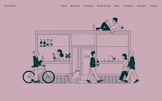
The page structure favors a max-width contained layout, though specific hero sections or illustrations can expand. The hero pattern features a centered, large-scale line illustration against a Dusty Rose (#c9a9b5) background, with minimal text, setting an immediate atmospheric tone. Section rhythm alternates between Parchment (#e9e9e2) and Old Gold (#aa9e54) backgrounds, sometimes introducing White Linen (#ffffff). Content is typically arranged in centered stacks or simple two-column layouts for text-dominant areas. There is ample white space and consistent vertical spacing (136px for sections), creating a feeling of spaciousness. Navigation is a minimalist top bar with ghost text links.
The visual language relies heavily on line illustrations, primarily monochrome (Inkwell #062d32 on pale backgrounds). These illustrations are detailed, depicting scenes with human figures and architectural elements, often in a whimsical, narrative style. They are generally contained compositions, not full-bleed, and serve a decorative and atmospheric role rather than explanatory. There are no photographs or product shots. Icons are simple, outlined, sharing the same stroke weight as the illustrations. Imagery plays a significant role in creating a specific, charming brand mood, complementing the text-heavy layout without overwhelming it.
Reminiscent of The Silverlake Wine, Typewolf, Kinfolk Magazine.
# Essie Wine — Style Reference
> Vintage Bookplate Serenity — a quiet, reserved aesthetic like an aged paper with delicate script.

**Theme:** light

**Site:** https://www.essiewine.com

Essie Wine cultivates a classic, understated visual identity through a sparse palette of off-whites, murky greens, and a singular, muted ochre. Its spacious, text-dominant layout employs a traditional serif for its primary messaging, harmoniously paired with a legible sans-serif for functional text. Components are minimalist, often appearing as subtle underlines or text-only elements, reflecting a design ethos of quiet sophistication rather than overt display. The overall aesthetic feels like a well-worn book or a vintage poster—timeless and unpretentious.

## Tokens — Colors

| Name | Value | Token | Role |
|------|------|------|------|
| Inkwell | `#062d32` | `--color-inkwell` | Primary text, headers, navigation links, input borders, ghost button borders. This dark, desaturated teal establishes a grounded, vintage feel |
| Old Gold | `#aa9e54` | `--color-old-gold` | Background for specific sections like forms or featured content. Its moderate saturation provides a warm, earthy contrast |
| Parchment | `#e9e9e2` | `--color-parchment` | Canvas background for primary content sections, subtle text elements |
| White Linen | `#ffffff` | `--color-white-linen` | Page backgrounds in select sections, pristine component surfaces |
| Dusty Rose | `#c9a9b5` | `--color-dusty-rose` | Secondary background sections, footer background. A muted, desaturated rose that contributes to the vintage atmosphere |
| Slate Grain | `#767676` | `--color-slate-grain` | Default input border color for a subtle, unobtrusive form |
| Deep Pewter | `#344b52` | `--color-deep-pewter` | Subtle border color for links and decorative accents |
| Pitch Black | `#000000` | `--color-pitch-black` | Highest contrast text, borders for ghost components, decorative lines |

## Tokens — Typography

### BasicCommercial LT Com Roman
- **Substitute:** Inter
- **Weights:** 300, 400
- **Sizes:** 19px, 38px, 49px
- **Line height:** 1.16, 1.18, 1.2
- **Letter spacing:** 0.003, 0.004, 0.008, 0.026
- **Role:** Main navigation, larger headings, and body text. Its clean, condensed sans-serif provides modern legibility against the serif.

### Adobe Caslon Pro
- **Substitute:** Libre Baskerville
- **Weights:** 300
- **Sizes:** 49px
- **Line height:** 1.18
- **Letter spacing:** 0.003
- **Role:** Primary headings, subheadings, and featured text blocks. The traditional serif conveys authority and elegance, creating an established, classic brand feel. Its lightness at 300 weight is distinctive, suggesting understated professionalism.

### Elementa
- **Substitute:** Graphik
- **Weights:** 300, 400
- **Sizes:** 16px, 19px
- **Line height:** 1, 1.16
- **Letter spacing:** 0.008, 0.042
- **Role:** Paragraph text, small labels, and detailed content. A highly readable sans-serif for practical information.

## Tokens — Type Scale

Golden Ratio (1.618) from 49px base.

| Role | Size | Line height | Letter spacing |
|------|------|------|------|
| caption | 19px | 1.18 | — |
| body-sm | 38px | 1.18 | — |
| body | 49px | 1.18 | — |

## Tokens — Spacing

- **Section gap:** 136px
- **Card padding:** 27px
- **Element gap:** 23px

## Tokens — Radius

- **Buttons:** 0px
- **Inputs:** 0px

## Layout

The page structure favors a max-width contained layout, though specific hero sections or illustrations can expand. The hero pattern features a centered, large-scale line illustration against a Dusty Rose (#c9a9b5) background, with minimal text, setting an immediate atmospheric tone. Section rhythm alternates between Parchment (#e9e9e2) and Old Gold (#aa9e54) backgrounds, sometimes introducing White Linen (#ffffff). Content is typically arranged in centered stacks or simple two-column layouts for text-dominant areas. There is ample white space and consistent vertical spacing (136px for sections), creating a feeling of spaciousness. Navigation is a minimalist top bar with ghost text links.

## Imagery

The visual language relies heavily on line illustrations, primarily monochrome (Inkwell #062d32 on pale backgrounds). These illustrations are detailed, depicting scenes with human figures and architectural elements, often in a whimsical, narrative style. They are generally contained compositions, not full-bleed, and serve a decorative and atmospheric role rather than explanatory. There are no photographs or product shots. Icons are simple, outlined, sharing the same stroke weight as the illustrations. Imagery plays a significant role in creating a specific, charming brand mood, complementing the text-heavy layout without overwhelming it.

## Components

### Ghost Text Button
*Default interactive element for navigation and actions.*

Text in Inkwell (#062d32), no background, no border, with a padding of 27px symmetrically. Underlined on hover or active state with Inkwell (#062d32).

### Underlined Call-to-Action
*Semantic action for submissions or primary interactions.*

Text in Pitch Black (#000000), no background, with a 1px solid Pitch Black (#000000) border bottom, 0px border radius, and 27px padding. Uses the 'Elementa' font at 16px, weight 400.

### Form Input Field
*Standard input for user data collection.*

No background, text in Pitch Black (#000000), with a 1px solid Slate Grain (#767676) border bottom. No padding or border radius. Focus state changes border to Inkwell (#062d32). Placeholder text uses the same style but in a lighter shade.

### Form Input Field (Active)
*Active state for form inputs.*

No background, text in Inkwell (#062d32), with a 1px solid Inkwell (#062d32) border bottom. No padding or border radius.

### Content Section (Old Gold)
*Distinct background for specific content blocks like forms.*

Background color Old Gold (#aa9e54), typically with text in Pitch Black (#000000), with generous vertical padding (e.g., 100-150px) to provide ample breathing room.

### Content Section (Dusty Rose)
*Background for hero sections or footers.*

Background color Dusty Rose (#c9a9b5), with text in Inkwell (#062d32), featuring flexible padding that allows for large illustrations or minimal content.

## Guidelines

### Do

- Prioritize Elementa for all body text and small labels at 16px, weight 400, for practical legibility.
- Use Adobe Caslon Pro at 49px (weight 300) for major headings to establish a classic, refined tone.
- Implement Inkwell (#062d32) as the primary accent for active states, link underlines, and subtle borders.
- Maintain a monochromatic palette for most UI elements, reserving Old Gold (#aa9e54) and Dusty Rose (#c9a9b5) for distinct background sections.
- Apply 27px padding uniformly to all buttons for consistent visual weight.
- Ensure all interactive elements and underlines use `0px` radius for a sharp, traditional finish.
- Utilize white Linen (#ffffff) and Parchment (#e9e9e2) as the default canvas colors, switching based on content hierarchy or section distinction.

### Don't

- Avoid using saturated or bright colors beyond the defined Old Gold (#aa9e54) for any UI elements.
- Do not introduce sharp shadows or significant elevation; the design relies on flat, understated surfaces.
- Refrain from using any border radius on buttons, inputs, or interactive elements; all corners should be sharp 0px.
- Do not break the line-based input field style with filled backgrounds or alternative border treatments.
- Avoid crowding elements; ensure generous spacing (e.g., 23px element gap, 136px section gap) to maintain an airy, considered layout.
- Do not use highly decorative fonts or vary font weights beyond 300 and 400; stick to the defined Elementa, Adobe Caslon Pro, and BasicCommercial families.

## Agent Prompt Guide

### Quick Color Reference
text: #062d32
background: #e9e9e2
border: #062d32
accent: #aa9e54
primary action: #062d32 (outlined action border)

### 3-5 Example Component Prompts
1. Create an Outlined Primary Action: Transparent background, #062d32 border and text, 9999px radius, compact pill padding. Use it for the main CTA instead of a filled button.
3. Create a hero section: Background Dusty Rose (#c9a9b5). Centered large responsive line illustration. No text immediately visible, allowing the illustration to dominate. Ensure significant vertical padding top and bottom (e.g., 100px top, 150px bottom) to frame the illustration.
More like this









Keep what you find
A free account saves references to boards and can send you a weekly email of picks based on what you save.
To see every result, go Pro.