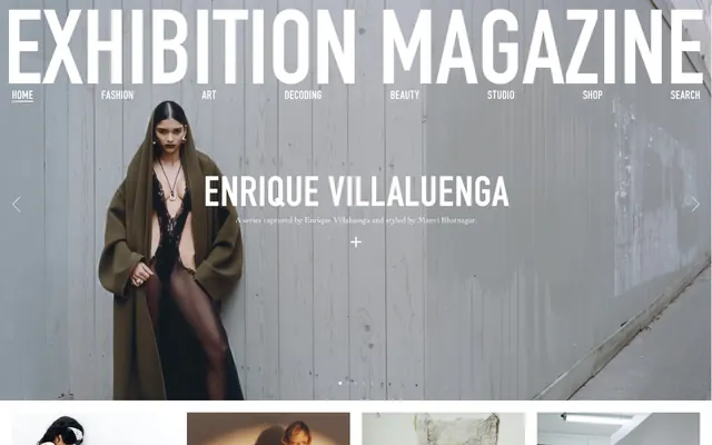
Preview image. Unlock full-res
monochrome editorial canvas
Color palette
Supporting palette color for small decorative accents when the core palette needs contrast. Do not promote it to the primary CTA color
Page backgrounds, header, card backgrounds. Provides a clean, bright stage for content
Primary text, headings, navigational elements. Establishes a bold and authoritative textual presence against light backgrounds
Subtle borders for cards, navigation items, and other structural dividers. Provides soft visual separation without being intrusive
Secondary card backgrounds, subtly differentiating content blocks or for specific sections
Accent background for specific featured cards or content areas, adding a hint of warmth
Typography
- Weights
- 400
- Sizes
- 16px, 46px
- Line height
- 1.2, 1.5
- Fallback
- Georgia
Primary body text and descriptive links. Its humanist serifs provide a classic, editorial feel against the modern sans-serifs, a deliberate contrast for readability and character.
- Weights
- 400
- Sizes
- 25px, 36px, 40px, 50px, 52px, 90px, 100px
- Line height
- 0.75, 0.8, 1, 1.2
- Letter spacing
- -0.0080em, -0.0060em, -0.0040em
- Fallback
- Inter
Dominant display typography for headings, titles, and calls to action. Its condensed, strong sans-serif form exudes a bold, confident voice, with tight letter-spacing enhancing its impact.
- Weights
- 500
- Sizes
- 13px
- Line height
- 1.6
- Letter spacing
- 0.0620em
- Fallback
- Roboto Mono
Small, highly tracked uppercase text for descriptors and meta-information. The wide letter-spacing adds a contemporary, functional touch for annotation.
Spacing & shape
Components
Ghost button with an Ink Black border on hover, 100% border-radius for a circular shape, with its primary text also in Ink Black. No explicit padding, relying on content for size.
Ink Black text, sans background, underlined with Ink Black for emphasis. Utilizes the DIN font for its commanding presence.
Transparent background with no shadow or border-radius, images are typically full-bleed within the card area. Text overlays are in Ink Black, featuring Cochin for descriptive text and DIN for titles.
Uses Blush Card Back (#fff5fa) as its background color, with 24px padding on all sides. No border-radius or shadow, maintaining the flat aesthetic.
Full-bleed image background with overlaid Ink Black text using the DIN font for headlines. Associated descriptive text uses Cochin. The layout is centered, minimalist.
Ink Black text in DIN font, with a Divider Gray underline on hover, contributing to the stark, functional header.
Guidelines
- Prioritize Ink Black (#000000) for all primary text and headings against Canvas White (#ffffff) backgrounds for maximum contrast.
- Use DIN font exclusively for all headings and significant display text, with its characteristic tight letter-spacing.
- Structure content using Divider Gray (#e5e7eb) for subtle linear borders and dividers, rather than heavy backgrounds or shadows.
- Treat images as full-bleed within their content containers, adhering to the 0px border-radius for a stark, unconstrained look.
- Reserve the Swiper Accent (#007aff) for minimal interactive cues, avoiding its use for primary calls to action or decorative elements.
- Maintain generous section gaps of 60px to provide ample white space and visual breathing room between content blocks.
- Utilize forma-djr-display for small supporting text, always uppercase and highly tracked (0.0620em) to differentiate it.
- Avoid using drop shadows or complex gradients; the design relies on flat surfaces and high contrast.
- Do not introduce new saturated colors; the palette is intentionally monochromatic with a single, highly controlled accent.
- Do not apply rounded corners to cards or main content blocks; maintain sharp, crisp edges (0px radius).
- Avoid decorative background patterns or textures; surfaces should remain clean and uncluttered.
- Do not use Cochin for headlines or large display text; its role is specifically for body copy and descriptive links.
- Do not place buttons or interactive elements on Muted Surface (#a9a9a9) or Blush Card Back (#fff5fa) backgrounds without sufficient contrast for text and interaction states.
- Do not create dense, information-heavy blocks without substantial white space; content should be spaced out to maintain clarity.
About this system
ShowHide
Exhibition Magazine embraces a high-contrast editorial aesthetic: stark black and white punctuated by strong photographic imagery. Content is presented on clean, unadorned surfaces with minimal elevation, emphasizing typography and photography. Subtle linear borders provide structure without visual weight. The overall impression is one of confident, minimalist sophistication, focusing reader attention on the curated content.
The page primarily uses a full-bleed layout for hero sections, filling the viewport horizontally. Content sections then generally narrow to a contained maximum width, centered on the page. The hero features a large full-bleed image with centered overlaid text. Sections follow a consistent vertical rhythm with a 60px gap. Content is arranged in alternating patterns, often with large image cards followed by text blocks. There's a clear 4-column implied grid for card layouts, though some sections use a single dominant image. Navigation is a minimalist top bar, sticky or otherwise. The overall density is comfortable, allowing for strong visual impact from images and typography.
This design system primarily utilizes photography, which is often full-bleed and serves as the dominant visual element. Images are usually high-contrast and often moody, presented with raw, un-masked edges and no rounding. Product shots are contained within image cards, and lifestyle photography in hero sections is used to set the tone rather than provide explicit information. Icons are minimal, likely outlined and monochromatic, acting as functional cues rather than decorative elements. Image density is high, with visuals often taking precedence over text in content blocks.
Reminiscent of The Gentlewoman, AIGA Eye on Design, Vogue Runway, Kinfolk Magazine.
# Exhibition Magazine — Style Reference
> monochrome editorial canvas

**Theme:** light

**Site:** https://exhibition-magazine.com

Exhibition Magazine embraces a high-contrast editorial aesthetic: stark black and white punctuated by strong photographic imagery. Content is presented on clean, unadorned surfaces with minimal elevation, emphasizing typography and photography. Subtle linear borders provide structure without visual weight. The overall impression is one of confident, minimalist sophistication, focusing reader attention on the curated content.

## Tokens — Colors

| Name | Value | Token | Role |
|------|------|------|------|
| Swiper Accent | `#007aff` | `--color-swiper-accent` | Supporting palette color for small decorative accents when the core palette needs contrast. Do not promote it to the primary CTA color |
| Canvas White | `#ffffff` | `--color-canvas-white` | Page backgrounds, header, card backgrounds. Provides a clean, bright stage for content |
| Ink Black | `#000000` | `--color-ink-black` | Primary text, headings, navigational elements. Establishes a bold and authoritative textual presence against light backgrounds |
| Divider Gray | `#e5e7eb` | `--color-divider-gray` | Subtle borders for cards, navigation items, and other structural dividers. Provides soft visual separation without being intrusive |
| Muted Surface | `#a9a9a9` | `--color-muted-surface` | Secondary card backgrounds, subtly differentiating content blocks or for specific sections |
| Blush Card Back | `#fff5fa` | `--color-blush-card-back` | Accent background for specific featured cards or content areas, adding a hint of warmth |

## Tokens — Typography

### Cochin
- **Substitute:** Georgia
- **Weights:** 400
- **Sizes:** 16px, 46px
- **Line height:** 1.2, 1.5
- **Role:** Primary body text and descriptive links. Its humanist serifs provide a classic, editorial feel against the modern sans-serifs, a deliberate contrast for readability and character.

### DIN
- **Substitute:** Inter
- **Weights:** 400
- **Sizes:** 25px, 36px, 40px, 50px, 52px, 90px, 100px
- **Line height:** 0.75, 0.8, 1, 1.2
- **Letter spacing:** -0.0080em, -0.0060em, -0.0040em
- **Role:** Dominant display typography for headings, titles, and calls to action. Its condensed, strong sans-serif form exudes a bold, confident voice, with tight letter-spacing enhancing its impact.

### forma-djr-display
- **Substitute:** Roboto Mono
- **Weights:** 500
- **Sizes:** 13px
- **Line height:** 1.6
- **Letter spacing:** 0.0620em
- **Role:** Small, highly tracked uppercase text for descriptors and meta-information. The wide letter-spacing adds a contemporary, functional touch for annotation.

## Tokens — Type Scale

Augmented Fourth (1.414) from 16px base.

| Role | Size | Line height | Letter spacing |
|------|------|------|------|
| caption | 13px | 1.6 | 0.79px |
| body | 16px | 1.5 | — |
| subheading | 25px | 1.2 | -0.2px |
| heading | 36px | 1.2 | -0.2px |
| heading-lg | 40px | 1 | -0.2px |
| display-sm | 46px | 1.2 | — |
| display | 90px | 0.8 | -0.36px |

## Tokens — Spacing

- **Section gap:** 60px
- **Card padding:** 24px
- **Element gap:** 12px

## Tokens — Radius

- **Buttons:** 100%
- **Cards:** 0px

## Layout

The page primarily uses a full-bleed layout for hero sections, filling the viewport horizontally. Content sections then generally narrow to a contained maximum width, centered on the page. The hero features a large full-bleed image with centered overlaid text. Sections follow a consistent vertical rhythm with a 60px gap. Content is arranged in alternating patterns, often with large image cards followed by text blocks. There's a clear 4-column implied grid for card layouts, though some sections use a single dominant image. Navigation is a minimalist top bar, sticky or otherwise. The overall density is comfortable, allowing for strong visual impact from images and typography.

## Imagery

This design system primarily utilizes photography, which is often full-bleed and serves as the dominant visual element. Images are usually high-contrast and often moody, presented with raw, un-masked edges and no rounding. Product shots are contained within image cards, and lifestyle photography in hero sections is used to set the tone rather than provide explicit information. Icons are minimal, likely outlined and monochromatic, acting as functional cues rather than decorative elements. Image density is high, with visuals often taking precedence over text in content blocks.

## Components

### Carousel Navigation Button
*Interactive element to navigate image carousels*

Ghost button with an Ink Black border on hover, 100% border-radius for a circular shape, with its primary text also in Ink Black. No explicit padding, relying on content for size.

### Load More Button
*Expands content using a prominent call to action.*

Ink Black text, sans background, underlined with Ink Black for emphasis. Utilizes the DIN font for its commanding presence.

### Image Card Default
*Displays articles or features prominently with large imagery.*

Transparent background with no shadow or border-radius, images are typically full-bleed within the card area. Text overlays are in Ink Black, featuring Cochin for descriptive text and DIN for titles.

### Blush Content Card
*Highlights specific curated content or editorial picks.*

Uses Blush Card Back (#fff5fa) as its background color, with 24px padding on all sides. No border-radius or shadow, maintaining the flat aesthetic.

### Hero Section Header
*Primary visual for articles, featuring a large image and overlaid title.*

Full-bleed image background with overlaid Ink Black text using the DIN font for headlines. Associated descriptive text uses Cochin. The layout is centered, minimalist.

### Navigation Link
*Top-level navigation items*

Ink Black text in DIN font, with a Divider Gray underline on hover, contributing to the stark, functional header.

## Guidelines

### Do

- Prioritize Ink Black (#000000) for all primary text and headings against Canvas White (#ffffff) backgrounds for maximum contrast.
- Use DIN font exclusively for all headings and significant display text, with its characteristic tight letter-spacing.
- Structure content using Divider Gray (#e5e7eb) for subtle linear borders and dividers, rather than heavy backgrounds or shadows.
- Treat images as full-bleed within their content containers, adhering to the 0px border-radius for a stark, unconstrained look.
- Reserve the Swiper Accent (#007aff) for minimal interactive cues, avoiding its use for primary calls to action or decorative elements.
- Maintain generous section gaps of 60px to provide ample white space and visual breathing room between content blocks.
- Utilize forma-djr-display for small supporting text, always uppercase and highly tracked (0.0620em) to differentiate it.

### Don't

- Avoid using drop shadows or complex gradients; the design relies on flat surfaces and high contrast.
- Do not introduce new saturated colors; the palette is intentionally monochromatic with a single, highly controlled accent.
- Do not apply rounded corners to cards or main content blocks; maintain sharp, crisp edges (0px radius).
- Avoid decorative background patterns or textures; surfaces should remain clean and uncluttered.
- Do not use Cochin for headlines or large display text; its role is specifically for body copy and descriptive links.
- Do not place buttons or interactive elements on Muted Surface (#a9a9a9) or Blush Card Back (#fff5fa) backgrounds without sufficient contrast for text and interaction states.
- Do not create dense, information-heavy blocks without substantial white space; content should be spaced out to maintain clarity.

## Agent Prompt Guide

Quick Color Reference:
text: #000000
background: #ffffff
border: #e5e7eb
accent: #007aff
primary action: no distinct CTA color

Example Component Prompts:
Create a navigation link: 'FASHION' text, #000000 color, DIN font weight 400, size 16px, with a #e5e7eb underline on hover.
Create a hero section title: 'EXHIBITION MAGAZINE' text, #000000 color, DIN font weight 400, size 90px, letter-spacing -0.0040em. Image background.
Create an image card: Transparent background, 0px border-radius, an image filling the card, with a text overlay using Cochin 16px weight 400 for description and DIN 25px weight 400 for title, both in #000000.
More like this







Keep what you find
A free account saves references to boards and can send you a weekly email of picks based on what you save.
To see every result, go Pro.