
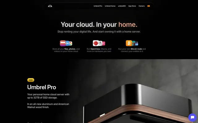
Preview image. Unlock full-res
Digital Studio, Cobalt Glow. A dark, immersive interface with bursts of vivid, digital-native color.
Color palette
Primary Call to Action buttons, active navigation indicators. This is the core interactive color.
Links, interactive hover states, sometimes used in illustrations. A slightly lighter, more vibrant blue than Cobalt Blue.
Illustrative accents, specific product features. A sharp, digital green.
Illustrative accents, secondary highlight elements. A playful and distinct accent.
Illustrative accents, product badges. A cooler, brighter blue accent.
Illustrative accents, unique product branding. A rich purple accent.
Primary surface background, text on light elements, input text in dark mode.
Nav bars, section backgrounds, deep contrast areas. Provides absolute black for maximum impact against lighter text.
Subtle background for UI elements, offers slight contrast from pure black.
Secondary button background in dark mode, provides a slightly lighter dark tone.
Primary text on dark backgrounds, icons, button text. Maximizes readability and brightness.
Secondary text, subtle borders, inactive elements, navigation links. A softer contrast against dark backgrounds.
Tertiary text, borders for inactive elements. Lighter than Storm Cloud for less emphasis.
Button borders, subtle dividers. Provides a distinct yet soft separation.
Featured text, alert accents. A highly saturated green for emphasis.
Emphasis text, often on contrasting backgrounds for strong brand presence.
Typography
- Weights
- 400, 500, 600, 700
- Sizes
- 12px, 13px, 14px, 16px, 18px, 20px, 26px
- Line height
- 1.2, 1.25, 1.43, 1.5
- Letter spacing
- -0.015
- Fallback
- Inter
Dominant text font for body copy, links, navigation, buttons, and most UI elements. Its variable nature allows for precise weight control across sizes, ensuring readability within the dark theme.
- Weights
- 400
- Sizes
- 14px, 28px, 36px, 48px, 54px
- Line height
- 1.25, 1.43
- Letter spacing
- 0.071
- Fallback
- Arial Black
Used for prominent headings and titles, specifically at larger sizes. The wider tracking on this display font creates an open, impactful feel, asserting authority without relying on heavy weights.
- Weights
- 400
- Sizes
- 20px
- Line height
- 1.25
- Letter spacing
- -0.015
- Fallback
- Arial
Used for select subheadings. Provides a more understated headline presence than SoehneBreit, balancing visual hierarchy.
Spacing & shape
Components
Background: Cobalt Blue (#1253ff), Text: Arctic Mist (#ffffff). Border: none. Radius: 60px. Padding: 13.5px vertical, 32px horizontal. Prominent and inviting.
Background: rgba(0, 0, 0, 0) (transparent), Text: Arctic Mist (#ffffff). Border: Arctic Mist (#ffffff). Radius: 0px. Padding: 0px. Used for subtle text-based actions or links.
Background: Cloudburst (#232426), Text: Arctic Mist (#ffffff). Border: Slate Border (#63656d). Radius: 50% (circular). Padding: 7.5px vertical, 20px horizontal. Its circular shape and dark background make it distinct yet non-intrusive.
Background: transparent. Text: Active Link Blue (#528fff) and Arctic Mist (#ffffff). No border or radius. Used for text links on dark backgrounds.
Background: transparent. Text: Midnight Ink (#121214). No border or radius. Used for text links on light backgrounds, appearing sparingly elsewhere.
Background: transparent. Text: Storm Cloud (#a6a8ad) by default, Arctic Mist (#ffffff) on hover/active. Font: InterVariable, weight 400. Letter spacing -0.015em. No explicit padding, defined by parent spacing. Radius: 1440px for a pill-like appearance.
Font: SoehneBreit, weight 400. Sizes: 54px, 48px. Line height 1.25. Letter spacing 0.071em. Text: Arctic Mist (#ffffff). Designed for high impact and readability against dark backdrops, using generous letter spacing for openness.
Background: transparent. Text: Midnight Ink (#121214). Border: Midnight Ink (#121214). Radius: 0px. Typically used in sections with lighter backgrounds.
Background: transparent. Text: Arctic Mist (#ffffff). Border: Arctic Mist (#ffffff). Radius: 0px. Used for inputs against dark backgrounds ensuring visibility.
Guidelines
- Prioritize Midnight Ink (#121214) and Deep Space (#000000) for backgrounds, creating a consistent dark canvas.
- Use Cobalt Blue (#1253ff) exclusively for primary call-to-action buttons, ensuring high visibility and user guidance.
- Apply a 60px border-radius to all primary interactive buttons, distinguishing them with a distinct pill shape.
- Utilize InterVariable for all body text and UI elements at weights 400-700, ensuring consistent typography for readability.
- Employ SoehneBreit weight 400 with 0.071em letter-spacing for all significant headings (28px minimum) to maintain the brand's impactful, open typographic style.
- Maintain a base unit of 8px for element spacing and 48px for section gaps to ensure comfortable density and visual rhythm.
- Use Arctic Mist (#ffffff) for all primary text on dark backgrounds to ensure optimal contrast and readability.
- Avoid using bright colors for large background areas; reserve them for accents, illustrations, or small interactive elements.
- Do not use generic square buttons; all primary interactive buttons must have a 60px radius (pill shape).
- Do not apply shadows for primary elevation; the design relies on changes in background color and imagery for depth.
- Avoid mixed-mode layouts on a single page; maintain the dark theme consistently throughout.
- Do not use letter-spacing outside of specified values for InterVariable (-0.015em) and SoehneBreit (0.071em) to preserve the intended typographic feel.
- Do not use border-radius less than 8px unless explicitly for imagery (4px) or specified components (e.g., 0px for some inputs).
- Avoid low-contrast text combinations; ensure all text is Arctic Mist (#ffffff) or Storm Cloud (#a6a8ad) on dark backgrounds, or Midnight Ink (#121214) on light backgrounds.
About this system
ShowHide
Splice embodies a 'dark-mode-first' approach, creating an immersive, studio-like atmosphere where dark surfaces highlight bright, focused interactive elements. A cool blue (#1253ff) dominates as the primary accent, reminiscent of digital waveforms or audio interfaces, providing a consistent visual anchor. Subtle use of other vivid colors (like yellow, green, red, vibrant blue, and violet) mainly in illustrative elements or specific product highlights prevents visual monotony while maintaining the core dark aesthetic. The interplay of highly rounded buttons and sharper graphic elements creates a contrast that feels modern and dynamic.
The site uses a full-bleed layout for its hero section, featuring a centered headline over a dark, atmospheric image. Subsequent sections maintain this dark theme, with content primarily wrapped within a conceptual max-width, though not strictly constrained by explicit pageMaxWidth. Sections often alternate between full-width elements and implicitly centered content blocks. There is a consistent use of vertical spacing, although explicit section dividers are absent, relying on shifts in background imagery or subtle color changes. Content arrangement varies, from stacked centered elements within the hero to potential multi-column layouts anticipated in internal sections. The navigation is a sticky top bar, minimal and dark, providing consistent access to primary sections.
This design primarily utilizes photography with a distinct green color cast or digital manipulation, creating an artificial, atmospheric mood rather than realistic product shots. Imagery is often full-bleed in hero sections, serving as a background for textual content, and typically blurred or desaturated to give prominence to UI elements. Small, illustrative abstract graphics—like the waveform—are used decoratively to reinforce the audio theme. Icons are monochromatic, often Arctic Mist (#ffffff), with a thin stroke or flat fill, used functionally within navigation and interactive elements. The overall density is balanced, with large atmospheric images providing visual interest behind primary headlines and text.
Reminiscent of Native Instruments, Ableton, Arturia, SoundCloud Go+, Serum by Xfer Records.
# Splice — Style Reference
> Digital Studio, Cobalt Glow. A dark, immersive interface with bursts of vivid, digital-native color.

**Theme:** dark

**Site:** https://splice.com

Splice embodies a 'dark-mode-first' approach, creating an immersive, studio-like atmosphere where dark surfaces highlight bright, focused interactive elements. A cool blue (#1253ff) dominates as the primary accent, reminiscent of digital waveforms or audio interfaces, providing a consistent visual anchor. Subtle use of other vivid colors (like yellow, green, red, vibrant blue, and violet) mainly in illustrative elements or specific product highlights prevents visual monotony while maintaining the core dark aesthetic. The interplay of highly rounded buttons and sharper graphic elements creates a contrast that feels modern and dynamic.

## Tokens — Colors

| Name | Value | Token | Role |
|------|------|------|------|
| Cobalt Blue | `#1253ff` | `--color-cobalt-blue` | Primary Call to Action buttons, active navigation indicators. This is the core interactive color. |
| Active Link Blue | `#528fff` | `--color-active-link-blue` | Links, interactive hover states, sometimes used in illustrations. A slightly lighter, more vibrant blue than Cobalt Blue. |
| Electric Lime | `#7cf727` | `--color-electric-lime` | Illustrative accents, specific product features. A sharp, digital green. |
| Neon Magenta | `#ff8aa6` | `--color-neon-magenta` | Illustrative accents, secondary highlight elements. A playful and distinct accent. |
| Skyfall Blue | `#62daff` | `--color-skyfall-blue` | Illustrative accents, product badges. A cooler, brighter blue accent. |
| Ametrine | `#b874ff` | `--color-ametrine` | Illustrative accents, unique product branding. A rich purple accent. |
| Midnight Ink | `#121214` | `--color-midnight-ink` | Primary surface background, text on light elements, input text in dark mode. |
| Deep Space | `#000000` | `--color-deep-space` | Nav bars, section backgrounds, deep contrast areas. Provides absolute black for maximum impact against lighter text. |
| Ghost Gray | `#09090a` | `--color-ghost-gray` | Subtle background for UI elements, offers slight contrast from pure black. |
| Cloudburst | `#232426` | `--color-cloudburst` | Secondary button background in dark mode, provides a slightly lighter dark tone. |
| Arctic Mist | `#ffffff` | `--color-arctic-mist` | Primary text on dark backgrounds, icons, button text. Maximizes readability and brightness. |
| Storm Cloud | `#a6a8ad` | `--color-storm-cloud` | Secondary text, subtle borders, inactive elements, navigation links. A softer contrast against dark backgrounds. |
| Pewter | `#c8c9cc` | `--color-pewter` | Tertiary text, borders for inactive elements. Lighter than Storm Cloud for less emphasis. |
| Slate Border | `#63656d` | `--color-slate-border` | Button borders, subtle dividers. Provides a distinct yet soft separation. |
| Vivid Green | `#f1f607` | `--color-vivid-green` | Featured text, alert accents. A highly saturated green for emphasis. |
| Deep Cadet | `#0029cc` | `--color-deep-cadet` | Emphasis text, often on contrasting backgrounds for strong brand presence. |

## Tokens — Typography

### InterVariable
- **Substitute:** Inter
- **Weights:** 400, 500, 600, 700
- **Sizes:** 12px, 13px, 14px, 16px, 18px, 20px, 26px
- **Line height:** 1.2, 1.25, 1.43, 1.5
- **Letter spacing:** -0.015
- **Role:** Dominant text font for body copy, links, navigation, buttons, and most UI elements. Its variable nature allows for precise weight control across sizes, ensuring readability within the dark theme.

### SoehneBreit
- **Substitute:** Arial Black
- **Weights:** 400
- **Sizes:** 14px, 28px, 36px, 48px, 54px
- **Line height:** 1.25, 1.43
- **Letter spacing:** 0.071
- **Role:** Used for prominent headings and titles, specifically at larger sizes. The wider tracking on this display font creates an open, impactful feel, asserting authority without relying on heavy weights.

### Soehne
- **Substitute:** Arial
- **Weights:** 400
- **Sizes:** 20px
- **Line height:** 1.25
- **Letter spacing:** -0.015
- **Role:** Used for select subheadings. Provides a more understated headline presence than SoehneBreit, balancing visual hierarchy.

## Tokens — Type Scale

Minor Third (1.2) from 14px base.

| Role | Size | Line height | Letter spacing |
|------|------|------|------|
| caption | 12px | 1.5 | — |
| body | 14px | 1.5 | -0.015em |
| body-lg | 16px | 1.5 | — |
| subheading | 18px | 1.25 | — |
| heading | 20px | 1.25 | -0.015em |
| heading-lg | 26px | 1.2 | — |
| display-sm | 28px | 1.25 | 0.071em |
| display-md | 36px | 1.25 | 0.071em |
| display | 48px | 1.25 | 0.071em |
| display-lg | 54px | 1.25 | 0.071em |

## Tokens — Spacing

- **Section gap:** 48px
- **Card padding:** 20px
- **Element gap:** 8px

## Tokens — Radius

- **Default:** 8px
- **Buttons:** 60px
- **nav:** 1440px

## Layout

The site uses a full-bleed layout for its hero section, featuring a centered headline over a dark, atmospheric image. Subsequent sections maintain this dark theme, with content primarily wrapped within a conceptual max-width, though not strictly constrained by explicit pageMaxWidth. Sections often alternate between full-width elements and implicitly centered content blocks. There is a consistent use of vertical spacing, although explicit section dividers are absent, relying on shifts in background imagery or subtle color changes. Content arrangement varies, from stacked centered elements within the hero to potential multi-column layouts anticipated in internal sections. The navigation is a sticky top bar, minimal and dark, providing consistent access to primary sections.

## Imagery

This design primarily utilizes photography with a distinct green color cast or digital manipulation, creating an artificial, atmospheric mood rather than realistic product shots. Imagery is often full-bleed in hero sections, serving as a background for textual content, and typically blurred or desaturated to give prominence to UI elements. Small, illustrative abstract graphics—like the waveform—are used decoratively to reinforce the audio theme. Icons are monochromatic, often Arctic Mist (#ffffff), with a thin stroke or flat fill, used functionally within navigation and interactive elements. The overall density is balanced, with large atmospheric images providing visual interest behind primary headlines and text.

## Components

### Announcement Banner

### Primary CTA Button Group

### Pricing Plan Card

### Primary Call to Action Button
*Core user interaction*

Background: Cobalt Blue (#1253ff), Text: Arctic Mist (#ffffff). Border: none. Radius: 60px. Padding: 13.5px vertical, 32px horizontal. Prominent and inviting.

### Secondary Ghost Button
*Secondary action or subtle navigation*

Background: rgba(0, 0, 0, 0) (transparent), Text: Arctic Mist (#ffffff). Border: Arctic Mist (#ffffff). Radius: 0px. Padding: 0px. Used for subtle text-based actions or links.

### Dark Icon Button
*Minimalist interactive element, often for playback controls or less prominent actions.*

Background: Cloudburst (#232426), Text: Arctic Mist (#ffffff). Border: Slate Border (#63656d). Radius: 50% (circular). Padding: 7.5px vertical, 20px horizontal. Its circular shape and dark background make it distinct yet non-intrusive.

### Text Link (Dark Background)
*Inline navigation or reference*

Background: transparent. Text: Active Link Blue (#528fff) and Arctic Mist (#ffffff). No border or radius. Used for text links on dark backgrounds.

### Text Link (Light Background)
*Inline navigation or reference on light surfaces*

Background: transparent. Text: Midnight Ink (#121214). No border or radius. Used for text links on light backgrounds, appearing sparingly elsewhere.

### Header Navigation Item
*Primary site navigation*

Background: transparent. Text: Storm Cloud (#a6a8ad) by default, Arctic Mist (#ffffff) on hover/active. Font: InterVariable, weight 400. Letter spacing -0.015em. No explicit padding, defined by parent spacing. Radius: 1440px for a pill-like appearance.

### Primary Headline
*Main page titles and major section headings*

Font: SoehneBreit, weight 400. Sizes: 54px, 48px. Line height 1.25. Letter spacing 0.071em. Text: Arctic Mist (#ffffff). Designed for high impact and readability against dark backdrops, using generous letter spacing for openness.

### Input Field (Dark)
*Data entry in dark sections*

Background: transparent. Text: Midnight Ink (#121214). Border: Midnight Ink (#121214). Radius: 0px. Typically used in sections with lighter backgrounds.

### Input Field (Light)
*Data entry in light sections*

Background: transparent. Text: Arctic Mist (#ffffff). Border: Arctic Mist (#ffffff). Radius: 0px. Used for inputs against dark backgrounds ensuring visibility.

## Guidelines

### Do

- Prioritize Midnight Ink (#121214) and Deep Space (#000000) for backgrounds, creating a consistent dark canvas.
- Use Cobalt Blue (#1253ff) exclusively for primary call-to-action buttons, ensuring high visibility and user guidance.
- Apply a 60px border-radius to all primary interactive buttons, distinguishing them with a distinct pill shape.
- Utilize InterVariable for all body text and UI elements at weights 400-700, ensuring consistent typography for readability.
- Employ SoehneBreit weight 400 with 0.071em letter-spacing for all significant headings (28px minimum) to maintain the brand's impactful, open typographic style.
- Maintain a base unit of 8px for element spacing and 48px for section gaps to ensure comfortable density and visual rhythm.
- Use Arctic Mist (#ffffff) for all primary text on dark backgrounds to ensure optimal contrast and readability.

### Don't

- Avoid using bright colors for large background areas; reserve them for accents, illustrations, or small interactive elements.
- Do not use generic square buttons; all primary interactive buttons must have a 60px radius (pill shape).
- Do not apply shadows for primary elevation; the design relies on changes in background color and imagery for depth.
- Avoid mixed-mode layouts on a single page; maintain the dark theme consistently throughout.
- Do not use letter-spacing outside of specified values for InterVariable (-0.015em) and SoehneBreit (0.071em) to preserve the intended typographic feel.
- Do not use border-radius less than 8px unless explicitly for imagery (4px) or specified components (e.g., 0px for some inputs).
- Avoid low-contrast text combinations; ensure all text is Arctic Mist (#ffffff) or Storm Cloud (#a6a8ad) on dark backgrounds, or Midnight Ink (#121214) on light backgrounds.

## Agent Prompt Guide

**Quick Color Reference:**
- Text (primary): #ffffff (Arctic Mist)
- Background (primary): #121214 (Midnight Ink)
- CTA Button: #1253ff (Cobalt Blue)
- Border (subtle): #63656d (Slate Border)
- Accent (link/hover): #528fff (Active Link Blue)

**Example Component Prompts:**
1. Create a `Primary Call to Action Button` with text 'Start Free Trial'.
2. Create a `Header Navigation Item` with text 'Sounds'. Use Arctic Mist as active state and Storm Cloud for inactive.
3. Create a section headline using `SoehneBreit` 400, size 48px, letter-spacing 0.071em, text Arctic Mist, that reads 'Discover Your Next Sound'.
4. Generate a `Dark Icon Button` for a play control, with an icon. Ensure the button has Cloudburst background, Arctic Mist text/icon, Slate Border, and 50% border-radius. The icon should be a simple play arrow (a right-facing triangle).
5. Design a text input field for a dark background section, with placeholder text 'Search samples'. It should have a transparent background, Arctic Mist text and border, and 0px border-radius, using `InterVariable` 400 at 16px.
More like this





Keep what you find
A free account saves references to boards and can send you a weekly email of picks based on what you save.
To see every result, go Pro.