Preview image. Unlock full-res
Apothecary's botanical canvas
Color palette
Primary text color, dark borders, and some interactive elements. This muted green-gray anchors the palette
Link text, prominent borders, and as an accent for subtle hover states
Primary page canvas and base background for light UI elements
Secondary surface background for cards, modals, and input fields
High-contrast text for headings and critical information
Placeholder text in input fields
Subtle button borders and decorative strokes
Typography
- Weights
- 400
- Sizes
- 8px, 10px, 11px, 12px, 16px, 18px, 24px, 30px
- Line height
- 1, 1.2, 2, 3
- Letter spacing
- -0.013em (at 30px), -0.017em (at 24px), -0.022em (at 18px), -0.025em (at 16px), -0.033em (at 12px), -0.036em (at 11px), -0.040em (at 10px), -0.050em (at 8px)
- Fallback
- IBM Plex Mono
Primary UI font for body text, navigation, links, and buttons. Its fixed width contributes to a precise, engineered feel. The consistent weight 400 maintains visual neutrality across various sizes.
- Weights
- 400
- Sizes
- 14px, 15px, 16px, 20px, 24px, 30px
- Line height
- 1, 1.2, 1.5
- Letter spacing
- 0.013em (at 30px), 0.017em (at 24px), 0.027em (at 20px), 0.029em (at 16px), 0.029em (at 15px), 0.029em (at 14px)
- Fallback
- Inter
Used sparingly for headings and specific callouts, this font provides a clean, sans-serif contrast. The subtle positive letter-spacing adds airiness.
Spacing & shape
Components
Minimalist button with no background or padding, only text in Sage Shadow (#464c3a). Hover state shows an underline in Moss Accent (#3f4536) at 1px height. Typography is basic-commercial, weight 400.
Transparent background, text color in Sage Shadow (#464c3a). Round shape (50% border radius) for small, dismissive actions. Typography is basic-commercial, weight 400.
Solid Sage Shadow (#464c3a) background with Text Black (#000000) text for minimal contrast, but with brand primary color emphasis. Padding is 0px top/bottom, 10px left/right. Radius is 0px. Typography is basic-commercial, weight 400.
Used for newsletter subscriptions. Transparent background with Sage Shadow (#464c3a) text and a 1px solid border in Subtle Charcoal (#373f47). Padding is 0px top/bottom, 10px left/right. Radius is 0px. Typography is basic-commercial, weight 400.
Cards have no distinct background, radius, or shadow, blending seamlesly with the Canvas Parchment (#fdfbf6) or Cream Surface (#f8f1e1) backgrounds. Padding is 0px.
Transparent background with Sage Shadow (#464c3a) text. A 1px border in Moss Accent (#3f4536) when focused. Placeholder text in Muted Placeholder (#b7b7b7). No border radius.
Input field with a Cream Surface (#f8f1e1) background and Sage Shadow (#464c3a) text. Placeholder text in Muted Placeholder (#b7b7b7). 16px left padding.
Guidelines
- Use Canvas Parchment (#fdfbf6) as the default background for all page sections unless an elevated surface is explicitly requested.
- Apply Sage Shadow (#464c3a) for all primary body text and main interaction elements to maintain the brand's muted tone.
- Ensure all interactive elements, including buttons and links, use the basic-commercial font at weight 400 with specific letter-spacing adjustments.
- Employ a 0px border-radius for most containers and cards, maintaining a sharp, clean edge, with the occasional 2px radius for small elements like buttons.
- Prioritize background color changes and subtle border lines over drop shadows for creating visual hierarchy between elements.
- Maintain minimal padding (0-10px) around interactive elements to contribute to a compact and efficient UI density.
- Use AkzidenzGrotesk only for primary headings, ensuring a slightly airy feel with appropriate positive letter-spacing.
- Avoid generic large drop shadows; elevation should primarily be achieved through background color shifts or hairline borders.
- Do not introduce highly saturated or vivid colors outside of the established Sage Shadow and Moss Accent tones.
- Do not vary font weights for basic-commercial; always use weight 400 for consistency.
- Avoid heavy borders or solid backgrounds on cards; they should maintain a lightweight appearance, often blending with the page background.
- Do not deviate from the specified letter-spacing values, as they are crucial to the typographic personality.
- Do not use generic system fonts; stick to basic-commercial and AkzidenzGrotesk for all text.
- Do not use high-contrast white text on Sage Shadow or Moss Accent backgrounds, use Text Black for increased legibility and subtlety.
About this system
ShowHide
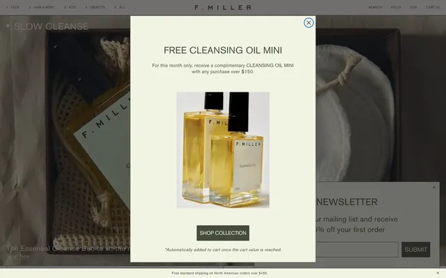
F. MILLER presents a serene, natural aesthetic through a desaturated, almost monochromatic palette of warm grays and muted greens, evoking an apothecary-like simplicity. Typography is understated and functional, with subtle letter spacing adjustments for a precise, unadorned feel. Components are minimal, often borderless or with hairline borders, and elevation is primarily achieved through subtle shifts in background color rather than shadows, creating a lightweight and tactile surface design.
The page primarily uses a full-bleed layout, with content often bleeding to the edges. The hero section often features large product photography. Content sections typically alternate between centered stacks and split text+visual arrangements, frequently with the main content aligned to the left. The site uses a responsive grid for product listings, but specific column counts are not consistently defined outside of product feeds. Vertical rhythm is established through consistent section-level spacing rather than strong visual dividers. Navigation is a minimal top bar, which may or may not be sticky, offering subtle interactive elements.
Imagery primarily features tight product crops on pure white or softly blurred backgrounds, emphasizing product details without distracting lifestyle contexts. The treatment is clean and isolated, with no overlapping elements or complex masks. Icons, if present, are minimal (e.g., arrows, close 'x' marks), thin-stroked, and mono-color, typically in Sage Shadow (#464c3a). The overall density is balanced, allowing product visuals to breathe while text provides context, maintaining a focus on the product itself.
Reminiscent of Glossier, Aesop, Byredo, Necessaire.
# F. MILLER — Style Reference
> Apothecary's botanical canvas

**Theme:** light

**Site:** https://fmillerskincare.com

F. MILLER presents a serene, natural aesthetic through a desaturated, almost monochromatic palette of warm grays and muted greens, evoking an apothecary-like simplicity. Typography is understated and functional, with subtle letter spacing adjustments for a precise, unadorned feel. Components are minimal, often borderless or with hairline borders, and elevation is primarily achieved through subtle shifts in background color rather than shadows, creating a lightweight and tactile surface design.

## Tokens — Colors

| Name | Value | Token | Role |
|------|------|------|------|
| Sage Shadow | `#464c3a` | `--color-sage-shadow` | Primary text color, dark borders, and some interactive elements. This muted green-gray anchors the palette |
| Moss Accent | `#3f4536` | `--color-moss-accent` | Link text, prominent borders, and as an accent for subtle hover states |
| Canvas Parchment | `#fdfbf6` | `--color-canvas-parchment` | Primary page canvas and base background for light UI elements |
| Cream Surface | `#f8f1e1` | `--color-cream-surface` | Secondary surface background for cards, modals, and input fields |
| Text Black | `#000000` | `--color-text-black` | High-contrast text for headings and critical information |
| Muted Placeholder | `#b7b7b7` | `--color-muted-placeholder` | Placeholder text in input fields |
| Subtle Charcoal | `#373f47` | `--color-subtle-charcoal` | Subtle button borders and decorative strokes |

## Tokens — Typography

### basic-commercial
- **Substitute:** IBM Plex Mono
- **Weights:** 400
- **Sizes:** 8px, 10px, 11px, 12px, 16px, 18px, 24px, 30px
- **Line height:** 1, 1.2, 2, 3
- **Letter spacing:** -0.013em (at 30px), -0.017em (at 24px), -0.022em (at 18px), -0.025em (at 16px), -0.033em (at 12px), -0.036em (at 11px), -0.040em (at 10px), -0.050em (at 8px)
- **Role:** Primary UI font for body text, navigation, links, and buttons. Its fixed width contributes to a precise, engineered feel. The consistent weight 400 maintains visual neutrality across various sizes.

### AkzidenzGrotesk
- **Substitute:** Inter
- **Weights:** 400
- **Sizes:** 14px, 15px, 16px, 20px, 24px, 30px
- **Line height:** 1, 1.2, 1.5
- **Letter spacing:** 0.013em (at 30px), 0.017em (at 24px), 0.027em (at 20px), 0.029em (at 16px), 0.029em (at 15px), 0.029em (at 14px)
- **Role:** Used sparingly for headings and specific callouts, this font provides a clean, sans-serif contrast. The subtle positive letter-spacing adds airiness.

## Tokens — Type Scale

Minor Third (1.2) from 12px base.

| Role | Size | Line height | Letter spacing |
|------|------|------|------|
| caption | 10px | 2 | — |
| body-sm | 11px | 2 | — |
| body | 12px | 2 | — |
| body-lg | 16px | 2 | — |
| heading-sm | 18px | 2 | — |
| heading | 24px | 1.3 | — |
| heading-lg | 30px | 1.3 | — |

## Tokens — Spacing

- **Section gap:** 144px
- **Card padding:** 0px
- **Element gap:** 20px

## Tokens — Radius

- **Buttons:** 2px
- **Inputs:** 0px
- **Cards:** 0px
- **all:** 2px

## Layout

The page primarily uses a full-bleed layout, with content often bleeding to the edges. The hero section often features large product photography. Content sections typically alternate between centered stacks and split text+visual arrangements, frequently with the main content aligned to the left. The site uses a responsive grid for product listings, but specific column counts are not consistently defined outside of product feeds. Vertical rhythm is established through consistent section-level spacing rather than strong visual dividers. Navigation is a minimal top bar, which may or may not be sticky, offering subtle interactive elements.

## Imagery

Imagery primarily features tight product crops on pure white or softly blurred backgrounds, emphasizing product details without distracting lifestyle contexts. The treatment is clean and isolated, with no overlapping elements or complex masks. Icons, if present, are minimal (e.g., arrows, close 'x' marks), thin-stroked, and mono-color, typically in Sage Shadow (#464c3a). The overall density is balanced, allowing product visuals to breathe while text provides context, maintaining a focus on the product itself.

## Components

### Text Link Button
*Navigation and subtle actions*

Minimalist button with no background or padding, only text in Sage Shadow (#464c3a). Hover state shows an underline in Moss Accent (#3f4536) at 1px height. Typography is basic-commercial, weight 400.

### Ghost Circular Button
*Icon-only actions like close buttons*

Transparent background, text color in Sage Shadow (#464c3a). Round shape (50% border radius) for small, dismissive actions. Typography is basic-commercial, weight 400.

### Primary Filled Button
*Main calls to action*

Solid Sage Shadow (#464c3a) background with Text Black (#000000) text for minimal contrast, but with brand primary color emphasis. Padding is 0px top/bottom, 10px left/right. Radius is 0px. Typography is basic-commercial, weight 400.

### Outline Submit Button
*Secondary form submission*

Used for newsletter subscriptions. Transparent background with Sage Shadow (#464c3a) text and a 1px solid border in Subtle Charcoal (#373f47). Padding is 0px top/bottom, 10px left/right. Radius is 0px. Typography is basic-commercial, weight 400.

### Simple Card
*Product listings, content containers*

Cards have no distinct background, radius, or shadow, blending seamlesly with the Canvas Parchment (#fdfbf6) or Cream Surface (#f8f1e1) backgrounds. Padding is 0px.

### Standard Text Input
*Form text entry fields*

Transparent background with Sage Shadow (#464c3a) text. A 1px border in Moss Accent (#3f4536) when focused. Placeholder text in Muted Placeholder (#b7b7b7). No border radius.

### Newsletter Input with Background
*Specific inputs requiring visual distinction*

Input field with a Cream Surface (#f8f1e1) background and Sage Shadow (#464c3a) text. Placeholder text in Muted Placeholder (#b7b7b7). 16px left padding.

## Guidelines

### Do

- Use Canvas Parchment (#fdfbf6) as the default background for all page sections unless an elevated surface is explicitly requested.
- Apply Sage Shadow (#464c3a) for all primary body text and main interaction elements to maintain the brand's muted tone.
- Ensure all interactive elements, including buttons and links, use the basic-commercial font at weight 400 with specific letter-spacing adjustments.
- Employ a 0px border-radius for most containers and cards, maintaining a sharp, clean edge, with the occasional 2px radius for small elements like buttons.
- Prioritize background color changes and subtle border lines over drop shadows for creating visual hierarchy between elements.
- Maintain minimal padding (0-10px) around interactive elements to contribute to a compact and efficient UI density.
- Use AkzidenzGrotesk only for primary headings, ensuring a slightly airy feel with appropriate positive letter-spacing.

### Don't

- Avoid generic large drop shadows; elevation should primarily be achieved through background color shifts or hairline borders.
- Do not introduce highly saturated or vivid colors outside of the established Sage Shadow and Moss Accent tones.
- Do not vary font weights for basic-commercial; always use weight 400 for consistency.
- Avoid heavy borders or solid backgrounds on cards; they should maintain a lightweight appearance, often blending with the page background.
- Do not deviate from the specified letter-spacing values, as they are crucial to the typographic personality.
- Do not use generic system fonts; stick to basic-commercial and AkzidenzGrotesk for all text.
- Do not use high-contrast white text on Sage Shadow or Moss Accent backgrounds, use Text Black for increased legibility and subtlety.

## Agent Prompt Guide

Quick Color Reference:
text: #464c3a
background: #fdfbf6
border: #3f4536
accent: #3f4536
primary action: #464c3a (filled action)

Example Component Prompts:
Create a hero section with 'SLOW CLEANSE' as the heading: background is a product image. Heading uses AkzidenzGrotesk, size 30px, weight 400, #000000 (black). Subtext uses basic-commercial, size 16px, weight 400, #464c3a.

Create a product card: no background, no border, no radius. Product image. Product name: basic-commercial, size 18px, weight 400, #464c3a. Price: basic-commercial, size 16px, weight 400, #464c3a.

Create a 'SHOP COLLECTION' button: solid background #464c3a, text #000000. Font basic-commercial, size 16px, weight 400, letter-spacing determined by the type scale. No radius.

Create a newsletter signup form: input field with Cream Surface (#f8f1e1) background, #464c3a text, placeholder #b7b7b7. Submit button is outlined, #373f47 border, #464c3a text, white background. Font basic-commercial, size 16px, weight 400, letter-spacing determined by the type scale.

Create a modal popup: background Cream Surface (#f8f1e1). Title: AkzidenzGrotesk, size 24px, weight 400, #000000. Body text: basic-commercial, size 16px, weight 400, #464c3a. Close button is a Ghost Circular Button.
More like this









Keep what you find
A free account saves references to boards and can send you a weekly email of picks based on what you save.
To see every result, go Pro.