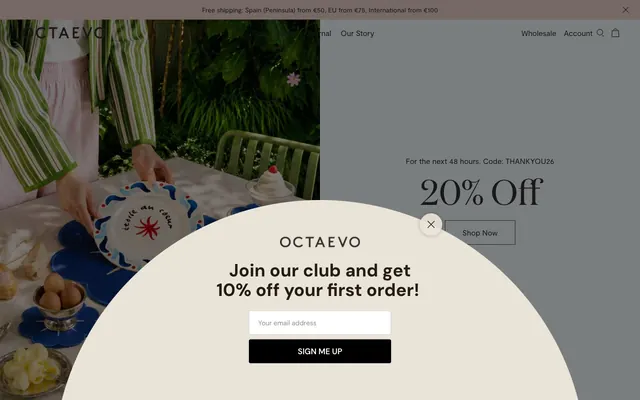
Preview image. Unlock full-res
Mediterranean sun-drenched linen
Color palette
Page backgrounds, large content sections, primary surface
Elevated card backgrounds, modal overlays
Subtle section dividers, footer background
Primary text, headings, strong borders, ghost button borders
Dark borders and separators for elevated surfaces and inverted UI. Do not promote it to the primary CTA color
Light input borders, subtle UI element strokes
Typography
- Weights
- 400
- Sizes
- 20px, 26px, 32px, 50px, 63px, 80px
- Line height
- 1.11, 1.25, 1.26, 1.47, 1.5, 1.85
- Letter spacing
- normal
- Fallback
- Playfair Display
Headlines and prominent display text — the elegant serif establishes a premium, classic tone.
- Weights
- 400, 500
- Sizes
- 14px, 15px, 17px, 18px
- Line height
- 1, 1.39, 1.47, 1.67, 1.81
- Letter spacing
- normal
- Fallback
- Inter
Body text, navigation, and functional elements — a clean sans-serif providing legibility and a contemporary counterpoint to the serif display font.
Spacing & shape
Components
Transparent background, 'Carbon Ink' (#313131) text and a 1px 'Carbon Ink' (#313131) border. Padding of 14px vertical and 17px horizontal. Features sharp 0px corners.
Transparent background, 'Midnight Core' (#000000) text, and a 1px 'Carbon Ink' (#313131) border with a 50% radius for a pill shape. Padding of 17px vertical and 36.5px horizontal.
Transparent background, 'Midnight Core' (#000000) text, no border. No padding, acting as a styled text link.
Transparent background, 'Carbon Ink' (#313131) text, and a 1px 'Carbon Ink' (#313131) border. Padding is 17px all around with sharp 0px corners.
Transparent background, 'Carbon Ink' (#313131) text, and a subtle 1px 'Faded Stone' (#cfcfc7) border. Padding is 17px all around with sharp 0px corners.
Transparent background, 'Carbon Ink' (#313131) text, and a 1px 'Carbon Ink' (#313131) border with a 100% radius for a pill shape. No padding.
Transparent background with 'Carbon Ink' (#313131) text, no border or padding and sharp 0px corners, integrating text directly into the layout.
Guidelines
- Prioritize 'Canvas Cream' (#f8eeee) for main backgrounds to establish a light, airy foundation.
- Use 'Carbon Ink' (#313131) as the default color for most text, ensuring high contrast against light backgrounds.
- Distinguish interactive elements like buttons and links with 1px borders in 'Carbon Ink' (#313131) for a subtle, ghosted appearance.
- Apply 'Domaine' font for all headings and large display text, retaining its specific weights and letter spacing for brand recognition.
- Structure content with ample 17px element gaps, promoting visual breathing room and a comfortable density.
- Embrace the 'sharp' (0px) border radius for most functional components and 'circular' (2880px) for distinct pill shapes, avoiding intermediate roundness.
- Utilize 'Buttermilk Overlay' (#fdf8eb) for cards and modals to create a soft, slightly elevated surface above the main canvas without shadows.
- Avoid using strong, saturated colors for UI elements; stick to the curated neutral palette for interface components.
- Do not introduce heavy shadows or gradients; rely on color temperature shifts and border definitions for visual hierarchy.
- Do not use font weights outside of those specified for 'Domaine' (400) and 'Moderat' (400, 500) to maintain typographic consistency.
- Avoid tight spacing; maintain the comfortable 17px element gap to prevent a dense or claustrophobic feel.
- Do not use mid-range border radii; stick to sharp 0px or fully circular 2880px to preserve the distinct shape language.
- Refrain from using solid background colors for primary action buttons; ghosted outlines are preferred.
- Do not deviate from the established type scale; maintain the precise sizes and line heights for each semantic role.
About this system
ShowHide
Octaevo embodies a serene, heirloom-quality aesthetic: a light cream canvas punctuated by rich, classic serifs and structured sans-serifs. Surfaces are matte and uncluttered, relying on subtle shifts in background tone for differentiation rather than heavy borders or shadows. Interactive elements are understated, often presented as ghost buttons with fine hairline borders, maintaining a sense of refined quietude. The overall impression is one of timeless craftsmanship and elegant restraint.
The site uses a max-width contained layout, likely around 1200px, creating a structured feel with generous side margins. The hero section often presents a split layout with photography on one side and a concise headline and call to action on the other, or a centered headline over a background image. Section rhythm is visually distinct through consistent vertical spacing and subtle shifts in background tone (Canvas Cream vs Buttermilk Overlay). Content generally arranges in a clean, often symmetrical manner, with alternating two-column text and image blocks and consistent card grids for product listings. Navigation is a sticky top bar with minimal links.
The visual language focuses on high-key product photography, often featuring tight crops of objects against pure white or very light, textured backgrounds. Lifestyle elements are minimal, appearing only as hands interacting with products, making the object the primary focus. Imagery is contained, never full-bleed, and often incorporates subtle framing or archival aesthetics. Icons are monochrome, outlined, and minimal, appearing small and functional. The overall role of imagery is to showcase product as art objects, emphasizing craftsmanship and clean presentation rather than narrative or dramatic atmosphere.
Reminiscent of Frama, Aesop, Kinfolk, Merci.
# Octaevo — Style Reference
> Mediterranean sun-drenched linen

**Theme:** light

**Site:** https://www.octaevo.com

Octaevo embodies a serene, heirloom-quality aesthetic: a light cream canvas punctuated by rich, classic serifs and structured sans-serifs. Surfaces are matte and uncluttered, relying on subtle shifts in background tone for differentiation rather than heavy borders or shadows. Interactive elements are understated, often presented as ghost buttons with fine hairline borders, maintaining a sense of refined quietude. The overall impression is one of timeless craftsmanship and elegant restraint.

## Tokens — Colors

| Name | Value | Token | Role |
|------|------|------|------|
| Canvas Cream | `#f8eeee` | `--color-canvas-cream` | Page backgrounds, large content sections, primary surface |
| Buttermilk Overlay | `#fdf8eb` | `--color-buttermilk-overlay` | Elevated card backgrounds, modal overlays |
| Ash Accent | `#f3f3f3` | `--color-ash-accent` | Subtle section dividers, footer background |
| Carbon Ink | `#313131` | `--color-carbon-ink` | Primary text, headings, strong borders, ghost button borders |
| Midnight Core | `#000000` | `--color-midnight-core` | Dark borders and separators for elevated surfaces and inverted UI. Do not promote it to the primary CTA color |
| Faded Stone | `#cfcfc7` | `--color-faded-stone` | Light input borders, subtle UI element strokes |

## Tokens — Typography

### Domaine
- **Substitute:** Playfair Display
- **Weights:** 400
- **Sizes:** 20px, 26px, 32px, 50px, 63px, 80px
- **Line height:** 1.11, 1.25, 1.26, 1.47, 1.5, 1.85
- **Letter spacing:** normal
- **Role:** Headlines and prominent display text — the elegant serif establishes a premium, classic tone.

### Moderat
- **Substitute:** Inter
- **Weights:** 400, 500
- **Sizes:** 14px, 15px, 17px, 18px
- **Line height:** 1, 1.39, 1.47, 1.67, 1.81
- **Letter spacing:** normal
- **Role:** Body text, navigation, and functional elements — a clean sans-serif providing legibility and a contemporary counterpoint to the serif display font.

## Tokens — Type Scale

| Role | Size | Line height | Letter spacing |
|------|------|------|------|
| caption | 14px | 1.67 | — |
| subheading | 18px | 1.47 | — |
| heading-sm | 20px | 1.25 | — |
| heading | 26px | 1.26 | — |
| heading-lg | 32px | 1.11 | — |
| display | 50px | 1.47 | — |

## Tokens — Spacing

- **Max width:** 1200px
- **Section gap:** 50px
- **Card padding:** 17px
- **Element gap:** 17px

## Tokens — Radius

- **circular:** 2880px
- **sharp:** 0px
- **soft:** 10px

## Layout

The site uses a max-width contained layout, likely around 1200px, creating a structured feel with generous side margins. The hero section often presents a split layout with photography on one side and a concise headline and call to action on the other, or a centered headline over a background image. Section rhythm is visually distinct through consistent vertical spacing and subtle shifts in background tone (Canvas Cream vs Buttermilk Overlay). Content generally arranges in a clean, often symmetrical manner, with alternating two-column text and image blocks and consistent card grids for product listings. Navigation is a sticky top bar with minimal links.

## Imagery

The visual language focuses on high-key product photography, often featuring tight crops of objects against pure white or very light, textured backgrounds. Lifestyle elements are minimal, appearing only as hands interacting with products, making the object the primary focus. Imagery is contained, never full-bleed, and often incorporates subtle framing or archival aesthetics. Icons are monochrome, outlined, and minimal, appearing small and functional. The overall role of imagery is to showcase product as art objects, emphasizing craftsmanship and clean presentation rather than narrative or dramatic atmosphere.

## Components

### Ghost Button - Default
*Primary Call-to-action, secondary actions*

Transparent background, 'Carbon Ink' (#313131) text and a 1px 'Carbon Ink' (#313131) border. Padding of 14px vertical and 17px horizontal. Features sharp 0px corners.

### Circular Ghost Button
*Navigation arrows, close buttons, action icons*

Transparent background, 'Midnight Core' (#000000) text, and a 1px 'Carbon Ink' (#313131) border with a 50% radius for a pill shape. Padding of 17px vertical and 36.5px horizontal.

### Text Link Button
*Inline actions, understated calls to action*

Transparent background, 'Midnight Core' (#000000) text, no border. No padding, acting as a styled text link.

### Standard Input Field
*Form inputs*

Transparent background, 'Carbon Ink' (#313131) text, and a 1px 'Carbon Ink' (#313131) border. Padding is 17px all around with sharp 0px corners.

### Muted Input Field
*Secondary form inputs, disabled states*

Transparent background, 'Carbon Ink' (#313131) text, and a subtle 1px 'Faded Stone' (#cfcfc7) border. Padding is 17px all around with sharp 0px corners.

### Pill Input Field
*Email capture inputs*

Transparent background, 'Carbon Ink' (#313131) text, and a 1px 'Carbon Ink' (#313131) border with a 100% radius for a pill shape. No padding.

### Plain Badge / Tag
*Informational tags, categories*

Transparent background with 'Carbon Ink' (#313131) text, no border or padding and sharp 0px corners, integrating text directly into the layout.

## Guidelines

### Do

- Prioritize 'Canvas Cream' (#f8eeee) for main backgrounds to establish a light, airy foundation.
- Use 'Carbon Ink' (#313131) as the default color for most text, ensuring high contrast against light backgrounds.
- Distinguish interactive elements like buttons and links with 1px borders in 'Carbon Ink' (#313131) for a subtle, ghosted appearance.
- Apply 'Domaine' font for all headings and large display text, retaining its specific weights and letter spacing for brand recognition.
- Structure content with ample 17px element gaps, promoting visual breathing room and a comfortable density.
- Embrace the 'sharp' (0px) border radius for most functional components and 'circular' (2880px) for distinct pill shapes, avoiding intermediate roundness.
- Utilize 'Buttermilk Overlay' (#fdf8eb) for cards and modals to create a soft, slightly elevated surface above the main canvas without shadows.

### Don't

- Avoid using strong, saturated colors for UI elements; stick to the curated neutral palette for interface components.
- Do not introduce heavy shadows or gradients; rely on color temperature shifts and border definitions for visual hierarchy.
- Do not use font weights outside of those specified for 'Domaine' (400) and 'Moderat' (400, 500) to maintain typographic consistency.
- Avoid tight spacing; maintain the comfortable 17px element gap to prevent a dense or claustrophobic feel.
- Do not use mid-range border radii; stick to sharp 0px or fully circular 2880px to preserve the distinct shape language.
- Refrain from using solid background colors for primary action buttons; ghosted outlines are preferred.
- Do not deviate from the established type scale; maintain the precise sizes and line heights for each semantic role.

## Agent Prompt Guide

Quick Color Reference: text: #313131, background: #f8eeee, border: #313131, accent: no distinct accent color, primary action: no distinct CTA color
More like this









Keep what you find
A free account saves references to boards and can send you a weekly email of picks based on what you save.
To see every result, go Pro.