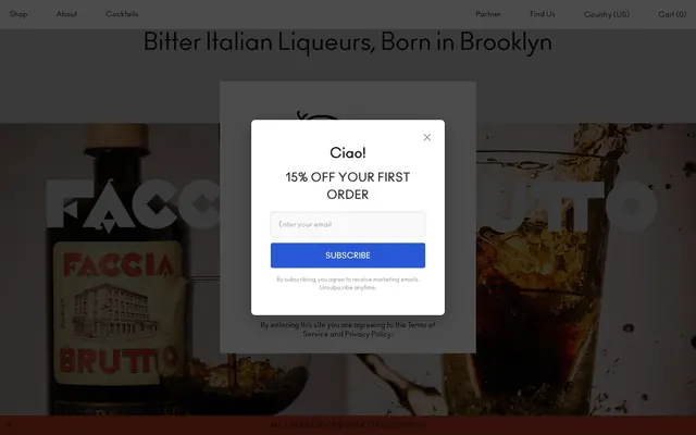
Preview image. Unlock full-res
Rustic Artisan Distillery – a raw, unfussy aesthetic of dark glass bottles and earthy craft paper
Color palette
Decorative background accents, highlight banners
Decorative background accents
Primary action button background — a gentle, earthy accent
Subscription button background in modals — a distinct, authoritative call to action
Secondary action button background, offering a soft, muted alternative
Primary text, headings, dark backgrounds, navigation links, prominent borders
Secondary text, muted borders, subtle button outlines
Page backgrounds, card surfaces, ghost button text, light borders
Background for secondary sections or subtle surface differentiation
Input borders, subtle shadows
Headline text in off-white contexts, focused border states
Input field borders
Typography
- Weights
- 400, 600, 700
- Sizes
- 12px, 15px, 16px, 20px, 24px, 25px, 28px, 30px, 40px, 50px
- Line height
- 1, 1.1, 1.15, 1.2, 1.25, 1.4, 1.5, 2
- Letter spacing
- -0.0100em, 0.0100em, 0.0180em, 0.0200em, 0.0310em, 0.0420em
- Fallback
- Montserrat
All text elements, including headings, body, links, and buttons. Its condensed nature and varied weights provide a distinct, almost stamped quality to the brand's voice.
Spacing & shape
Elevation
Components
Transparent background, Ink text (#181313), with Ink (#181313) border. No border radius. Padding is minimal (0px).
Background is Sage Bloom (#a3a96f), text is Ink (#181313). Border radius is 0px. Padding is 18px vertical, 20px horizontal.
Background is Cream (#dddeba), text is Ink (#181313). Border radius is 0px. Padding is 18px vertical, 0px horizontal.
Background is Indigo (#2858d5), text is Canvas (#fefefe). Border radius is 4px. Padding is 14px vertical, 16px horizontal.
Transparent background, no box shadow or border. Padding is 0px. Border radius is 0px.
White background (#fefefe), border radius 8px. Shadow: `rgba(0, 0, 0, 0.3) 0px 10px 40px 0px`. No internal padding specified.
Transparent background, Ink text (#181313), Ash border (#b2b2b2). Rounded with a large radius (16777215px, effectively a pill shape). Padding is 10px vertical, 40px horizontal.
Background is #f9f9f9, text is #4a4a4a (Stone Gray variant). Border is Parchment (#d4d4d4), radius 4px. Padding is 14px vertical, 16px horizontal.
Guidelines
- Use Ink (#181313) for all primary text, headings, and most clickable elements to maintain visual depth and contrast.
- Prioritize Ano font at various weights and sizes for all textual content, ensuring consistency in typographic voice.
- Employ Sage Bloom (#a3a96f) exclusively for primary calls to action on product-related pages, conveying a natural, inviting prompt.
- Limit component radii to 0px for most elements, 4px for inputs and specific buttons, and 8px for cards to maintain the crisp, no-frills aesthetic.
- Use a comfortable density with element gaps of 20px and section gaps of 40px to give content breathing room without feeling sparse.
- Apply the single modal shadow `rgba(0, 0, 0, 0.3) 0px 10px 40px 0px` only to modals or overlay cards to provide distinct elevation.
- Implement Canvas (#fefefe) as the primary background for content areas, contrasting with Ink (#181313) text for high readability.
- Avoid using gradients or complex inner shadows, as the system relies on flat surfaces and subtle material changes.
- Do not introduce new vibrant or saturated colors outside of the defined accent palette; color should be used sparingly for impact.
- Refrain from using heavily rounded corners on primary elements; most components should retain a sharp, unyielding edge.
- Do not deviate from the Ano font family; its specific character is integral to the brand's identity.
- Avoid excessive use of uppercase for body text; reserve it for headlines and specific navigational elements to maintain impact.
- Do not use transparent backgrounds for action buttons unless explicitly defined as a ghost button, to prevent visual ambiguity.
- Never add unnecessary borders or decorative elements that detract from the functional, handcrafted feel.
About this system
ShowHide
Faccia Brutto Spirits uses a rustic artisan aesthetic, blending a limited monochromatic palette with earthy tones and a single bold action color. Typography is condensed and authoritative, with strong uppercase headlines. Surfaces are clean and unembellished, relying on subtle textural nuances instead of gradients or heavy shadows. Components emphasize functionality with minimal styling, echoing a handcrafted yet direct approach.
The page primarily uses a full-bleed structure for hero sections and product photography, alternating with content sections that appear to be constrained to an unstated max-width. The hero features large product imagery with centered, strong headlines. Section rhythm is guided by background color changes, such as the terracotta band visible in the screenshot. Content is often presented in centered stacks or simple grid arrangements, with ample vertical spacing between blocks. Navigation is a simple, fixed top bar.
The site uses product photography featuring bottles in either crisp, high-key isolation against white or dark, moody settings for atmosphere. These images are typically full-bleed or large focal points. Graphics are predominantly typographical, using the Ano font for strong, brand-reinforcing statements. Icons, when present, are simple, monochromatic outlines, maintaining a minimalist and functional aesthetic. Imagery's role is primarily atmospheric and product showcase.
Reminiscent of Aperol, Seedlip, Death & Co, Kombucha Brands (e.g., Health-Ade).
# Faccia Brutto Spirits — Style Reference
> Rustic Artisan Distillery – a raw, unfussy aesthetic of dark glass bottles and earthy craft paper

**Theme:** light

**Site:** https://facciabruttospirits.com

Faccia Brutto Spirits uses a rustic artisan aesthetic, blending a limited monochromatic palette with earthy tones and a single bold action color. Typography is condensed and authoritative, with strong uppercase headlines. Surfaces are clean and unembellished, relying on subtle textural nuances instead of gradients or heavy shadows. Components emphasize functionality with minimal styling, echoing a handcrafted yet direct approach.

## Tokens — Colors

| Name | Value | Token | Role |
|------|------|------|------|
| Terra Cotta | `#e53d22` | `--color-terra-cotta` | Decorative background accents, highlight banners |
| Ocean Blue | `#357fbd` | `--color-ocean-blue` | Decorative background accents |
| Sage Bloom | `#a3a96f` | `--color-sage-bloom` | Primary action button background — a gentle, earthy accent |
| Indigo | `#2858d5` | `--color-indigo` | Subscription button background in modals — a distinct, authoritative call to action |
| Cream | `#dddeba` | `--color-cream` | Secondary action button background, offering a soft, muted alternative |
| Ink | `#181313` | `--color-ink` | Primary text, headings, dark backgrounds, navigation links, prominent borders |
| Stone Gray | `#4c4c4c` | `--color-stone-gray` | Secondary text, muted borders, subtle button outlines |
| Canvas | `#fefefe` | `--color-canvas` | Page backgrounds, card surfaces, ghost button text, light borders |
| Mist | `#c5c3c3` | `--color-mist` | Background for secondary sections or subtle surface differentiation |
| Ash | `#b2b2b2` | `--color-ash` | Input borders, subtle shadows |
| Charcoal | `#333333` | `--color-charcoal` | Headline text in off-white contexts, focused border states |
| Parchment | `#d4d4d4` | `--color-parchment` | Input field borders |

## Tokens — Typography

### Ano
- **Substitute:** Montserrat
- **Weights:** 400, 600, 700
- **Sizes:** 12px, 15px, 16px, 20px, 24px, 25px, 28px, 30px, 40px, 50px
- **Line height:** 1, 1.1, 1.15, 1.2, 1.25, 1.4, 1.5, 2
- **Letter spacing:** -0.0100em, 0.0100em, 0.0180em, 0.0200em, 0.0310em, 0.0420em
- **Role:** All text elements, including headings, body, links, and buttons. Its condensed nature and varied weights provide a distinct, almost stamped quality to the brand's voice.

## Tokens — Type Scale

Perfect Fourth (1.333) from 12px base.

| Role | Size | Line height | Letter spacing |
|------|------|------|------|
| caption | 12px | 2 | 0.042em |
| body-sm | 15px | 1.4 | 0.018em |
| subheading | 20px | 1.25 | 0.01em |
| heading-sm | 24px | 1.25 | 0.01em |
| heading | 30px | 1.15 | -0.01em |
| display | 50px | 1 | -0.01em |

## Tokens — Spacing

- **Section gap:** 40px
- **Card padding:** 20px
- **Element gap:** 20px

## Tokens — Radius

- **Buttons:** 4px
- **Inputs:** 4px
- **Cards:** 8px
- **pill:** 16777215px

## Tokens — Elevation

- **Modal Card:** `rgba(0, 0, 0, 0.3) 0px 10px 40px 0px`

## Layout

The page primarily uses a full-bleed structure for hero sections and product photography, alternating with content sections that appear to be constrained to an unstated max-width. The hero features large product imagery with centered, strong headlines. Section rhythm is guided by background color changes, such as the terracotta band visible in the screenshot. Content is often presented in centered stacks or simple grid arrangements, with ample vertical spacing between blocks. Navigation is a simple, fixed top bar.

## Imagery

The site uses product photography featuring bottles in either crisp, high-key isolation against white or dark, moody settings for atmosphere. These images are typically full-bleed or large focal points. Graphics are predominantly typographical, using the Ano font for strong, brand-reinforcing statements. Icons, when present, are simple, monochromatic outlines, maintaining a minimalist and functional aesthetic. Imagery's role is primarily atmospheric and product showcase.

## Components

### Ghost Button
*Navigation, secondary actions, and inline links that require minimal visual weight.*

Transparent background, Ink text (#181313), with Ink (#181313) border. No border radius. Padding is minimal (0px).

### Primary Action Button
*Main call to actions, such as 'Start Shopping'.*

Background is Sage Bloom (#a3a96f), text is Ink (#181313). Border radius is 0px. Padding is 18px vertical, 20px horizontal.

### Secondary Action Button
*Alternative or less prominent actions.*

Background is Cream (#dddeba), text is Ink (#181313). Border radius is 0px. Padding is 18px vertical, 0px horizontal.

### Subscription Button
*Specific call to action for subscription forms, like in pop-up modals.*

Background is Indigo (#2858d5), text is Canvas (#fefefe). Border radius is 4px. Padding is 14px vertical, 16px horizontal.

### Product Card
*Displaying individual product items on catalog pages.*

Transparent background, no box shadow or border. Padding is 0px. Border radius is 0px.

### Modal Card
*Pop-up content like subscription forms or notifications.*

White background (#fefefe), border radius 8px. Shadow: `rgba(0, 0, 0, 0.3) 0px 10px 40px 0px`. No internal padding specified.

### Pill Input Field
*Search bars or simple text inputs that need a soft, rounded appearance.*

Transparent background, Ink text (#181313), Ash border (#b2b2b2). Rounded with a large radius (16777215px, effectively a pill shape). Padding is 10px vertical, 40px horizontal.

### Standard Input Field
*General form inputs.*

Background is #f9f9f9, text is #4a4a4a (Stone Gray variant). Border is Parchment (#d4d4d4), radius 4px. Padding is 14px vertical, 16px horizontal.

## Guidelines

### Do

- Use Ink (#181313) for all primary text, headings, and most clickable elements to maintain visual depth and contrast.
- Prioritize Ano font at various weights and sizes for all textual content, ensuring consistency in typographic voice.
- Employ Sage Bloom (#a3a96f) exclusively for primary calls to action on product-related pages, conveying a natural, inviting prompt.
- Limit component radii to 0px for most elements, 4px for inputs and specific buttons, and 8px for cards to maintain the crisp, no-frills aesthetic.
- Use a comfortable density with element gaps of 20px and section gaps of 40px to give content breathing room without feeling sparse.
- Apply the single modal shadow `rgba(0, 0, 0, 0.3) 0px 10px 40px 0px` only to modals or overlay cards to provide distinct elevation.
- Implement Canvas (#fefefe) as the primary background for content areas, contrasting with Ink (#181313) text for high readability.

### Don't

- Avoid using gradients or complex inner shadows, as the system relies on flat surfaces and subtle material changes.
- Do not introduce new vibrant or saturated colors outside of the defined accent palette; color should be used sparingly for impact.
- Refrain from using heavily rounded corners on primary elements; most components should retain a sharp, unyielding edge.
- Do not deviate from the Ano font family; its specific character is integral to the brand's identity.
- Avoid excessive use of uppercase for body text; reserve it for headlines and specific navigational elements to maintain impact.
- Do not use transparent backgrounds for action buttons unless explicitly defined as a ghost button, to prevent visual ambiguity.
- Never add unnecessary borders or decorative elements that detract from the functional, handcrafted feel.

## Agent Prompt Guide

Quick Color Reference:
text: #181313
background: #fefefe
border: #181313
accent: #a3a96f
primary action: #a3a96f (filled action)

Example Component Prompts:
1. Create a primary action button: Sage Bloom (#a3a96f) background, Ink (#181313) text, Ano font weight 400, 0px border radius, 18px vertical and 20px horizontal padding.
2. Design a subscription modal: Canvas (#fefefe) background, 8px border radius, `rgba(0, 0, 0, 0.3) 0px 10px 40px 0px` box shadow. Inside, center an input field with #f9f9f9 background, Ash (#b2b2b2) border, 4px radius, 14px vertical and 16px horizontal padding. Below it, add an Indigo (#2858d5) subscription button with Canvas (#fefefe) text, 4px border radius, 14px vertical and 16px horizontal padding. Content text is Charcoal (#333333).
3. Implement a ghost navigation item: Transparent background, Ink (#181313) text, Ano font weight 400, 0px padding, 0px border radius. When hovered, text color remains Ink, but add a subtle underline if interactive.
4. Create a hero section headline: 'Bitter Italian Liqueurs, Born in Brooklyn' using Ano font, 50px size, weight 700, Ink (#181313) color, letter-spacing -0.01em, centered alignment, with 40px section padding at top and bottom.
More like this









Keep what you find
A free account saves references to boards and can send you a weekly email of picks based on what you save.
To see every result, go Pro.