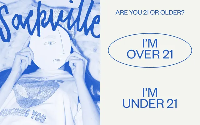
Preview image. Unlock full-res
Electric Blue Studio
Color palette
Violet accent for outlined action borders, linked labels, and lightweight interactive emphasis. Do not promote it to the primary CTA color
Secondary brand accent, highlight backgrounds, occasional text, and decorative borders – introduces warmth and a playful contrast
Page backgrounds, card surfaces, ghost button backgrounds – provides a soft, warm base that lifts the saturated brand colors
Primary text, strong headings, prominent borders, and active navigation items – anchors the design with deep, near-black contrast
High-contrast text, borders, and icon fills – used sparingly for maximum impact
Secondary text and subtle borders – a softer alternative to Midnight Ash
Error states, call-to-action borders, and selective decorative elements – commands attention with its vivid red hue
Typography
- Weights
- 400
- Sizes
- 16px, 22px, 23px, 25px, 26px, 29px, 32px, 34px, 38px, 47px, 50px, 60px, 72px, 85px, 99px, 122px, 130px
- Line height
- 0.8, 0.85, 0.9, 0.94, 1, 1.15, 1.3, 1.5, 2.19
- Letter spacing
- normal
- Fallback
- Inter
Primary user interface text, body copy, and most headings – consistent weight but highly variable sizes contribute to a dynamic typographic rhythm.
- Weights
- 400
- Sizes
- 29px, 34px, 60px, 122px, 130px
- Line height
- 0.8, 0.85, 1, 1.1, 1.15
- Letter spacing
- normal
- Fallback
- Times New Roman
Distinctive display headlines and select navigation elements – its semi-light weight contrasts with its large size for an artistic, elegant statement.
Spacing & shape
Components
Background: rgba(0, 0, 0, 0), Text Color: rgba(0, 0, 0, 0), Borders are transparent, internal padding is 5px on all sides. Used for subtle interactions like search or navigation numbers.
Background: rgba(0, 0, 0, 0), Text Color: Midnight Ash (#231f20), with a transparent border. Its primary function is to act as a clickable text link within content.
Background: rgba(0,0,0,0), Text Color: Deep Space Blue (#245dc5), with a Deep Space Blue border. Border radius is an exaggerated oval (81px / 39px) for a distinctive, organic shape. Padding: 8.56px top, 12.84px bottom, 0px left/right.
Background: rgba(0,0,0,0), Text Color: Crimson Ember (#f04736), with a Crimson Ember border. Border radius is an exaggerated oval (81px / 39px) for a distinctive, organic shape. Padding: 8.56px top, 12.84px bottom, 0px left/right.
Background: Deep Space Blue (#245dc5), with a top-only border radius of 10px. Padding is 20px on all sides, no shadow, creating a flat, immersive surface for content.
Background: rgba(0,0,0,0), Text Color: Deep Space Blue (#245dc5), with a Deep Space Blue border. Border radius is 50% for a perfect circle. Minimal padding.
Background: Sunset Orange (#ffc6a6), Text Color: Jet (#000000), with a Jet border. Border radius is 0px for sharp edges. Padding: 1px top/bottom, 2px left/right.
Guidelines
- Prioritize Deep Space Blue (#245dc5) and Crimson Ember (#f04736) for interactive element borders rather than filled backgrounds.
- Use Canvas Creme (#f3f4ee) as the dominant background surface for all page sections to maintain a bright, airy feel.
- Apply the FoundersGrotesk font with varied sizes but consistent weight (400) for most UI text to create visual interest without additional typographic complexity.
- Employ the asymmetrical border radius '81px / 39px' for primary action buttons to give a unique, organic feel.
- Ensure large headlines leverage the contrast between TimesNow SemiLight (400) and FoundersGrotesk (400) for typographic hierarchy.
- Maintain comfortable spacing with an element gap of 10px and card padding of 20px to prevent visual crowding.
- Do not use solid background fills for primary action buttons; utilize outlined styles with brand colors.
- Avoid using multiple font weights within a single text block; stick to weight 400 for both primary typefaces.
- Do not introduce sharp, angular radii for primary interactive elements that are intended to feel organic or unique, such as oval buttons.
- Do not use dark backgrounds for entire page sections; reserve Deep Space Blue (#245dc5) for specific component surfaces or brand accents.
- Do not overuse highly saturated colors; focus on Deep Space Blue and Crimson Ember for functional highlights, allowing Canvas Creme to dominate.
About this system
ShowHide
Sackville & Co. employs a vibrant, expressive visual language centered on high contrast and dynamic shapes. The design features a light, almost off-white canvas punctuated by a bold, energetic blue. Typography is confident and slightly quirky, mixing a strong sans-serif with a more artistic serif for impactful headlines. Components often prioritize outlined styles with organic, asymmetric radii, making elements feel handcrafted yet sophisticated.
The page maintains a full-width linear scroll, but content is often contained within a perceived maximum width. The hero section frequently features a full-bleed visual element with overlaid text or an age-gate. Section rhythm is primarily consistent vertical spacing with occasional alternating visual treatments or distinct card-based layouts for product showcases. Content arrangement is flexible, featuring centered stacks for calls to action, text-left/image-right compositions for features, and multi-column card grids for product listings. Navigation is a persistent top bar, often minimal, with supplementary navigation in the footer.
The site uses a mix of evocative photography and minimalist line art. Photography leans towards moody or branded lifestyle shots, often with a blue tint or duotone effect, sometimes featuring product crops against the Canvas Creme background. Illustrations and icons are typically minimal line drawings, often in Deep Space Blue, contributing to a modern, artistic, and slightly mysterious atmosphere. Imagery serves both decorative atmosphere and product showcase, with a moderate density.
Reminiscent of Glossier, Parade, Magic Spoon.
# Sackville & Co. — Style Reference
> Electric Blue Studio

**Theme:** light

**Site:** https://sackville.co

Sackville & Co. employs a vibrant, expressive visual language centered on high contrast and dynamic shapes. The design features a light, almost off-white canvas punctuated by a bold, energetic blue. Typography is confident and slightly quirky, mixing a strong sans-serif with a more artistic serif for impactful headlines. Components often prioritize outlined styles with organic, asymmetric radii, making elements feel handcrafted yet sophisticated.

## Tokens — Colors

| Name | Value | Token | Role |
|------|------|------|------|
| Deep Space Blue | `#245dc5` | `--color-deep-space-blue` | Violet accent for outlined action borders, linked labels, and lightweight interactive emphasis. Do not promote it to the primary CTA color |
| Sunset Orange | `#ffc6a6` | `--color-sunset-orange` | Secondary brand accent, highlight backgrounds, occasional text, and decorative borders – introduces warmth and a playful contrast |
| Canvas Creme | `#f3f4ee` | `--color-canvas-creme` | Page backgrounds, card surfaces, ghost button backgrounds – provides a soft, warm base that lifts the saturated brand colors |
| Midnight Ash | `#231f20` | `--color-midnight-ash` | Primary text, strong headings, prominent borders, and active navigation items – anchors the design with deep, near-black contrast |
| Jet | `#000000` | `--color-jet` | High-contrast text, borders, and icon fills – used sparingly for maximum impact |
| Charcoal Whisper | `#383435` | `--color-charcoal-whisper` | Secondary text and subtle borders – a softer alternative to Midnight Ash |
| Crimson Ember | `#f04736` | `--color-crimson-ember` | Error states, call-to-action borders, and selective decorative elements – commands attention with its vivid red hue |

## Tokens — Typography

### FoundersGrotesk
- **Substitute:** Inter
- **Weights:** 400
- **Sizes:** 16px, 22px, 23px, 25px, 26px, 29px, 32px, 34px, 38px, 47px, 50px, 60px, 72px, 85px, 99px, 122px, 130px
- **Line height:** 0.8, 0.85, 0.9, 0.94, 1, 1.15, 1.3, 1.5, 2.19
- **Letter spacing:** normal
- **Role:** Primary user interface text, body copy, and most headings – consistent weight but highly variable sizes contribute to a dynamic typographic rhythm.

### TimesNow SemiLight
- **Substitute:** Times New Roman
- **Weights:** 400
- **Sizes:** 29px, 34px, 60px, 122px, 130px
- **Line height:** 0.8, 0.85, 1, 1.1, 1.15
- **Letter spacing:** normal
- **Role:** Distinctive display headlines and select navigation elements – its semi-light weight contrasts with its large size for an artistic, elegant statement.

## Tokens — Type Scale

Augmented Fourth (1.414) from 22px base.

| Role | Size | Line height | Letter spacing |
|------|------|------|------|
| body-sm | 16px | 1 | — |
| body | 22px | 1.15 | — |
| subheading | 25px | 1.15 | — |
| heading-sm | 29px | 0.8 | — |
| heading | 34px | 0.85 | — |
| heading-lg | 47px | 0.9 | — |
| display | 130px | 0.8 | — |

## Tokens — Spacing

- **Section gap:** 43px
- **Card padding:** 20px
- **Element gap:** 10px

## Tokens — Radius

- **Buttons:** 50px
- **Cards:** 10px 10px 0px 0px
- **ovalButtons:** 81px / 39px

## Layout

The page maintains a full-width linear scroll, but content is often contained within a perceived maximum width. The hero section frequently features a full-bleed visual element with overlaid text or an age-gate. Section rhythm is primarily consistent vertical spacing with occasional alternating visual treatments or distinct card-based layouts for product showcases. Content arrangement is flexible, featuring centered stacks for calls to action, text-left/image-right compositions for features, and multi-column card grids for product listings. Navigation is a persistent top bar, often minimal, with supplementary navigation in the footer.

## Imagery

The site uses a mix of evocative photography and minimalist line art. Photography leans towards moody or branded lifestyle shots, often with a blue tint or duotone effect, sometimes featuring product crops against the Canvas Creme background. Illustrations and icons are typically minimal line drawings, often in Deep Space Blue, contributing to a modern, artistic, and slightly mysterious atmosphere. Imagery serves both decorative atmosphere and product showcase, with a moderate density.

## Components

### Ghost Button
*Minimal interactive elements*

Background: rgba(0, 0, 0, 0), Text Color: rgba(0, 0, 0, 0), Borders are transparent, internal padding is 5px on all sides. Used for subtle interactions like search or navigation numbers.

### Text Link Button
*Inline text actions*

Background: rgba(0, 0, 0, 0), Text Color: Midnight Ash (#231f20), with a transparent border. Its primary function is to act as a clickable text link within content.

### Oval Outline Button - Deep Space
*Primary interaction button*

Background: rgba(0,0,0,0), Text Color: Deep Space Blue (#245dc5), with a Deep Space Blue border. Border radius is an exaggerated oval (81px / 39px) for a distinctive, organic shape. Padding: 8.56px top, 12.84px bottom, 0px left/right.

### Oval Outline Button - Crimson
*Secondary interaction button, often for 'Underage' states*

Background: rgba(0,0,0,0), Text Color: Crimson Ember (#f04736), with a Crimson Ember border. Border radius is an exaggerated oval (81px / 39px) for a distinctive, organic shape. Padding: 8.56px top, 12.84px bottom, 0px left/right.

### Rounded Product Card
*Product display card*

Background: Deep Space Blue (#245dc5), with a top-only border radius of 10px. Padding is 20px on all sides, no shadow, creating a flat, immersive surface for content.

### Circular Outline Icon Button
*Iconic button for navigation or filtering*

Background: rgba(0,0,0,0), Text Color: Deep Space Blue (#245dc5), with a Deep Space Blue border. Border radius is 50% for a perfect circle. Minimal padding.

### Accent Input Field
*Data entry fields*

Background: Sunset Orange (#ffc6a6), Text Color: Jet (#000000), with a Jet border. Border radius is 0px for sharp edges. Padding: 1px top/bottom, 2px left/right.

## Guidelines

### Do

- Prioritize Deep Space Blue (#245dc5) and Crimson Ember (#f04736) for interactive element borders rather than filled backgrounds.
- Use Canvas Creme (#f3f4ee) as the dominant background surface for all page sections to maintain a bright, airy feel.
- Apply the FoundersGrotesk font with varied sizes but consistent weight (400) for most UI text to create visual interest without additional typographic complexity.
- Employ the asymmetrical border radius '81px / 39px' for primary action buttons to give a unique, organic feel.
- Ensure large headlines leverage the contrast between TimesNow SemiLight (400) and FoundersGrotesk (400) for typographic hierarchy.
- Maintain comfortable spacing with an element gap of 10px and card padding of 20px to prevent visual crowding.

### Don't

- Do not use solid background fills for primary action buttons; utilize outlined styles with brand colors.
- Avoid using multiple font weights within a single text block; stick to weight 400 for both primary typefaces.
- Do not introduce sharp, angular radii for primary interactive elements that are intended to feel organic or unique, such as oval buttons.
- Do not use dark backgrounds for entire page sections; reserve Deep Space Blue (#245dc5) for specific component surfaces or brand accents.
- Do not overuse highly saturated colors; focus on Deep Space Blue and Crimson Ember for functional highlights, allowing Canvas Creme to dominate.

## Agent Prompt Guide

Quick Color Reference:
text: #231f20
background: #f3f4ee
border: #231f20
accent: #245dc5
primary action: #245dc5 (outlined action border)

Example Component Prompts:
Create a product card: background Canvas Creme (#f3f4ee), top border-radius 10px 10px 0px 0px, 20px padding. Product title in Midnight Ash (#231f20) at 34px FoundersGrotesk (400), line-height 0.85. Price in Midnight Ash (#231f20) at 22px FoundersGrotesk (400), line-height 1.15.
Create a primary call-to-action button for 'I'm Over 21': Background transparent, Text Deep Space Blue (#245dc5), Border Deep Space Blue (#245dc5), Border-radius 81px / 39px, Padding 8.56px top, 12.84px bottom, 0px left/right. Font FoundersGrotesk (400) at 29px.
Create an input field for email signup: Background Sunset Orange (#ffc6a6), Text Jet (#000000), Border Jet (#000000), Border-radius 0px, Padding 1px top/bottom, 2px left/right. Placeholder text in Jet (#000000) at 16px FoundersGrotesk (400).
Create a navigation link: Text Midnight Ash (#231f20), 16px FoundersGrotesk (400), normal letter-spacing, transparent background, with 5px padding on all sides.
Create a Section Heading: Text Charcoal Whisper (#383435), 60px TimesNow SemiLight (400), line-height 0.8. Element gap of 10px below.
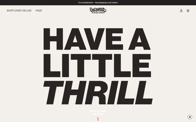
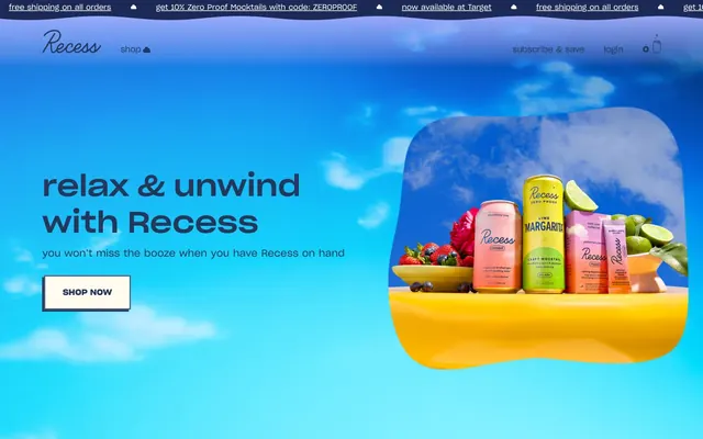
More like this








Keep what you find
A free account saves references to boards and can send you a weekly email of picks based on what you save.
To see every result, go Pro.