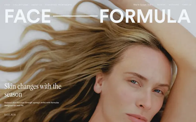
Preview image. Unlock full-res
serene Scandinavian minimalist
Color palette
Primary text color, bold accents, brand elements, active states. This particular cool blue-grey defines the brand's primary visual identity
Primary page background, elevated card surfaces
Subtle background panels, light hover states, decorative borders. This is a very light, almost white grey
Secondary background panels, subtle section dividers
Darkest text for contrast on light backgrounds
Secondary text, muted links, subtle button borders
Subtle button borders, decorative strokes, light element outlines
Iconography, strong text emphasis, borders on dark elements
Typography
- Weights
- 400
- Sizes
- 32px, 52px, 120px
- Line height
- 1, 1.1, 1.2
- Letter spacing
- -0.64, -0.52, -1.2
- Fallback
- Playfair Display
Headline typeface. Its delicate, almost whispery quality (despite large sizes) evokes a crafted, sophisticated brand rather than shouting for attention. letter-spacing reduces at smaller headline sizes.
- Weights
- 400
- Sizes
- 12px, 13px, 15px, 16px
- Line height
- 1, 1.4
- Letter spacing
- 0.12, 0.26, 0.3, 2.4
- Fallback
- Inter
Body copy, navigation, buttons, and all functional text. The slightly wider letter spacing gives it an airy, open feel, enhancing the minimalist aesthetic.
Spacing & shape
Components
backgroundColor: rgba(0, 0, 0, 0), color: Deep Ocean (#3b505a), border: none, padding: 0px.
backgroundColor: rgba(0, 0, 0, 0), color: Ghost Fog (#f2f5f8), border: none, padding: 0px.
backgroundColor: Ghost Fog (#f2f5f8), color: Link Blue (#58737e), border: none, padding: 0px 47.5px.
backgroundColor: rgba(0, 0, 0, 0), color: Deep Ocean (#3b505a), borderBottom: 1px solid Deep Ocean (#3b505a), borderRadius: 0px, padding: 0px 14.8px 0px 0px.
backgroundColor: Link Blue (#58737e), color: Ghost Fog (#f2f5f8), padding: 6px 6px, borderRadius: 0px.
Guidelines
- Prioritize Deep Ocean (#3b505a) for primary textual content and interactive elements, establishing it as the dominant brand color.
- Use Libre Caslon Condensed (or Playfair Display) exclusively for major headings, leveraging its distinct serif character.
- Apply Circular Pro (or Inter) for all body text, navigation, and button labels, maintaining a consistent sans-serif voice.
- Ensure generous white space, particularly using Canvas White (#ffffff) and Ghost Fog (#f2f5f8) for background dilution and section separation.
- Use Border Mist (#e6ebee) for subtle background shifts to indicate different content blocks without heavy visual breaks.
- Set all border-radius values to 0px for a sharp, modern, and uncluttered appearance.
- Maintain a default element gap of 16px for consistent visual rhythm between components.
- Avoid using bold or highly saturated colors outside of the defined brand palette for primary UI elements.
- Do not introduce strong shadows or excessive elevation; the design favors flat surfaces and subtle depth.
- Do not deviate from the specified 0px border-radius; rounded corners are not part of this aesthetic.
- Do not use generic system fonts for body or heading; the custom typefaces are critical to the brand identity.
- Avoid dense information placement; maintain the comfortable density and ample spacing.
- Do not use multiple font weights for Circular Pro; it is intended to be used at its regular weight 400 throughout.
- Do not use 'Action', 'CTA', 'primary action', or similar phrasing for buttons unless they explicitly have a #3b505a background or border, and prioritize un-filled, text-based button styles rather than solid fills where possible.
About this system
ShowHide
Face Formula cultivates a natural, understated aesthetic with a muted color palette dominated by cool greys and subtle blue-greys, echoing its Norwegian roots. Typography combines a classic serif for impactful headlines with a clean sans-serif for body text, creating a balanced and readable experience. Design elements are minimal, favoring delicate borders and ample white space over bold colors or heavy shadows. Components are lightweight, emphasizing content and a serene visual atmosphere.
The page primarily employs a max-width contained layout, with content centered. The hero section is full-bleed, overlaying large lifestyle photography with centered or left-aligned headlines and subtext. Section rhythm is created through alternating Canvas White and Ghost Fog background bands, with generous vertical spacing (32px section gap). Content often uses two-column arrangements, alternating text-left/image-right or vice-versa, or stacked centered blocks. There's a 3-column card grid in some sections, likely for product display. Navigation is a fixed top bar with ghost text links.
The site uses high-quality, product-focused photography and natural lifestyle imagery featuring models with clear, healthy skin. Photography is usually full-bleed in hero sections, serving as a backdrop for textual content. Product visuals are crisp, isolated shots on clean white or solid color backgrounds. There are small decorative landscape images. Iconography is minimalist, outlined, and monochromatic, primarily using Black Ink (#000000) or Deep Ocean (#3b505a), maintaining a light stroke weight. Imagery is primarily decorative and atmospheric but also showcases product details.
Reminiscent of aesop.com, byredo.com, frama.com.
# Face Formula — Style Reference
> serene Scandinavian minimalist

**Theme:** light

**Site:** https://faceformula.com

Face Formula cultivates a natural, understated aesthetic with a muted color palette dominated by cool greys and subtle blue-greys, echoing its Norwegian roots. Typography combines a classic serif for impactful headlines with a clean sans-serif for body text, creating a balanced and readable experience. Design elements are minimal, favoring delicate borders and ample white space over bold colors or heavy shadows. Components are lightweight, emphasizing content and a serene visual atmosphere.

## Tokens — Colors

| Name | Value | Token | Role |
|------|------|------|------|
| Deep Ocean | `#3b505a` | `--color-deep-ocean` | Primary text color, bold accents, brand elements, active states. This particular cool blue-grey defines the brand's primary visual identity |
| Canvas White | `#ffffff` | `--color-canvas-white` | Primary page background, elevated card surfaces |
| Ghost Fog | `#f2f5f8` | `--color-ghost-fog` | Subtle background panels, light hover states, decorative borders. This is a very light, almost white grey |
| Border Mist | `#e6ebee` | `--color-border-mist` | Secondary background panels, subtle section dividers |
| Text Slate | `#202f3b` | `--color-text-slate` | Darkest text for contrast on light backgrounds |
| Link Blue | `#58737e` | `--color-link-blue` | Secondary text, muted links, subtle button borders |
| Light Steel | `#cfdce7` | `--color-light-steel` | Subtle button borders, decorative strokes, light element outlines |
| Black Ink | `#000000` | `--color-black-ink` | Iconography, strong text emphasis, borders on dark elements |

## Tokens — Typography

### Libre Caslon Condensed
- **Substitute:** Playfair Display
- **Weights:** 400
- **Sizes:** 32px, 52px, 120px
- **Line height:** 1, 1.1, 1.2
- **Letter spacing:** -0.64, -0.52, -1.2
- **Role:** Headline typeface. Its delicate, almost whispery quality (despite large sizes) evokes a crafted, sophisticated brand rather than shouting for attention. letter-spacing reduces at smaller headline sizes.

### Circular Pro
- **Substitute:** Inter
- **Weights:** 400
- **Sizes:** 12px, 13px, 15px, 16px
- **Line height:** 1, 1.4
- **Letter spacing:** 0.12, 0.26, 0.3, 2.4
- **Role:** Body copy, navigation, buttons, and all functional text. The slightly wider letter spacing gives it an airy, open feel, enhancing the minimalist aesthetic.

## Tokens — Type Scale

| Role | Size | Line height | Letter spacing |
|------|------|------|------|
| caption | 12px | 1 | 0.12px |
| heading | 32px | 1.2 | -0.64px |
| heading-lg | 52px | 1.1 | -0.52px |
| display | 120px | 1 | -1.2px |

## Tokens — Spacing

- **Section gap:** 32px
- **Card padding:** 0px
- **Element gap:** 16px

## Tokens — Radius

- **none:** 0px

## Layout

The page primarily employs a max-width contained layout, with content centered. The hero section is full-bleed, overlaying large lifestyle photography with centered or left-aligned headlines and subtext. Section rhythm is created through alternating Canvas White and Ghost Fog background bands, with generous vertical spacing (32px section gap). Content often uses two-column arrangements, alternating text-left/image-right or vice-versa, or stacked centered blocks. There's a 3-column card grid in some sections, likely for product display. Navigation is a fixed top bar with ghost text links.

## Imagery

The site uses high-quality, product-focused photography and natural lifestyle imagery featuring models with clear, healthy skin. Photography is usually full-bleed in hero sections, serving as a backdrop for textual content. Product visuals are crisp, isolated shots on clean white or solid color backgrounds. There are small decorative landscape images. Iconography is minimalist, outlined, and monochromatic, primarily using Black Ink (#000000) or Deep Ocean (#3b505a), maintaining a light stroke weight. Imagery is primarily decorative and atmospheric but also showcases product details.

## Components

### Ghost Navigation Button (Light)
*Header navigation links, inline text links.*

backgroundColor: rgba(0, 0, 0, 0), color: Deep Ocean (#3b505a), border: none, padding: 0px.

### Ghost Navigation Button (Dark)
*Contextual navigation links against dark hero backgrounds.*

backgroundColor: rgba(0, 0, 0, 0), color: Ghost Fog (#f2f5f8), border: none, padding: 0px.

### Contained Button
*Secondary action button for interactive elements.*

backgroundColor: Ghost Fog (#f2f5f8), color: Link Blue (#58737e), border: none, padding: 0px 47.5px.

### Product Input Field
*Text input areas with a subtle border for user interaction.*

backgroundColor: rgba(0, 0, 0, 0), color: Deep Ocean (#3b505a), borderBottom: 1px solid Deep Ocean (#3b505a), borderRadius: 0px, padding: 0px 14.8px 0px 0px.

### Bestseller Label
*Small, contained label for product features.*

backgroundColor: Link Blue (#58737e), color: Ghost Fog (#f2f5f8), padding: 6px 6px, borderRadius: 0px.

## Guidelines

### Do

- Prioritize Deep Ocean (#3b505a) for primary textual content and interactive elements, establishing it as the dominant brand color.
- Use Libre Caslon Condensed (or Playfair Display) exclusively for major headings, leveraging its distinct serif character.
- Apply Circular Pro (or Inter) for all body text, navigation, and button labels, maintaining a consistent sans-serif voice.
- Ensure generous white space, particularly using Canvas White (#ffffff) and Ghost Fog (#f2f5f8) for background dilution and section separation.
- Use Border Mist (#e6ebee) for subtle background shifts to indicate different content blocks without heavy visual breaks.
- Set all border-radius values to 0px for a sharp, modern, and uncluttered appearance.
- Maintain a default element gap of 16px for consistent visual rhythm between components.

### Don't

- Avoid using bold or highly saturated colors outside of the defined brand palette for primary UI elements.
- Do not introduce strong shadows or excessive elevation; the design favors flat surfaces and subtle depth.
- Do not deviate from the specified 0px border-radius; rounded corners are not part of this aesthetic.
- Do not use generic system fonts for body or heading; the custom typefaces are critical to the brand identity.
- Avoid dense information placement; maintain the comfortable density and ample spacing.
- Do not use multiple font weights for Circular Pro; it is intended to be used at its regular weight 400 throughout.
- Do not use 'Action', 'CTA', 'primary action', or similar phrasing for buttons unless they explicitly have a #3b505a background or border, and prioritize un-filled, text-based button styles rather than solid fills where possible.

## Agent Prompt Guide

Quick Color Reference:
text: #3b505a
background: #ffffff
border: #cfdce7
accent: #3b505a
primary action: no distinct CTA color

Example Component Prompts:
1. Create a hero section with a full-bleed background image. Overlay a headline 'Skin changes with the season' using Libre Caslon Condensed weight 400, size 52px, lineHeight 1.1, letterSpacing -0.52px, color #f2f5f8. Below it, a subtext 'Support skin function through spring's shifts' using Circular Pro weight 400, size 15px, lineHeight 1.4, letterSpacing 0.3px, color #f2f5f8. Include a 'SHOP NOW' ghost link beneath that, using Circular Pro weight 400, size 15px, lineHeight 1.4, letterSpacing 0.3px, color #f2f5f8, no border or background.
2. Create a content section starting with 'Rooted in Norway. Guided by biology.' using Libre Caslon Condensed weight 400, size 32px, lineHeight 1.2, letterSpacing -0.64px, color #3b505a. Follow it with a two-column layout: an image on the left and supporting text on the right using Circular Pro weight 400, size 15px, lineHeight 1.4, letterSpacing 0.3px, color #3b505a. The section has a Canvas White (#ffffff) background.
3. Design a product card: background Canvas White (#ffffff), no border-radius. Title 'Essential Formula' using Circular Pro weight 400, size 15px, lineHeight 1.4, letterSpacing 0.3px, color #3b505a. Price '€37,95' using Circular Pro weight 400, size 15px, lineHeight 1.4, letterSpacing 0.3px, color #3b505a. Include a 'Bestseller' label using Link Blue (#58737e) background, Ghost Fog (#f2f5f8) text, 0px radius, 6px padding. The card padding is 0px.
More like this









Keep what you find
A free account saves references to boards and can send you a weekly email of picks based on what you save.
To see every result, go Pro.