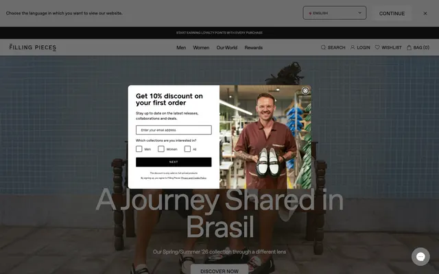
Preview image. Unlock full-res
monochromatic gallery, precise typography
Color palette
Page backgrounds, subtle dividers, inactive states, large surface areas that provide visual breathing room
Dialog backgrounds, card surfaces, interactive elements like buttons and primary navigation backgrounds
Primary text, headings, icons, strong borders, and filled button backgrounds for primary actions
Subtle background for secondary sections, giving a slight depth difference from primary surfaces without introducing color
Input borders, muted text, placeholder text for form fields — a darker gray for functional UI elements
Typography
- Weights
- 400, 600
- Sizes
- 8px, 10px, 11px, 12px, 14px, 16px, 18px, 35px, 50px, 100px
- Line height
- 0.9, 1, 1.2, 1.5, 1.78
- Letter spacing
- -0.04em
- Fallback
- system-ui
Favort is the singular typeface, used across all text elements. Its geometric yet humanist style, combined with tight letter-spacing and a generous range of sizes, defines the brand's precise and modern voice. Weight 400 is for body text, labels, and descriptions, maintaining lightness, while weight 600 delivers emphasis for headlines and important calls to action.
Spacing & shape
Components
Solid Ink Black background with Pure White text, 8px border-radius, minimum 32px horizontal padding. Font is Favorit 600, 11px, with tight letter spacing.
Transparent background with Ink Black text, a 1px Ink Black border, and 8px border-radius, 32px horizontal padding. Font is Favorit 400, 11px.
Pure White background with Ink Black text, 1px Canvas Ice border, 8px border-radius, 32px horizontal padding. Font is Favorit 400, 11px.
Transparent background, 1px Steel Gray bottom border, 8px border-radius. Text is Ink Black Favorit 400. Includes 12px vertical and 32px horizontal padding for content.
Pure White background, 1px Ink Black border, 8px border-radius. Text is Ink Black Favorit 400. Includes 12px vertical and 32px horizontal padding for content.
Pure White background, 8px border-radius. Uses 16px internal padding for content. Minimal to no visible border, relies on surrounding negative space.
Container with Canvas Ice background, 8px border-radius. Product image occupies primary space, with product name (Favorit 400, 14px, Ink Black) and price (Favorit 400, 14px, Ink Black) below, separated by 4px element gaps.
Guidelines
- Prioritize product imagery: UI elements should be achromatic to allow product visuals to dominate the canvas.
- Maintain high contrast: Use Ink Black (#000000) for all primary text and calls to action against Pure White (#ffffff) or Canvas Ice (#e5e7eb) backgrounds.
- Apply consistent border-radius: All interactive elements like buttons and inputs, and structural components like cards and modals, must use an 8px border-radius.
- Utilize tight letter-spacing: Implement a consistent -0.04em letter-spacing for all Favorit text to maintain a compact, precise typographic presence.
- Employ the 4px base unit: Ensure all spacing (padding, margins, gaps) is a multiple of 4px to maintain rhythm and consistency.
- Use distinct surface levels: Differentiate main page content (Canvas Ice #e5e7eb) from component backgrounds (Pure White #ffffff) and secondary sections (Fog Gray #efefef) to create visual hierarchy.
- Favor ghosting for secondary actions: Outline buttons with Ink Black when a less assertive action is required, reserving solid Ink Black fills for primary conversion points.
- Avoid color in functional UI: Refrain from introducing vibrant or chromatic colors into standard interface elements like buttons, inputs, or navigation, save for specific branded accents if introduced.
- Do not use generic typography: Stick to the Favorit typeface with its specified weights and letter-spacing for all text to preserve brand identity.
- Do not vary border-radius: Deviations from the 8px radius will clash with the established component styling and soften the overall sharp aesthetic.
- Do not introduce heavy shadows or elevation: The design relies on flat surfaces and subtle borders; prominent shadows conflict with this minimalist approach.
- Avoid arbitrary text sizes or line heights: Adhere strictly to the defined type scale to maintain typographic rhythm and readability.
- Do not use spacing values outside the 4px grid: Inconsistent spacing will create visual disorder and disrupt the clean layout.
- Do not add decorative gradients to UI elements: The system emphasizes flat, high-contrast surfaces.
About this system
ShowHide
Filling Pieces establishes a confident, minimalist e-commerce aesthetic with a strong emphasis on product presentation. The system uses a limited, high-contrast achromatic palette, allowing product imagery to carry the visual weight. Typography is compact and precise, maintaining overall lightness. Components are structured and refined, relying on subtle borders and uniform radii rather than heavy elevation, contributing to an uncluttered and direct user experience.
The page primarily uses a max-width contained layout, though the hero section often features full-bleed photography. The hero establishes an immersive visual, with large, centered headlines layered over background imagery, often accompanied by a prominent 'Discover Now' button. Section rhythm is predominantly defined by alternating distinct background colors (Canvas Ice, Fog Gray) or large photographic blocks. Content is arranged in flexible grids, including two-column layouts pairing text with visuals and multi-column product grids. Navigation is a consistent sticky top bar with minimal, text-based links and functional icons.
Imagery is centered on high-quality editorial photography, often full-bleed or large format, showcasing products in aspirational and lifestyle contexts. When not lifestyle, individual products are presented cleanly on a light background. Illustrations are absent. Icons are typically solid Ink Black, minimal, and functional. Imagery is critical for conveying the brand's fashion-forward identity, dominating visual space while UI elements remain unobtrusive.
Reminiscent of Acne Studios, COS, AllSaints, Studio Nicholson.
# Filling Pieces — Style Reference
> monochromatic gallery, precise typography

**Theme:** light

**Site:** https://www.fillingpieces.com

Filling Pieces establishes a confident, minimalist e-commerce aesthetic with a strong emphasis on product presentation. The system uses a limited, high-contrast achromatic palette, allowing product imagery to carry the visual weight. Typography is compact and precise, maintaining overall lightness. Components are structured and refined, relying on subtle borders and uniform radii rather than heavy elevation, contributing to an uncluttered and direct user experience.

## Tokens — Colors

| Name | Value | Token | Role |
|------|------|------|------|
| Canvas Ice | `#e5e7eb` | `--color-canvas-ice` | Page backgrounds, subtle dividers, inactive states, large surface areas that provide visual breathing room |
| Pure White | `#ffffff` | `--color-pure-white` | Dialog backgrounds, card surfaces, interactive elements like buttons and primary navigation backgrounds |
| Ink Black | `#000000` | `--color-ink-black` | Primary text, headings, icons, strong borders, and filled button backgrounds for primary actions |
| Fog Gray | `#efefef` | `--color-fog-gray` | Subtle background for secondary sections, giving a slight depth difference from primary surfaces without introducing color |
| Steel Gray | `#6b7280` | `--color-steel-gray` | Input borders, muted text, placeholder text for form fields — a darker gray for functional UI elements |

## Tokens — Typography

### Favorit
- **Substitute:** system-ui
- **Weights:** 400, 600
- **Sizes:** 8px, 10px, 11px, 12px, 14px, 16px, 18px, 35px, 50px, 100px
- **Line height:** 0.9, 1, 1.2, 1.5, 1.78
- **Letter spacing:** -0.04em
- **Role:** Favort is the singular typeface, used across all text elements. Its geometric yet humanist style, combined with tight letter-spacing and a generous range of sizes, defines the brand's precise and modern voice. Weight 400 is for body text, labels, and descriptions, maintaining lightness, while weight 600 delivers emphasis for headlines and important calls to action.

## Tokens — Type Scale

| Role | Size | Line height | Letter spacing |
|------|------|------|------|
| button-label | 11px | 1.2 | -0.44px |
| body | 14px | 1.2 | -0.56px |
| heading-sm | 18px | 1.2 | -0.72px |
| heading | 35px | 1 | -1.4px |
| heading-lg | 50px | 0.9 | -2px |
| display | 100px | 0.9 | -4px |

## Tokens — Spacing

- **Section gap:** 40px
- **Card padding:** 16px
- **Element gap:** 16px

## Tokens — Radius

- **all:** 8px

## Layout

The page primarily uses a max-width contained layout, though the hero section often features full-bleed photography. The hero establishes an immersive visual, with large, centered headlines layered over background imagery, often accompanied by a prominent 'Discover Now' button. Section rhythm is predominantly defined by alternating distinct background colors (Canvas Ice, Fog Gray) or large photographic blocks. Content is arranged in flexible grids, including two-column layouts pairing text with visuals and multi-column product grids. Navigation is a consistent sticky top bar with minimal, text-based links and functional icons.

## Imagery

Imagery is centered on high-quality editorial photography, often full-bleed or large format, showcasing products in aspirational and lifestyle contexts. When not lifestyle, individual products are presented cleanly on a light background. Illustrations are absent. Icons are typically solid Ink Black, minimal, and functional. Imagery is critical for conveying the brand's fashion-forward identity, dominating visual space while UI elements remain unobtrusive.

## Components

### Primary Filled Button
*Main call to action*

Solid Ink Black background with Pure White text, 8px border-radius, minimum 32px horizontal padding. Font is Favorit 600, 11px, with tight letter spacing.

### Ghost Button
*Secondary action or discrete navigation*

Transparent background with Ink Black text, a 1px Ink Black border, and 8px border-radius, 32px horizontal padding. Font is Favorit 400, 11px.

### Surface Button
*Navigational elements or filters within a light context*

Pure White background with Ink Black text, 1px Canvas Ice border, 8px border-radius, 32px horizontal padding. Font is Favorit 400, 11px.

### Text Input (Default)
*Standard form field for user input*

Transparent background, 1px Steel Gray bottom border, 8px border-radius. Text is Ink Black Favorit 400. Includes 12px vertical and 32px horizontal padding for content.

### Text Input (Light Background)
*Standard form field for user input on white surfaces*

Pure White background, 1px Ink Black border, 8px border-radius. Text is Ink Black Favorit 400. Includes 12px vertical and 32px horizontal padding for content.

### Card/Modal Container
*Content grouping, dialogs, product listings*

Pure White background, 8px border-radius. Uses 16px internal padding for content. Minimal to no visible border, relies on surrounding negative space.

### Product Grid Item
*Displaying product images and details*

Container with Canvas Ice background, 8px border-radius. Product image occupies primary space, with product name (Favorit 400, 14px, Ink Black) and price (Favorit 400, 14px, Ink Black) below, separated by 4px element gaps.

## Guidelines

### Do

- Prioritize product imagery: UI elements should be achromatic to allow product visuals to dominate the canvas.
- Maintain high contrast: Use Ink Black (#000000) for all primary text and calls to action against Pure White (#ffffff) or Canvas Ice (#e5e7eb) backgrounds.
- Apply consistent border-radius: All interactive elements like buttons and inputs, and structural components like cards and modals, must use an 8px border-radius.
- Utilize tight letter-spacing: Implement a consistent -0.04em letter-spacing for all Favorit text to maintain a compact, precise typographic presence.
- Employ the 4px base unit: Ensure all spacing (padding, margins, gaps) is a multiple of 4px to maintain rhythm and consistency.
- Use distinct surface levels: Differentiate main page content (Canvas Ice #e5e7eb) from component backgrounds (Pure White #ffffff) and secondary sections (Fog Gray #efefef) to create visual hierarchy.
- Favor ghosting for secondary actions: Outline buttons with Ink Black when a less assertive action is required, reserving solid Ink Black fills for primary conversion points.

### Don't

- Avoid color in functional UI: Refrain from introducing vibrant or chromatic colors into standard interface elements like buttons, inputs, or navigation, save for specific branded accents if introduced.
- Do not use generic typography: Stick to the Favorit typeface with its specified weights and letter-spacing for all text to preserve brand identity.
- Do not vary border-radius: Deviations from the 8px radius will clash with the established component styling and soften the overall sharp aesthetic.
- Do not introduce heavy shadows or elevation: The design relies on flat surfaces and subtle borders; prominent shadows conflict with this minimalist approach.
- Avoid arbitrary text sizes or line heights: Adhere strictly to the defined type scale to maintain typographic rhythm and readability.
- Do not use spacing values outside the 4px grid: Inconsistent spacing will create visual disorder and disrupt the clean layout.
- Do not add decorative gradients to UI elements: The system emphasizes flat, high-contrast surfaces.

## Agent Prompt Guide

Quick Color Reference:
text: #000000
background: #e5e7eb
border: #e5e7eb
accent: no distinct accent color
primary action: #000000 (filled action)

Example Component Prompts:
1. Create a primary call-to-action button: Ink Black background (#000000), Pure White text (#ffffff), Favorit 600 at 11px, -0.04em letter-spacing, 8px border-radius, 32px horizontal padding.
2. Design a standard text input field: Clear background, 1px Steel Gray (#6b7280) bottom border, Ink Black (#000000) placeholder text (Favorit 400 at 14px), 8px border-radius, 12px vertical and 32px horizontal padding.
3. Implement a product card: Pure White background (#ffffff), 8px border-radius, 16px padding. Product name is Ink Black (#000000) Favorit 400 at 14px, product price is Ink Black (#000000) Favorit 400 at 14px, with 4px gap between elements.
4. Create a Primary Action Button: #000000 background, #ffffff text, 9999px radius, compact pill padding. Use this filled treatment for the main CTA.
More like this









Keep what you find
A free account saves references to boards and can send you a weekly email of picks based on what you save.
To see every result, go Pro.