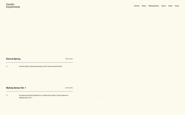
Preview image. Unlock full-res
Warm parchment archive.
Color palette
Supporting palette color for small decorative accents when the core palette needs contrast. Do not promote it to the primary CTA color
Primary page background, content blocks
Hairline borders, dividers, input outlines, and card edges on light surfaces. Do not promote it to the primary CTA color
Primary text, strong headings, active link text, and prominent borders
Secondary headings, emphasizing content without the starkness of pure black
Body text for secondary information, muted links, and descriptive captions
Fine line dividers, subtle borders, and section backgrounds
Specific background for the top navigation header
Typography
- Weights
- 400
- Sizes
- 9px, 11px, 16px
- Line height
- 1, 1.15, 1.64, 1.67
- Fallback
- Source Serif 4
Body copy, navigation links, and descriptive text. Its moderate letter spacing and varied line heights support readability across small and medium text blocks. The 9px size is used for very fine print like dates, 11px for secondary body text, and 16px as the standard long-form body.
- Weights
- 400
- Sizes
- 13px, 17px, 19px
- Line height
- 1.29, 1.3, 1.31, 1.32
- Fallback
- Playfair Display
Headings and prominent titles. The consistent 400 weight across different sizes creates a soft, editorial feel, avoiding the harshness of bold headlines for a more reserved brand voice. The 13px size is used for subheadings, 17px for mid-level story titles, and 19px for primary section titles.
Spacing & shape
Components
Uses Tiempos-Text, 16px, weight 400, color Text Black (#000000). Underlined on hover with a 1px solid Text Black border.
Tiempos-Headline, 19px, weight 400, color Text Black (#000000). Followed by a 1px solid Text Black (#000000) line divider, 16px vertical padding around the text, and additional 14px margin-top.
Tiempos-Text, 11px, weight 400, color Muted Ash (#6a6a6a). Rendered below a thin divider, with 9px vertical padding.
Tiempos-Text, 11px, weight 400, color Text Black (#000000). Underlined with a 1px solid Text Black (#000000) border, right-aligned to content.
Background color Card Ivory (#ffffff) with 0px border-radius and no box-shadow. Content within has 16px padding on all sides. Item titles use Tiempos-Headline, 17px, weight 400, color Text Black (#000000).
Guidelines
- Prioritize the Parchment (#f2efe3) background as the primary canvas for most content sections.
- Use Text Black (#000000) minimally for primary text and significant headings to maintain contrast on the warm background.
- Employ thin 1px solid dividers in Text Black (#000000) to create separation between content blocks, especially for story lists.
- Maintain consistent vertical spacing of 48px between major sections to ensure ample whitespace.
- Apply 16px inner padding to all content blocks and card elements.
- Ensure all interactive text elements use Tiempos-Text, 16px, weight 400, color Text Black (#000000) and are underlined on hover to denote interactivity.
- Prefer the 0px border-radius for all elements, maintaining a sharp, structured aesthetic.
- Avoid using bold or heavy font weights for headlines; use Tiempos-Headline at weight 400 exclusively for titles.
- Do not introduce strong accent colors; leverage the existing desaturated neutrals and subtle brand colors.
- Refrain from using drop shadows or complex elevation effects; visual hierarchy is established through typography, spacing, and subtle background shifts.
- Do not use highly saturated photography or complex illustrations; imagery should align with the muted and editorial aesthetic.
- Avoid tight, compact layouts; maintain comfortable spacing between elements and sections.
- Do not vary color for links unless it’s the default browser blue; all links should be Text Black (#000000) or Muted Ash (#6a6a6a).
- Do not use rounded corners on any UI elements. The design consistently employs sharp, 0px radii.
About this system
ShowHide
Faculty Department establishes a refined editorial aesthetic with a warm, desaturated canvas and minimalist, text-focused layouts. The design emphasizes clear information hierarchy through understated typography and subtle visual separation, using fine hairline borders rather than heavy containers or shadows. The overall impression is one of calm restraint, allowing content to take precedence, supported by a muted background palette and precise typographic detailing.
The page adheres to a maximal-width fluid layout for its main content, with a centered implied column for text. The header is a sticky, full-width top bar. The hero section is characterized by a centered, multi-line headline and descriptive text, followed by an immediate transition into list-based content. Sections are clearly delineated by consistent vertical spacing (48px) and fine hairline borders for content grouping. The primary content presentation uses sequential, stacked information blocks, often with a prominent title, a number, and a descriptive subtitle. A three-column grid is used for 'Selected Stories' or similar feature listings, where each card acts as a contained content unit, prioritizing an image placeholder (though none are currently visible) and text.
The site predominantly uses minimalistic imagery, focusing on photography of objects or abstract concepts when visuals are present. Product images are typically presented in a contained, isolated manner without complex backgrounds or lifestyle context. There are no heavy illustrations or 3D renders. Icons are absent from active UI, contributing to the text-dominant, editorial aesthetic. When imagery is implied in content areas (like the grid cards), it is subtle, suggesting a placeholder for future content rather than a defined asset type.
Reminiscent of A24's editorial journal, Kinfolk Magazine online, Aesop (blog/editorial section), The New York Times (magazine section).
# Faculty Department — Style Reference
> Warm parchment archive.

**Theme:** light

**Site:** https://facultydept.com

Faculty Department establishes a refined editorial aesthetic with a warm, desaturated canvas and minimalist, text-focused layouts. The design emphasizes clear information hierarchy through understated typography and subtle visual separation, using fine hairline borders rather than heavy containers or shadows. The overall impression is one of calm restraint, allowing content to take precedence, supported by a muted background palette and precise typographic detailing.

## Tokens — Colors

| Name | Value | Token | Role |
|------|------|------|------|
| Accent Blue-Gray | `#abb8c3` | `--color-accent-blue-gray` | Supporting palette color for small decorative accents when the core palette needs contrast. Do not promote it to the primary CTA color |
| Parchment | `#f2efe3` | `--color-parchment` | Primary page background, content blocks |
| Card Ivory | `#ffffff` | `--color-card-ivory` | Hairline borders, dividers, input outlines, and card edges on light surfaces. Do not promote it to the primary CTA color |
| Text Black | `#000000` | `--color-text-black` | Primary text, strong headings, active link text, and prominent borders |
| Headline Ink | `#222222` | `--color-headline-ink` | Secondary headings, emphasizing content without the starkness of pure black |
| Muted Ash | `#6a6a6a` | `--color-muted-ash` | Body text for secondary information, muted links, and descriptive captions |
| Divider Clay | `#dad9cd` | `--color-divider-clay` | Fine line dividers, subtle borders, and section backgrounds |
| Header Linen | `#FCF9EE` | `--color-header-linen` | Specific background for the top navigation header |

## Tokens — Typography

### Tiempos-Text
- **Substitute:** Source Serif 4
- **Weights:** 400
- **Sizes:** 9px, 11px, 16px
- **Line height:** 1, 1.15, 1.64, 1.67
- **Role:** Body copy, navigation links, and descriptive text. Its moderate letter spacing and varied line heights support readability across small and medium text blocks. The 9px size is used for very fine print like dates, 11px for secondary body text, and 16px as the standard long-form body.

### Tiempos-Headline
- **Substitute:** Playfair Display
- **Weights:** 400
- **Sizes:** 13px, 17px, 19px
- **Line height:** 1.29, 1.3, 1.31, 1.32
- **Role:** Headings and prominent titles. The consistent 400 weight across different sizes creates a soft, editorial feel, avoiding the harshness of bold headlines for a more reserved brand voice. The 13px size is used for subheadings, 17px for mid-level story titles, and 19px for primary section titles.

## Tokens — Type Scale

| Role | Size | Line height | Letter spacing |
|------|------|------|------|
| heading | 19px | 1.31 | — |

## Tokens — Spacing

- **Section gap:** 48px
- **Card padding:** 16px
- **Element gap:** 16px

## Tokens — Radius

- **Default:** 0px

## Layout

The page adheres to a maximal-width fluid layout for its main content, with a centered implied column for text. The header is a sticky, full-width top bar. The hero section is characterized by a centered, multi-line headline and descriptive text, followed by an immediate transition into list-based content. Sections are clearly delineated by consistent vertical spacing (48px) and fine hairline borders for content grouping. The primary content presentation uses sequential, stacked information blocks, often with a prominent title, a number, and a descriptive subtitle. A three-column grid is used for 'Selected Stories' or similar feature listings, where each card acts as a contained content unit, prioritizing an image placeholder (though none are currently visible) and text.

## Imagery

The site predominantly uses minimalistic imagery, focusing on photography of objects or abstract concepts when visuals are present. Product images are typically presented in a contained, isolated manner without complex backgrounds or lifestyle context. There are no heavy illustrations or 3D renders. Icons are absent from active UI, contributing to the text-dominant, editorial aesthetic. When imagery is implied in content areas (like the grid cards), it is subtle, suggesting a placeholder for future content rather than a defined asset type.

## Components

### Navigation Link
*Top navigation items and inline text links.*

Uses Tiempos-Text, 16px, weight 400, color Text Black (#000000). Underlined on hover with a 1px solid Text Black border.

### Story Item Header
*Title for individual stories or entries.*

Tiempos-Headline, 19px, weight 400, color Text Black (#000000). Followed by a 1px solid Text Black (#000000) line divider, 16px vertical padding around the text, and additional 14px margin-top.

### Story Item Description
*Descriptive text accompanying a story header.*

Tiempos-Text, 11px, weight 400, color Muted Ash (#6a6a6a). Rendered below a thin divider, with 9px vertical padding.

### View More Link
*Call to action for expanding content.*

Tiempos-Text, 11px, weight 400, color Text Black (#000000). Underlined with a 1px solid Text Black (#000000) border, right-aligned to content.

### Grid Item Card
*Containers for image-less content previews in a grid layout.*

Background color Card Ivory (#ffffff) with 0px border-radius and no box-shadow. Content within has 16px padding on all sides. Item titles use Tiempos-Headline, 17px, weight 400, color Text Black (#000000).

## Guidelines

### Do

- Prioritize the Parchment (#f2efe3) background as the primary canvas for most content sections.
- Use Text Black (#000000) minimally for primary text and significant headings to maintain contrast on the warm background.
- Employ thin 1px solid dividers in Text Black (#000000) to create separation between content blocks, especially for story lists.
- Maintain consistent vertical spacing of 48px between major sections to ensure ample whitespace.
- Apply 16px inner padding to all content blocks and card elements.
- Ensure all interactive text elements use Tiempos-Text, 16px, weight 400, color Text Black (#000000) and are underlined on hover to denote interactivity.
- Prefer the 0px border-radius for all elements, maintaining a sharp, structured aesthetic.

### Don't

- Avoid using bold or heavy font weights for headlines; use Tiempos-Headline at weight 400 exclusively for titles.
- Do not introduce strong accent colors; leverage the existing desaturated neutrals and subtle brand colors.
- Refrain from using drop shadows or complex elevation effects; visual hierarchy is established through typography, spacing, and subtle background shifts.
- Do not use highly saturated photography or complex illustrations; imagery should align with the muted and editorial aesthetic.
- Avoid tight, compact layouts; maintain comfortable spacing between elements and sections.
- Do not vary color for links unless it’s the default browser blue; all links should be Text Black (#000000) or Muted Ash (#6a6a6a).
- Do not use rounded corners on any UI elements. The design consistently employs sharp, 0px radii.

## Agent Prompt Guide

Quick Color Reference:
text: #000000
background: #f2efe3
border: #000000
accent: #abb8c3
primary action: no distinct CTA color

Example Component Prompts:
1. Create a header: background Header Linen (#FCF9EE), text Navigation Link (#000000, Tiempos-Text, 16px, weight 400). Content aligned left for logo, right for nav links, 16px padding on left/right.
2. Design a Story Item in a list: Title 'Eternal Spring' (Tiempos-Headline, 19px, weight 400, color Text Black #000000). Number '01' (Tiempos-Text, 16px, weight 400, color Text Black #000000). Description 'Limited edition original paintings by artist Jereme Brian Mendez.' (Tiempos-Text, 11px, weight 400, color Muted Ash #6a6a6a). A 1px solid Text Black (#000000) divider below the items. 16px vertical spacing between title and description.
3. Create a Grid Item Card: background Card Ivory (#ffffff), 0px radius. Inside, place a title 'Esteban del Rio, Professor' (Tiempos-Headline, 17px, weight 400, Text Black #000000) and a subtitle 'SAN DIEGO, CA' (Tiempos-Text, 11px, weight 400, Muted Ash #6a6a6a). Apply 16px padding inside the card.
More like this






Keep what you find
A free account saves references to boards and can send you a weekly email of picks based on what you save.
To see every result, go Pro.