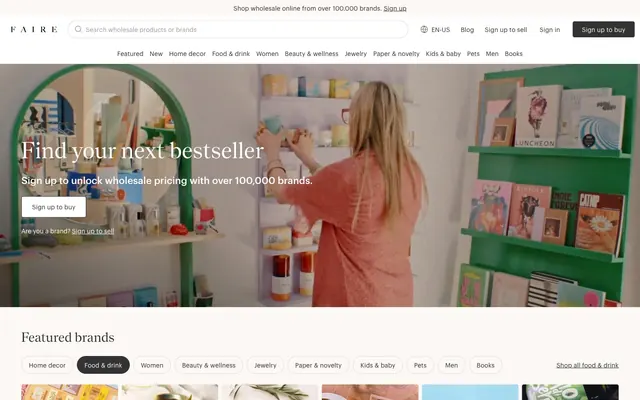
Preview image. Unlock full-res
Warm artisanal marketplace.
Color palette
Decorative highlights, accent text, and elements requiring a distinct, warm emphasis
Page background; a slightly off-white serving as the primary content surface
Elevated surfaces, card backgrounds, and button fills
Primary text, strong borders, and icons
Secondary text, input text, and default button text
Subtle borders, dividers, and ghost button outlines
Muted text, helper text, and less prominent borders
Text color specifically for light-themed toast notifications
Typography
- Weights
- 100, 400
- Sizes
- 14px, 16px, 18px, 22px, 28px, 30px
- Line height
- 1.2, 1.25, 1.27, 1.43, 1.44, 1.45, 1.5
- Letter spacing
- 0.0050em (at 30px), 0.0080em (at 28px), 0.0090em (at 22px), 0.0110em (at 14px); tracking loosens at smaller sizes.
- Fallback
- Inter
Primary sans-serif for body text, general UI elements, and subheadings. Weight 400 maintains approachability throughout the interface.
- Weights
- 400
- Sizes
- 14px, 16px
- Line height
- 1.43, 1.5
- Letter spacing
- 0.0090em (at 16px), 0.0110em (at 14px); slightly wider tracking for functional elements.
- Fallback
- Inter
Used for specific functional text, like input fields and small buttons, ensuring readability.
- Weights
- 400
- Sizes
- 22px, 30px, 38px, 52px
- Line height
- 1.23, 1.27, 1.32, 1.45
- Letter spacing
- normal
- Fallback
- Merriweather
Distinct serif for prominent headlines, adding character and a hint of classic craftsmanship. Letter spacing is neutral, allowing the serif forms to breathe.
Spacing & shape
Components
Text link, color: Ink Black (#000000), no background, no border, no padding. Hover states subtly change color.
backgroundColor=rgba(0, 0, 0, 0), color=Graphite (#333333), borderRadius=0px, no padding. Visually similar to a link but carries button semantics.
backgroundColor=Surface White (#ffffff), color=Graphite (#333333), border: 1px solid Graphite (#333333) or Fog Gray (#dadada), borderRadius=4px, horizontal padding=23-24px, no vertical padding. Minimalist, outlined appearance.
backgroundColor=Ink Black (#000000), color=Surface White (#ffffff), borderRadius=4px, horizontal padding=23-24px, no vertical padding. Provides strong contrast for key actions.
backgroundColor=rgba(0, 0, 0, 0), color=Ink Black (#000000), border: 1px solid Ink Black (#000000), borderRadius=999px (fully rounded), no padding. Emphasizes selection or categorization.
backgroundColor=rgba(0, 0, 0, 0), color=Graphite (#333333), border: 1px solid Ink Black (#000000), borderRadius=999px, padding-left=48px (for icon). Placeholder text in Storm Gray (#6c6a6a).
backgroundColor=Surface White (#ffffff), borderRadius=4px, padding=16px. Features a muted border of Fog Gray (#dadada) or no border based on context. Imagery has 4px radius.
backgroundColor=Surface White (#ffffff), color=Graphite (#333333), border: 1px solid Fog Gray (#dadada), borderRadius=40px, padding: 4px vertical, 7px horizontal. Features a distinct, larger radius than buttons.
Guidelines
- Use Market Yellow (#f1f29f) sparingly for illustrative highlights or soft decorative elements, not for interactive states.
- Apply Graphik weight 400 for all body text and UI labels, ensuring consistent readability across the interface.
- Reserve the nantes typeface exclusively for prominent headlines (22px to 52px), leveraging its distinctive serif character.
- Maintain a default border-radius of 4px for all cards, buttons, and visual containers, providing a subtle softness.
- Utilize Ink Black (#000000) for primary CTAs to create a strong, clear intention, paired with Surface White (#ffffff) text.
- Employ Canvas White (#fbf8f6) as the base page background, providing a subtle, warm off-white canvas.
- Ensure button padding consistently uses horizontal values of 23-24px and no vertical padding, maintaining a compact appearance.
- Do not use Market Yellow (#f1f29f) for actionable elements like buttons or links; it is a decorative accent.
- Avoid using multiple font weights within a single text element; stick to the defined weights for Graphik (100, 400) and nantes (400).
- Do not apply sharp 0px corners to interactive elements; maintain a minimum 4px radius for a consistent, approachable feel.
- Never use full-width sections without horizontal padding; ensure a minimum 48px left and right padding on large screens.
- Avoid using a border on product images unless it serves a specific functional purpose; let the image content stand out clearly.
- Do not apply excessive box-shadows or elevation. The system favors subtle borders and flat surfaces for depth.
- Refrain from using saturated colors other than Market Yellow; the palette is predominantly neutral with functional semantic color sparingly applied.
About this system
ShowHide
Faire presents a warm, artisanal marketplace aesthetic, balancing utility with a handcrafted feel. Predominantly light surfaces provide a clean backdrop for product showcases, punctuated by a soft, moderate yellow that adds a unique brand signature. Typography combines a sturdy sans-serif for functional text with a distinct serif for headlines, creating an approachable yet authoritative voice. Component shapes exhibit soft, approachable corners, reinforcing the friendly marketplace identity.
The page adheres to a max-width contained layout, with content centered. The hero section often features a split layout with text on the left and a prominent visual on the right, or a centered headline over a background image. Sections are vertically stacked with consistent 48px section gaps. Content is typically arranged in alternating left/right text-image blocks or in multi-column card grids, particularly for product displays, maintaining a clean, breathable information hierarchy. A sticky top header with a prominent search bar ensures constant navigation access.
The site heavily relies on high-quality editorial photography, capturing product arrangements or models interacting with products in natural, often studio-like settings. Imagery is contained within cards or banners, rarely full-bleed, and often has a subtle 4px corner radius. The aesthetic is bright and clear, showcasing the product directly or in a relevant lifestyle context without heavy filters or abstract compositions. Icons are simple, outlined, and monochromatic, typically in Ink Black (#000000).
Reminiscent of Etsy, Shopify, Pinterest.
# Faire ES — Style Reference
> Warm artisanal marketplace.

**Theme:** light

**Site:** https://www.faire.com

Faire presents a warm, artisanal marketplace aesthetic, balancing utility with a handcrafted feel. Predominantly light surfaces provide a clean backdrop for product showcases, punctuated by a soft, moderate yellow that adds a unique brand signature. Typography combines a sturdy sans-serif for functional text with a distinct serif for headlines, creating an approachable yet authoritative voice. Component shapes exhibit soft, approachable corners, reinforcing the friendly marketplace identity.

## Tokens — Colors

| Name | Value | Token | Role |
|------|------|------|------|
| Market Yellow | `#f1f29f` | `--color-market-yellow` | Decorative highlights, accent text, and elements requiring a distinct, warm emphasis |
| Canvas White | `#fbf8f6` | `--color-canvas-white` | Page background; a slightly off-white serving as the primary content surface |
| Surface White | `#ffffff` | `--color-surface-white` | Elevated surfaces, card backgrounds, and button fills |
| Ink Black | `#000000` | `--color-ink-black` | Primary text, strong borders, and icons |
| Graphite | `#333333` | `--color-graphite` | Secondary text, input text, and default button text |
| Fog Gray | `#dadada` | `--color-fog-gray` | Subtle borders, dividers, and ghost button outlines |
| Storm Gray | `#6c6a6a` | `--color-storm-gray` | Muted text, helper text, and less prominent borders |
| Toastify Light Text | `#757575` | `--color-toastify-light-text` | Text color specifically for light-themed toast notifications |

## Tokens — Typography

### Graphik
- **Substitute:** Inter
- **Weights:** 100, 400
- **Sizes:** 14px, 16px, 18px, 22px, 28px, 30px
- **Line height:** 1.2, 1.25, 1.27, 1.43, 1.44, 1.45, 1.5
- **Letter spacing:** 0.0050em (at 30px), 0.0080em (at 28px), 0.0090em (at 22px), 0.0110em (at 14px); tracking loosens at smaller sizes.
- **Role:** Primary sans-serif for body text, general UI elements, and subheadings. Weight 400 maintains approachability throughout the interface.

### Graphik_fix
- **Substitute:** Inter
- **Weights:** 400
- **Sizes:** 14px, 16px
- **Line height:** 1.43, 1.5
- **Letter spacing:** 0.0090em (at 16px), 0.0110em (at 14px); slightly wider tracking for functional elements.
- **Role:** Used for specific functional text, like input fields and small buttons, ensuring readability.

### nantes
- **Substitute:** Merriweather
- **Weights:** 400
- **Sizes:** 22px, 30px, 38px, 52px
- **Line height:** 1.23, 1.27, 1.32, 1.45
- **Letter spacing:** normal
- **Role:** Distinct serif for prominent headlines, adding character and a hint of classic craftsmanship. Letter spacing is neutral, allowing the serif forms to breathe.

## Tokens — Type Scale

| Role | Size | Line height | Letter spacing |
|------|------|------|------|
| caption | 14px | 1.43 | — |
| body-sm | 16px | 1.43 | — |
| body | 18px | 1.43 | — |
| body-lg | 22px | 1.43 | — |
| heading-sm | 28px | 1.3 | — |
| heading | 30px | 1.3 | — |

## Tokens — Spacing

- **Section gap:** 48px
- **Card padding:** 16px
- **Element gap:** 16px

## Tokens — Radius

- **Default:** 4px
- **Buttons:** 4px
- **Cards:** 4px
- **search:** 999px
- **tags:** 40px

## Layout

The page adheres to a max-width contained layout, with content centered. The hero section often features a split layout with text on the left and a prominent visual on the right, or a centered headline over a background image. Sections are vertically stacked with consistent 48px section gaps. Content is typically arranged in alternating left/right text-image blocks or in multi-column card grids, particularly for product displays, maintaining a clean, breathable information hierarchy. A sticky top header with a prominent search bar ensures constant navigation access.

## Imagery

The site heavily relies on high-quality editorial photography, capturing product arrangements or models interacting with products in natural, often studio-like settings. Imagery is contained within cards or banners, rarely full-bleed, and often has a subtle 4px corner radius. The aesthetic is bright and clear, showcasing the product directly or in a relevant lifestyle context without heavy filters or abstract compositions. Icons are simple, outlined, and monochromatic, typically in Ink Black (#000000).

## Components

### Navigation Link
*Navigational elements in headers and footers.*

Text link, color: Ink Black (#000000), no background, no border, no padding. Hover states subtly change color.

### Text Button
*Low-prominence actions, often inline or secondary.*

backgroundColor=rgba(0, 0, 0, 0), color=Graphite (#333333), borderRadius=0px, no padding. Visually similar to a link but carries button semantics.

### Default Button
*General purpose buttons.*

backgroundColor=Surface White (#ffffff), color=Graphite (#333333), border: 1px solid Graphite (#333333) or Fog Gray (#dadada), borderRadius=4px, horizontal padding=23-24px, no vertical padding. Minimalist, outlined appearance.

### Primary Action Button
*Prominent calls to action, typically for sign-up or purchase.*

backgroundColor=Ink Black (#000000), color=Surface White (#ffffff), borderRadius=4px, horizontal padding=23-24px, no vertical padding. Provides strong contrast for key actions.

### Pill Button
*Category filters or tags.*

backgroundColor=rgba(0, 0, 0, 0), color=Ink Black (#000000), border: 1px solid Ink Black (#000000), borderRadius=999px (fully rounded), no padding. Emphasizes selection or categorization.

### Search Input Field
*Allows users to search for content.*

backgroundColor=rgba(0, 0, 0, 0), color=Graphite (#333333), border: 1px solid Ink Black (#000000), borderRadius=999px, padding-left=48px (for icon). Placeholder text in Storm Gray (#6c6a6a).

### Product Card
*Displaying product items in grids.*

backgroundColor=Surface White (#ffffff), borderRadius=4px, padding=16px. Features a muted border of Fog Gray (#dadada) or no border based on context. Imagery has 4px radius.

### Category Tag
*Labeling and filtering content categories.*

backgroundColor=Surface White (#ffffff), color=Graphite (#333333), border: 1px solid Fog Gray (#dadada), borderRadius=40px, padding: 4px vertical, 7px horizontal. Features a distinct, larger radius than buttons.

## Guidelines

### Do

- Use Market Yellow (#f1f29f) sparingly for illustrative highlights or soft decorative elements, not for interactive states.
- Apply Graphik weight 400 for all body text and UI labels, ensuring consistent readability across the interface.
- Reserve the nantes typeface exclusively for prominent headlines (22px to 52px), leveraging its distinctive serif character.
- Maintain a default border-radius of 4px for all cards, buttons, and visual containers, providing a subtle softness.
- Utilize Ink Black (#000000) for primary CTAs to create a strong, clear intention, paired with Surface White (#ffffff) text.
- Employ Canvas White (#fbf8f6) as the base page background, providing a subtle, warm off-white canvas.
- Ensure button padding consistently uses horizontal values of 23-24px and no vertical padding, maintaining a compact appearance.

### Don't

- Do not use Market Yellow (#f1f29f) for actionable elements like buttons or links; it is a decorative accent.
- Avoid using multiple font weights within a single text element; stick to the defined weights for Graphik (100, 400) and nantes (400).
- Do not apply sharp 0px corners to interactive elements; maintain a minimum 4px radius for a consistent, approachable feel.
- Never use full-width sections without horizontal padding; ensure a minimum 48px left and right padding on large screens.
- Avoid using a border on product images unless it serves a specific functional purpose; let the image content stand out clearly.
- Do not apply excessive box-shadows or elevation. The system favors subtle borders and flat surfaces for depth.
- Refrain from using saturated colors other than Market Yellow; the palette is predominantly neutral with functional semantic color sparingly applied.

## Agent Prompt Guide

Quick Color Reference:
- text: #333333
- background: #fbf8f6
- border: #dadada
- accent: #f1f29f
- primary action: no distinct CTA color

Example Component Prompts:
- Create a text input for search: backgroundColor=Surface White (#ffffff), color=Graphite (#333333), border: 1px solid Ink Black (#000000), borderRadius=999px. Placeholder text 'Search wholesale products or brands' in Storm Gray (#6c6a6a).
- Build a primary 'Sign up to buy' button: backgroundColor=Ink Black (#000000), color=Surface White (#ffffff), borderRadius=4px, padding: 0px vertical, 23px horizontal. Font: Graphik weight 400, 16px.
- Render a product card: backgroundColor=Surface White (#ffffff), borderRadius=4px, padding=16px. Include an image with 4px radius and a title below it in Graphik weight 400, Ink Black (#000000), 16px.
- Design a category tag: backgroundColor=Surface White (#ffffff), color=Graphite (#333333), border: 1px solid Fog Gray (#dadada), borderRadius=40px, padding: 4px vertical, 7px horizontal. Font: Graphik weight 400, 14px.
More like this









Keep what you find
A free account saves references to boards and can send you a weekly email of picks based on what you save.
To see every result, go Pro.