
Preview image. Unlock full-res
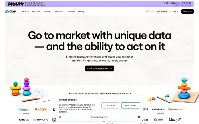
AI-powered clarity on a pristine canvas. Like crisp architecture outlined in electric blue, housing playful, rounded forms.
Color palette
Primary headline and body text, button text on light backgrounds, ensuring strong legibility.
Primary interactive elements, call-to-action buttons, link text, active states – the most prominent brand accent.
Subtle background fill for highlighted elements, providing a slightly warmer blue than Vivid Cobalt.
Calls to action, prominent interactive elements – this gradient enhances the visual energy of primary actions.
Page backgrounds, card surfaces, primary text for dark elements.
Subtle background accents, borders for inactive elements, providing slight visual separation without stark contrast.
Divider lines, inactive borders, subtle container outlines, offering a soft structural guide.
Shadow tints for a soft, lifted effect, creating depth without heavy darkness.
Secondary text, inactive icon fills, navigation links, providing a muted counterpoint to Deep Midnight for less emphasized content.
Background for specific sections, providing a soft blue tint that subtly differs from pure white.
Hero section backgrounds, providing a soft, ethereal backdrop.
Typography
- Weights
- 400, 500, 600, 700
- Sizes
- 12px, 14px, 16px, 18px, 20px, 24px, 34px, 36px, 44px, 60px
- Line height
- 1, 1.11, 1.25, 1.32, 1.33, 1.4, 1.41, 1.43, 1.56, 1.57, 1.6, 1.63
- Letter spacing
- normal
- Fallback
- Inter
The primary typeface for all text. Its unique, custom nature defines the brand's voice. Weight 700 at 60px size for display headings commands attention without being overbearing. Weight 400 at 16px provides clear body copy. The consistent use of a single, custom font across all elements ensures a unified and specific brand identity.
Spacing & shape
Elevation
Components
Text: Thicccboi, 16px, weight 400, #757693. Background: transparent. No border. Padding: 0px. Used for navigation items in the header.
Font: Thicccboi, 60px, weight 700, #181c31. Line height: 1.11. Used for primary introductory text sections.
Font: Thicccboi, 44px, weight 700, #181c31. Line height: 1.25. Used for sub-sections introducing major content blocks.
Font: Thicccboi, 16px, weight 400, #757693. Line height: 1.63. Used for most descriptive text content.
Font: Thicccboi, 16px, weight 400, #ffffff. Background: transparent. Padding: 10px 30px. Border-radius: 9999px. Used on transparent buttons, particularly for login/signup calls where the text color is white.
Border-radius: 12px. Shadow: rgba(32, 36, 138, 0.25) -19px 5px 60px 4px. Used for embedding product screenshots or hero images with a distinct, tinted lift.
Guidelines
- Use Thicccboi font for all text, adhering to specified weights and sizes for a consistent brand voice.
- Apply 9999px border-radius to all interactive buttons and small tags for a friendly, pill-like appearance.
- Utilize 'Hyper Blue Gradient' (linear-gradient(to right, rgb(68, 87, 255), rgb(117, 131, 253))) for all primary call-to-action buttons.
- Employ 'Canvas White' (#ffffff) as the primary page and card background, accentuating content with ample negative space.
- Use 'Deep Midnight' (#181c31) for main headlines and critical text to ensure high contrast and readability.
- Apply Cloud Mist (#e5e7eb) for subtle borders and dividers between content blocks to maintain a light, airy separation.
- Avoid sharp corners; the minimum radius for significant elements should be 12px, preferring 24px for cards and 9999px for buttons.
- Do not introduce strong, saturated colors outside the defined brand blue and violet spectrum.
- Refrain from using heavy, dark shadows; instead, apply the subtle, blue-tinted rgba(32, 36, 138, 0.25) -19px 5px 60px 4px shadow for elevation.
- Do not deviate from the 'Thicccboi' typeface; its custom nature is central to the FeedHive identity.
- Avoid dense, clustered layouts; maintain generous spacing with base unit increments of 4px, especially 16px for internal padding and 20px-24px for element gaps.
- Do not use generic system fonts; only `Thicccboi` with its specific weights adds to the brand's unique character.
About this system
ShowHide
FeedHive projects a clean, approachable, and slightly playful digital aesthetic. The use of a custom "Thicccboi" typeface at varying weights, often bold and large for headlines, gives the content a direct, confident voice. Subtle gradients and rounded elements, particularly the ubiquitous 9999px pill shape, soften the otherwise structured interface. A limited but vibrant palette of blues and violets provides energy against a predominantly white and light gray background, suggesting a modern, user-friendly platform.
The page maintains a centered max-width content area, but with a full-bleed hero section that utilizes a soft blue gradient background. Sections typically feature generous vertical spacing (48-80px). Content is often arranged in a split layout, with text on one side and an image/mockup on the other, or as centered stacks for headlines and CTAs. Feature blocks sometimes use a grid of testimonial cards, each with a rounded container and subtle shadow. The navigation is a sticky top bar with ghost buttons for primary links and a prominent pill-shaped 'Sign up' CTA.
The site uses a combination of product screenshots, often cropped tightly and presented within a UI context. These screenshots are given a slight blue-tinted elevation via box-shadow, presenting the software itself as a central artifact. Abstract, energetic shapes and simple, filled icons are also used decoratively, often incorporating the brand's blue and violet gradients. There are no lifestyle photos; the focus is entirely on the software, its UI, and brand-aligned abstract graphics. Icons are primarily filled, monochrome in the body, but take on brand colors or gradients when serving as major feature indicators.
Reminiscent of Buffer, Loom, Webflow, ClickUp.
# FeedHive — Style Reference
> AI-powered clarity on a pristine canvas. Like crisp architecture outlined in electric blue, housing playful, rounded forms.

**Theme:** light

**Site:** https://feedhive.com

FeedHive projects a clean, approachable, and slightly playful digital aesthetic. The use of a custom "Thicccboi" typeface at varying weights, often bold and large for headlines, gives the content a direct, confident voice. Subtle gradients and rounded elements, particularly the ubiquitous 9999px pill shape, soften the otherwise structured interface. A limited but vibrant palette of blues and violets provides energy against a predominantly white and light gray background, suggesting a modern, user-friendly platform.

## Tokens — Colors

| Name | Value | Token | Role |
|------|------|------|------|
| Deep Midnight | `#181c31` | `--color-deep-midnight` | Primary headline and body text, button text on light backgrounds, ensuring strong legibility. |
| Vivid Cobalt | `#4457ff` | `--color-vivid-cobalt` | Primary interactive elements, call-to-action buttons, link text, active states – the most prominent brand accent. |
| Electric Lavender | `#596aff` | `--color-electric-lavender` | Subtle background fill for highlighted elements, providing a slightly warmer blue than Vivid Cobalt. |
| Hyper Blue Gradient | `#4457ff` | `--color-hyper-blue-gradient` | Calls to action, prominent interactive elements – this gradient enhances the visual energy of primary actions. |
| Canvas White | `#ffffff` | `--color-canvas-white` | Page backgrounds, card surfaces, primary text for dark elements. |
| UI Platinum | `#f3f5ff` | `--color-ui-platinum` | Subtle background accents, borders for inactive elements, providing slight visual separation without stark contrast. |
| Cloud Mist | `#e5e7eb` | `--color-cloud-mist` | Divider lines, inactive borders, subtle container outlines, offering a soft structural guide. |
| Warm Stone | `#c7c8e2` | `--color-warm-stone` | Shadow tints for a soft, lifted effect, creating depth without heavy darkness. |
| Subtle Stone | `#757693` | `--color-subtle-stone` | Secondary text, inactive icon fills, navigation links, providing a muted counterpoint to Deep Midnight for less emphasized content. |
| Cloudy Sky | `#dbeafe` | `--color-cloudy-sky` | Background for specific sections, providing a soft blue tint that subtly differs from pure white. |
| Pale Blue Gradient | `#f8f9ff` | `--color-pale-blue-gradient` | Hero section backgrounds, providing a soft, ethereal backdrop. |

## Tokens — Typography

### Thicccboi
- **Substitute:** Inter
- **Weights:** 400, 500, 600, 700
- **Sizes:** 12px, 14px, 16px, 18px, 20px, 24px, 34px, 36px, 44px, 60px
- **Line height:** 1, 1.11, 1.25, 1.32, 1.33, 1.4, 1.41, 1.43, 1.56, 1.57, 1.6, 1.63
- **Letter spacing:** normal
- **Role:** The primary typeface for all text. Its unique, custom nature defines the brand's voice. Weight 700 at 60px size for display headings commands attention without being overbearing. Weight 400 at 16px provides clear body copy. The consistent use of a single, custom font across all elements ensures a unified and specific brand identity.

## Tokens — Type Scale

Minor Third (1.2) from 16px base.

| Role | Size | Line height | Letter spacing |
|------|------|------|------|
| caption | 12px | 1.57 | — |
| body-sm | 14px | 1.56 | — |
| body | 16px | 1.63 | — |
| subheading | 18px | 1.43 | — |
| heading-sm | 20px | 1.4 | — |
| heading | 24px | 1.33 | — |
| heading-lg | 34px | 1.32 | — |
| heading-xl | 36px | 1.25 | — |
| display | 44px | 1.25 | — |
| display-lg | 60px | 1.11 | — |

## Tokens — Spacing

- **Section gap:** 48-80px
- **Card padding:** 16-24px
- **Element gap:** 4px

## Tokens — Radius

- **Buttons:** 9999px
- **Cards:** 24px
- **Images:** 12px
- **misc:** 24px

## Tokens — Elevation

- **Product Screenshot:** `box-shadow: rgba(32, 36, 138, 0.25) -19px 5px 60px 4px`

## Layout

The page maintains a centered max-width content area, but with a full-bleed hero section that utilizes a soft blue gradient background. Sections typically feature generous vertical spacing (48-80px). Content is often arranged in a split layout, with text on one side and an image/mockup on the other, or as centered stacks for headlines and CTAs. Feature blocks sometimes use a grid of testimonial cards, each with a rounded container and subtle shadow. The navigation is a sticky top bar with ghost buttons for primary links and a prominent pill-shaped 'Sign up' CTA.

## Imagery

The site uses a combination of product screenshots, often cropped tightly and presented within a UI context. These screenshots are given a slight blue-tinted elevation via box-shadow, presenting the software itself as a central artifact. Abstract, energetic shapes and simple, filled icons are also used decoratively, often incorporating the brand's blue and violet gradients. There are no lifestyle photos; the focus is entirely on the software, its UI, and brand-aligned abstract graphics. Icons are primarily filled, monochrome in the body, but take on brand colors or gradients when serving as major feature indicators.

## Components

### CTA Button Group

### Testimonial Card

### Social Proof Rating Strip

### Ghost Navigation Button
*Navigation links*

Text: Thicccboi, 16px, weight 400, #757693. Background: transparent. No border. Padding: 0px. Used for navigation items in the header.

### Main Headline
*Key page titles*

Font: Thicccboi, 60px, weight 700, #181c31. Line height: 1.11. Used for primary introductory text sections.

### Sub-headline
*Section titles*

Font: Thicccboi, 44px, weight 700, #181c31. Line height: 1.25. Used for sub-sections introducing major content blocks.

### Body Text
*Standard paragraph content*

Font: Thicccboi, 16px, weight 400, #757693. Line height: 1.63. Used for most descriptive text content.

### Pill Accent Text
*Highlight text on transparent buttons*

Font: Thicccboi, 16px, weight 400, #ffffff. Background: transparent. Padding: 10px 30px. Border-radius: 9999px. Used on transparent buttons, particularly for login/signup calls where the text color is white.

### Shadowed Image Container
*Product screenshot display*

Border-radius: 12px. Shadow: rgba(32, 36, 138, 0.25) -19px 5px 60px 4px. Used for embedding product screenshots or hero images with a distinct, tinted lift.

## Guidelines

### Do

- Use Thicccboi font for all text, adhering to specified weights and sizes for a consistent brand voice.
- Apply 9999px border-radius to all interactive buttons and small tags for a friendly, pill-like appearance.
- Utilize 'Hyper Blue Gradient' (linear-gradient(to right, rgb(68, 87, 255), rgb(117, 131, 253))) for all primary call-to-action buttons.
- Employ 'Canvas White' (#ffffff) as the primary page and card background, accentuating content with ample negative space.
- Use 'Deep Midnight' (#181c31) for main headlines and critical text to ensure high contrast and readability.
- Apply Cloud Mist (#e5e7eb) for subtle borders and dividers between content blocks to maintain a light, airy separation.

### Don't

- Avoid sharp corners; the minimum radius for significant elements should be 12px, preferring 24px for cards and 9999px for buttons.
- Do not introduce strong, saturated colors outside the defined brand blue and violet spectrum.
- Refrain from using heavy, dark shadows; instead, apply the subtle, blue-tinted rgba(32, 36, 138, 0.25) -19px 5px 60px 4px shadow for elevation.
- Do not deviate from the 'Thicccboi' typeface; its custom nature is central to the FeedHive identity.
- Avoid dense, clustered layouts; maintain generous spacing with base unit increments of 4px, especially 16px for internal padding and 20px-24px for element gaps.
- Do not use generic system fonts; only `Thicccboi` with its specific weights adds to the brand's unique character.

## Agent Prompt Guide

### Quick Color Reference
- Text: #181c31 (Deep Midnight)
- Background: #ffffff (Canvas White)
- CTA Primary: #4457ff (Vivid Cobalt) or Hyper Blue Gradient
- Border/Divider: #e5e7eb (Cloud Mist)
- Secondary Text/Inactive: #757693 (Subtle Stone)

### Example Component Prompts
1. **Create a hero section:** background is Pale Blue Gradient (linear-gradient(to top, rgb(248, 249, 255), rgb(222, 231, 255))). Centered headline 'Create content at scale.' at 60px, Thicccboi weight 700, #181c31. Subtext 'Social media using AI & Automation.' at 34px, Thicccboi weight 700, #181c31. Follow with a Primary Pill Button 'Get started' (Hyper Blue Gradient, #ffffff text, 9999px radius, 10px 30px padding).
2. **Generate a Review Card:** Background #ffffff, border #e5e7eb, 24px border-radius, 20px padding. Inside, include a 5-star rating icon. Review text 'The UI of this app is insane.' at 16px Thicccboi weight 400, #181c31. Author 'Jon W' at 16px Thicccboi weight 600, #181c31. Shadow with rgba(32, 36, 138, 0.25) -19px 5px 60px 4px.
3. **Design a Navigation Link:** Text 'Features' at 16px, Thicccboi weight 400, #757693. Background transparent, no border. Padding 0px. Render as a ghost button in a header, next to a Primary Pill Button 'Sign up'.
4. **Create a section headline:** 'Don't take our word for it. See what our clients say.' at 44px, Thicccboi weight 700, #181c31. Ensure a margin-top of at least 48px from the previous section.
More like this









Keep what you find
A free account saves references to boards and can send you a weekly email of picks based on what you save.
To see every result, go Pro.