Preview image. Unlock full-res
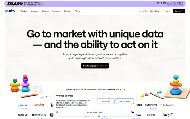
Playful Precision Playground. A brightly lit space filled with meticulously arranged, colorful building blocks.
Color palette
Primary brand accent for interactive elements like links and key call-to-action details
Highlight color for cards, bringing a clear, energetic blue to sections
Energetic accent color for cards and visual elements, signaling warmth and dynamism
Vibrant accent color for cards, indicating freshness and vibrancy
Bright accent color for cards, contributing to a playful and modern feel
Bold accent color for cards, adding a strong, distinctive pop
Core accent color for cards, serving as a primary vibrant blue
Pastel accent often used as a background for special sections or badges
Primary text, button backgrounds, strong accents for contrast
Page backgrounds, card backgrounds, inverse text on dark elements
Subtle background for UI elements like secondary cards or sections
Subtle borders and separators, secondary button borders
Border color for various UI elements, providing a warm, subtle distinction
Typography
- Weights
- 400, 500, 600, 700
- Sizes
- 10px, 11px, 12px, 13px, 14px, 15px, 16px, 18px, 20px, 32px, 44px, 60px, 80px
- Line height
- 1, 1.1, 1.2, 1.4, 1.5, 1.6
- Letter spacing
- -0.0400em, -0.0300em, -0.0200em, -0.0100em, -0.0080em, 0.0900em
- Fallback
- Arial
The primary typeface for all text elements. Its geometric yet friendly character defines the brand's voice, using varying weights and precise letter-spacing to articulate hierarchy and emphasis.
- Weights
- 400
- Sizes
- 13px, 16px, 20px
- Line height
- 1
- Letter spacing
- normal
- Fallback
- system-ui
Used for specific functional elements or icons, providing a clear, unadorned visual style where ligatures might enhance clarity without decorative flourish.
- Weights
- 400
- Sizes
- 16px
- Line height
- 1
- Letter spacing
- normal
- Fallback
- system-ui
A bolder variant of Phosphor, used sparingly for emphasis within functional text or specific icons.
Spacing & shape
Components
Solid black background (#000000), white text (#ffffff), 12px border-radius, 6.4px vertical padding, 12.8px horizontal padding. Delivers clear, high-contrast calls to action.
Transparent background, dark gray text (#222222), no border-radius (0px), no padding. Used for minimal, text-based actions or links that require less visual emphasis.
White background (#ffffff), black text (#000000), 12px border-radius, 8px vertical padding, 16px horizontal padding. Provides a prominent but less assertive alternative to the primary button.
White background (#ffffff), black text (#000000), 1584px (full pill) border-radius, 8px padding. Used for small, contained interactive elements like navigation pills or tags.
Transparent background, 12px border-radius, 20px padding on all sides. Used for informational boxes with subtle definition, no shadow.
Translucent background (rgba(0,0,0,0.11)), 24px border-radius, no padding. Used for overlaying content with a soft, frosted-glass effect.
Guidelines
- Prioritize Roobert for all text, applying specific letter-spacing: -0.0400em for 60px headings and 0.0900em for 10px text, balancing readability and visual density.
- Use Pitch Black (#000000) for primary text and calls to action, ensuring high contrast against light backgrounds like Ghost White (#ffffff) or Cloud Gray (#f9f8f6).
- Employ the 40px border-radius for distinct content blocks like testimonial cards, paired with vibrant accent colors (e.g., #ff7614 Tangerine, #cbd810 Lime Pop).
- Apply Oatmeal (#dad4c8) for subtle borders on UI elements, contributing to a warm, approachable feel without harsh lines.
- Maintain a clear pageMaxWidth of 1200px for main content, using generous section gaps around multiples of 64px to create a spacious layout.
- Utilize Clay Violet (#3859f9) consistently for primary interactive elements, links, and key brand highlights, providing a cohesive brand signature.
- Use 1584px radius for all pill-shaped elements and buttons, reserving the 8px radius for smaller interactive components like nav items.
- Avoid using harsh, sharp corners; instead, adopt the system's rounded radii, with 12px as a default for most interactive elements and 40px for prominent display cards.
- Do not introduce new shadow effects; adhere to the subtle inset button shadow (rgba(0, 0, 0, 0.1) 0px 1px 1px 0px, rgba(0, 0, 0, 0.04) 0px -1px 1px 0px inset, rgba(0, 0, 0, 0.05) 0px -0.5px 1px 0px) for elevation.
- Refrain from using highly saturated colors for large text blocks; reserve them for accents, backgrounds of component-level cards, or illustrations.
- Do not deviate from Roobert's specific letter-spacing values at given sizes; these are crucial for the font's intended visual rhythm and legibility.
- Avoid arbitrary text alignments; maintain left-aligned text for paragraphs and headlines, centered only for specific hero sections or impactful statements.
- Do not introduce body text sizes smaller than 13px or larger than 18px; use the designated type scale for readable content blocks.
About this system
ShowHide
This design system feels like a thoughtfully organized play-space, balancing crisp professional typography with unexpected bursts of vibrant, playful color in testimonial cards and illustrations. The overall tone is light and inviting, grounded by a clean, spacious layout. Subtle border treatments and generous radii on containers soften the digital edge, creating a friendly yet authoritative aesthetic.
The layout is primarily centered and contained within a max-width of 1200px. The hero section features a large, centered headline over a subtle background texture. Subsequent sections often alternate between text-left/image-right or image-left/text-right patterns, with generous vertical spacing (64px section gaps). Features are presented in a multi-column card grid, often with distinctive, playfully colored backgrounds. The navigation is a sticky top bar, emphasizing common links and a log-in/demo. The overall density is spacious, providing ample breathing room between elements and sections.
The site uses a mix of playful, colorful 3D illustrations featuring abstract shapes and objects (like colorful building blocks or pencils) that are often contained or positioned to complement text blocks. There's also the occasional use of product screenshots or UI snippets that are tightly cropped and framed, but the dominant visual language leans heavily into these vibrant, almost toy-like illustrations. Icons are primarily outlined. The imagery serves a decorative atmospheric role, making technical concepts feel more approachable and engaging, while also being explanatory in the product screenshots.
Reminiscent of Airtable, Figma, Notion, Stripe, Linear.
# Clay — Style Reference
> Playful Precision Playground. A brightly lit space filled with meticulously arranged, colorful building blocks.

**Theme:** light

**Site:** https://clay.com

This design system feels like a thoughtfully organized play-space, balancing crisp professional typography with unexpected bursts of vibrant, playful color in testimonial cards and illustrations. The overall tone is light and inviting, grounded by a clean, spacious layout. Subtle border treatments and generous radii on containers soften the digital edge, creating a friendly yet authoritative aesthetic.

## Tokens — Colors

| Name | Value | Token | Role |
|------|------|------|------|
| Clay Violet | `#3859f9` | `--color-clay-violet` | Primary brand accent for interactive elements like links and key call-to-action details |
| Vivid Sky | `#429dff` | `--color-vivid-sky` | Highlight color for cards, bringing a clear, energetic blue to sections |
| Tangerine | `#ff7614` | `--color-tangerine` | Energetic accent color for cards and visual elements, signaling warmth and dynamism |
| Lime Pop | `#cbd810` | `--color-lime-pop` | Vibrant accent color for cards, indicating freshness and vibrancy |
| Azure Glow | `#3bd3fd` | `--color-azure-glow` | Bright accent color for cards, contributing to a playful and modern feel |
| Dragonfruit Pink | `#8b045c` | `--color-dragonfruit-pink` | Bold accent color for cards, adding a strong, distinctive pop |
| Blueberry Deep | `#0667d9` | `--color-blueberry-deep` | Core accent color for cards, serving as a primary vibrant blue |
| Ube Haze | `#c1b0ff` | `--color-ube-haze` | Pastel accent often used as a background for special sections or badges |
| Pitch Black | `#000000` | `--color-pitch-black` | Primary text, button backgrounds, strong accents for contrast |
| Ghost White | `#ffffff` | `--color-ghost-white` | Page backgrounds, card backgrounds, inverse text on dark elements |
| Cloud Gray | `#f9f8f6` | `--color-cloud-gray` | Subtle background for UI elements like secondary cards or sections |
| Platinum Gray | `#e6e8ec` | `--color-platinum-gray` | Subtle borders and separators, secondary button borders |
| Oatmeal | `#dad4c8` | `--color-oatmeal` | Border color for various UI elements, providing a warm, subtle distinction |

## Tokens — Typography

### Roobert
- **Substitute:** Arial
- **Weights:** 400, 500, 600, 700
- **Sizes:** 10px, 11px, 12px, 13px, 14px, 15px, 16px, 18px, 20px, 32px, 44px, 60px, 80px
- **Line height:** 1, 1.1, 1.2, 1.4, 1.5, 1.6
- **Letter spacing:** -0.0400em, -0.0300em, -0.0200em, -0.0100em, -0.0080em, 0.0900em
- **Role:** The primary typeface for all text elements. Its geometric yet friendly character defines the brand's voice, using varying weights and precise letter-spacing to articulate hierarchy and emphasis.

### Phosphor
- **Substitute:** system-ui
- **Weights:** 400
- **Sizes:** 13px, 16px, 20px
- **Line height:** 1
- **Letter spacing:** normal
- **Role:** Used for specific functional elements or icons, providing a clear, unadorned visual style where ligatures might enhance clarity without decorative flourish.

### Phosphor-Bold
- **Substitute:** system-ui
- **Weights:** 400
- **Sizes:** 16px
- **Line height:** 1
- **Letter spacing:** normal
- **Role:** A bolder variant of Phosphor, used sparingly for emphasis within functional text or specific icons.

## Tokens — Type Scale

Perfect Fourth (1.333) from 16px base.

| Role | Size | Line height | Letter spacing |
|------|------|------|------|
| caption | 10px | 1.4 | 0.9px |
| body | 16px | 1.6 | — |
| subheading | 18px | 1.5 | — |
| heading-sm | 20px | 1.5 | — |
| heading | 32px | 1.2 | -0.48px |
| heading-lg | 44px | 1.1 | -0.88px |
| display | 60px | 1 | -2.4px |

## Tokens — Spacing

- **Max width:** 1200px
- **Section gap:** 64px
- **Card padding:** 20px
- **Element gap:** 8px

## Tokens — Radius

- **Buttons:** 12px
- **Cards:** 12px
- **interactiveElements:** 8px
- **largeCards:** 40px
- **pill:** 1584px

## Layout

The layout is primarily centered and contained within a max-width of 1200px. The hero section features a large, centered headline over a subtle background texture. Subsequent sections often alternate between text-left/image-right or image-left/text-right patterns, with generous vertical spacing (64px section gaps). Features are presented in a multi-column card grid, often with distinctive, playfully colored backgrounds. The navigation is a sticky top bar, emphasizing common links and a log-in/demo. The overall density is spacious, providing ample breathing room between elements and sections.

## Imagery

The site uses a mix of playful, colorful 3D illustrations featuring abstract shapes and objects (like colorful building blocks or pencils) that are often contained or positioned to complement text blocks. There's also the occasional use of product screenshots or UI snippets that are tightly cropped and framed, but the dominant visual language leans heavily into these vibrant, almost toy-like illustrations. Icons are primarily outlined. The imagery serves a decorative atmospheric role, making technical concepts feel more approachable and engaging, while also being explanatory in the product screenshots.

## Components

### CTA Button Group

### Feature Bullet Card with Stat

### Testimonial Cards

### Primary Action Button
*Button*

Solid black background (#000000), white text (#ffffff), 12px border-radius, 6.4px vertical padding, 12.8px horizontal padding. Delivers clear, high-contrast calls to action.

### Secondary Outline Button
*Button*

Transparent background, dark gray text (#222222), no border-radius (0px), no padding. Used for minimal, text-based actions or links that require less visual emphasis.

### Ghost Button
*Button*

White background (#ffffff), black text (#000000), 12px border-radius, 8px vertical padding, 16px horizontal padding. Provides a prominent but less assertive alternative to the primary button.

### Pill Button
*Button*

White background (#ffffff), black text (#000000), 1584px (full pill) border-radius, 8px padding. Used for small, contained interactive elements like navigation pills or tags.

### Hero Section Card
*Card*

Transparent background, 12px border-radius, 20px padding on all sides. Used for informational boxes with subtle definition, no shadow.

### Modal Overlay Card
*Card*

Translucent background (rgba(0,0,0,0.11)), 24px border-radius, no padding. Used for overlaying content with a soft, frosted-glass effect.

## Guidelines

### Do

- Prioritize Roobert for all text, applying specific letter-spacing: -0.0400em for 60px headings and 0.0900em for 10px text, balancing readability and visual density.
- Use Pitch Black (#000000) for primary text and calls to action, ensuring high contrast against light backgrounds like Ghost White (#ffffff) or Cloud Gray (#f9f8f6).
- Employ the 40px border-radius for distinct content blocks like testimonial cards, paired with vibrant accent colors (e.g., #ff7614 Tangerine, #cbd810 Lime Pop).
- Apply Oatmeal (#dad4c8) for subtle borders on UI elements, contributing to a warm, approachable feel without harsh lines.
- Maintain a clear pageMaxWidth of 1200px for main content, using generous section gaps around multiples of 64px to create a spacious layout.
- Utilize Clay Violet (#3859f9) consistently for primary interactive elements, links, and key brand highlights, providing a cohesive brand signature.
- Use 1584px radius for all pill-shaped elements and buttons, reserving the 8px radius for smaller interactive components like nav items.

### Don't

- Avoid using harsh, sharp corners; instead, adopt the system's rounded radii, with 12px as a default for most interactive elements and 40px for prominent display cards.
- Do not introduce new shadow effects; adhere to the subtle inset button shadow (rgba(0, 0, 0, 0.1) 0px 1px 1px 0px, rgba(0, 0, 0, 0.04) 0px -1px 1px 0px inset, rgba(0, 0, 0, 0.05) 0px -0.5px 1px 0px) for elevation.
- Refrain from using highly saturated colors for large text blocks; reserve them for accents, backgrounds of component-level cards, or illustrations.
- Do not deviate from Roobert's specific letter-spacing values at given sizes; these are crucial for the font's intended visual rhythm and legibility.
- Avoid arbitrary text alignments; maintain left-aligned text for paragraphs and headlines, centered only for specific hero sections or impactful statements.
- Do not introduce body text sizes smaller than 13px or larger than 18px; use the designated type scale for readable content blocks.

## Agent Prompt Guide

### Quick Color Reference
- **Text:** #000000 (Pitch Black)
- **Background:** #ffffff (Ghost White)
- **CTA:** #000000 (Pitch Black)
- **Border:** #dad4c8 (Oatmeal)
- **Accent:** #3859f9 (Clay Violet)

### 3-5 Example Component Prompts
1. **Create a Hero Section:** Background Ghost White (#ffffff). Headline (display role) 'Go to market with unique data' text Pitch Black (#000000), font Roobert, weight 700, size 60px, lineHeight 1.0, letterSpacing -2.4px. Subtext (body role) 'Bring AI agents together' text Inkwell (#55534e), font Roobert, weight 400, size 16px, lineHeight 1.6. Primary Action Button: 'Start building for free' background Pitch Black (#000000), text Ghost White (#ffffff), radius 12px, padding 6.4px 12.8px.
2. **Generate a Testimonial Card:** Background Tangerine (#ff7614), border-radius 40px, padding 40px top, 32px sides/bottom. Quote text Pitch Black (#000000), font Roobert, weight 500, size 18px, lineHeight 1.5. Author name Pitch Black (#000000), font Roobert, weight 600, size 16px, lineHeight 1.6.
3. **Design a Navigation Bar:** Background Ghost White (#ffffff), fixed top. Nav links (body-sm role) 'Product', 'Use cases' etc. text Pitch Black (#000000), font Roobert, weight 400, size 13px, lineHeight 1.6. Log in button: Ghost Button variant, text Pitch Black (#000000), background Ghost White (#ffffff), radius 12px, padding 8px 16px. Sign up button: Primary Action Button variant, text Ghost White (#ffffff), background Pitch Black (#000000), radius 12px, padding 6.4px 12.8px.
4. **Create a Cookie Consent Banner:** Background Cloud Gray (#f9f8f6), border-radius 24px, padding 20px. Body text Inkwell (#55534e), font Roobert, weight 400, size 16px, lineHeight 1.6. 'Accept all' button: Ghost Button variant, text Clay Violet (#3859f9), background Ghost White (#ffffff), radius 12px, padding 8.8px 19.2px. 'More choices' button: Ghost Button variant, text Pitch Black (#000000), background Ghost White (#ffffff), radius 12px, padding 8.8px 19.2px.
More like this







Keep what you find
A free account saves references to boards and can send you a weekly email of picks based on what you save.
To see every result, go Pro.