Preview image. Unlock full-res
Playful, energetic pet care
Color palette
Primary branding, navigation backgrounds, hero section backgrounds, primary action button fills, bold headers, and icon accents. Creates a deep, authoritative base
Primary body text, link text, secondary button borders, and accent strokes. Provides warmth and contrast against lighter surfaces
Hero section background, spot illustrations, and decorative elements. Infuses youthful energy and a soft, approachable quality
Highlight text, star ratings, subtle card borders, and secondary accent details. Adds a pop of energetic brightness
Main page background, card backgrounds, icon fills, and primary button text. Provides a clean, bright canvas
Subtle card backgrounds and alternate section backgrounds. Offers a soft, barely-there surface contrast
Muted text, helper text, and subtle borders. Provides a softer contrast than Cedar Brown
Muted body text, descriptive labels, and occasional secondary link styling. Offers lower contrast for less prominent information
Typography
- Weights
- 400, 500, 600
- Sizes
- 14px, 15px, 18px, 24px, 26px, 30px, 36px
- Line height
- 1, 1.1, 1.17, 1.25, 1.4, 1.5, 1.6, 1.64, 1.67
- Letter spacing
- -0.56px at 36px, normal at 14px
- Fallback
- system-ui
Primary san-serif for body text, descriptive labels, secondary headings, and button text. Its legibility and range of weights provide structure for most interface elements.
- Weights
- 400, 500
- Sizes
- 14px, 18px, 30px, 36px, 64px, 83px, 85px, 96px, 133px
- Line height
- 0.72, 1, 1.04, 1.1, 1.18, 1.22, 1.28, 1.4
- Letter spacing
- 0.1em at display sizes, 0.05em at text sizes
- Fallback
- system-ui
High-impact display font for headlines and prominent brand statements. Its wide tracking at larger sizes gives it a distinct, bold presence, contrasting with Larsseit.
- Weights
- 400
- Sizes
- 13px
- Line height
- 1, 1.4
- Letter spacing
- 0.038em
- Fallback
- monospace
Monospaced font used for small, functional text such as labels or detailed information. Its technical feel serves as a subtle counterpoint to the primary fonts.
Spacing & shape
Components
Uses Midnight Ink as background (#161345) with Paper White text (#ffffff). Border radius is 60px with 15px top/bottom padding and 36px left/right padding. Typography is Larsseit, typically weight 400.
Transparent background with Cedar Brown text (#321004) and a 1px Cedar Brown border. Border radius is 60px with 13px top/bottom padding and 20px left/right padding. Typography is Larsseit, weight 400.
Uses Pale Gray background (#f9f9f9) with a 20px border radius. Padding is 40px on all sides and no shadow.
Uses Paper White background (#ffffff) with a 20px border radius. No internal padding or shadow specified for this variant.
Transparent background with Paper White text (#ffffff) and a 1px Paper White bottom border. No border radius. Top/bottom padding is 15px with zero left/right padding. Typography is Athletics, typically weight 400.
Guidelines
- Use Midnight Ink (#161345) for primary filled button backgrounds and key headline sections to establish brand presence.
- Apply 60px border-radius to all interactive buttons and tags for a consistent soft, approachable shape.
- Ensure primary body text and main link colors leverage Cedar Brown (#321004) to maintain warm readability.
- Utilize Athletics font for large display headings (64px and above) with a letter-spacing of 0.1em to achieve impactful, branded statements.
- Incorporate Vivid Pink (#feafbb) as a background for hero sections or prominent visual blocks to introduce energy.
- Maintain an elementGap of 15px between adjacent components to ensure comfortable readability and visual segmentation.
- All cards should use a 20px border-radius.
- Avoid using multiple chromatic colors for primary call-to-action buttons; restrict this role to Midnight Ink (#161345).
- Do not use Monosten for body text or large headlines; reserve it for specific small, technical labels.
- Refrain from sharp corners (0px border-radius) on interactive elements like buttons or cards, which contradicts the brand's soft aesthetic.
- Do not introduce strong shadows or aggressive elevation effects; the design relies on flat, clean surfaces.
- Avoid dense, information-heavy blocks of text; break content into manageable sections using a comfortable 15px element gap for readability.
- Do not use light text on light backgrounds or dark text on dark backgrounds; ensure sufficient contrast with the defined palette (e.g., Paper White on Midnight Ink, Cedar Brown on Paper White).
About this system
ShowHide
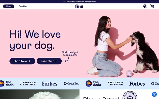
Finn uses a vibrant, playful e-commerce aesthetic with a strong emphasis on brand personality. The design couples a foundational dark blue and brown palette with a vivid pink and orange for accent, creating a cheerful yet trustworthy feel. Typography is structured and clean, ensuring legibility, while rounded forms in buttons and cards add a soft, approachable touch. The overall impression is energetic and customer-friendly, reflecting a modern pet wellness brand.
The page uses a contained layout with some full-bleed hero sections. The main content is centered within a maximum width. The hero pattern prominently features a full-bleed vibrant pink background with a large headline positioned to the left, balanced by lifestyle photography on the right. Sections alternate between full-bleed color blocks (like the pink hero or dark blue testimonial section) and white/pale gray contained sections. Content arrangement frequently uses a split-screen approach with text on one side and a visual on the other, or centered stacks for testimonials and feature descriptions. There's a 3-column grid for product displays. The navigation is a sticky top bar with logo, shop/quiz links, and cart/account icons.
The site prominently features expressive, high-quality photography of dogs, often interacting with people, conveying emotion and connection. Product shots are clean and contained, typically against a white background or within styled compositions. Illustrations are minimal but present, using bold, organic shapes in brand colors (pink, orange). Icons are outlined and consistent in stroke weight. Imagery primarily serves as expressive atmosphere and social proof, with product showcases being clear and focused. The density is image-heavy in hero sections, balancing emotional appeal with functional product display.
Reminiscent of Blinkist, Glossier, Everlane.
# Finn — Style Reference
> Playful, energetic pet care

**Theme:** light

**Site:** https://petfinn.com

Finn uses a vibrant, playful e-commerce aesthetic with a strong emphasis on brand personality. The design couples a foundational dark blue and brown palette with a vivid pink and orange for accent, creating a cheerful yet trustworthy feel. Typography is structured and clean, ensuring legibility, while rounded forms in buttons and cards add a soft, approachable touch. The overall impression is energetic and customer-friendly, reflecting a modern pet wellness brand.

## Tokens — Colors

| Name | Value | Token | Role |
|------|------|------|------|
| Midnight Ink | `#161345` | `--color-midnight-ink` | Primary branding, navigation backgrounds, hero section backgrounds, primary action button fills, bold headers, and icon accents. Creates a deep, authoritative base |
| Cedar Brown | `#321004` | `--color-cedar-brown` | Primary body text, link text, secondary button borders, and accent strokes. Provides warmth and contrast against lighter surfaces |
| Vivid Pink | `#feafbb` | `--color-vivid-pink` | Hero section background, spot illustrations, and decorative elements. Infuses youthful energy and a soft, approachable quality |
| Zesty Orange | `#ff7f00` | `--color-zesty-orange` | Highlight text, star ratings, subtle card borders, and secondary accent details. Adds a pop of energetic brightness |
| Paper White | `#ffffff` | `--color-paper-white` | Main page background, card backgrounds, icon fills, and primary button text. Provides a clean, bright canvas |
| Pale Gray | `#f9f9f9` | `--color-pale-gray` | Subtle card backgrounds and alternate section backgrounds. Offers a soft, barely-there surface contrast |
| Light Heather | `#ebebeb` | `--color-light-heather` | Muted text, helper text, and subtle borders. Provides a softer contrast than Cedar Brown |
| Medium Gray | `#999999` | `--color-medium-gray` | Muted body text, descriptive labels, and occasional secondary link styling. Offers lower contrast for less prominent information |

## Tokens — Typography

### Larsseit
- **Substitute:** system-ui
- **Weights:** 400, 500, 600
- **Sizes:** 14px, 15px, 18px, 24px, 26px, 30px, 36px
- **Line height:** 1, 1.1, 1.17, 1.25, 1.4, 1.5, 1.6, 1.64, 1.67
- **Letter spacing:** -0.56px at 36px, normal at 14px
- **Role:** Primary san-serif for body text, descriptive labels, secondary headings, and button text. Its legibility and range of weights provide structure for most interface elements.

### Athletics
- **Substitute:** system-ui
- **Weights:** 400, 500
- **Sizes:** 14px, 18px, 30px, 36px, 64px, 83px, 85px, 96px, 133px
- **Line height:** 0.72, 1, 1.04, 1.1, 1.18, 1.22, 1.28, 1.4
- **Letter spacing:** 0.1em at display sizes, 0.05em at text sizes
- **Role:** High-impact display font for headlines and prominent brand statements. Its wide tracking at larger sizes gives it a distinct, bold presence, contrasting with Larsseit.

### Monosten
- **Substitute:** monospace
- **Weights:** 400
- **Sizes:** 13px
- **Line height:** 1, 1.4
- **Letter spacing:** 0.038em
- **Role:** Monospaced font used for small, functional text such as labels or detailed information. Its technical feel serves as a subtle counterpoint to the primary fonts.

## Tokens — Type Scale

Augmented Fourth (1.414) from 15px base.

| Role | Size | Line height | Letter spacing |
|------|------|------|------|
| caption | 13px | 1.4 | 0.494px |
| body | 15px | 1.67 | 0.375px |
| subheading | 18px | 1.5 | 0.63px |
| heading | 24px | 1.4 | 0.84px |
| heading-lg | 36px | 1.4 | 0.56px |
| display | 83px | 1.04 | 8.3px |

## Tokens — Spacing

- **Max width:** 1200px
- **Section gap:** 40px
- **Card padding:** 15px
- **Element gap:** 15px

## Tokens — Radius

- **Buttons:** 60px
- **Cards:** 20px
- **pill:** 50px

## Layout

The page uses a contained layout with some full-bleed hero sections. The main content is centered within a maximum width. The hero pattern prominently features a full-bleed vibrant pink background with a large headline positioned to the left, balanced by lifestyle photography on the right. Sections alternate between full-bleed color blocks (like the pink hero or dark blue testimonial section) and white/pale gray contained sections. Content arrangement frequently uses a split-screen approach with text on one side and a visual on the other, or centered stacks for testimonials and feature descriptions. There's a 3-column grid for product displays. The navigation is a sticky top bar with logo, shop/quiz links, and cart/account icons.

## Imagery

The site prominently features expressive, high-quality photography of dogs, often interacting with people, conveying emotion and connection. Product shots are clean and contained, typically against a white background or within styled compositions. Illustrations are minimal but present, using bold, organic shapes in brand colors (pink, orange). Icons are outlined and consistent in stroke weight. Imagery primarily serves as expressive atmosphere and social proof, with product showcases being clear and focused. The density is image-heavy in hero sections, balancing emotional appeal with functional product display.

## Components

### Primary Filled Button
*Call to action for key actions.*

Uses Midnight Ink as background (#161345) with Paper White text (#ffffff). Border radius is 60px with 15px top/bottom padding and 36px left/right padding. Typography is Larsseit, typically weight 400.

### Outlined Button
*Secondary actions that need less prominence.*

Transparent background with Cedar Brown text (#321004) and a 1px Cedar Brown border. Border radius is 60px with 13px top/bottom padding and 20px left/right padding. Typography is Larsseit, weight 400.

### Card, Pale Gray
*Container for product listings or feature blocks.*

Uses Pale Gray background (#f9f9f9) with a 20px border radius. Padding is 40px on all sides and no shadow.

### Card, Paper White
*General content container, often within a Pale Gray section.*

Uses Paper White background (#ffffff) with a 20px border radius. No internal padding or shadow specified for this variant.

### Text Input
*Form fields for user input.*

Transparent background with Paper White text (#ffffff) and a 1px Paper White bottom border. No border radius. Top/bottom padding is 15px with zero left/right padding. Typography is Athletics, typically weight 400.

## Guidelines

### Do

- Use Midnight Ink (#161345) for primary filled button backgrounds and key headline sections to establish brand presence.
- Apply 60px border-radius to all interactive buttons and tags for a consistent soft, approachable shape.
- Ensure primary body text and main link colors leverage Cedar Brown (#321004) to maintain warm readability.
- Utilize Athletics font for large display headings (64px and above) with a letter-spacing of 0.1em to achieve impactful, branded statements.
- Incorporate Vivid Pink (#feafbb) as a background for hero sections or prominent visual blocks to introduce energy.
- Maintain an elementGap of 15px between adjacent components to ensure comfortable readability and visual segmentation.
- All cards should use a 20px border-radius.

### Don't

- Avoid using multiple chromatic colors for primary call-to-action buttons; restrict this role to Midnight Ink (#161345).
- Do not use Monosten for body text or large headlines; reserve it for specific small, technical labels.
- Refrain from sharp corners (0px border-radius) on interactive elements like buttons or cards, which contradicts the brand's soft aesthetic.
- Do not introduce strong shadows or aggressive elevation effects; the design relies on flat, clean surfaces.
- Avoid dense, information-heavy blocks of text; break content into manageable sections using a comfortable 15px element gap for readability.
- Do not use light text on light backgrounds or dark text on dark backgrounds; ensure sufficient contrast with the defined palette (e.g., Paper White on Midnight Ink, Cedar Brown on Paper White).

## Agent Prompt Guide

Quick Color Reference:
text: #321004
background: #ffffff
border: #ebebeb
accent: #ff7f00
primary action: #161345 (filled action)

Example Component Prompts:
1. Create a Primary Action Button: #161345 background, #ffffff text, 9999px radius, compact pill padding. Use this filled treatment for the main CTA.
2. Design a Card, Pale Gray, with 40px internal padding, containing a product image and Cedar Brown text at 18px Larsseit weight 500, '#321004'.
4. Design an outlined text input field for 'Email Address' in a dark section, using Paper White text and a Paper White bottom border, with Athletics font at 18px.
More like this









Keep what you find
A free account saves references to boards and can send you a weekly email of picks based on what you save.
To see every result, go Pro.