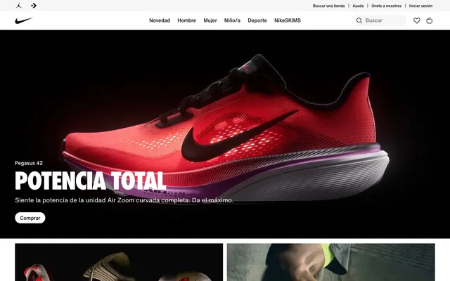
Preview image. Unlock full-res
High-contrast arena with athletic curves.
Color palette
Accent for urgent notifications or strong calls to action (though not prominently used in provided data, implied by token `--podium-cds-color-red-500`).
Accent for highlighting special offers or secondary calls to action (though not prominently used in provided data, implied by token `--podium-cds-color-orange-400`).
Primary text, headings, outlines, icons, primary brand color. Establishes strong contrast and a sense of luxury.
Page backgrounds, card surfaces, primary button background, prominent UI elements. Provides a clean, expansive canvas.
Subtle background for secondary sections and borders. Offers a slight textural shift from pure white.
Background for subtle accents like navigation hovers or specific button states. A very light, almost imperceptible shift from white.
Secondary text, muted links, subtle icons, inactive states. Provides hierarchy without being too light.
Placeholder text, disabled states, decorative strokes. The lightest functional gray.
Typography
- Weights
- 400, 500
- Sizes
- 16px, 20px
- Line height
- 1.5, 1.75
- Letter spacing
- normal
- Fallback
- Arial, Helvetica, sans-serif
Primary text, body copy, navigation links, button labels. Weight 500 signals medium emphasis for navigation and smaller headings, while 400 is for general body content. This family is the workhorse of the system, maintaining legibility and a contemporary feel across all textual elements.
- Weights
- 500
- Sizes
- 20px, 24px
- Line height
- 1.2, 1.5
- Letter spacing
- normal
- Fallback
- Arial, Helvetica, sans-serif
Secondary headings and larger button text. Used for smaller display headings, bridging the gap between body text and the largest display font, providing clear hierarchy.
- Weights
- 500
- Sizes
- 76px
- Line height
- 1
- Letter spacing
- normal
- Fallback
- Arial, Helvetica, sans-serif
Hero headlines. This custom geometric sans-serif, with its powerful 76px size, provides a bold, iconic brand statement at grand scale. Its uniqueness drives brand recognition for major statements.
Spacing & shape
Components
Solid white background with Pitch Black (#111111) text and a 1px Pitch Black (#111111) border. The prominent 30px border-radius makes buttons feel distinct and softer than other UI elements. Padding is 6px vertical, 16px horizontal.
Transparent background with Pitch Black (#111111) text. No visible border or padding by default. Used for less prominent actions, blending seamlessly with the background.
White background with Pitch Black (#111111) icon/text. Features a 50% border-radius, creating perfect circles. Used for compact actions like search or favorites in the header.
Transparent background, no border-radius. Features a large image, a Pitch Black (#111111) heading, and Steel Gray (#707072) body copy, with Ghost Buttons for action. No visible border or shadow, relying on imagery for visual separation.
Cloud White (#ffffff) background with a 1px Alloy Gray (#e5e5e5) border. No border-radius. Displays product images and Pitch Black (#111111) product names, used in structured grids.
Guidelines
- Use Pitch Black (#111111) for all primary text, headings, and outlines to maintain high contrast and sophistication.
- Apply Cloud White (#ffffff) as the primary background for all page sections and card surfaces, ensuring visual spaciousness.
- Ensure primary action buttons feature 30px border-radius with 6px vertical and 16px horizontal padding.
- Implement a compact spacing system using 8px as the primary `elementGap` between UI elements.
- Utilize Nike Futura ND (or Arial as substitute) at 76px size and 1.0 lineHeight for all hero headlines to convey brand power.
- Divide content using subtle background shifts to Alloy Gray (#e5e5e5) for secondary sections instead of heavy borders or shadows.
- Avoid using drop shadows or heavy box shadows, as the system relies on background color shifts and borders for depth.
- Do not deviate from the monochrome palette for functional UI elements; save branded colors for marketing accents only.
- Do not use generic system fonts when custom fonts like Helvetica Now Text/Display or Nike Futura ND are specified, as they are crucial for brand identity.
- Disregard the 30px radius for buttons and nav items except for specific utility components like circular buttons.
- Do not introduce large gaps or excessive padding; the design favors a compact, information-dense layout.
- Avoid using multiple bright, saturated colors for primary UI elements; reserve these for specific brand highlights or imagery if necessary.
About this system
ShowHide
Nike.com evokes a sharp, performance-driven aesthetic, grounded in a highly contrasting black-and-white palette. The dominant use of stark black typography against pristine white surfaces creates an immediate sense of clarity and authority, amplified by a compact spacing system that keeps elements close-knit. Key elements like primary buttons and navigation items feature generous 30px radii, introducing a subtle softness that contrasts with the otherwise angular, direct visual language, hinting at the athletic curves of their products.
The layout primarily uses a max-width contained grid for most content, though the hero section often leverages full-bleed imagery. The header is sticky and provides a minimal but clear global navigation. Sections alternate between prominent full-width visual statements (like the hero shoe image) and structured content blocks. Content arrangement frequently uses two-column or four-column card grids for features and product listings. Vertical spacing between logical sections appears consistent, creating a rhythmic flow down the page. The overall density is compact, ensuring visual information is readily available without excessive scrolling.
The visual language is characterized by high-quality product photography, often shot with dramatic lighting against dark, sometimes black, backgrounds for hero sections, and on pristine white or simple colored backgrounds for product listings. When not product-focused, imagery features crisp action shots of athletes. Images are typically contained within rectangular frames with sharp edges or within grid structures, with no noticeable masking or complex overlapping. Icons are monochrome, often Pitch Black (#111111) on white, thin-stroked, and functional.
Reminiscent of Adidas, Apple, lululemon, Under Armour.
# Nike.com — Style Reference
> High-contrast arena with athletic curves.

**Theme:** light

**Site:** https://nike.com

Nike.com evokes a sharp, performance-driven aesthetic, grounded in a highly contrasting black-and-white palette. The dominant use of stark black typography against pristine white surfaces creates an immediate sense of clarity and authority, amplified by a compact spacing system that keeps elements close-knit. Key elements like primary buttons and navigation items feature generous 30px radii, introducing a subtle softness that contrasts with the otherwise angular, direct visual language, hinting at the athletic curves of their products.

## Tokens — Colors

| Name | Value | Token | Role |
|------|------|------|------|
| Ignite Red | `#EE0005` | `--color-ignite-red` | Accent for urgent notifications or strong calls to action (though not prominently used in provided data, implied by token `--podium-cds-color-red-500`). |
| Blaze Orange | `#FF5000` | `--color-blaze-orange` | Accent for highlighting special offers or secondary calls to action (though not prominently used in provided data, implied by token `--podium-cds-color-orange-400`). |
| Pitch Black | `#111111` | `--color-pitch-black` | Primary text, headings, outlines, icons, primary brand color. Establishes strong contrast and a sense of luxury. |
| Cloud White | `#ffffff` | `--color-cloud-white` | Page backgrounds, card surfaces, primary button background, prominent UI elements. Provides a clean, expansive canvas. |
| Alloy Gray | `#e5e5e5` | `--color-alloy-gray` | Subtle background for secondary sections and borders. Offers a slight textural shift from pure white. |
| Feather Gray | `#f5f5f5` | `--color-feather-gray` | Background for subtle accents like navigation hovers or specific button states. A very light, almost imperceptible shift from white. |
| Steel Gray | `#707072` | `--color-steel-gray` | Secondary text, muted links, subtle icons, inactive states. Provides hierarchy without being too light. |
| Pewter Gray | `#9e9ea0` | `--color-pewter-gray` | Placeholder text, disabled states, decorative strokes. The lightest functional gray. |

## Tokens — Typography

### Helvetica Now Text
- **Substitute:** Arial, Helvetica, sans-serif
- **Weights:** 400, 500
- **Sizes:** 16px, 20px
- **Line height:** 1.5, 1.75
- **Letter spacing:** normal
- **Role:** Primary text, body copy, navigation links, button labels. Weight 500 signals medium emphasis for navigation and smaller headings, while 400 is for general body content. This family is the workhorse of the system, maintaining legibility and a contemporary feel across all textual elements.

### Helvetica Now Display
- **Substitute:** Arial, Helvetica, sans-serif
- **Weights:** 500
- **Sizes:** 20px, 24px
- **Line height:** 1.2, 1.5
- **Letter spacing:** normal
- **Role:** Secondary headings and larger button text. Used for smaller display headings, bridging the gap between body text and the largest display font, providing clear hierarchy.

### Nike Futura ND
- **Substitute:** Arial, Helvetica, sans-serif
- **Weights:** 500
- **Sizes:** 76px
- **Line height:** 1
- **Letter spacing:** normal
- **Role:** Hero headlines. This custom geometric sans-serif, with its powerful 76px size, provides a bold, iconic brand statement at grand scale. Its uniqueness drives brand recognition for major statements.

## Tokens — Type Scale

Augmented Fourth (1.414) from 16px base.

| Role | Size | Line height | Letter spacing |
|------|------|------|------|
| caption | 12px | 1.5 | — |
| body-sm | 14px | 1.75 | — |
| body | 16px | 1.75 | — |
| subheading | 20px | 1.5 | — |
| heading | 24px | 1.2 | — |
| display | 76px | 1 | — |

## Tokens — Spacing

- **Section gap:** 48px
- **Card padding:** 0px
- **Element gap:** 8px

## Tokens — Radius

- **Default:** 8px
- **Buttons:** 30px
- **Cards:** 0px
- **navItems:** 30px

## Layout

The layout primarily uses a max-width contained grid for most content, though the hero section often leverages full-bleed imagery. The header is sticky and provides a minimal but clear global navigation. Sections alternate between prominent full-width visual statements (like the hero shoe image) and structured content blocks. Content arrangement frequently uses two-column or four-column card grids for features and product listings. Vertical spacing between logical sections appears consistent, creating a rhythmic flow down the page. The overall density is compact, ensuring visual information is readily available without excessive scrolling.

## Imagery

The visual language is characterized by high-quality product photography, often shot with dramatic lighting against dark, sometimes black, backgrounds for hero sections, and on pristine white or simple colored backgrounds for product listings. When not product-focused, imagery features crisp action shots of athletes. Images are typically contained within rectangular frames with sharp edges or within grid structures, with no noticeable masking or complex overlapping. Icons are monochrome, often Pitch Black (#111111) on white, thin-stroked, and functional.

## Components

### Primary Filled Button
*Call to Action*

Solid white background with Pitch Black (#111111) text and a 1px Pitch Black (#111111) border. The prominent 30px border-radius makes buttons feel distinct and softer than other UI elements. Padding is 6px vertical, 16px horizontal.

### Ghost Button
*Secondary Action*

Transparent background with Pitch Black (#111111) text. No visible border or padding by default. Used for less prominent actions, blending seamlessly with the background.

### Circular Icon Button
*Navigation/Utility*

White background with Pitch Black (#111111) icon/text. Features a 50% border-radius, creating perfect circles. Used for compact actions like search or favorites in the header.

### Feature Card
*Content Display*

Transparent background, no border-radius. Features a large image, a Pitch Black (#111111) heading, and Steel Gray (#707072) body copy, with Ghost Buttons for action. No visible border or shadow, relying on imagery for visual separation.

### Product Tile
*Product Listing*

Cloud White (#ffffff) background with a 1px Alloy Gray (#e5e5e5) border. No border-radius. Displays product images and Pitch Black (#111111) product names, used in structured grids.

## Guidelines

### Do

- Use Pitch Black (#111111) for all primary text, headings, and outlines to maintain high contrast and sophistication.
- Apply Cloud White (#ffffff) as the primary background for all page sections and card surfaces, ensuring visual spaciousness.
- Ensure primary action buttons feature 30px border-radius with 6px vertical and 16px horizontal padding.
- Implement a compact spacing system using 8px as the primary `elementGap` between UI elements.
- Utilize Nike Futura ND (or Arial as substitute) at 76px size and 1.0 lineHeight for all hero headlines to convey brand power.
- Divide content using subtle background shifts to Alloy Gray (#e5e5e5) for secondary sections instead of heavy borders or shadows.

### Don't

- Avoid using drop shadows or heavy box shadows, as the system relies on background color shifts and borders for depth.
- Do not deviate from the monochrome palette for functional UI elements; save branded colors for marketing accents only.
- Do not use generic system fonts when custom fonts like Helvetica Now Text/Display or Nike Futura ND are specified, as they are crucial for brand identity.
- Disregard the 30px radius for buttons and nav items except for specific utility components like circular buttons.
- Do not introduce large gaps or excessive padding; the design favors a compact, information-dense layout.
- Avoid using multiple bright, saturated colors for primary UI elements; reserve these for specific brand highlights or imagery if necessary.

## Agent Prompt Guide

### Quick Color Reference
- Text (Primary): #111111 (Pitch Black)
- Background (Primary): #ffffff (Cloud White)
- Call to Action (Background): #ffffff (Cloud White)
- Call to Action (Text): #111111 (Pitch Black)
- Border (Default): #111111 (Pitch Black)
- Secondary Text: #707072 (Steel Gray)

### 3-5 Example Component Prompts
1. **Create a Hero Section:** Full-width hero section with a centered image. Overlay 'POTENCIA TOTAL' as a `display` heading in Pitch Black (#111111), followed by 'Siente la potencia de la unidad Air Zoom curvada completa. Da el máximo.' as `body` text in Pitch Black (#111111). Below a 'Comprar' (Primary Filled) button: background Cloud White (#ffffff), text Pitch Black (#111111), border Pitch Black (#111111), 30px radius, 6px 16px padding.
2. **Generate a Product Grid Card:** A card with a Cloud White (#ffffff) background, 0px radius, and a 1px Alloy Gray (#e5e5e5) border. Include a product image. Below the image, display 'Nike United' as `body` text weight 500 in Pitch Black (#111111). Follow with 'Creadas por atletas. Diseñadas para destacar.' as `body` text weight 400 in Steel Gray (#707072). Include two Ghost Buttons ('Comprar todo' and 'Comprar para niño/a') with Pitch Black (#111111) text, no background or border.
3. **Design a Global Navigation Item:** Use 'Novedad' as `body` text weight 500 in Pitch Black (#111111). On hover, background should be Feather Gray (#f5f5f5).
4. **Create a Footer Link:** Display 'Zapatillas de running en negro' as `body` text weight 400, color Steel Gray (#707072). There should be no specific background or border, and the component should fit into a list structure with an 8px element gap.
More like this









Keep what you find
A free account saves references to boards and can send you a weekly email of picks based on what you save.
To see every result, go Pro.