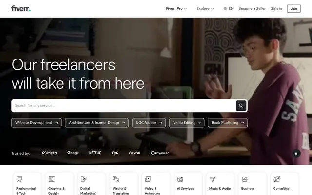
Preview image. Unlock full-res
Green accented workplace
Color palette
Green accent for outlined action borders, linked labels, and lightweight interactive emphasis. Do not promote it to the primary CTA color
Hero section backgrounds, card backgrounds, and prominent dark surface areas; grounds the interface with a rich, deep green. This color provides a strong contrast to white text
Primary text color for headings and body copy on light backgrounds, strong button fills (dark mode-like), and prominent icon strokes; conveys professionalism and high contrast
Page backgrounds, filled button backgrounds, primary card surfaces, and text on dark backgrounds
Secondary text, muted links, placeholder text, and subtle icon fills; softer contrast for less prominent information
Neutral form states, badge text, and quiet UI feedback where color should stay understated. Do not promote it to the primary CTA color
Subtle background shading for sections, dividers, and ghost button borders; light separation and tertiary boundaries
Tertiary text for meta-information or less important labels, and subtle decorative fills; offers slightly softer contrast than Graphite
Ghost button text and icons, subtle navigation elements; provides readability without dominance
Typography
- Weights
- 280, 400, 600, 700
- Sizes
- 10px, 14px, 16px, 18px, 48px, 72px
- Line height
- 1, 1.05, 1.2, 1.5, 1.56, 1.57, 2.4
- Letter spacing
- -0.0600em at 72px, -0.0300em at 48px, normal at 18px and below
- Fallback
- system-ui, sans-serif
The primary typeface for all text content. Its semi-condensed form and varied weights from ultra-light to bold support both impactful headlines and functional body text, maintaining legibility and a modern, efficient character across the interface.
Spacing & shape
Elevation
Components
Text in Cloud White (#ffffff), transparent background, with a 1px Cloud White border and 8px border-radius. Padding is 8px vertical, 16px horizontal. This button has no distinct CTA color but relies on the border for prominence.
Graphite (#222325) text on a transparent background, with a 1px Ash Gray (#dadbdd) border and 8px border-radius. Padding is 8px vertical, 16px horizontal. Focuses on clarity and hierarchy over color.
Slate Gray (#62646a) text, transparent background, no border, 0px border-radius. No padding is explicitly defined from data, suggesting it conforms to surrounding text spacing.
Graphite (#222325) text on a Cloud White (#ffffff) background, with a 1px Cloud White border and 16px border-radius. Padding is 16px vertical, 12px horizontal.
Deep Moss (#003912) background, 16px border-radius, and a soft shadow (rgba(0, 0, 0, 0.13) 0px 3px 10px 0px). Content padding is 25px top, 6px right, 6px bottom, 6px left.
Cloud White (#ffffff) background, Pebble Gray (#c5c6c9) border, and 12px border-radius. Placeholder text in Slate Gray (#62646a). Padding is 10px vertical, 16px left, and 58px right to accommodate an icon.
Fiverr Green (#1dbf73) text or icon, on a transparent background. Implied usage as a label next to 'Trending'.
Guidelines
- Use Graphite (#222325) for primary text on light backgrounds and Cloud White (#ffffff) for primary text on dark backgrounds to ensure high contrast.
- Apply Fiverr Green (#1dbf73) exclusively for interactive elements like links and active states, or for decorative accents, to signal interactability and brand presence.
- Maintain a clear element gap of `12px` for consistent vertical and horizontal rhythm between most UI components.
- Utilize `16px` border-radius for cards and `8px` for buttons to maintain a consistent, slightly softened aesthetic without appearing overly rounded.
- Implement `Macan` typeface with `text-align: left` for body text and `text-align: center` for hero headlines, leveraging its versatility for content hierarchy.
- Apply the card shadow `rgba(0, 0, 0, 0.13) 0px 3px 10px 0px` consistently to cards for a subtle lift off the page.
- Prioritize Cloud White (#ffffff) for main page and card backgrounds to establish a light theme canvas, contrasting with Deep Moss (#003912) for hero sections and feature blocks.
- Do not use Fiverr Green (#1dbf73) as a background for large sections or containers, as its vividness is reserved for accents.
- Avoid using multiple distinct colors for primary call-to-action buttons; stick to the specified outlined white or subtle filled graphite for actions.
- Do not use text weights below 400 for body copy on light backgrounds, as the system favors legibility over excessive lightness.
- Refrain from introducing additional shadow styles; adhere to the defined card shadow for all elevation needs.
- Do not use highly saturated colors for borders or backgrounds of primary UI elements; maintain a neutral base with controlled green accents.
- Avoid using inconsistent spacing values; always refer to the defined `elementGap`, `cardPadding`, and `sectionGap` tokens for predictable layouts.
- Do not alter the `Macan` typeface letter spacing; apply `-0.0600em` only at `72px` and `-0.0300em` at `48px`, keeping normal spacing for smaller text sizes.
About this system
ShowHide
Fiverr.com projects a workaday, accessible design system with a sharp focus on clarity and function. The visual style is rooted in a dominant, slightly desaturated green brand color used for accents and action, set against a predominantly achromatic palette of white, grays, and dark graphite surfaces. Interface elements are compact, utilizing soft curves and minimal elevation to maintain a lightweight feel, emphasizing direct interaction without visual clutter. The overall impression is one of efficiency and straightforward professionalism, guiding users through a clean, task-oriented experience.
The page primarily uses a max-width contained layout, usually centered around `1200px`. The hero section is full-bleed, using a dark background with a prominent, centered headline and search input. Sections alternate between Cloud White (#ffffff) and Ash Gray (#dadbdd) backgrounds, maintaining consistent vertical spacing. Content is arranged in alternating text-left/image-right patterns or centered stacks for feature descriptions. Card grids are prominently used for service categories, typically in a 3-column layout. Navigation is a sticky top bar with branding, primary links, and user actions on the right.
The site uses a mix of real-world photography and abstract product illustrations. Photography is contextual, often showing individuals in work settings or close-up product shots, frequently presented in a desaturated, almost monochromatic style to blend with the neutral palette. Illustrations are flat, dimensional, and often feature the brand's Deep Moss and Fiverr Green, used to represent concepts or services. Icons are filled, with a consistent stroke weight, and follow a mono-color scheme, typically in Graphite or Fiverr Green. Imagery serves both decorative atmosphere in hero sections and explanatory content in feature blocks, maintaining a relatively high density of visuals within defined content areas.
Reminiscent of Upwork, Stripe, Asana, Canva.
# Fiverr.com — Style Reference
> Green accented workplace

**Theme:** light

**Site:** https://www.fiverr.com

Fiverr.com projects a workaday, accessible design system with a sharp focus on clarity and function. The visual style is rooted in a dominant, slightly desaturated green brand color used for accents and action, set against a predominantly achromatic palette of white, grays, and dark graphite surfaces. Interface elements are compact, utilizing soft curves and minimal elevation to maintain a lightweight feel, emphasizing direct interaction without visual clutter. The overall impression is one of efficiency and straightforward professionalism, guiding users through a clean, task-oriented experience.

## Tokens — Colors

| Name | Value | Token | Role |
|------|------|------|------|
| Fiverr Green | `#1dbf73` | `--color-fiverr-green` | Green accent for outlined action borders, linked labels, and lightweight interactive emphasis. Do not promote it to the primary CTA color |
| Deep Moss | `#003912` | `--color-deep-moss` | Hero section backgrounds, card backgrounds, and prominent dark surface areas; grounds the interface with a rich, deep green. This color provides a strong contrast to white text |
| Graphite | `#222325` | `--color-graphite` | Primary text color for headings and body copy on light backgrounds, strong button fills (dark mode-like), and prominent icon strokes; conveys professionalism and high contrast |
| Cloud White | `#ffffff` | `--color-cloud-white` | Page backgrounds, filled button backgrounds, primary card surfaces, and text on dark backgrounds |
| Slate Gray | `#62646a` | `--color-slate-gray` | Secondary text, muted links, placeholder text, and subtle icon fills; softer contrast for less prominent information |
| Pebble Gray | `#c5c6c9` | `--color-pebble-gray` | Neutral form states, badge text, and quiet UI feedback where color should stay understated. Do not promote it to the primary CTA color |
| Ash Gray | `#dadbdd` | `--color-ash-gray` | Subtle background shading for sections, dividers, and ghost button borders; light separation and tertiary boundaries |
| Warm Gray | `#404145` | `--color-warm-gray` | Tertiary text for meta-information or less important labels, and subtle decorative fills; offers slightly softer contrast than Graphite |
| Cool Gray | `#74767e` | `--color-cool-gray` | Ghost button text and icons, subtle navigation elements; provides readability without dominance |

## Tokens — Typography

### Macan
- **Substitute:** system-ui, sans-serif
- **Weights:** 280, 400, 600, 700
- **Sizes:** 10px, 14px, 16px, 18px, 48px, 72px
- **Line height:** 1, 1.05, 1.2, 1.5, 1.56, 1.57, 2.4
- **Letter spacing:** -0.0600em at 72px, -0.0300em at 48px, normal at 18px and below
- **Role:** The primary typeface for all text content. Its semi-condensed form and varied weights from ultra-light to bold support both impactful headlines and functional body text, maintaining legibility and a modern, efficient character across the interface.

## Tokens — Type Scale

Perfect Fifth (1.5) from 16px base.

| Role | Size | Line height | Letter spacing |
|------|------|------|------|
| caption | 10px | 1.5 | — |
| body-sm | 14px | 1.5 | — |
| body | 16px | 1.5 | — |
| subheading | 18px | 1.57 | — |
| heading | 48px | 1.05 | -0.48px |
| display | 72px | 1 | -0.48px |

## Tokens — Spacing

- **Max width:** 1200px
- **Section gap:** 40px
- **Card padding:** 12px
- **Element gap:** 12px

## Tokens — Radius

- **Buttons:** 8px
- **Inputs:** 12px
- **Cards:** 16px
- **navigation:** 4px
- **tags:** 9999px

## Tokens — Elevation

- **Category Card:** `rgba(0, 0, 0, 0.13) 0px 3px 10px 0px`

## Layout

The page primarily uses a max-width contained layout, usually centered around `1200px`. The hero section is full-bleed, using a dark background with a prominent, centered headline and search input. Sections alternate between Cloud White (#ffffff) and Ash Gray (#dadbdd) backgrounds, maintaining consistent vertical spacing. Content is arranged in alternating text-left/image-right patterns or centered stacks for feature descriptions. Card grids are prominently used for service categories, typically in a 3-column layout. Navigation is a sticky top bar with branding, primary links, and user actions on the right.

## Imagery

The site uses a mix of real-world photography and abstract product illustrations. Photography is contextual, often showing individuals in work settings or close-up product shots, frequently presented in a desaturated, almost monochromatic style to blend with the neutral palette. Illustrations are flat, dimensional, and often feature the brand's Deep Moss and Fiverr Green, used to represent concepts or services. Icons are filled, with a consistent stroke weight, and follow a mono-color scheme, typically in Graphite or Fiverr Green. Imagery serves both decorative atmosphere in hero sections and explanatory content in feature blocks, maintaining a relatively high density of visuals within defined content areas.

## Components

### Primary Ghost Button
*Call to action; outlined button against dark backgrounds*

Text in Cloud White (#ffffff), transparent background, with a 1px Cloud White border and 8px border-radius. Padding is 8px vertical, 16px horizontal. This button has no distinct CTA color but relies on the border for prominence.

### Small Filter Button
*Navigation links or categorical filters within sub-sections.*

Graphite (#222325) text on a transparent background, with a 1px Ash Gray (#dadbdd) border and 8px border-radius. Padding is 8px vertical, 16px horizontal. Focuses on clarity and hierarchy over color.

### Text Only Button
*Minimal interactive elements or navigation links that primarily use text.*

Slate Gray (#62646a) text, transparent background, no border, 0px border-radius. No padding is explicitly defined from data, suggesting it conforms to surrounding text spacing.

### White Filled Button
*General action button on light backgrounds.*

Graphite (#222325) text on a Cloud White (#ffffff) background, with a 1px Cloud White border and 16px border-radius. Padding is 16px vertical, 12px horizontal.

### Category Card
*Displays service categories with an associated image and text.*

Deep Moss (#003912) background, 16px border-radius, and a soft shadow (rgba(0, 0, 0, 0.13) 0px 3px 10px 0px). Content padding is 25px top, 6px right, 6px bottom, 6px left.

### Search Input Field
*Global site search or form inputs.*

Cloud White (#ffffff) background, Pebble Gray (#c5c6c9) border, and 12px border-radius. Placeholder text in Slate Gray (#62646a). Padding is 10px vertical, 16px left, and 58px right to accommodate an icon.

### Trending Tag
*Highlights trending topics or services.*

Fiverr Green (#1dbf73) text or icon, on a transparent background. Implied usage as a label next to 'Trending'.

## Guidelines

### Do

- Use Graphite (#222325) for primary text on light backgrounds and Cloud White (#ffffff) for primary text on dark backgrounds to ensure high contrast.
- Apply Fiverr Green (#1dbf73) exclusively for interactive elements like links and active states, or for decorative accents, to signal interactability and brand presence.
- Maintain a clear element gap of `12px` for consistent vertical and horizontal rhythm between most UI components.
- Utilize `16px` border-radius for cards and `8px` for buttons to maintain a consistent, slightly softened aesthetic without appearing overly rounded.
- Implement `Macan` typeface with `text-align: left` for body text and `text-align: center` for hero headlines, leveraging its versatility for content hierarchy.
- Apply the card shadow `rgba(0, 0, 0, 0.13) 0px 3px 10px 0px` consistently to cards for a subtle lift off the page.
- Prioritize Cloud White (#ffffff) for main page and card backgrounds to establish a light theme canvas, contrasting with Deep Moss (#003912) for hero sections and feature blocks.

### Don't

- Do not use Fiverr Green (#1dbf73) as a background for large sections or containers, as its vividness is reserved for accents.
- Avoid using multiple distinct colors for primary call-to-action buttons; stick to the specified outlined white or subtle filled graphite for actions.
- Do not use text weights below 400 for body copy on light backgrounds, as the system favors legibility over excessive lightness.
- Refrain from introducing additional shadow styles; adhere to the defined card shadow for all elevation needs.
- Do not use highly saturated colors for borders or backgrounds of primary UI elements; maintain a neutral base with controlled green accents.
- Avoid using inconsistent spacing values; always refer to the defined `elementGap`, `cardPadding`, and `sectionGap` tokens for predictable layouts.
- Do not alter the `Macan` typeface letter spacing; apply `-0.0600em` only at `72px` and `-0.0300em` at `48px`, keeping normal spacing for smaller text sizes.

## Agent Prompt Guide

### Quick Color Reference
text: #222325
background: #ffffff
border: #dadbdd
accent: #1dbf73
primary action: #222325 (filled action)

### 3-5 Example Component Prompts
1. Create a hero section: Deep Moss background (#003912). Headline 'Our freelancers will take it from here' in Cloud White (#ffffff) at 72px Macan weight 700, letter-spacing -0.48px. Below it, a search input with Cloud White (#ffffff) background, Pebble Gray (#c5c6c9) border, and 12px radius. To the right of the headline, show a ghost button: Cloud White text (#ffffff), transparent background, 1px Cloud White border, 8px radius, 8px vertical 16px horizontal padding.
2. Create a 'Popular services' section: Cloud White (#ffffff) background. Heading 'Popular services' in Graphite (#222325) at 48px Macan weight 700. Below it, a three-column grid of 'Category Card' components. Each card has a Deep Moss (#003912) background, 16px radius, and prominent shadow (rgba(0, 0, 0, 0.13) 0px 3px 10px 0px). Inside each card, 'Website Development' text in Cloud White (#ffffff) at 18px Macan weight 600, with 25px top padding.
3. Create a navigation bar: Cloud White (#ffffff) background. 'Fiverr Pro' text in Graphite (#222325) at 16px Macan weight 600, with a Text Only Button 'Explore' in Slate Gray (#62646a) at 16px Macan weight 400. To the far right, a White Filled Button 'Join' with Graphite text (#222325) and Cloud White background (#ffffff), 16px radius, 16px vertical 12px horizontal padding.
More like this









Keep what you find
A free account saves references to boards and can send you a weekly email of picks based on what you save.
To see every result, go Pro.