Preview image. Unlock full-res
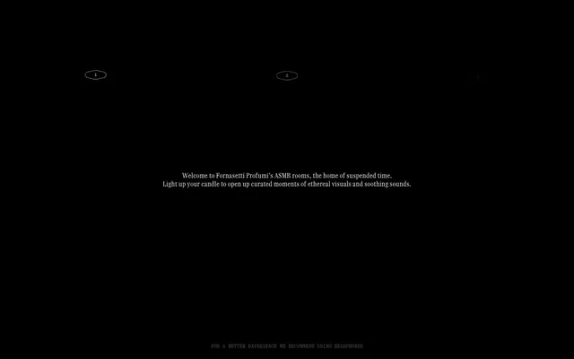
velvet darkness, whispered elegance
Color palette
Page backgrounds, full-bleed sections, ambient darkness
Hairline borders, dividers, input outlines, and card edges on light surfaces. Do not promote it to the primary CTA color
Muted helper text, secondary information, very subtle borders – recedes into the background, providing information without drawing attention
Typography
- Weights
- 400
- Sizes
- 10px, 12px, 16px
- Line height
- 1, 1.3, 1.5
- Letter spacing
- -0.15em
- Fallback
- IBM Plex Mono
Decorative labels, small utility text, captions. The generous letter-spacing makes it airy and subtle, almost a visual texture.
- Weights
- 400
- Sizes
- 10px, 12px, 16px
- Line height
- 1, 1.3, 1.5
- Letter spacing
- -0.15em
- Fallback
- IBM Plex Mono
Body text for descriptions and detail. Maintains legibility while keeping the ethereal, sparse feel.
- Weights
- 400
- Sizes
- 10px, 12px, 16px
- Line height
- 1, 1.3, 1.5
- Letter spacing
- -0.15em
- Fallback
- IBM Plex Mono
Main content headings, interactive element text. The wide letter-spacing is a signature, lending an antique, almost hand-set quality.
- Weights
- 400
- Sizes
- 16px
- Line height
- 1.3
- Letter spacing
- 0.03em
- Fallback
- Playfair Display
Primary headings, elegant titles. Its slight serif and more compact letter-spacing provide a touch of classic sophistication against the monospaced backdrop.
Spacing & shape
Components
A purely outlined circular button with a 0px border-radius, using Antique Ivory (#ffffff) for its border and text. Buttons are visually light, almost transparent, aligning with the ethereal aesthetic. Text uses Quadrant Text Mono at 16px with -0.15em letter-spacing. Padding for these specific circular elements is implicitly driven by their content, not explicit padding tokens in the data. The visual shape is a circle due to internal SVG paths, which acts as the 'button'.
Centered text blocks on the Midnight Canvas (#000000) background. Main headline uses Fornasetti Text 16px with 0.03em letter-spacing, color Antique Ivory (#ffffff). Subtext uses Quadrant Text Mono 16px with -0.15em letter-spacing, color Antique Ivory (#ffffff). Content areas are constrained to a max-width of 900px, creating focused viewing.
Simple text links using Antique Ivory (#ffffff) on the Midnight Canvas (#000000). Uses Quadrant Text Mono 16px, -0.15em letter-spacing. Padded horizontally with 48px to create generous whitespace, serving as discrete navigation items.
Body copy uses Quadrant Text Mono 12px with -0.15em letter-spacing and Antique Ivory (#ffffff) color, creating a readable yet subdued presence. Lines are set with 1.3 line height.
Small, functional text blocks using Shadowed Slate (#4d4d4d) for extreme subtlety against Midnight Canvas (#000000), using Quadrant Text Mono at 10px with -0.15em letter-spacing. Intended to be almost invisible boilerplate.
Guidelines
- Ground all designs in Midnight Canvas (#000000) for backgrounds and primary surfaces.
- Use Antique Ivory (#ffffff) sparingly for primary text and subtle UI outlines to create luminous contrast.
- Employ Quadrant Text Mono (IBM Plex Mono) with -0.15em letter-spacing for the majority of UI text to maintain the ethereal, spaced-out feel.
- Limit interactive elements to pure outlines or text-only, avoiding solid filled backgrounds for buttons unless explicitly necessary.
- Maintain a clear sense of visual spaciousness, especially around interactive elements where 48px horizontal padding is typical.
- Utilize Fornasetti Text (Playfair Display) for key headlines or titles, leveraging its classic serif appearance at 16px 400 weight with 0.03em letter-spacing.
- Ensure all components have a 0px border radius, contributing to a sharp, uncluttered aesthetic.
- Do not introduce highly saturated colors; the palette is strictly achromatic and relies on subtle contrast for visual interest.
- Avoid heavy shadows or gradients; elevation should be achieved through subtle borders or implied depth via content placement.
- Do not use generic sans-serif fonts; the distinct monospaced and serif typefaces are fundamental to the brand's atmosphere.
- Avoid dense, information-heavy layouts; prioritize generous white space and minimal content presentation.
- Do not deviate from the 0px border radius; rounded corners would disrupt the precise, antique quality of the design.
- Do not animate elements with fast, jarring transitions; motion should be smooth and subtle (circa 0.5s ease).
- Do not overload screens with interactive elements; the UI is meant to be sparse and meditative.
About this system
ShowHide
Fornasetti Profumi ASMR creates a deeply immersive, almost reverent atmosphere through its use of a pure black canvas and delicate, antique-inspired typography. The UI is exceptionally sparse, relying on subtle outlined interactive elements and minimal text to guide the user. The aesthetic is one of quiet luxury and focused attention, where UI elements are barely-there whispers rather than prominent features.
The layout is primarily a full-bleed dark canvas with content constrained to a max-width of 900px and centered. The hero section features a centered headline and subtext over the Midnight Canvas. Subsequent sections also follow a centered, single-column content stack, each section appearing to be a distinct 'room' without strong visual dividers between them. The rhythm is slow and deliberate, with a focus on individual content blocks that fade into the dominant darkness. The navigation is minimal and appears as discreet, widely spaced text links or subtle outlined interactive elements.
The site primarily features a lack of overt imagery, creating a stark, UI-dominant experience. When 'imagery' is present, it is represented by conceptual, almost abstract interactive candle elements, consisting of simple white outlines on the black canvas. These outlined 'candles' serve as functional interaction points that reveal content rather than decorative graphics. Icons, if present, are minimal simple outlines. The visual language emphasizes emptiness and suggestion over overt visual content, allowing the focus to remain on the poetic text and implied sensory experience.
Reminiscent of Aēsop, Bang & Olufsen, Le Moniteur des Parfums, The Art of Shaving.
# Fornasetti Profumi ASMR Rooms — Style Reference
> velvet darkness, whispered elegance

**Theme:** dark

**Site:** https://www.fornasettiprofumi.com

Fornasetti Profumi ASMR creates a deeply immersive, almost reverent atmosphere through its use of a pure black canvas and delicate, antique-inspired typography. The UI is exceptionally sparse, relying on subtle outlined interactive elements and minimal text to guide the user. The aesthetic is one of quiet luxury and focused attention, where UI elements are barely-there whispers rather than prominent features.

## Tokens — Colors

| Name | Value | Token | Role |
|------|------|------|------|
| Midnight Canvas | `#000000` | `--color-midnight-canvas` | Page backgrounds, full-bleed sections, ambient darkness |
| Antique Ivory | `#ffffff` | `--color-antique-ivory` | Hairline borders, dividers, input outlines, and card edges on light surfaces. Do not promote it to the primary CTA color |
| Shadowed Slate | `#4d4d4d` | `--color-shadowed-slate` | Muted helper text, secondary information, very subtle borders – recedes into the background, providing information without drawing attention |

## Tokens — Typography

### Quadrant Text Mono
- **Substitute:** IBM Plex Mono
- **Weights:** 400
- **Sizes:** 10px, 12px, 16px
- **Line height:** 1, 1.3, 1.5
- **Letter spacing:** -0.15em
- **Role:** Decorative labels, small utility text, captions. The generous letter-spacing makes it airy and subtle, almost a visual texture.

### Quadrant Text Mono
- **Substitute:** IBM Plex Mono
- **Weights:** 400
- **Sizes:** 10px, 12px, 16px
- **Line height:** 1, 1.3, 1.5
- **Letter spacing:** -0.15em
- **Role:** Body text for descriptions and detail. Maintains legibility while keeping the ethereal, sparse feel.

### Quadrant Text Mono
- **Substitute:** IBM Plex Mono
- **Weights:** 400
- **Sizes:** 10px, 12px, 16px
- **Line height:** 1, 1.3, 1.5
- **Letter spacing:** -0.15em
- **Role:** Main content headings, interactive element text. The wide letter-spacing is a signature, lending an antique, almost hand-set quality.

### Fornasetti Text
- **Substitute:** Playfair Display
- **Weights:** 400
- **Sizes:** 16px
- **Line height:** 1.3
- **Letter spacing:** 0.03em
- **Role:** Primary headings, elegant titles. Its slight serif and more compact letter-spacing provide a touch of classic sophistication against the monospaced backdrop.

## Tokens — Type Scale

Major Third (1.25) from 16px base.

| Role | Size | Line height | Letter spacing |
|------|------|------|------|
| caption | 10px | 1.3 | — |
| body-sm | 12px | 1.3 | — |
| body | 16px | 1.3 | — |

## Tokens — Spacing

- **Max width:** 900px
- **Card padding:** 24px
- **Element gap:** 8px

## Tokens — Radius

- **elements:** 0px

## Layout

The layout is primarily a full-bleed dark canvas with content constrained to a max-width of 900px and centered. The hero section features a centered headline and subtext over the Midnight Canvas. Subsequent sections also follow a centered, single-column content stack, each section appearing to be a distinct 'room' without strong visual dividers between them. The rhythm is slow and deliberate, with a focus on individual content blocks that fade into the dominant darkness. The navigation is minimal and appears as discreet, widely spaced text links or subtle outlined interactive elements.

## Imagery

The site primarily features a lack of overt imagery, creating a stark, UI-dominant experience. When 'imagery' is present, it is represented by conceptual, almost abstract interactive candle elements, consisting of simple white outlines on the black canvas. These outlined 'candles' serve as functional interaction points that reveal content rather than decorative graphics. Icons, if present, are minimal simple outlines. The visual language emphasizes emptiness and suggestion over overt visual content, allowing the focus to remain on the poetic text and implied sensory experience.

## Components

### Ghost Circular Action Button
*Primary interactive elements*

A purely outlined circular button with a 0px border-radius, using Antique Ivory (#ffffff) for its border and text. Buttons are visually light, almost transparent, aligning with the ethereal aesthetic. Text uses Quadrant Text Mono at 16px with -0.15em letter-spacing. Padding for these specific circular elements is implicitly driven by their content, not explicit padding tokens in the data. The visual shape is a circle due to internal SVG paths, which acts as the 'button'.

### Introductory Text Block
*Hero and section introductions*

Centered text blocks on the Midnight Canvas (#000000) background. Main headline uses Fornasetti Text 16px with 0.03em letter-spacing, color Antique Ivory (#ffffff). Subtext uses Quadrant Text Mono 16px with -0.15em letter-spacing, color Antique Ivory (#ffffff). Content areas are constrained to a max-width of 900px, creating focused viewing.

### Navigation Link
*Accessing different 'rooms' or sections*

Simple text links using Antique Ivory (#ffffff) on the Midnight Canvas (#000000). Uses Quadrant Text Mono 16px, -0.15em letter-spacing. Padded horizontally with 48px to create generous whitespace, serving as discrete navigation items.

### Body Copy Text
*Detailed descriptions*

Body copy uses Quadrant Text Mono 12px with -0.15em letter-spacing and Antique Ivory (#ffffff) color, creating a readable yet subdued presence. Lines are set with 1.3 line height.

### Muted Footer Text
*Legal or experience guidance text*

Small, functional text blocks using Shadowed Slate (#4d4d4d) for extreme subtlety against Midnight Canvas (#000000), using Quadrant Text Mono at 10px with -0.15em letter-spacing. Intended to be almost invisible boilerplate.

## Guidelines

### Do

- Ground all designs in Midnight Canvas (#000000) for backgrounds and primary surfaces.
- Use Antique Ivory (#ffffff) sparingly for primary text and subtle UI outlines to create luminous contrast.
- Employ Quadrant Text Mono (IBM Plex Mono) with -0.15em letter-spacing for the majority of UI text to maintain the ethereal, spaced-out feel.
- Limit interactive elements to pure outlines or text-only, avoiding solid filled backgrounds for buttons unless explicitly necessary.
- Maintain a clear sense of visual spaciousness, especially around interactive elements where 48px horizontal padding is typical.
- Utilize Fornasetti Text (Playfair Display) for key headlines or titles, leveraging its classic serif appearance at 16px 400 weight with 0.03em letter-spacing.
- Ensure all components have a 0px border radius, contributing to a sharp, uncluttered aesthetic.

### Don't

- Do not introduce highly saturated colors; the palette is strictly achromatic and relies on subtle contrast for visual interest.
- Avoid heavy shadows or gradients; elevation should be achieved through subtle borders or implied depth via content placement.
- Do not use generic sans-serif fonts; the distinct monospaced and serif typefaces are fundamental to the brand's atmosphere.
- Avoid dense, information-heavy layouts; prioritize generous white space and minimal content presentation.
- Do not deviate from the 0px border radius; rounded corners would disrupt the precise, antique quality of the design.
- Do not animate elements with fast, jarring transitions; motion should be smooth and subtle (circa 0.5s ease).
- Do not overload screens with interactive elements; the UI is meant to be sparse and meditative.

## Agent Prompt Guide

### Quick Color Reference
- text: #ffffff
- background: #000000
- border: #ffffff
- accent: no distinct accent color
- primary action: no distinct CTA color

### 3-5 Example Component Prompts
- Create a hero section: Midnight Canvas (#000000) background. Headline 'Welcome to Fornasetti Profumi's ASMR rooms,' using Fornasetti Text 16px weight 400, Antique Ivory (#ffffff), letter-spacing 0.03em. Body text 'Light up your candle to open up curated moments of ethereal visuals and soothing sounds.' using Quadrant Text Mono 16px weight 400, Antique Ivory (#ffffff), letter-spacing -0.15em. Both texts are centered within a 900px max-width container.
- Create an interactive 'candle' placeholder button: A purely text-based link 'SUL TARDI scented candle' using Quadrant Text Mono 16px weight 400, Antique Ivory (#ffffff), letter-spacing -0.15em. Place it on a Midnight Canvas (#000000) background with 48px horizontal padding, and a subtle circular Antique Ivory (#ffffff) border that acts as the interactive hit area without solid fill.
- Create a muted footer warning: 'FOR A BETTER EXPERIENCE WE RECOMMEND USING HEADPHONES' using Quadrant Text Mono 10px weight 400, Shadowed Slate (#4d4d4d), letter-spacing -0.15em, centered on Midnight Canvas (#000000).
More like this









Keep what you find
A free account saves references to boards and can send you a weekly email of picks based on what you save.
To see every result, go Pro.