Preview image. Unlock full-res
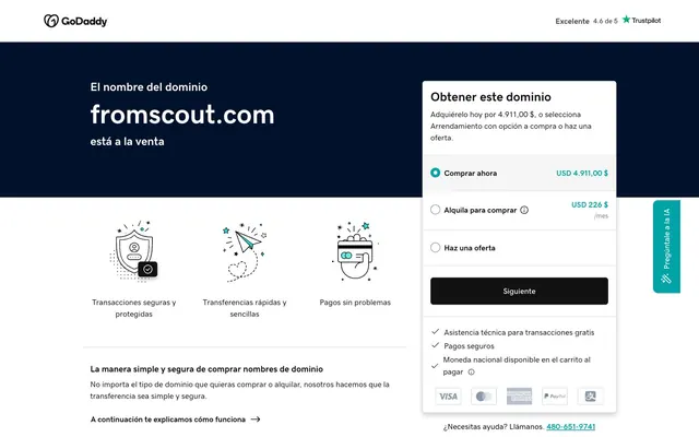
Pragmatic Blue Canvas
Color palette
Primary hero backgrounds, dominant visual anchors — establishes a serious and professional backdrop
Interactive elements like buttons, active states, accent borders, and functional links — provides a clear, actionable focal point
Page backgrounds, card surfaces, interactive backgrounds — creates an open, clean canvas
Primary body text, headings, and most dark-on-light UI elements — ensures high readability
Subtle card borders and dividers — offers visual separation without starkness
Icons and occasional bold accents — used sparingly for maximum impact or intricate detail
Medium-contrast borders, control outlines, and structural separators. Do not promote it to the primary CTA color
Link colors, supporting text — provides a strong contrast while indicating interactivity
Supporting neutral for secondary UI, dividers, and muted labels. Do not promote it to the primary CTA color
Typography
- Weights
- 400, 500, 700
- Sizes
- 11px, 13px, 14px, 16px, 18px, 24px, 26px, 56px
- Line height
- 0.71, 1, 1.22, 1.25, 1.33, 1.38, 1.5, 1.69
- Letter spacing
- normal
- Fallback
- system-ui
The primary typeface for all text content, from headings to body text and buttons. Its versatile weights support clear information hierarchy.
Spacing & shape
Elevation
Components
Transparent background, Charcoal Text (#111111), 6px border-radius, 0px padding. Border defined by text.
Transparent background, Charcoal Text (#111111), 0px border-radius, 8px horizontal padding. Border: Charcoal Text (#111111) only on bottom.
White background (#ffffff), Charcoal Text (#111111), 6px border-radius, 8px vertical and 12px horizontal padding. Border: Silver Mist (#767676) solid.
Charcoal Text (#111111) background, Crisp White (#ffffff) text, 6px border-radius, 16px vertical and 12px horizontal padding. Border: Charcoal Text (#111111) solid.
Activation Teal (#00A4A6) background, Crisp White (#ffffff) text, 10px border-radius, with a subtle Light Shadow (rgb(128,128,128) 0px 0px 1px 0px).
Crisp White (#ffffff) background, 6px border-radius, 16px padding on all sides. Elevated with rgba(0, 0, 0, 0.1) 0px 5px 10px 0px shadow.
Transparent background, Charcoal Text (#111111) placeholder/value, 0px border-radius, 8px padding. Border: Charcoal Text (#111111) on bottom.
Guidelines
- Use Midnight Ink (#00112C) only for large hero sections or prominent headers to create a bold visual anchor.
- Apply Activation Teal (#00A4A6) exclusively to primary calls to action, active states, and small, functional accents like checkboxes or link underlines.
- Maintain a clear visual hierarchy by primarily using Crisp White (#ffffff) for backgrounds and Charcoal Text (#111111) for main text, ensuring high contrast.
- Implement a 6px border-radius for all cards and most buttons to maintain a consistent, slightly softened aesthetic.
- Ensure all interactive elements have sufficient padding: 8px vertical and 12px horizontal as a minimum for small buttons, scaling up for larger elements.
- Use Silver Mist (#767676) for secondary text and borders that need to recede slightly without losing legibility.
- Employ the card shadow (rgba(0, 0, 0, 0.1) 0px 5px 10px 0px) sparingly, only for cards and elevated components to provide subtle depth.
- Do not use Activation Teal (#00A4A6) for large blocks of text or background sections; reserve it for functional accents.
- Avoid using multiple chromatic colors; limit the palette to the primary Activation Teal and neutral shades.
- Do not deviate from the gdsherpa font family for any UI text, as it defines the brand's typographic voice.
- Avoid excessive use of shadows; elevation should be subtle and serve a functional purpose for interactive or distinct components.
- Do not use transparent backgrounds with non-text elements unless it's a ghost button or input field.
- Refrain from using very thin borders for primary interactive elements; use solid borders or filled backgrounds for clarity.
- Do not introduce new border radii values beyond 6px or 10px; adhere strictly to established values for consistency.
About this system
ShowHide
GoDaddy's design system, as observed, features a pragmatic and informative tone. It relies on a high-contrast dark blue (#00112C) for primary display areas contrasting sharply with an expansive white canvas. Text is generally dark and crisp (#111111), punctuated by a single vibrant teal (#00A4A6) that highlights interactive elements and key information without being overly playful. Components are structured, defined by subtle borders and minimal shadow, favoring clarity and directness over decorative flourishes.
The page uses a contained layout model, with content centered within a maximum width that appears to be less than full-bleed for core sections. The hero section, however, uses a full-bleed dark background for visual impact, with centered headlines. Section rhythm is created through distinct content blocks, transitioning from a dark hero to a broad white canvas for feature listings. Content is arranged in alternating text-dominant blocks and icon-based feature grids. Vertical spacing between sections is generous but not excessive, promoting readability. Navigation consists of a simple top bar, with a prominent floating AI button on the right side.
The site uses a sparse, functional iconography style. Icons are primarily outlined or filled with Graphite (#000000), light, and abstract, serving to explain features rather than provide decorative flair. They are simple, geometric, and isolated, enclosed within their own content blocks. There is no use of photography or complex illustrations, emphasizing a clear, information-focused user interface.
Reminiscent of Squarespace, Stripe, Namecheap.
# fromscout.com — Style Reference
> Pragmatic Blue Canvas

**Theme:** light

**Site:** https://www.fromscout.com

GoDaddy's design system, as observed, features a pragmatic and informative tone. It relies on a high-contrast dark blue (#00112C) for primary display areas contrasting sharply with an expansive white canvas. Text is generally dark and crisp (#111111), punctuated by a single vibrant teal (#00A4A6) that highlights interactive elements and key information without being overly playful. Components are structured, defined by subtle borders and minimal shadow, favoring clarity and directness over decorative flourishes.

## Tokens — Colors

| Name | Value | Token | Role |
|------|------|------|------|
| Midnight Ink | `#00112c` | `--color-midnight-ink` | Primary hero backgrounds, dominant visual anchors — establishes a serious and professional backdrop |
| Activation Teal | `#00a4a6` | `--color-activation-teal` | Interactive elements like buttons, active states, accent borders, and functional links — provides a clear, actionable focal point |
| Crisp White | `#ffffff` | `--color-crisp-white` | Page backgrounds, card surfaces, interactive backgrounds — creates an open, clean canvas |
| Charcoal Text | `#111111` | `--color-charcoal-text` | Primary body text, headings, and most dark-on-light UI elements — ensures high readability |
| Sky Gray | `#d4dbe0` | `--color-sky-gray` | Subtle card borders and dividers — offers visual separation without starkness |
| Graphite | `#000000` | `--color-graphite` | Icons and occasional bold accents — used sparingly for maximum impact or intricate detail |
| Silver Mist | `#767676` | `--color-silver-mist` | Medium-contrast borders, control outlines, and structural separators. Do not promote it to the primary CTA color |
| Dark Granite | `#444444` | `--color-dark-granite` | Link colors, supporting text — provides a strong contrast while indicating interactivity |
| Light Shadow | `#808080` | `--color-light-shadow` | Supporting neutral for secondary UI, dividers, and muted labels. Do not promote it to the primary CTA color |

## Tokens — Typography

### gdsherpa
- **Substitute:** system-ui
- **Weights:** 400, 500, 700
- **Sizes:** 11px, 13px, 14px, 16px, 18px, 24px, 26px, 56px
- **Line height:** 0.71, 1, 1.22, 1.25, 1.33, 1.38, 1.5, 1.69
- **Letter spacing:** normal
- **Role:** The primary typeface for all text content, from headings to body text and buttons. Its versatile weights support clear information hierarchy.

## Tokens — Type Scale

Perfect Fifth (1.5) from 11px base.

| Role | Size | Line height | Letter spacing |
|------|------|------|------|
| caption | 11px | 1.5 | — |
| heading-sm | 18px | 1.33 | — |
| heading | 24px | 1 | — |
| heading-lg | 26px | 0.71 | — |
| display | 56px | 0.71 | — |

## Tokens — Spacing

- **Section gap:** 24px
- **Card padding:** 16px
- **Element gap:** 8px

## Tokens — Radius

- **Buttons:** 6px
- **Cards:** 6px
- **tags:** 10px

## Tokens — Elevation

- **Information Card:** `rgba(0, 0, 0, 0.1) 0px 5px 10px 0px, rgba(0, 0, 0, 0.1) 0px 5px 10px 0px`
- **Teal AI Button:** `rgb(128, 128, 128) 0px 0px 1px 0px`

## Layout

The page uses a contained layout model, with content centered within a maximum width that appears to be less than full-bleed for core sections. The hero section, however, uses a full-bleed dark background for visual impact, with centered headlines. Section rhythm is created through distinct content blocks, transitioning from a dark hero to a broad white canvas for feature listings. Content is arranged in alternating text-dominant blocks and icon-based feature grids. Vertical spacing between sections is generous but not excessive, promoting readability. Navigation consists of a simple top bar, with a prominent floating AI button on the right side.

## Imagery

The site uses a sparse, functional iconography style. Icons are primarily outlined or filled with Graphite (#000000), light, and abstract, serving to explain features rather than provide decorative flair. They are simple, geometric, and isolated, enclosed within their own content blocks. There is no use of photography or complex illustrations, emphasizing a clear, information-focused user interface.

## Components

### Ghost Button
*Secondary calls to action or navigational links.*

Transparent background, Charcoal Text (#111111), 6px border-radius, 0px padding. Border defined by text.

### Outline Link Button
*Contextual navigation or subtle calls to action.*

Transparent background, Charcoal Text (#111111), 0px border-radius, 8px horizontal padding. Border: Charcoal Text (#111111) only on bottom.

### Subtle Text Button
*Tertiary actions or interactive text hints.*

White background (#ffffff), Charcoal Text (#111111), 6px border-radius, 8px vertical and 12px horizontal padding. Border: Silver Mist (#767676) solid.

### Primary Filled Button
*Main calls to action.*

Charcoal Text (#111111) background, Crisp White (#ffffff) text, 6px border-radius, 16px vertical and 12px horizontal padding. Border: Charcoal Text (#111111) solid.

### Teal AI Button
*Specialized, highly visible action button for AI integration.*

Activation Teal (#00A4A6) background, Crisp White (#ffffff) text, 10px border-radius, with a subtle Light Shadow (rgb(128,128,128) 0px 0px 1px 0px).

### Information Card
*Grouping of related content, often with interactive elements.*

Crisp White (#ffffff) background, 6px border-radius, 16px padding on all sides. Elevated with rgba(0, 0, 0, 0.1) 0px 5px 10px 0px shadow.

### Text Input
*User input fields.*

Transparent background, Charcoal Text (#111111) placeholder/value, 0px border-radius, 8px padding. Border: Charcoal Text (#111111) on bottom.

## Guidelines

### Do

- Use Midnight Ink (#00112C) only for large hero sections or prominent headers to create a bold visual anchor.
- Apply Activation Teal (#00A4A6) exclusively to primary calls to action, active states, and small, functional accents like checkboxes or link underlines.
- Maintain a clear visual hierarchy by primarily using Crisp White (#ffffff) for backgrounds and Charcoal Text (#111111) for main text, ensuring high contrast.
- Implement a 6px border-radius for all cards and most buttons to maintain a consistent, slightly softened aesthetic.
- Ensure all interactive elements have sufficient padding: 8px vertical and 12px horizontal as a minimum for small buttons, scaling up for larger elements.
- Use Silver Mist (#767676) for secondary text and borders that need to recede slightly without losing legibility.
- Employ the card shadow (rgba(0, 0, 0, 0.1) 0px 5px 10px 0px) sparingly, only for cards and elevated components to provide subtle depth.

### Don't

- Do not use Activation Teal (#00A4A6) for large blocks of text or background sections; reserve it for functional accents.
- Avoid using multiple chromatic colors; limit the palette to the primary Activation Teal and neutral shades.
- Do not deviate from the gdsherpa font family for any UI text, as it defines the brand's typographic voice.
- Avoid excessive use of shadows; elevation should be subtle and serve a functional purpose for interactive or distinct components.
- Do not use transparent backgrounds with non-text elements unless it's a ghost button or input field.
- Refrain from using very thin borders for primary interactive elements; use solid borders or filled backgrounds for clarity.
- Do not introduce new border radii values beyond 6px or 10px; adhere strictly to established values for consistency.

## Agent Prompt Guide

Quick Color Reference:
text: #111111
background: #ffffff
border: #d4dbe0
accent: #00a4a6
primary action: #00a4a6 (filled action)

Example Component Prompts:
Create an Information Card: Crisp White background, 6px radius, 16px padding on all sides, rgba(0, 0, 0, 0.1) 0px 5px 10px 0px shadow. Inside, add a heading at gdsherpa weight 700, 24px, Charcoal Text (#111111) and a paragraph at gdsherpa weight 400, 14px, Charcoal Text (#111111).
Create a Primary Action Button: #00a4a6 background, #000000 text, 9999px radius, compact pill padding. Use this filled treatment for the main CTA.
Create a Teal AI Button: Activation Teal (#00A4A6) background, Crisp White (#ffffff) text, gdsherpa weight 500, 16px, 10px radius, rgb(128, 128, 128) 0px 0px 1px 0px shadow. The button is vertically oriented with text 'Pregúntale a la IA'.
Create a Ghost Button: Transparent background, Charcoal Text (#111111) text, gdsherpa weight 500, 14px, 6px radius, 0px padding. This functions as a link.
Create a Text Input: Transparent background, gdsherpa weight 400, 14px, Charcoal Text (#111111) text/placeholder. Bottom border is 1px solid Charcoal Text (#111111), with 8px padding.
More like this









Keep what you find
A free account saves references to boards and can send you a weekly email of picks based on what you save.
To see every result, go Pro.