Preview image. Unlock full-res
Bright canvas, dark contrast
Color palette
Primary call-to-action fills, active states, accent borders, link text for critical information
Primary text, dark surface backgrounds, button fills for primary actions
Page backgrounds, card surfaces, ghost button text, prominent headings against dark backgrounds
Hairline card borders, subtle dividers
Secondary text, icon fills, strong borders
Link borders, input borders, less prominent button borders
Secondary text, footer links
Typography
- Weights
- 400, 500, 700
- Sizes
- 11px, 13px, 14px, 16px, 18px, 24px, 26px, 56px
- Line height
- 0.71, 1, 1.22, 1.25, 1.33, 1.38, 1.5
- Letter spacing
- normal
- Fallback
- Arial
All text elements including headings, body, buttons, and links. The consistent use of a single custom typeface reinforces brand identity through every textual element.
Spacing & shape
Elevation
Components
Filled with Midnight Ink (#111111), white Canvas White (#ffffff) text, 6px border-radius, 16px vertical padding, 12px horizontal padding. Prominent and directs user flow.
Filled with Action Teal (#00a4a6), white Canvas White (#ffffff) text, 6px border-radius. Found in side panels for interaction.
Transparent background, Midnight Ink (#111111) text, 0px padding, 0px border-radius. Primarily used for inline actions.
Canvas White (#ffffff) background, Midnight Ink (#111111) text, 1px Muted Gray (#767676) border, 6px border-radius, 8px vertical padding, 12px horizontal padding.
Canvas White (#ffffff) background, 6px border-radius, subtle shadow rgba(0, 0, 0, 0.1) 0px 5px 10px 0px, 16px all-around padding. Contains related content and forms.
Transparent background, 1px Midnight Ink (#111111) border at bottom for an underline effect, 8px padding. Uses the gdsherpa font at a functional size.
Guidelines
- Use Midnight Ink (#111111) for primary text and dark backgrounds and Canvas White (#ffffff) for light backgrounds and main surfaces, adhering to robust contrast.
- Apply Action Teal (#00a4a6) exclusively for primary interactive elements, critical links, and distinct accents to guide user attention.
- Standardize on 6px border-radius for cards and buttons to provide a consistent soft-edged feel.
- Maintain a clear visual hierarchy using gdsherpa at various weights and sizes, reserving larger, bolder text for key headlines.
- Structure content with a default element gap of 8px and card padding of 16px for comfortable density and readability.
- Employ the subtle card shadow `rgba(0, 0, 0, 0.1) 0px 5px 10px 0px` for interactive panels to provide a soft lift without heavy elevation.
- Do not introduce new saturated accent colors beyond Action Teal (#00a4a6) to maintain focus and brand consistency.
- Avoid strong, multi-layered shadows; elevation should be subtle, not a dominant visual feature.
- Do not use highly decorative or script fonts; stick to the gdsherpa family for all text to preserve the clean, direct tone.
- Refrain from varying border-radius values excessively; maintain 6px for most interactive elements and cards for visual harmony.
- Do not center-align large blocks of body text; left-alignment is preferred for readability within content sections.
- Avoid full-bleed, uncontained element layouts outside of hero sections; use max-width containers and consistent spacing for content.
About this system
ShowHide
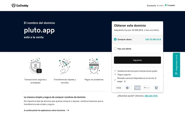
GoDaddy's Pluto.app page uses a direct, functional interface language on a bright canvas. Dark surfaces and robust typography provide clarity, anchored by a single vibrant teal accent for key interactive elements. Content is structured within clear, card-like containers, employing subtle elevation to distinguish interactive panels without heavy ornamentation, prioritizing straightforward information presentation.
Reminiscent of Stripe, Notion, Linear.
# pluto.app — Style Reference
> Bright canvas, dark contrast

**Theme:** light

**Site:** https://www.pluto.app

GoDaddy's Pluto.app page uses a direct, functional interface language on a bright canvas. Dark surfaces and robust typography provide clarity, anchored by a single vibrant teal accent for key interactive elements. Content is structured within clear, card-like containers, employing subtle elevation to distinguish interactive panels without heavy ornamentation, prioritizing straightforward information presentation.

## Tokens — Colors

| Name | Value | Token | Role |
|------|------|------|------|
| Action Teal | `#00a4a6` | `--color-action-teal` | Primary call-to-action fills, active states, accent borders, link text for critical information |
| Midnight Ink | `#111111` | `--color-midnight-ink` | Primary text, dark surface backgrounds, button fills for primary actions |
| Canvas White | `#ffffff` | `--color-canvas-white` | Page backgrounds, card surfaces, ghost button text, prominent headings against dark backgrounds |
| Subtle Gray | `#d4dbe0` | `--color-subtle-gray` | Hairline card borders, subtle dividers |
| Pure Black | `#000000` | `--color-pure-black` | Secondary text, icon fills, strong borders |
| Muted Gray | `#767676` | `--color-muted-gray` | Link borders, input borders, less prominent button borders |
| Deep Gray | `#444444` | `--color-deep-gray` | Secondary text, footer links |

## Tokens — Typography

### gdsherpa
- **Substitute:** Arial
- **Weights:** 400, 500, 700
- **Sizes:** 11px, 13px, 14px, 16px, 18px, 24px, 26px, 56px
- **Line height:** 0.71, 1, 1.22, 1.25, 1.33, 1.38, 1.5
- **Letter spacing:** normal
- **Role:** All text elements including headings, body, buttons, and links. The consistent use of a single custom typeface reinforces brand identity through every textual element.

## Tokens — Type Scale

Perfect Fifth (1.5) from 11px base.

| Role | Size | Line height | Letter spacing |
|------|------|------|------|
| caption | 11px | 1.5 | — |
| heading-sm | 18px | 1.38 | — |
| heading | 24px | 1.25 | — |
| heading-lg | 26px | 1.22 | — |
| display | 56px | 0.71 | — |

## Tokens — Spacing

- **Section gap:** 24px
- **Card padding:** 16px
- **Element gap:** 8px

## Tokens — Radius

- **Buttons:** 6px
- **Cards:** 6px
- **tags:** 10px

## Tokens — Elevation

- **Information Card:** `rgba(0, 0, 0, 0.1) 0px 5px 10px 0px, rgba(0, 0, 0, 0.1) 0px 5px 10px 0px`
- **Teal Call-to-Action Button:** `rgb(128, 128, 128) 0px 0px 1px 0px`

## Components

### Primary Action Button
*Main call-to-action*

Filled with Midnight Ink (#111111), white Canvas White (#ffffff) text, 6px border-radius, 16px vertical padding, 12px horizontal padding. Prominent and directs user flow.

### Teal Call-to-Action Button
*Secondary, accent call-to-action*

Filled with Action Teal (#00a4a6), white Canvas White (#ffffff) text, 6px border-radius. Found in side panels for interaction.

### Ghost Button
*Supportive, low-emphasis action*

Transparent background, Midnight Ink (#111111) text, 0px padding, 0px border-radius. Primarily used for inline actions.

### Outlined Button
*Alternative interaction, explicit selection*

Canvas White (#ffffff) background, Midnight Ink (#111111) text, 1px Muted Gray (#767676) border, 6px border-radius, 8px vertical padding, 12px horizontal padding.

### Information Card
*Content grouping, interactive panel*

Canvas White (#ffffff) background, 6px border-radius, subtle shadow rgba(0, 0, 0, 0.1) 0px 5px 10px 0px, 16px all-around padding. Contains related content and forms.

### Form Input Field
*User data entry*

Transparent background, 1px Midnight Ink (#111111) border at bottom for an underline effect, 8px padding. Uses the gdsherpa font at a functional size.

## Guidelines

### Do

- Use Midnight Ink (#111111) for primary text and dark backgrounds and Canvas White (#ffffff) for light backgrounds and main surfaces, adhering to robust contrast.
- Apply Action Teal (#00a4a6) exclusively for primary interactive elements, critical links, and distinct accents to guide user attention.
- Standardize on 6px border-radius for cards and buttons to provide a consistent soft-edged feel.
- Maintain a clear visual hierarchy using gdsherpa at various weights and sizes, reserving larger, bolder text for key headlines.
- Structure content with a default element gap of 8px and card padding of 16px for comfortable density and readability.
- Employ the subtle card shadow `rgba(0, 0, 0, 0.1) 0px 5px 10px 0px` for interactive panels to provide a soft lift without heavy elevation.

### Don't

- Do not introduce new saturated accent colors beyond Action Teal (#00a4a6) to maintain focus and brand consistency.
- Avoid strong, multi-layered shadows; elevation should be subtle, not a dominant visual feature.
- Do not use highly decorative or script fonts; stick to the gdsherpa family for all text to preserve the clean, direct tone.
- Refrain from varying border-radius values excessively; maintain 6px for most interactive elements and cards for visual harmony.
- Do not center-align large blocks of body text; left-alignment is preferred for readability within content sections.
- Avoid full-bleed, uncontained element layouts outside of hero sections; use max-width containers and consistent spacing for content.

## Agent Prompt Guide

Quick Color Reference:
- text: #111111
- background: #ffffff
- border: #d4dbe0
- accent: #00a4a6
- primary action: #00a4a6 (filled action)

Example Component Prompts:
- Create a hero section: Dark Blue background (#00112c assumed from surrounding elements), centered headline 'pluto.app' in Canvas White (#ffffff) gdsherpa weight 700 at 56px, line-height 0.71. Below, add a 'Siguiente' button: Midnight Ink (#111111) background, Canvas White (#ffffff) text (gdsherpa weight 400), 16px/12px padding, 6px radius.
- Generate a feature card: Canvas White (#ffffff) background, 6px radius, subtle shadow, 16px padding. Title 'Transacciones seguras y protegidas' in Midnight Ink (#111111) gdsherpa weight 500 at 18px. Body text in Pure Black (#000000) gdsherpa weight 400 at 14px.
- Create a teal accent button: Action Teal (#00a4a6) background, Canvas White (#ffffff) text (gdsherpa weight 400). Round ends, 10px radius, with a subtle gray shadow `rgb(128, 128, 128) 0px 0px 1px 0px`.
More like this









Keep what you find
A free account saves references to boards and can send you a weekly email of picks based on what you save.
To see every result, go Pro.