Preview image. Unlock full-res
Calm Financial Clarity
Color palette
Primary action buttons, brand logo, active navigation indicators, link hover states — a grounding, trustworthy color
Decorative icons, light accents on cards, subtle approval indicators
Light background wash for sections, subtle button backgrounds, navigation borders
Background for feature cards, soft decorative panels, creating warmth
Muted secondary headings, financial figures, specific card text — provides a warm earthy contrast
Light button backgrounds, subtle hover states, providing a cool undertone
Light button backgrounds, subtle hover states
Soft section background, alternate surface, and quiet card fill. Do not promote it to the primary CTA color
Primary page background, card backgrounds, all base surfaces
Primary text, prominent headings, and strong borders
Subtle card backgrounds, navigation accents, very light surface differentiation
Secondary text, muted links, descriptive body copy
Typography
- Weights
- 400, 500, 600, 700
- Sizes
- 11px, 12px, 13px, 14px, 15px, 16px, 18px, 19px, 20px, 21px, 23px, 24px, 26px, 38px, 45px, 48px, 49px, 60px, 91px
- Line height
- 1.2
- Letter spacing
- -0.0190em, -0.0100em, -0.0040em
- Fallback
- Inter, Arial, sans-serif
The sole typeface, used across all elements from large display headings to fine print. Its clean, geometric sans-serif form ensures modern readability and consistency. Variable letter-spacing helps optimize legibility across different sizes, from subtle tightening on display sizes to standard tracking for body text. Weight 400 is standard for body, 500 for semi-bold emphasis, and 600/700 for headlines.
Spacing & shape
Elevation
Components
Filled with Deep Fern Green (#0b7443), white text, 12px border radius. Padding: 8px vertical, 20px horizontal. Uses PP Neue Montreal, 400 weight.
Transparent background, Cool Gray (#98a2b3) 1px border. Cool Gray (#98a2b3) text, 12px border radius. Padding: 7.55px vertical, 22.66px horizontal. Uses PP Neue Montreal, 400 weight.
Subtle Ash (#eceff4) background, Rich Black (#000000) text, 12px border radius. Padding: 8px vertical, 20px horizontal. Uses PP Neue Montreal, 400 weight.
Melon Tint (#fee9d1) background, 12px border radius. No visible shadow or additional padding from specific variant data.
Subtle Ash (#eceff4) background, 12px border radius. Padding: 20px vertical, 48px horizontal. No shadow.
Light Peach (#fef0c7) background, 10px border radius. Features a soft, layered shadow: rgba(0, 0, 0, 0.05) 0px 25px 16px 0px, rgba(0, 0, 0, 0.1) 0px 10px 10px 0px, rgba(0, 0, 0, 0.1) 0px 3px 6px 0px.
White text on a transparent background with 80px border radius and a 0.4 opacity white background (#f9fabb, 0.4). Padding: 5.66px in all directions. Uses PP Neue Montreal, 400 weight. (Example: '☀️ Cheerful').
Guidelines
- Prioritize Canvas White (#ffffff) for primary backgrounds to maintain an expansive, clean feel.
- Use Deep Fern Green (#0b7443) exclusively for primary calls to action and critical brand accents.
- Reserve Rich Black (#000000) for all primary text and display headings, ensuring strong contrast.
- Apply 12px border radius for all interactive elements like buttons, cards, and images to ensure visual consistency.
- Maintain a comfortable information density using an 8px base unit, evidenced by frequent element gaps.
- Differentiate content blocks with subtle background tints like Subtle Ash (#eceff4) or Melon Tint (#fee9d1) rather than strong borders.
- Avoid using multiple vivid colors; restrict the palette to the primary green and selected muted accents.
- Do not introduce strong, dark backgrounds unless clearly for a full-bleed hero section, as the theme is predominantly light.
- Do not use sharp corners; a minimum 12px radius should be present on most significant UI elements.
- Refrain from heavy, intense shadows; employ the light, layered shadow of the 'Elevated Marketing Card' for subtle depth only.
- Avoid generic system fonts; PP Neue Montreal is key to the brand's distinct typographic voice.
- Do not use dark text on dark backgrounds; ensure sufficient contrast (at least 7:1 for body text, 4.5:1 for large text) for all text elements.
About this system
ShowHide
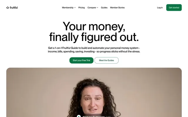
Fruitful projects a calm, approachable financial tech image through a clean white canvas, softened neutrals, and a prominent, vibrant green brand accent. Typography is modern and unembellished, emphasizing clarity and directness. Components are lightweight with generous rounded corners, conveying a friendly and trustworthy feel, while subtle shadows add minimal depth without heaviness. The overall impression is one of ease and quiet confidence in managing personal finance.
The page structure is max-width contained, with content centered. The hero section is full-width with a prominent, centered headline over a white background, followed by a video element with rounded corners. Subsequent sections alternate between white and subtle tinted backgrounds (e.g., Melon Tint, Subtle Ash), creating a rhythmic vertical flow. Content is often arranged in a two-column layout with text on one side and imagery/cards on the other, or in feature grids with a comfortable column count. Navigation is a sticky top bar with a clear primary action button on the right.
Minimal imagery focused primarily on product-related visuals and authentic human portraits. Photography of individuals (guides) is candid, well-lit, and appears within soft-edged card containers, usually with muted background colors like Melon Tint (#fee9d1). Visuals serve to explain services or introduce team members, not for decorative atmosphere. Icons are simple, outlined, and occasionally filled with brand colors like Leafy Green (#61bc76), maintaining a clean UI aesthetic. Visual density is low, making imagery feel deliberate and impactful when present.
Reminiscent of Wealthfront, Betterment, Mint, Stripe.
# Fruitful — Style Reference
> Calm Financial Clarity

**Theme:** light

**Site:** https://fruitful.com

Fruitful projects a calm, approachable financial tech image through a clean white canvas, softened neutrals, and a prominent, vibrant green brand accent. Typography is modern and unembellished, emphasizing clarity and directness. Components are lightweight with generous rounded corners, conveying a friendly and trustworthy feel, while subtle shadows add minimal depth without heaviness. The overall impression is one of ease and quiet confidence in managing personal finance.

## Tokens — Colors

| Name | Value | Token | Role |
|------|------|------|------|
| Deep Fern Green | `#0b7443` | `--color-deep-fern-green` | Primary action buttons, brand logo, active navigation indicators, link hover states — a grounding, trustworthy color |
| Leafy Green | `#61bc76` | `--color-leafy-green` | Decorative icons, light accents on cards, subtle approval indicators |
| Muted Sage | `#d1fadf` | `--color-muted-sage` | Light background wash for sections, subtle button backgrounds, navigation borders |
| Melon Tint | `#fee9d1` | `--color-melon-tint` | Background for feature cards, soft decorative panels, creating warmth |
| Terra Cotta | `#715039` | `--color-terra-cotta` | Muted secondary headings, financial figures, specific card text — provides a warm earthy contrast |
| Sky Mist | `#c7e0f8` | `--color-sky-mist` | Light button backgrounds, subtle hover states, providing a cool undertone |
| Light Peach | `#ffdcb4` | `--color-light-peach` | Light button backgrounds, subtle hover states |
| Mint Green Glow | `#e1fdea` | `--color-mint-green-glow` | Soft section background, alternate surface, and quiet card fill. Do not promote it to the primary CTA color |
| Canvas White | `#ffffff` | `--color-canvas-white` | Primary page background, card backgrounds, all base surfaces |
| Rich Black | `#000000` | `--color-rich-black` | Primary text, prominent headings, and strong borders |
| Subtle Ash | `#eceff4` | `--color-subtle-ash` | Subtle card backgrounds, navigation accents, very light surface differentiation |
| Cool Gray | `#5b616b` | `--color-cool-gray` | Secondary text, muted links, descriptive body copy |

## Tokens — Typography

### PP Neue Montreal
- **Substitute:** Inter, Arial, sans-serif
- **Weights:** 400, 500, 600, 700
- **Sizes:** 11px, 12px, 13px, 14px, 15px, 16px, 18px, 19px, 20px, 21px, 23px, 24px, 26px, 38px, 45px, 48px, 49px, 60px, 91px
- **Line height:** 1.2
- **Letter spacing:** -0.0190em, -0.0100em, -0.0040em
- **Role:** The sole typeface, used across all elements from large display headings to fine print. Its clean, geometric sans-serif form ensures modern readability and consistency. Variable letter-spacing helps optimize legibility across different sizes, from subtle tightening on display sizes to standard tracking for body text. Weight 400 is standard for body, 500 for semi-bold emphasis, and 600/700 for headlines.

## Tokens — Type Scale

Perfect Fourth (1.333) from 16px base.

| Role | Size | Line height | Letter spacing |
|------|------|------|------|
| caption | 11px | 1.32 | — |
| body-sm | 13px | 1.32 | — |
| body | 16px | 1.32 | — |
| body-lg | 19px | 1.32 | — |
| heading-sm | 21px | 1.32 | — |
| heading | 24px | 1.3 | — |
| heading-lg | 45px | 1.3 | — |
| display-sm | 49px | 1.3 | — |
| display | 91px | 1.3 | — |

## Tokens — Spacing

- **Section gap:** 48px
- **Card padding:** 48px
- **Element gap:** 8px

## Tokens — Radius

- **General:** 12px
- **Buttons:** 12px
- **Inputs:** 12px
- **Cards:** 12px
- **Images:** 12px
- **badges:** 80px

## Tokens — Elevation

- **Marketing Card:** `rgba(0, 0, 0, 0.05) 0px 25px 16px 0px, rgba(0, 0, 0, 0.1) 0px 10px 10px 0px, rgba(0, 0, 0, 0.1) 0px 3px 6px 0px`

## Layout

The page structure is max-width contained, with content centered. The hero section is full-width with a prominent, centered headline over a white background, followed by a video element with rounded corners. Subsequent sections alternate between white and subtle tinted backgrounds (e.g., Melon Tint, Subtle Ash), creating a rhythmic vertical flow. Content is often arranged in a two-column layout with text on one side and imagery/cards on the other, or in feature grids with a comfortable column count. Navigation is a sticky top bar with a clear primary action button on the right.

## Imagery

Minimal imagery focused primarily on product-related visuals and authentic human portraits. Photography of individuals (guides) is candid, well-lit, and appears within soft-edged card containers, usually with muted background colors like Melon Tint (#fee9d1). Visuals serve to explain services or introduce team members, not for decorative atmosphere. Icons are simple, outlined, and occasionally filled with brand colors like Leafy Green (#61bc76), maintaining a clean UI aesthetic. Visual density is low, making imagery feel deliberate and impactful when present.

## Components

### Primary Filled Button
*Main call to action button.*

Filled with Deep Fern Green (#0b7443), white text, 12px border radius. Padding: 8px vertical, 20px horizontal. Uses PP Neue Montreal, 400 weight.

### Ghost Outline Button
*Secondary action or alternative call to action.*

Transparent background, Cool Gray (#98a2b3) 1px border. Cool Gray (#98a2b3) text, 12px border radius. Padding: 7.55px vertical, 22.66px horizontal. Uses PP Neue Montreal, 400 weight.

### Muted Neutral Button
*Tertiary action or filter controls.*

Subtle Ash (#eceff4) background, Rich Black (#000000) text, 12px border radius. Padding: 8px vertical, 20px horizontal. Uses PP Neue Montreal, 400 weight.

### Feature Card (Peach)
*Highlighting key features or interactive elements.*

Melon Tint (#fee9d1) background, 12px border radius. No visible shadow or additional padding from specific variant data.

### Plain Content Card
*Standard content containers, often for text or simple UI groups.*

Subtle Ash (#eceff4) background, 12px border radius. Padding: 20px vertical, 48px horizontal. No shadow.

### Elevated Marketing Card
*Promotional or high-impact content block requiring subtle depth.*

Light Peach (#fef0c7) background, 10px border radius. Features a soft, layered shadow: rgba(0, 0, 0, 0.05) 0px 25px 16px 0px, rgba(0, 0, 0, 0.1) 0px 10px 10px 0px, rgba(0, 0, 0, 0.1) 0px 3px 6px 0px.

### Attribute Badge (White)
*Metadata tags for categorizing or describing items.*

White text on a transparent background with 80px border radius and a 0.4 opacity white background (#f9fabb, 0.4). Padding: 5.66px in all directions. Uses PP Neue Montreal, 400 weight. (Example: '☀️ Cheerful').

## Guidelines

### Do

- Prioritize Canvas White (#ffffff) for primary backgrounds to maintain an expansive, clean feel.
- Use Deep Fern Green (#0b7443) exclusively for primary calls to action and critical brand accents.
- Reserve Rich Black (#000000) for all primary text and display headings, ensuring strong contrast.
- Apply 12px border radius for all interactive elements like buttons, cards, and images to ensure visual consistency.
- Maintain a comfortable information density using an 8px base unit, evidenced by frequent element gaps.
- Differentiate content blocks with subtle background tints like Subtle Ash (#eceff4) or Melon Tint (#fee9d1) rather than strong borders.

### Don't

- Avoid using multiple vivid colors; restrict the palette to the primary green and selected muted accents.
- Do not introduce strong, dark backgrounds unless clearly for a full-bleed hero section, as the theme is predominantly light.
- Do not use sharp corners; a minimum 12px radius should be present on most significant UI elements.
- Refrain from heavy, intense shadows; employ the light, layered shadow of the 'Elevated Marketing Card' for subtle depth only.
- Avoid generic system fonts; PP Neue Montreal is key to the brand's distinct typographic voice.
- Do not use dark text on dark backgrounds; ensure sufficient contrast (at least 7:1 for body text, 4.5:1 for large text) for all text elements.

## Agent Prompt Guide

Quick Color Reference:
text: #000000
background: #ffffff
border: #d1fadf
accent: #0b7443
primary action: #0b7443 (filled action)

Example Component Prompts:
1. Create a primary call-to-action button: 'Get Started' text, filled with Deep Fern Green (#0b7443), white text, 12px radius, 8px vertical padding, 20px horizontal padding, PP Neue Montreal 400 weight.
2. Create a secondary ghost button: 'Learn More' text, transparent background, Cool Gray (#98a2b3) 1px border, Cool Gray (#98a2b3) text, 12px radius, 7.55px vertical padding, 22.66px horizontal padding, PP Neue Montreal 400 weight.
3. Design a feature card: Melon Tint (#fee9d1) background, 12px radius. Place a heading 'Smart Savings' in Rich Black (#000000), PP Neue Montreal 600 weight, and body text 'Automate your financial goals' in Cool Gray (#5b616b), PP Neue Montreal 400 weight. Use 20px top/bottom padding and 48px left/right padding.
4. Create a person card for a guide: Pale Peach (#fef0c7) background, 10px radius, with the specific layered shadow. Include a name 'Jane Doe' in Rich Black (#000000), PP Neue Montreal 500 weight, and a badge 'Collaborative' with white text on an 80px radius rgba(249, 250, 251, 0.4) background, 5.66px padding, PP Neue Montreal 400 weight.

## Type Scale

**role:** caption
**size:** 11
**lineHeight:** 1.33

**role:** body-sm
**size:** 14
**lineHeight:** 1.32

**role:** body
**size:** 16
**lineHeight:** 1.5

**role:** subheading
**size:** 20
**lineHeight:** 1.4

**role:** heading-sm
**size:** 24
**lineHeight:** 1.33

**role:** heading
**size:** 38
**lineHeight:** 1.25
**letterSpacing:** -0.48

**role:** heading-lg
**size:** 48
**lineHeight:** 1.1
**letterSpacing:** -0.91

**role:** display
**size:** 91
**lineHeight:** 0.9
**letterSpacing:** -1.73
More like this









Keep what you find
A free account saves references to boards and can send you a weekly email of picks based on what you save.
To see every result, go Pro.