Preview image. Unlock full-res
Achromatic ledger, crisp yet silent
Color palette
Green text accent for links, tags, and emphasized short phrases. Use as a supporting accent, not as a status color
Page backgrounds, card surfaces, ghost button backgrounds, default icon fill — creates a bright, expansive foundation
Secondary body text, navigation labels, and subdued headings. Do not promote it to the primary CTA color
Hairline borders for cards, buttons, and decorative separators — defines structure without visual weight, echoing traditional ledger paper
Primary action button background — provides a strong, serious focal point for key interactions against the light canvas
Subtle background for secondary sections, selected tabs, and subtle hints of elevation — adds textural variation within the neutral palette
Secondary text, link text, helper text, and subtle icon strokes — provides hierarchy and de-emphasizes content gently
Typography
- Weights
- 400, 500
- Sizes
- 10px, 11px, 12px, 14px, 16px, 18px, 20px, 24px, 48px, 508px
- Line height
- 1, 1.33, 1.4, 1.43, 1.5, 1.56, 1.63
- Letter spacing
- 0.0250em for lighter weights, 0.0500em for smaller body text
- Fallback
- Inter
Primary UI text, body copy, navigation, button labels, and small headings — maintains clarity and compactness across the interface.
- Weights
- 400
- Sizes
- 24px, 72px
- Line height
- 1, 1.33
- Letter spacing
- -0.0250em
- Fallback
- Playfair Display
Prominent headings and display text — its formal, open character with generous negative tracking creates a sense of established authority and elegant presence.
Spacing & shape
Components
White background (#ffffff), Ink Black text (#121212), 1px Ash Gray border (#dbdad7), 9999px border-radius for a pill shape. Padding 6px vertical, 12px horizontal. Used for secondary actions and navigation entries.
Solid Deep Graphite background (#18181b), Canvas White text (#ffffff), no border, 0px border-radius. Padding 8px vertical, 24px horizontal. Commands attention for key actions like 'Start your trial'.
Transparent background, Muted Stone text (#616161), 1px Ash Gray border (#dbdad7), 0px border-radius. Padding 8px vertical, 12px horizontal. Used for subtle toggles like 'Monthly'/'Yearly' selectors.
Canvas White background (#ffffff), no shadow, 0px border-radius. Features 20px padding on all sides. Used for displaying individual integration tiles.
Canvas White background (#ffffff), no shadow, 0px border-radius. Features 20px padding on all sides. Used for presenting pricing tiers or descriptive content blocks.
Transparent background, Muted Stone text (#616161), 1px Ash Gray border (#dbdad7), 9999px border-radius. Padding 6px vertical, 12px horizontal. Used for concise announcements.
Guidelines
- Use Hedvig Letters Sans at weight 400 for all body text and UI elements, with Ink Black (#121212) as the default text color.
- Apply Hedvig Letters Serif at weight 400 and letter-spacing -0.0250em for main headings and display text, using Ink Black (#121212).
- Define all structural boundaries with a 1px solid Ash Gray (#dbdad7) border to maintain a lightweight, precise aesthetic.
- Utilize Canvas White (#ffffff) as the dominant background for all primary content surfaces and page canvas.
- Form primary action buttons with a solid Deep Graphite (#18181b) background and Canvas White (#ffffff) text, always with a 0px border-radius.
- Ensure all interactive elements and badges with a soft, secondary role use a 9999px radii, contrasting with the sharp corners of content cards.
- Maintain a clear visual hierarchy by applying Muted Stone (#616161) for secondary text and helper elements.
- Avoid using box-shadows; visible elevation is created through subtle background color changes or strong typographic hierarchy instead.
- Do not introduce additional chromatic colors beyond Success Green (#4caf50), reserving it exclusively for semantic indicators and data accents.
- Never use rounded corners on content cards or panels; maintain the sharp, square aesthetic (0px radius) for all informational containers.
- Do not vary line-height unless explicitly defined by the type scale; follow the specified line-heights for each font size to maintain vertical rhythm.
- Avoid using bold weights for body text; rely on color contrast and spacing for emphasis within paragraphs.
- Do not use gradients for backgrounds or components; the system relies on flat colors and subtle textural variation.
- Refrain from using decorative imagery or full-bleed photography that breaks the clean, high-key achromatic canvas.
About this system
ShowHide
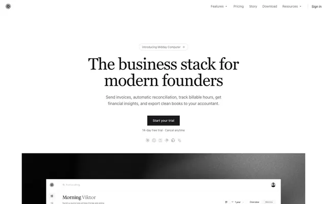
Midday uses a minimalist, content-focused visual language with a strong emphasis on readability and clean information architecture. The design balances crisp sans-serif with a commanding serif for headlines, all within an open, achromatic canvas. Subtle borders and ghost-like components keep the interface feeling lightweight and direct, with a monochromatic palette reinforcing a sense of serious utility and precision.
The page adheres to a max-width 1280px, center-aligned layout, creating a contained and structured experience. The hero section features a prominent, centered headline with supporting text, followed by a dark primary action button against the white canvas. Section rhythm is primarily created through consistent vertical spacing (sectionGap 24px) rather than alternating background colors. Content is often arranged in centered stacks or simple grids, such as 3-column feature/pricing cards or alternating text+icon blocks. Navigation is a minimalist top bar with ghost-like links and a 'Sign in' call to action, maintaining a light footprint.
The visual language predominantly features clean, small, outline-style icons with a clear, functional purpose, often rendered in Ink Black. Product screenshots are contained within card-like structures, showcasing UI elements against the site's achromatic background. No large-scale marketing photography or complex illustrations are present, reinforcing a functional, content-first approach. Visuals serve to explain or denote, not to decorate.
Reminiscent of Stripe, Linear, Mercury, Segment.
# Midday — Style Reference
> Achromatic ledger, crisp yet silent

**Theme:** light

**Site:** https://midday.ai

Midday uses a minimalist, content-focused visual language with a strong emphasis on readability and clean information architecture. The design balances crisp sans-serif with a commanding serif for headlines, all within an open, achromatic canvas. Subtle borders and ghost-like components keep the interface feeling lightweight and direct, with a monochromatic palette reinforcing a sense of serious utility and precision.

## Tokens — Colors

| Name | Value | Token | Role |
|------|------|------|------|
| Success Green | `#4caf50` | `--color-success-green` | Green text accent for links, tags, and emphasized short phrases. Use as a supporting accent, not as a status color |
| Canvas White | `#ffffff` | `--color-canvas-white` | Page backgrounds, card surfaces, ghost button backgrounds, default icon fill — creates a bright, expansive foundation |
| Ink Black | `#121212` | `--color-ink-black` | Secondary body text, navigation labels, and subdued headings. Do not promote it to the primary CTA color |
| Ash Gray | `#dbdad7` | `--color-ash-gray` | Hairline borders for cards, buttons, and decorative separators — defines structure without visual weight, echoing traditional ledger paper |
| Deep Graphite | `#18181b` | `--color-deep-graphite` | Primary action button background — provides a strong, serious focal point for key interactions against the light canvas |
| Cool Gray Mist | `#e6e4e0` | `--color-cool-gray-mist` | Subtle background for secondary sections, selected tabs, and subtle hints of elevation — adds textural variation within the neutral palette |
| Muted Stone | `#616161` | `--color-muted-stone` | Secondary text, link text, helper text, and subtle icon strokes — provides hierarchy and de-emphasizes content gently |

## Tokens — Typography

### Hedvig Letters Sans
- **Substitute:** Inter
- **Weights:** 400, 500
- **Sizes:** 10px, 11px, 12px, 14px, 16px, 18px, 20px, 24px, 48px, 508px
- **Line height:** 1, 1.33, 1.4, 1.43, 1.5, 1.56, 1.63
- **Letter spacing:** 0.0250em for lighter weights, 0.0500em for smaller body text
- **Role:** Primary UI text, body copy, navigation, button labels, and small headings — maintains clarity and compactness across the interface.

### Hedvig Letters Serif
- **Substitute:** Playfair Display
- **Weights:** 400
- **Sizes:** 24px, 72px
- **Line height:** 1, 1.33
- **Letter spacing:** -0.0250em
- **Role:** Prominent headings and display text — its formal, open character with generous negative tracking creates a sense of established authority and elegant presence.

## Tokens — Type Scale

Perfect Fifth (1.5) from 14px base.

| Role | Size | Line height | Letter spacing |
|------|------|------|------|
| caption | 10px | 1.5 | 0.5px |
| body | 14px | 1.56 | 0.25px |
| subheading | 18px | 1.4 | 0.25px |
| heading-sm | 24px | 1.33 | -0.25px |
| heading | 48px | 1 | -1.2px |
| display | 72px | 1 | -1.8px |

## Tokens — Spacing

- **Max width:** 1280px
- **Section gap:** 24px
- **Card padding:** 20px
- **Element gap:** 8px

## Tokens — Radius

- **Buttons:** 9999px
- **Cards:** 0px
- **badges:** 9999px
- **icons:** 8px
- **input:** 0px

## Layout

The page adheres to a max-width 1280px, center-aligned layout, creating a contained and structured experience. The hero section features a prominent, centered headline with supporting text, followed by a dark primary action button against the white canvas. Section rhythm is primarily created through consistent vertical spacing (sectionGap 24px) rather than alternating background colors. Content is often arranged in centered stacks or simple grids, such as 3-column feature/pricing cards or alternating text+icon blocks. Navigation is a minimalist top bar with ghost-like links and a 'Sign in' call to action, maintaining a light footprint.

## Imagery

The visual language predominantly features clean, small, outline-style icons with a clear, functional purpose, often rendered in Ink Black. Product screenshots are contained within card-like structures, showcasing UI elements against the site's achromatic background. No large-scale marketing photography or complex illustrations are present, reinforcing a functional, content-first approach. Visuals serve to explain or denote, not to decorate.

## Components

### Pill Button - Default
*Default interactive button*

White background (#ffffff), Ink Black text (#121212), 1px Ash Gray border (#dbdad7), 9999px border-radius for a pill shape. Padding 6px vertical, 12px horizontal. Used for secondary actions and navigation entries.

### Solid Button - Primary
*Primary call to action button*

Solid Deep Graphite background (#18181b), Canvas White text (#ffffff), no border, 0px border-radius. Padding 8px vertical, 24px horizontal. Commands attention for key actions like 'Start your trial'.

### Ghost Button
*Ghost-style button for secondary actions or toggles*

Transparent background, Muted Stone text (#616161), 1px Ash Gray border (#dbdad7), 0px border-radius. Padding 8px vertical, 12px horizontal. Used for subtle toggles like 'Monthly'/'Yearly' selectors.

### Integration Card Variant
*Card for displaying tool integrations*

Canvas White background (#ffffff), no shadow, 0px border-radius. Features 20px padding on all sides. Used for displaying individual integration tiles.

### Feature Card
*Information card for features or pricing*

Canvas White background (#ffffff), no shadow, 0px border-radius. Features 20px padding on all sides. Used for presenting pricing tiers or descriptive content blocks.

### Badge - Introducing
*Informational badge for new features*

Transparent background, Muted Stone text (#616161), 1px Ash Gray border (#dbdad7), 9999px border-radius. Padding 6px vertical, 12px horizontal. Used for concise announcements.

## Guidelines

### Do

- Use Hedvig Letters Sans at weight 400 for all body text and UI elements, with Ink Black (#121212) as the default text color.
- Apply Hedvig Letters Serif at weight 400 and letter-spacing -0.0250em for main headings and display text, using Ink Black (#121212).
- Define all structural boundaries with a 1px solid Ash Gray (#dbdad7) border to maintain a lightweight, precise aesthetic.
- Utilize Canvas White (#ffffff) as the dominant background for all primary content surfaces and page canvas.
- Form primary action buttons with a solid Deep Graphite (#18181b) background and Canvas White (#ffffff) text, always with a 0px border-radius.
- Ensure all interactive elements and badges with a soft, secondary role use a 9999px radii, contrasting with the sharp corners of content cards.
- Maintain a clear visual hierarchy by applying Muted Stone (#616161) for secondary text and helper elements.

### Don't

- Avoid using box-shadows; visible elevation is created through subtle background color changes or strong typographic hierarchy instead.
- Do not introduce additional chromatic colors beyond Success Green (#4caf50), reserving it exclusively for semantic indicators and data accents.
- Never use rounded corners on content cards or panels; maintain the sharp, square aesthetic (0px radius) for all informational containers.
- Do not vary line-height unless explicitly defined by the type scale; follow the specified line-heights for each font size to maintain vertical rhythm.
- Avoid using bold weights for body text; rely on color contrast and spacing for emphasis within paragraphs.
- Do not use gradients for backgrounds or components; the system relies on flat colors and subtle textural variation.
- Refrain from using decorative imagery or full-bleed photography that breaks the clean, high-key achromatic canvas.

## Agent Prompt Guide

Quick Color Reference:
text: #121212
background: #ffffff
border: #dbdad7
accent: #4caf50
primary action: #18181b (filled action)

Example Component Prompts:
1. Create a Primary Action Button: #18181b background, #616161 text, 9999px radius, compact pill padding. Use this filled treatment for the main CTA.
2. Create a Feature Card: Canvas White background (#ffffff), 0px border-radius, 20px padding. Inside, 'Reporting' as a subheading (18px Hedvig Letters Sans weight 400, #121212, line-height 1.4) followed by body text 'Detailed daily reports' (14px Hedvig Letters Sans weight 400, #121212, line-height 1.56).
3. Create a Ghost Toggle Button: Transparent background, Muted Stone text (#616161), 1px Ash Gray border (#dbdad7), 0px border-radius. Padding 8px vertical, 12px horizontal. Text 'Monthly'.
More like this









Keep what you find
A free account saves references to boards and can send you a weekly email of picks based on what you save.
To see every result, go Pro.