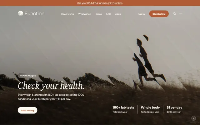
Preview image. Unlock full-res
organic science lab
Color palette
Primary action background, iconography, accent borders — a warm, earthy orange providing a single point of vivid interaction and brand recognition
Primary text for headings and body, providing strong contrast on light surfaces
Secondary text, borders, and functional iconography, slightly softer than primary text for hierarchy
Muted body text and subtle element borders, lower contrast for less prominent information
Light neutral action fill for buttons on dark surfaces.
Secondary background surfaces and elevated card backgrounds, offering a soft distinction from the main canvas
Subtle background panels and less prominent borders, used for tertiary surface differentiation
Input component borders, provides a soft, focused outline
Focused text on dark backgrounds, or pure white card backgrounds for a crisp contrast layer
Typography
- Weights
- 300, 400, 600, 700
- Sizes
- 12px, 14px, 16px, 18px, 20px, 24px, 88px
- Line height
- 1, 1.1, 1.11, 1.2, 1.25, 1.3, 1.4, 1.43, 1.5
- Letter spacing
- -0.023
- Fallback
- Inter
Primary sans-serif for all UI elements, body text, navigation, and functional headings. Its consistent tracking establishes a practical, readable tone across the interface.
- Weights
- 300, 400
- Sizes
- 34px, 45px, 64px, 80px
- Line height
- 0.9, 1, 1.1, 1.15
- Letter spacing
- 0
- Fallback
- Playfair Display
Elegant serif for large display headings. The light weights (300, 400) make it feel sophisticated and welcoming, rather than imposing.
- Weights
- 400
- Sizes
- 11px
- Line height
- 1
- Letter spacing
- 0
- Fallback
- Fira Code
Monospaced font for small, technical labels or badging where a distinct, compact style is needed.
Spacing & shape
Elevation
Components
Background: Amber Glow (#b05a36), Text: Parchment White (#fef9ef), Padding: 12px vertical, 24px horizontal, Border Radius: 40px.
Background: Parchment White (#fef9ef), Border: 1px solid Amber Glow (#b05a36), Text: Amber Glow (#b05a36), Padding: 12px vertical, 24px horizontal, Border Radius: 40px.
Background: transparent, Text: Charcoal Grey (#333333), Padding: 0, Border Radius: 0.
Background: Cream Canvas (#f5eee1), Padding: 40px vertical, 20px horizontal, Border Radius: 12px, No shadow.
Background: Cream Canvas (#f5eee1), Padding: 56px vertical, 64px horizontal, Border Radius: 24px, Shadow: rgba(42, 43, 47, 0.1) 12px 32px 80px 0px.
Background: pure white, Text: Night Sky (#2a2b2f), Border: 1px solid Slate Border (#808988), Padding: 13px vertical, 16px horizontal, Border Radius: 1440px (pill shape).
Background: transparent, Text: Charcoal Grey (#333333), Padding: 1px vertical, 6px horizontal, Border Radius: 50%.
Guidelines
- Use Ftbase for all body text, navigation, and functional headings at Ftbase weight 400 for optimal readability.
- Apply Amber Glow (#b05a36) exclusively for primary interactive elements, brand iconography, and accents, ensuring it is a consistent focal point.
- Maintain a generous border radius of 40px for all interactive buttons and 12px for cards to convey a soft, friendly aesthetic.
- Employ Parchment White (#fef9ef) as the primary background for all page sections, reserving Cream Canvas (#f5eee1) and Warm Mist (#d1c9bf) for subtle content differentiation.
- Utilize Financier Display for all major headings above 34px, emphasizing its lighter weights (300, 400) for an elegant and inviting feel.
- Ensure input fields have a 1440px border-radius, creating a distinct pill shape, with a Slate Border (#808988).
- Space elements with multiples of 8px, using 16px for `elementGap` and 25px for `cardPadding` to maintain a comfortable visual rhythm.
- Do not introduce new vivid colors; Amber Glow (#b05a36) is the sole saturated accent color.
- Avoid heavy shadows; use rgba(42, 43, 47, 0.1) 12px 32px 80px 0px sparingly for only the most elevated content.
- Do not use dark backgrounds that contrast sharply with the established light theme; maintain the soft, airy feel.
- Do not use Ftbase for large display headings; reserve Financier Display for these to preserve typographic hierarchy.
- Avoid tight spacing; maintain the comfortable density established by 16px element gaps and 25px card padding.
- Do not use sharp corners; all interactive elements and most containers should use generous border radii (40px or 12px).
About this system
ShowHide
Function Health uses a soft, organic health-science aesthetic: light, airy surfaces, grounded typography, and an earthy orange accent. The design feels approachable and trustworthy, balancing scientific rigor with human comfort. Typography mixes a robust sans-serif for functional text with an elegant serif for display headlines, establishing a clear hierarchy. Components are lightweight with generous radii, often featuring subtle background tints to differentiate sections.
The page primarily uses a max-width contained layout of 1434px, with content centered. The hero section, however, is full-bleed, featuring a large background image with centered, overlaid text and a call to action. Subsequent sections alternate between two dominant patterns: a centered stack of content (like 'Testing is easy' cards) or alternating two-column layouts featuring text on one side and a visual element on the other. Vertical rhythm is maintained by consistent section gaps. Navigation is a sticky top bar, lightweight with minimal branding and a clear primary action button.
The site uses diverse imagery. The hero section features a desaturated, slightly hazy photographic background of a figure running, conveying a sense of aspiration and nature-infused health. Other sections utilize minimal, clean product-illustration style graphics depicting simple data visualizations (like a line graph) and an abstract calendar. Icons are generally outlined with a medium stroke weight. The overall feel is a balance of soft, aspirational photography and clear, illustrative explanations. Imagery is generally contained within sections or cards, with the hero being a full-width background element.
Reminiscent of Levels Health, Eight Sleep, Whoop, Calm.
# Function — Style Reference
> organic science lab

**Theme:** light

**Site:** https://www.functionhealth.com

Function Health uses a soft, organic health-science aesthetic: light, airy surfaces, grounded typography, and an earthy orange accent. The design feels approachable and trustworthy, balancing scientific rigor with human comfort. Typography mixes a robust sans-serif for functional text with an elegant serif for display headlines, establishing a clear hierarchy. Components are lightweight with generous radii, often featuring subtle background tints to differentiate sections.

## Tokens — Colors

| Name | Value | Token | Role |
|------|------|------|------|
| Amber Glow | `#b05a36` | `--color-amber-glow` | Primary action background, iconography, accent borders — a warm, earthy orange providing a single point of vivid interaction and brand recognition |
| Night Sky | `#2a2b2f` | `--color-night-sky` | Primary text for headings and body, providing strong contrast on light surfaces |
| Charcoal Grey | `#333333` | `--color-charcoal-grey` | Secondary text, borders, and functional iconography, slightly softer than primary text for hierarchy |
| Faded Stone | `#515151` | `--color-faded-stone` | Muted body text and subtle element borders, lower contrast for less prominent information |
| Parchment White | `#fef9ef` | `--color-parchment-white` | Light neutral action fill for buttons on dark surfaces. |
| Cream Canvas | `#f5eee1` | `--color-cream-canvas` | Secondary background surfaces and elevated card backgrounds, offering a soft distinction from the main canvas |
| Warm Mist | `#d1c9bf` | `--color-warm-mist` | Subtle background panels and less prominent borders, used for tertiary surface differentiation |
| Slate Border | `#808988` | `--color-slate-border` | Input component borders, provides a soft, focused outline |
| Off-White | `#ffffff` | `--color-off-white` | Focused text on dark backgrounds, or pure white card backgrounds for a crisp contrast layer |

## Tokens — Typography

### Ftbase
- **Substitute:** Inter
- **Weights:** 300, 400, 600, 700
- **Sizes:** 12px, 14px, 16px, 18px, 20px, 24px, 88px
- **Line height:** 1, 1.1, 1.11, 1.2, 1.25, 1.3, 1.4, 1.43, 1.5
- **Letter spacing:** -0.023
- **Role:** Primary sans-serif for all UI elements, body text, navigation, and functional headings. Its consistent tracking establishes a practical, readable tone across the interface.

### Financier Display
- **Substitute:** Playfair Display
- **Weights:** 300, 400
- **Sizes:** 34px, 45px, 64px, 80px
- **Line height:** 0.9, 1, 1.1, 1.15
- **Letter spacing:** 0
- **Role:** Elegant serif for large display headings. The light weights (300, 400) make it feel sophisticated and welcoming, rather than imposing.

### Fragment mono
- **Substitute:** Fira Code
- **Weights:** 400
- **Sizes:** 11px
- **Line height:** 1
- **Letter spacing:** 0
- **Role:** Monospaced font for small, technical labels or badging where a distinct, compact style is needed.

## Tokens — Type Scale

| Role | Size | Line height | Letter spacing |
|------|------|------|------|
| caption | 11px | 1 | — |
| body | 14px | 1.4 | -0.322px |
| body-lg | 16px | 1.4 | -0.368px |
| subheading | 20px | 1.3 | -0.46px |
| heading | 24px | 1.25 | -0.552px |
| heading-lg | 34px | 1.15 | — |
| display-sm | 45px | 1.11 | — |
| display | 64px | 1.1 | — |

## Tokens — Spacing

- **Max width:** 1434px
- **Section gap:** 64px
- **Card padding:** 25px
- **Element gap:** 16px

## Tokens — Radius

- **Buttons:** 40px
- **Inputs:** 1440px
- **Cards:** 12px
- **small:** 2px

## Tokens — Elevation

- **Elevated Content Card:** `rgba(42, 43, 47, 0.1) 12px 32px 80px 0px`

## Layout

The page primarily uses a max-width contained layout of 1434px, with content centered. The hero section, however, is full-bleed, featuring a large background image with centered, overlaid text and a call to action. Subsequent sections alternate between two dominant patterns: a centered stack of content (like 'Testing is easy' cards) or alternating two-column layouts featuring text on one side and a visual element on the other. Vertical rhythm is maintained by consistent section gaps. Navigation is a sticky top bar, lightweight with minimal branding and a clear primary action button.

## Imagery

The site uses diverse imagery. The hero section features a desaturated, slightly hazy photographic background of a figure running, conveying a sense of aspiration and nature-infused health. Other sections utilize minimal, clean product-illustration style graphics depicting simple data visualizations (like a line graph) and an abstract calendar. Icons are generally outlined with a medium stroke weight. The overall feel is a balance of soft, aspirational photography and clear, illustrative explanations. Imagery is generally contained within sections or cards, with the hero being a full-width background element.

## Components

### Primary Action Button
*Filled button for primary calls to action.*

Background: Amber Glow (#b05a36), Text: Parchment White (#fef9ef), Padding: 12px vertical, 24px horizontal, Border Radius: 40px.

### Ghost Button
*Outlined button for secondary actions, or when less visual prominence is desired.*

Background: Parchment White (#fef9ef), Border: 1px solid Amber Glow (#b05a36), Text: Amber Glow (#b05a36), Padding: 12px vertical, 24px horizontal, Border Radius: 40px.

### Text Link Button
*Minimal button styled as a text link.*

Background: transparent, Text: Charcoal Grey (#333333), Padding: 0, Border Radius: 0.

### Feature Card
*Card for showcasing key features or information blocks.*

Background: Cream Canvas (#f5eee1), Padding: 40px vertical, 20px horizontal, Border Radius: 12px, No shadow.

### Elevated Content Card
*Card with subtle shadow for emphasized content blocks.*

Background: Cream Canvas (#f5eee1), Padding: 56px vertical, 64px horizontal, Border Radius: 24px, Shadow: rgba(42, 43, 47, 0.1) 12px 32px 80px 0px.

### Input Field
*Standard input field for user data entry.*

Background: pure white, Text: Night Sky (#2a2b2f), Border: 1px solid Slate Border (#808988), Padding: 13px vertical, 16px horizontal, Border Radius: 1440px (pill shape).

### Circular Badge
*Small, decorative circular badge.*

Background: transparent, Text: Charcoal Grey (#333333), Padding: 1px vertical, 6px horizontal, Border Radius: 50%.

## Guidelines

### Do

- Use Ftbase for all body text, navigation, and functional headings at Ftbase weight 400 for optimal readability.
- Apply Amber Glow (#b05a36) exclusively for primary interactive elements, brand iconography, and accents, ensuring it is a consistent focal point.
- Maintain a generous border radius of 40px for all interactive buttons and 12px for cards to convey a soft, friendly aesthetic.
- Employ Parchment White (#fef9ef) as the primary background for all page sections, reserving Cream Canvas (#f5eee1) and Warm Mist (#d1c9bf) for subtle content differentiation.
- Utilize Financier Display for all major headings above 34px, emphasizing its lighter weights (300, 400) for an elegant and inviting feel.
- Ensure input fields have a 1440px border-radius, creating a distinct pill shape, with a Slate Border (#808988).
- Space elements with multiples of 8px, using 16px for `elementGap` and 25px for `cardPadding` to maintain a comfortable visual rhythm.

### Don't

- Do not introduce new vivid colors; Amber Glow (#b05a36) is the sole saturated accent color.
- Avoid heavy shadows; use rgba(42, 43, 47, 0.1) 12px 32px 80px 0px sparingly for only the most elevated content.
- Do not use dark backgrounds that contrast sharply with the established light theme; maintain the soft, airy feel.
- Do not use Ftbase for large display headings; reserve Financier Display for these to preserve typographic hierarchy.
- Avoid tight spacing; maintain the comfortable density established by 16px element gaps and 25px card padding.
- Do not use sharp corners; all interactive elements and most containers should use generous border radii (40px or 12px).

## Agent Prompt Guide

### Quick Color Reference
- text: #2a2b2f
- background: #fef9ef
- border: #d1c9bf
- accent: #b05a36
- primary action: #b05a36 (filled action)

### 3-5 Example Component Prompts
- Create a Primary Action Button: #b05a36 background, #fef9ef text, 9999px radius, compact pill padding. Use this filled treatment for the main CTA.
- **Create a Feature Card**: Background Cream Canvas (#f5eee1), padding 40px vertical, 20px horizontal, border-radius 12px. Headline '160+ lab tests' in Ftbase, 24px, weight 700, color Night Sky (#2a2b2f). Body text in Ftbase, 16px, weight 400, color Faded Stone (#515151).
- **Create a Ghost Button**: Background Parchment White (#fef9ef), border 1px solid Amber Glow (#b05a36), text Amber Glow (#b05a36), Ftbase 16px weight 400, padding 12px vertical, 24px horizontal, border-radius 40px.
- **Create an Input Field**: Background pure white, text placeholder in Faded Stone (#515151), input text in Night Sky (#2a2b2f), border 1px solid Slate Border (#808988), padding 13px vertical, 16px horizontal, border-radius 1440px.
More like this









Keep what you find
A free account saves references to boards and can send you a weekly email of picks based on what you save.
To see every result, go Pro.