Preview image. Unlock full-res
Evergreen clarity on a clean slate
Color palette
Primary text, major headlines, brand elements, and prominent borders for content sections. Establishes a deep, grounded presence
Interactive text links, decorative accents, and outlines for ghost buttons or interactive states. A vivid green for functional highlights
Page background, primary surface for content blocks
Secondary text for paragraphs and descriptive content, offering strong contrast on light backgrounds
Muted text for subheadings and informational cues, borders for less prominent components
Hairline borders for dividers and subtle content segregation
Hairline borders, dividers, input outlines, and card edges on light surfaces. Do not promote it to the primary CTA color
Typography
- Weights
- 600, 700
- Sizes
- 23px, 52px, 64px, 66px
- Line height
- 0.95, 1, 1.1, 1.2
- Fallback
- Montserrat
Display headlines and hero text. The condensed, strong presence of PP Mori at higher weights anchors the page and communicates authority. Its unique character distinguishes the brand's voice without being overly decorative.
- Weights
- 400, 500, 700
- Sizes
- 16px, 18px, 20px, 23px, 24px
- Line height
- 1.3, 1.4
- Letter spacing
- -0.0300em
- Fallback
- Inter
Primary text for body, links, lists, and secondary headings. Inter provides high legibility and a neutral, professional tone, complementing the distinctiveness of PP Mori without competing with it.
Spacing & shape
Components
Uses PP Mori, weight 700, size 66px, lineHeight 0.95, color Midnight Pine (#003f2e).
Uses PP Mori, weight 600, size 52px, lineHeight 1.0, color Midnight Pine (#003f2e).
Uses Inter, weight 400, size 18px, lineHeight 1.4, letterSpacing -0.0300em, color Slate Text (#333333).
Uses Inter, weight 400, size 20px, lineHeight 1.3, letterSpacing -0.0300em, color Ash Gray (#6e7673).
Uses Inter, weight 400, size 16px, lineHeight 1.4, letterSpacing -0.0300em, color Forest Link (#039861).
A 3px solid border in Light Gray Border (#d6d6d6) spanning full width, positioned below a heading.
Clickable heading (Inter, weight 700, size 23px, color Midnight Pine #003f2e) with a circular '+' icon (color Forest Link #039861) on one side, and a 3px solid border in Light Gray Border (#d6d6d6) on the bottom.
Large number (PP Mori, weight 600, size 64px, color Midnight Pine #003f2e) with descriptive text below (Inter, weight 400, size 18px, color Ash Gray #6e7673, lineHeight 1.4). No explicit borders, relies on surrounding negative space.
Guidelines
- Prioritize PP Mori for all headlines and display text, leveraging its strong character at larger sizes.
- Use Midnight Pine (#003f2e) for primary text content to maintain strong contrast and brand presence.
- Apply Forest Link (#039861) exclusively for active links and interactive elements, ensuring its vibrancy draws attention.
- Employ Light Gray Border (#d6d6d6) and Steel Border (#a6a6a6) for functional dividers and UI element outlines, using 3px solid for major sections and 1px solid for subtle distinctions.
- Maintain generous vertical spacing between sections (32px to 64px) to emphasize clarity and airiness.
- Utilize the `circular` (9999px) and `soft` (800px) radii for all interactive elements and badges, to convey a friendly tangibility.
- Ensure all body text uses Inter with -0.0300em letter spacing for enhanced readability on screen.
- Avoid using saturated colors other than Forest Link (#039861) on interactive elements.
- Never use generic rectangular buttons; all buttons must adopt the `circular` (9999px) or `soft` (800px) radius.
- Do not introduce new serif fonts; the system relies on the distinct contrast between PP Mori and Inter.
- Avoid heavy drop shadows or complex gradients; the system prefers a flat, border-driven aesthetic.
- Do not deviate from the established text colors; use Midnight Pine (#003f2e), Slate Text (#333333), and Ash Gray (#6e7673) only for their designated roles.
- Refrain from using tight line spacing; maintain the established line heights (1.3-1.4) for all body copy to prevent text density.
- Do not use accent colors for large background areas; reserve them for small, functional UI elements.
About this system
ShowHide
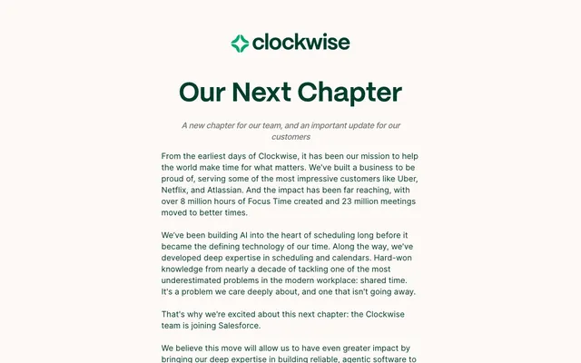
Clockwise employs a crisp, professional visual system with a bright canvas and strong green branding. Text is highly structured, using a custom display font for headlines and a clear sans-serif for body content. Borders are prominent, acting as dividers and enclosures, while color accents are used sparingly for links and interactive elements, maintaining an airy yet authoritative feel.
The page follows a classic max-width contained layout, likely centered, though specific max-width is not provided. The hero section presents a large, centered headline followed by a descriptive subtitle. Content is arranged in a single-column flow with consistent vertical spacing between paragraphs and sections. The FAQ section uses a clear question-and-answer format, bordered for distinction. Towards the bottom, there's a multi-column grid for partner logos, and a two-column grid for numerical stats, indicating a balanced use of white space and structured content blocks. The navigation is a simple top bar with a logo.
The site uses minimal imagery, primarily focusing on its logo and a grid of partner logos that are presented in a monochrome, desaturated style to maintain visual harmony. There are no full-bleed photographs or illustrations. Icons, like the plus/minus in the FAQ, are simple, outlined, and monochromatic, with a prominent stroke weight, and use the accent green for interactive states. The overall density of imagery is low, with text dominating the visual space and acting as the primary carrier of information.
Reminiscent of Calendly, Notion, linear.app, Superhuman.
# Getclockwise — Style Reference
> Evergreen clarity on a clean slate

**Theme:** light

**Site:** https://www.getclockwise.com

Clockwise employs a crisp, professional visual system with a bright canvas and strong green branding. Text is highly structured, using a custom display font for headlines and a clear sans-serif for body content. Borders are prominent, acting as dividers and enclosures, while color accents are used sparingly for links and interactive elements, maintaining an airy yet authoritative feel.

## Tokens — Colors

| Name | Value | Token | Role |
|------|------|------|------|
| Midnight Pine | `#003f2e` | `--color-midnight-pine` | Primary text, major headlines, brand elements, and prominent borders for content sections. Establishes a deep, grounded presence |
| Forest Link | `#039861` | `--color-forest-link` | Interactive text links, decorative accents, and outlines for ghost buttons or interactive states. A vivid green for functional highlights |
| Canvas White | `#fdf9f7` | `--color-canvas-white` | Page background, primary surface for content blocks |
| Slate Text | `#333333` | `--color-slate-text` | Secondary text for paragraphs and descriptive content, offering strong contrast on light backgrounds |
| Ash Gray | `#6e7673` | `--color-ash-gray` | Muted text for subheadings and informational cues, borders for less prominent components |
| Steel Border | `#a6a6a6` | `--color-steel-border` | Hairline borders for dividers and subtle content segregation |
| Light Gray Border | `#d6d6d6` | `--color-light-gray-border` | Hairline borders, dividers, input outlines, and card edges on light surfaces. Do not promote it to the primary CTA color |

## Tokens — Typography

### PP Mori
- **Substitute:** Montserrat
- **Weights:** 600, 700
- **Sizes:** 23px, 52px, 64px, 66px
- **Line height:** 0.95, 1, 1.1, 1.2
- **Role:** Display headlines and hero text. The condensed, strong presence of PP Mori at higher weights anchors the page and communicates authority. Its unique character distinguishes the brand's voice without being overly decorative.

### Inter
- **Substitute:** Inter
- **Weights:** 400, 500, 700
- **Sizes:** 16px, 18px, 20px, 23px, 24px
- **Line height:** 1.3, 1.4
- **Letter spacing:** -0.0300em
- **Role:** Primary text for body, links, lists, and secondary headings. Inter provides high legibility and a neutral, professional tone, complementing the distinctiveness of PP Mori without competing with it.

## Tokens — Type Scale

Major Third (1.25) from 18px base.

| Role | Size | Line height | Letter spacing |
|------|------|------|------|
| body-sm | 16px | 1.4 | -0.48px |
| body | 18px | 1.4 | -0.54px |
| subheading | 20px | 1.3 | -0.6px |
| heading-sm | 23px | 1.2 | -0.69px |
| heading | 52px | 1 | — |
| heading-lg | 64px | 0.95 | — |
| display | 66px | 0.95 | — |

## Tokens — Spacing

- **Section gap:** 32px
- **Card padding:** 20px
- **Element gap:** 20px

## Tokens — Radius

- **circular:** 9999px
- **soft:** 800px

## Layout

The page follows a classic max-width contained layout, likely centered, though specific max-width is not provided. The hero section presents a large, centered headline followed by a descriptive subtitle. Content is arranged in a single-column flow with consistent vertical spacing between paragraphs and sections. The FAQ section uses a clear question-and-answer format, bordered for distinction. Towards the bottom, there's a multi-column grid for partner logos, and a two-column grid for numerical stats, indicating a balanced use of white space and structured content blocks. The navigation is a simple top bar with a logo.

## Imagery

The site uses minimal imagery, primarily focusing on its logo and a grid of partner logos that are presented in a monochrome, desaturated style to maintain visual harmony. There are no full-bleed photographs or illustrations. Icons, like the plus/minus in the FAQ, are simple, outlined, and monochromatic, with a prominent stroke weight, and use the accent green for interactive states. The overall density of imagery is low, with text dominating the visual space and acting as the primary carrier of information.

## Components

### Primary Headline
*Dominant page titles and hero content.*

Uses PP Mori, weight 700, size 66px, lineHeight 0.95, color Midnight Pine (#003f2e).

### Section Heading
*Titles for major content sections, establishing hierarchy.*

Uses PP Mori, weight 600, size 52px, lineHeight 1.0, color Midnight Pine (#003f2e).

### Body Text Paragraph
*Standard paragraph content for readability.*

Uses Inter, weight 400, size 18px, lineHeight 1.4, letterSpacing -0.0300em, color Slate Text (#333333).

### Muted Subheading
*Descriptive text under headlines or for secondary information.*

Uses Inter, weight 400, size 20px, lineHeight 1.3, letterSpacing -0.0300em, color Ash Gray (#6e7673).

### Link Text
*Hyperlinks within body copy or navigation.*

Uses Inter, weight 400, size 16px, lineHeight 1.4, letterSpacing -0.0300em, color Forest Link (#039861).

### FAQ Section Divider
*Visual separator for question groups in an FAQ.*

A 3px solid border in Light Gray Border (#d6d6d6) spanning full width, positioned below a heading.

### FAQ Accordion Item
*Interactive question and answer section.*

Clickable heading (Inter, weight 700, size 23px, color Midnight Pine #003f2e) with a circular '+' icon (color Forest Link #039861) on one side, and a 3px solid border in Light Gray Border (#d6d6d6) on the bottom.

### Stat Card
*Highlighting key numerical achievements.*

Large number (PP Mori, weight 600, size 64px, color Midnight Pine #003f2e) with descriptive text below (Inter, weight 400, size 18px, color Ash Gray #6e7673, lineHeight 1.4). No explicit borders, relies on surrounding negative space.

## Guidelines

### Do

- Prioritize PP Mori for all headlines and display text, leveraging its strong character at larger sizes.
- Use Midnight Pine (#003f2e) for primary text content to maintain strong contrast and brand presence.
- Apply Forest Link (#039861) exclusively for active links and interactive elements, ensuring its vibrancy draws attention.
- Employ Light Gray Border (#d6d6d6) and Steel Border (#a6a6a6) for functional dividers and UI element outlines, using 3px solid for major sections and 1px solid for subtle distinctions.
- Maintain generous vertical spacing between sections (32px to 64px) to emphasize clarity and airiness.
- Utilize the `circular` (9999px) and `soft` (800px) radii for all interactive elements and badges, to convey a friendly tangibility.
- Ensure all body text uses Inter with -0.0300em letter spacing for enhanced readability on screen.

### Don't

- Avoid using saturated colors other than Forest Link (#039861) on interactive elements.
- Never use generic rectangular buttons; all buttons must adopt the `circular` (9999px) or `soft` (800px) radius.
- Do not introduce new serif fonts; the system relies on the distinct contrast between PP Mori and Inter.
- Avoid heavy drop shadows or complex gradients; the system prefers a flat, border-driven aesthetic.
- Do not deviate from the established text colors; use Midnight Pine (#003f2e), Slate Text (#333333), and Ash Gray (#6e7673) only for their designated roles.
- Refrain from using tight line spacing; maintain the established line heights (1.3-1.4) for all body copy to prevent text density.
- Do not use accent colors for large background areas; reserve them for small, functional UI elements.

## Agent Prompt Guide

Create an Outlined Primary Action: Transparent background, #039861 border and text, 9999px radius, compact pill padding. Use it for the main CTA instead of a filled button.

Example Component Prompts:
Create a hero section: background Canvas White (#fdf9f7). Headline 'Our Next Chapter' using PP Mori weight 700, 66px, lineHeight 0.95, color Midnight Pine (#003f2e). Subtitle 'A new chapter for our team, and an important update for our customers.' using Inter weight 400, 20px, lineHeight 1.3, letter-spacing -0.6px, color Ash Gray (#6e7673).
Create an FAQ accordion item: Title 'How will the events on my calendar be impacted when the Clockwise services end?' using Inter weight 700, 23px, lineHeight 1.2, letter-spacing -0.69px, color Midnight Pine (#003f2e). Plus icon should be outlined, color Forest Link (#039861). Bottom border 3px solid Light Gray Border (#d6d6d6).
Create a stat card: Large number '8 million' using PP Mori weight 600, 64px, lineHeight 0.95, color Midnight Pine (#003f2e). Descriptive text 'hours of Focus Time created' using Inter weight 400, 18px, lineHeight 1.4, letter-spacing -0.54px, color Ash Gray (#6e7673).
More like this








Keep what you find
A free account saves references to boards and can send you a weekly email of picks based on what you save.
To see every result, go Pro.