Preview image. Unlock full-res
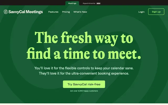
Organic Green Engine. A lush, vibrant green landscape where every element functions with precision.
Color palette
Primary brand color, background for hero sections and key promotional blocks. Deep and grounded, providing a rich base for brighter accents.
Secondary brand green, used for internal iconography, borders, and some text elements. Visually similar to SavvyGreen but used for details.
Primary interactive accent for buttons and links. This vivid lime is the most active color, signaling interactivity and success.
Secondary accent for 'new' badges, decorative elements, and occasional highlights. Its warmth contrasts sharply with the greens, drawing immediate attention.
Main page background, providing a soft, warm canvas for content. It's a key distinguishing factor, avoiding stark white.
Primary text color for most body copy and headings. Provides strong contrast against Parchment.
Subtle background tint for highlighting specific content blocks or sections.
Secondary text color for less prominent body copy, descriptions, and metadata.
Subtle borders and dividers for UI elements.
Background for decorative patterns and illustrations, providing a soft red counterpart to the BurntOrange.
Typography
- Weights
- 700
- Sizes
- 96px, 136px
- Line height
- 1, 1.08
- Fallback
- Playfair Display
Display headlines; the 96px and 136px sizes grab attention with bold weight and condensed elegance, creating a distinct editorial feel.
- Weights
- 400
- Sizes
- 18px, 38px
- Line height
- 1.38, 1.56
- Letter spacing
- -0.45, 1.9
- Fallback
- Oswald
Sub-display headings and emphasized phrases, leveraging the condensed form to create impact while conserving horizontal space.
- Weights
- 400, 700
- Sizes
- 16px, 18px, 20px, 24px, 30px
- Line height
- 1.33, 1.38, 1.5, 1.56
- Letter spacing
- -0.112
- Fallback
- Inter
Workhorse text for structural elements like navigation, subheadings, and lead paragraphs. Its slightly condensed nature at these sizes gives a modern, efficient feel with a slight edge.
- Weights
- 400, 700
- Sizes
- 10px, 14px, 16px, 18px, 24px
- Line height
- 1, 1.43, 1.5, 1.56
- Fallback
- Inter
Labels, captions, and buttons. This extended variant provides a contrast to the standard and condensed forms, offering visual variety at smaller sizes.
- Weights
- 400
- Sizes
- 16px
- Line height
- 1.5
- Fallback
- Inter
Used for standard body text and detailed paragraphs, ensuring high readability at functional sizes while complementing the GT-America family.
Spacing & shape
Components
Background: LimeAccent (#b9ff78), Text: Coal (#1c1917), Border Radius: 8px, Padding: 20px 40px. The vibrant lime makes it pop against both SavvyGreen and Parchment backgrounds.
Background: BurntOrange (#f54320), Text: white (#ffffff), Border Radius: 8px, Padding: 20px 40px. Used for high-contrast actions, leveraging the strong red as an alarm.
Background: oklch(0.216 0.006 56.043) (SavvyGreen), Text: oklab(0.977267 0.0013901 0.0142071 / 0.7) (White with 70% opacity), Border Radius: 0px, Padding: 8px 24px. The opaque white text against the deep green ensures visibility within the header.
Font: GT-Alpina-Condensed, Weight: 700, Size: 136px, Line-height: 1.08, Color: LimeAccent (#b9ff78). Set prominently on the SavvyGreen background, it's the first visual engagement on the page.
Font: GT-America-Condensed, Weight: 400, Size: 38px, Line-height: 1.56, Letter-spacing: 1.9px, Color: Coal (#1c1917). Used for secondary section titles, balancing impact with legibility.
Background: Parchment (#fcf7ed), Border Radius: 8px, Padding: 24px. Features a prominent screenshot or image area, often with a subtle drop shadow.
Guidelines
- Do use GT-Alpina-Condensed 700 for display headings at 96px or 136px for maximum impact and distinct brand voice.
- Do apply LimeAccent (#b9ff78) for all primary interactive elements like buttons and active links for consistent user feedback.
- Do use Parchment (#fcf7ed) as the default page background, offering a warm and inviting base.
- Do ensure key CTA buttons have a Border Radius of 8px and generous padding of 20px 40px to feel substantial and clickable.
- Do utilize the SavvyGreen (#0d542b) as a background for high-impact sections, creating depth and a distinct visual block.
- Do incorporate the BurntOrange (#f54320) for 'New' badges and secondary emphasis, particularly against green or white backgrounds.
- Don't use stark white backgrounds; always opt for Parchment (#fcf7ed) or SubtleGreenTint (#dcfce7) to maintain the brand's warmth.
- Don't use font weights lighter than 400 for any text, ensuring readability across all type families.
- Don't deviate from the 8px default border radius for buttons and cards; sharp corners are not part of this aesthetic.
- Don't introduce additional accent colors outside of LimeAccent (#b9ff78), BurntOrange (#f54320), and ForestGreen (#008236) to maintain chromatic discipline.
- Don't use generic system fonts; always prioritize the custom GT-Alpina, GT-America, and InterVariable families for brand consistency.
About this system
ShowHide
SavvyCal feels like a playful, yet precise, garden of productivity. The dominant use of organic greens and a vibrant lime accent creates an energetic atmosphere, grounded by a warm, almost parchment-like off-white background. The interplay between the structured, almost architectural feel of GT-America typefaces and the more expressive, flowing display type of GT-Alpina gives the system its distinctive voice: serious about function, but delivered with a light, engaging touch. Small, unexpected flourishes like the 'new' badge and the subtle orange accent line add personality without sacrificing clarity.
The page primarily follows a max-width contained layout, with content centered within a comfortable reading width, though the hero section breaks this by utilizing a full-width background. Sections largely alternate between the warm Parchment background and deeper SavvyGreen blocks, creating a clear vertical rhythm. The hero features a centered headline over a swirling organic graphic. Content sections often use a two-column layout, alternating between text on the left and a product visual on the right, or vice versa. Footer elements are organized into clear and compact columns. The overall density is comfortable, with generous vertical spacing (48-64px) separating major sections, creating a breathable experience.
The visual language blends crisp product screenshots with abstract, organic line art illustrations, and occasional lifestyle imagery. Product shots are typically clean, showcasing UI within browser windows, often overlaid on soft, muted landscape photography backgrounds. Illustrations are primarily abstract, geometric patterns or simple icons rendered in BurntOrange (#f54320) or ForestGreen (#008236), often used decoratively to break up sections or add visual interest. The organic, swirling pattern visible in the hero serves as a recurring visual motif, providing a sense of natural movement. Images are generally contained within their sections, not full-bleed, with a preference for 8px rounded corners on product screenshots.
Reminiscent of Calendly, Airtable, Mailchimp (old brand), Superhuman.
# Savvycal — Style Reference
> Organic Green Engine. A lush, vibrant green landscape where every element functions with precision.

**Theme:** light

**Site:** https://savvycal.com

SavvyCal feels like a playful, yet precise, garden of productivity. The dominant use of organic greens and a vibrant lime accent creates an energetic atmosphere, grounded by a warm, almost parchment-like off-white background. The interplay between the structured, almost architectural feel of GT-America typefaces and the more expressive, flowing display type of GT-Alpina gives the system its distinctive voice: serious about function, but delivered with a light, engaging touch. Small, unexpected flourishes like the 'new' badge and the subtle orange accent line add personality without sacrificing clarity.

## Tokens — Colors

| Name | Value | Token | Role |
|------|------|------|------|
| SavvyGreen | `#0d542b` | `--color-savvygreen` | Primary brand color, background for hero sections and key promotional blocks. Deep and grounded, providing a rich base for brighter accents. |
| ForestGreen | `#008236` | `--color-forestgreen` | Secondary brand green, used for internal iconography, borders, and some text elements. Visually similar to SavvyGreen but used for details. |
| LimeAccent | `#b9ff78` | `--color-limeaccent` | Primary interactive accent for buttons and links. This vivid lime is the most active color, signaling interactivity and success. |
| BurntOrange | `#f54320` | `--color-burntorange` | Secondary accent for 'new' badges, decorative elements, and occasional highlights. Its warmth contrasts sharply with the greens, drawing immediate attention. |
| Parchment | `#fcf7ed` | `--color-parchment` | Main page background, providing a soft, warm canvas for content. It's a key distinguishing factor, avoiding stark white. |
| Coal | `#1c1917` | `--color-coal` | Primary text color for most body copy and headings. Provides strong contrast against Parchment. |
| SubtleGreenTint | `#dcfce7` | `--color-subtlegreentint` | Subtle background tint for highlighting specific content blocks or sections. |
| Slate | `#44403b` | `--color-slate` | Secondary text color for less prominent body copy, descriptions, and metadata. |
| LightBorder | `#e5e7eb` | `--color-lightborder` | Subtle borders and dividers for UI elements. |
| CrimsonPattern | `#ffe3e3` | `--color-crimsonpattern` | Background for decorative patterns and illustrations, providing a soft red counterpart to the BurntOrange. |

## Tokens — Typography

### GT-Alpina-Condensed
- **Substitute:** Playfair Display
- **Weights:** 700
- **Sizes:** 96px, 136px
- **Line height:** 1, 1.08
- **Role:** Display headlines; the 96px and 136px sizes grab attention with bold weight and condensed elegance, creating a distinct editorial feel.

### GT-America-Condensed
- **Substitute:** Oswald
- **Weights:** 400
- **Sizes:** 18px, 38px
- **Line height:** 1.38, 1.56
- **Letter spacing:** -0.45, 1.9
- **Role:** Sub-display headings and emphasized phrases, leveraging the condensed form to create impact while conserving horizontal space.

### GT-America-Standard
- **Substitute:** Inter
- **Weights:** 400, 700
- **Sizes:** 16px, 18px, 20px, 24px, 30px
- **Line height:** 1.33, 1.38, 1.5, 1.56
- **Letter spacing:** -0.112
- **Role:** Workhorse text for structural elements like navigation, subheadings, and lead paragraphs. Its slightly condensed nature at these sizes gives a modern, efficient feel with a slight edge.

### GT-America-Extended
- **Substitute:** Inter
- **Weights:** 400, 700
- **Sizes:** 10px, 14px, 16px, 18px, 24px
- **Line height:** 1, 1.43, 1.5, 1.56
- **Role:** Labels, captions, and buttons. This extended variant provides a contrast to the standard and condensed forms, offering visual variety at smaller sizes.

### InterVariable
- **Substitute:** Inter
- **Weights:** 400
- **Sizes:** 16px
- **Line height:** 1.5
- **Role:** Used for standard body text and detailed paragraphs, ensuring high readability at functional sizes while complementing the GT-America family.

## Tokens — Type Scale

Perfect Fourth (1.333) from 16px base.

| Role | Size | Line height | Letter spacing |
|------|------|------|------|
| caption | 10px | 1 | — |
| body-sm | 14px | 1.43 | — |
| body | 16px | 1.5 | — |
| subheading | 18px | 1.56 | -0.126px |
| heading-sm | 20px | 1.5 | — |
| heading | 24px | 1.56 | -0.168px |
| heading-lg | 30px | 1.33 | -0.21px |
| display | 38px | 1.56 | 1.9px |
| display-lg | 96px | 1 | — |
| display-xl | 136px | 1.08 | — |

## Tokens — Spacing

- **Section gap:** 48-64px
- **Element gap:** 16px

## Tokens — Radius

- **Default:** 8px
- **Buttons:** 8px
- **Cards:** 8px
- **badges:** 24px

## Layout

The page primarily follows a max-width contained layout, with content centered within a comfortable reading width, though the hero section breaks this by utilizing a full-width background. Sections largely alternate between the warm Parchment background and deeper SavvyGreen blocks, creating a clear vertical rhythm. The hero features a centered headline over a swirling organic graphic. Content sections often use a two-column layout, alternating between text on the left and a product visual on the right, or vice versa. Footer elements are organized into clear and compact columns. The overall density is comfortable, with generous vertical spacing (48-64px) separating major sections, creating a breathable experience.

## Imagery

The visual language blends crisp product screenshots with abstract, organic line art illustrations, and occasional lifestyle imagery. Product shots are typically clean, showcasing UI within browser windows, often overlaid on soft, muted landscape photography backgrounds. Illustrations are primarily abstract, geometric patterns or simple icons rendered in BurntOrange (#f54320) or ForestGreen (#008236), often used decoratively to break up sections or add visual interest. The organic, swirling pattern visible in the hero serves as a recurring visual motif, providing a sense of natural movement. Images are generally contained within their sections, not full-bleed, with a preference for 8px rounded corners on product screenshots.

## Components

### Primary CTA Button Group

### Pricing Card

### Feature Section Block

### Primary CTA Button
*Main call to action button (e.g., 'Try SavvyCal risk-free')*

Background: LimeAccent (#b9ff78), Text: Coal (#1c1917), Border Radius: 8px, Padding: 20px 40px. The vibrant lime makes it pop against both SavvyGreen and Parchment backgrounds.

### Secondary CTA Button - Orange
*Alternative call to action button for specific, emphasized actions*

Background: BurntOrange (#f54320), Text: white (#ffffff), Border Radius: 8px, Padding: 20px 40px. Used for high-contrast actions, leveraging the strong red as an alarm.

### Header Navigation Item (Active)
*Active state for navigation links in the header.*

Background: oklch(0.216 0.006 56.043) (SavvyGreen), Text: oklab(0.977267 0.0013901 0.0142071 / 0.7) (White with 70% opacity), Border Radius: 0px, Padding: 8px 24px. The opaque white text against the deep green ensures visibility within the header.

### Hero Headline
*Dominant headline in the main hero section.*

Font: GT-Alpina-Condensed, Weight: 700, Size: 136px, Line-height: 1.08, Color: LimeAccent (#b9ff78). Set prominently on the SavvyGreen background, it's the first visual engagement on the page.

### Section Subheading
*Sub-title for content sections.*

Font: GT-America-Condensed, Weight: 400, Size: 38px, Line-height: 1.56, Letter-spacing: 1.9px, Color: Coal (#1c1917). Used for secondary section titles, balancing impact with legibility.

### Feature Card (Image)
*Container for product feature visuals or descriptions.*

Background: Parchment (#fcf7ed), Border Radius: 8px, Padding: 24px. Features a prominent screenshot or image area, often with a subtle drop shadow.

## Guidelines

### Do

- Do use GT-Alpina-Condensed 700 for display headings at 96px or 136px for maximum impact and distinct brand voice.
- Do apply LimeAccent (#b9ff78) for all primary interactive elements like buttons and active links for consistent user feedback.
- Do use Parchment (#fcf7ed) as the default page background, offering a warm and inviting base.
- Do ensure key CTA buttons have a Border Radius of 8px and generous padding of 20px 40px to feel substantial and clickable.
- Do utilize the SavvyGreen (#0d542b) as a background for high-impact sections, creating depth and a distinct visual block.
- Do incorporate the BurntOrange (#f54320) for 'New' badges and secondary emphasis, particularly against green or white backgrounds.

### Don't

- Don't use stark white backgrounds; always opt for Parchment (#fcf7ed) or SubtleGreenTint (#dcfce7) to maintain the brand's warmth.
- Don't use font weights lighter than 400 for any text, ensuring readability across all type families.
- Don't deviate from the 8px default border radius for buttons and cards; sharp corners are not part of this aesthetic.
- Don't introduce additional accent colors outside of LimeAccent (#b9ff78), BurntOrange (#f54320), and ForestGreen (#008236) to maintain chromatic discipline.
- Don't use generic system fonts; always prioritize the custom GT-Alpina, GT-America, and InterVariable families for brand consistency.

## Agent Prompt Guide

Quick Color Reference:
- Text (primary): #1c1917
- Background (page): #fcf7ed
- CTA Button: Fill #b9ff78, Text #1c1917
- Border (light): #e5e7eb
- Accent (secondary): #f54320

Example Component Prompts:
1. Create a hero section: SavvyGreen (#0d542b) background with an organic swirling pattern. Centered headline 'The fresh way to find a time to meet.' using GT-Alpina-Condensed 700 at 136px, LimeAccent (#b9ff78). Subtext at 18px GT-America-Standard 400, white text. Primary CTA button 'Try SavvyCal risk-free' (LimeAccent #b9ff78, Coal #1c1917 text, 8px radius, 20px 40px padding).
2. Generate a feature section: Parchment (#fcf7ed) background. Subheading 'Scheduling Experience' using GT-America-Condensed 400 at 38px, Coal (#1c1917), letter-spacing 1.9px. Underneath, a decorative wavy line in BurntOrange (#f54320). Body text below uses InterVariable 400 at 16px, Slate (#44403b).
3. Design a 'New' badge: BurntOrange (#f54320) background, white (#ffffff) text 'New', border-radius 24px, padding 2px 6px. Font is GT-America-Extended 700 at 10px. Place it adjacent to a navigation link.
More like this








Keep what you find
A free account saves references to boards and can send you a weekly email of picks based on what you save.
To see every result, go Pro.