Preview image. Unlock full-res
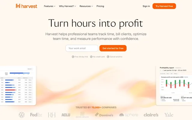
Warm, organized workspace: like an inviting desk with neatly arranged tools and a single, bright sticky note.
Color palette
Primary action buttons, interactive elements, brand highlights — a warm red-orange that signifies activity and focus
Accent for card shadows — a faint golden hue that echoes the primary brand color
Subtle background for cards, embedded sections, and visual containment, providing a soft contrast to white
Primary text, headings, and significant UI elements — a very dark, almost black, for strong readability
Neutral form states, badge text, and quiet UI feedback where color should stay understated. Do not promote it to the primary CTA color
Input borders, subtle dividers, and non-intrusive UI boundaries
Subtle shadow tint for cards, adding a delicate warmth to elevated elements
Secondary text, descriptive labels, and less prominent UI elements
Muted link text and subtle icons, providing less emphasis than primary text
Hairline borders and separators, providing minimal visual interruption
Tertiary text and subtle informational elements
Darker decorative borders and occasional icon fills
Even lighter secondary text and subtle boundary accents
Placeholder text and very muted labels
Base for subtle button shadows, often combined with an alpha value
Typography
- Weights
- 400, 500, 600, 700
- Sizes
- 13px, 14px, 16px, 17px, 18px, 20px, 22px, 24px, 25px, 26px, 28px, 34px, 48px, 50px
- Line height
- 1, 1.1, 1.15, 1.2, 1.26, 1.3, 1.35, 1.38, 1.4, 1.5
- Letter spacing
- 0.0150em
- Fallback
- Inter
Primary UI font for body text, navigation, forms, and most headings — its slightly wider tracking contributes to the open and breathable aesthetic.
- Weights
- 400
- Sizes
- 72px
- Line height
- 1.2
- Letter spacing
- normal
- Fallback
- Playfair Display
Display font used specifically for large, impactful headlines, offering a more traditional and grounded presence at significant scales.
Spacing & shape
Elevation
Components
Filled with Amber Glow (#fa5d00), white text, prominently rounded corners via 16px border-radius, generous padding. Used for primary calls to action like 'Try Harvest free'.
Rounded corners (20px), Harvest Cream background (#fff8f1), no visible border, and no shadow. Used for features or descriptive blocks.
Rounded corners (15px), Canvas White background (#ffffff), and a distinct golden-tinted shadow (rgba(250, 166, 0, 0.25) 6px 4px 24px 0px). Used to highlight key information or interactive elements.
Canvas White background (#ffffff), subtle Soft Fog border (#c0bbb6), and generously rounded 16px corners. Primary text color uses Deep Graphite (#1d1e1c).
Guidelines
- Prioritize Canvas White (#ffffff) or Harvest Cream (#fff8f1) for all background surfaces to maintain a light and airy feel.
- Use Amber Glow (#fa5d00) exclusively for primary interactive elements and brand accents; avoid scattering it decoratively.
- Apply Deep Graphite (#1d1e1c) for all primary text and headings to ensure strong contrast and readability.
- Maintain a 16px border-radius for buttons and inputs, and a softer 20px for content cards to unify the rounded aesthetic.
- Employ MuotoWeb as the default font across the UI, leveraging its 0.0150em letter spacing for an open typographic presence.
- Utilize 10px as the default elementGap horizontally and vertically between related UI elements for comfortable spacing.
- Ensure all interactive components have a moderate transition duration of 0.2s with an ease timing function for smooth feedback.
- Do not introduce new saturated colors; the palette relies on Amber Glow (#fa5d00) as the sole chromatic accent.
- Avoid hard-edged components; all card, button, and input elements should adhere to the established border-radius values.
- Do not use heavy, dark shadows; elevation should be subtle, leveraging the Golden Wash (#fee3b5) or rgba(0, 0, 0, 0.2) tints.
- Refrain from tight, condensed typography; prioritize the slightly expanded letter spacing of MuotoWeb for all body and UI text.
- Do not use gradients on backgrounds or interactive elements; the visual system is primarily flat with subtle surface changes.
- Avoid dense, information-packed sections without generous internal padding or a Clearfix button text in Amber Glow.
- Do not use dark backgrounds for main content areas; maintain the light theme with Canvas White and Harvest Cream as primary surfaces.
About this system
ShowHide
Harvest projects a dependable, organized workspace aesthetic, blending understated neutrals with a single vibrant orange accent. The primary visual tension arises from the interplay of a clean, spacious layout and rich, textured data visualizations. Surfaces are primarily crisp white, occasionally warmed by a subtle cream, with a focus on soft, rounded corners rather than hard edges. Typography is approachable yet confident, often using a slightly wider letter-spacing for an open feel, contrasting with compact, data-rich interfaces.
The page uses a maximum content width centered layout, rather than full-bleed, creating a contained and organized feel. The hero section often features a large, centered headline (Monarch font) over a subtle, abstract background using light, warm washes, with a call to action immediately below. Sections alternate between Canvas White and Harvest Cream backgrounds, creating a gentle visual rhythm. Content within sections favors centered stacks or two-column layouts (text alongside illustrations or cards). Feature sections often arrange content in three-column card grids. The overall density is comfortable, with generous vertical spacing between sections (around 30px). Navigation is a sticky top bar.
The site uses a mix of stylized product screenshots and abstract graphic elements. Product screenshots are typically rendered on white or a very light pastel background, focusing on clean UI and data visualization. Abstract graphics are subtle, organic, and often take the form of watercolor-like washes in warm, muted tones (like those suggesting Golden Wash #fee3b5 or Pale Sand #e3d6c5). Icons are primarily mono-color, Deep Graphite outlines or fills, used functionally to illustrate features. Imagery serves an explanatory and atmospheric role, rather than decorative, and never breaks out of contained, rounded forms.
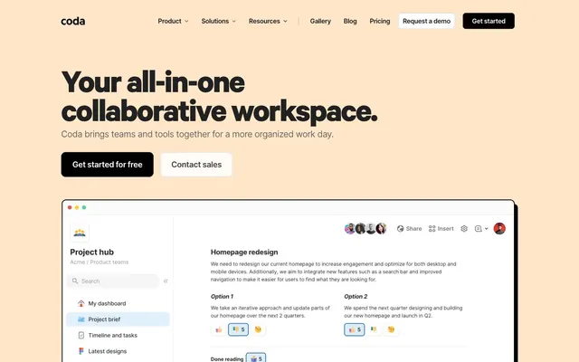
Reminiscent of FreshBooks, Toggl Track, Clockify.
# Getharvest — Style Reference
> Warm, organized workspace: like an inviting desk with neatly arranged tools and a single, bright sticky note.

**Theme:** light

**Site:** https://www.getharvest.com

Harvest projects a dependable, organized workspace aesthetic, blending understated neutrals with a single vibrant orange accent. The primary visual tension arises from the interplay of a clean, spacious layout and rich, textured data visualizations. Surfaces are primarily crisp white, occasionally warmed by a subtle cream, with a focus on soft, rounded corners rather than hard edges. Typography is approachable yet confident, often using a slightly wider letter-spacing for an open feel, contrasting with compact, data-rich interfaces.

## Tokens — Colors

| Name | Value | Token | Role |
|------|------|------|------|
| Amber Glow | `#fa5d00` | `--color-amber-glow` | Primary action buttons, interactive elements, brand highlights — a warm red-orange that signifies activity and focus |
| Golden Wash | `#fee3b5` | `--color-golden-wash` | Accent for card shadows — a faint golden hue that echoes the primary brand color |
| Harvest Cream | `#fff8f1` | `--color-harvest-cream` | Subtle background for cards, embedded sections, and visual containment, providing a soft contrast to white |
| Deep Graphite | `#1d1e1c` | `--color-deep-graphite` | Primary text, headings, and significant UI elements — a very dark, almost black, for strong readability |
| Canvas White | `#ffffff` | `--color-canvas-white` | Neutral form states, badge text, and quiet UI feedback where color should stay understated. Do not promote it to the primary CTA color |
| Soft Fog | `#c0bbb6` | `--color-soft-fog` | Input borders, subtle dividers, and non-intrusive UI boundaries |
| Pale Sand | `#e3d6c5` | `--color-pale-sand` | Subtle shadow tint for cards, adding a delicate warmth to elevated elements |
| Muted Stone | `#8e8b87` | `--color-muted-stone` | Secondary text, descriptive labels, and less prominent UI elements |
| Link Gray | `#615f5c` | `--color-link-gray` | Muted link text and subtle icons, providing less emphasis than primary text |
| Light Steel | `#d9d9d9` | `--color-light-steel` | Hairline borders and separators, providing minimal visual interruption |
| Mid Slate | `#777571` | `--color-mid-slate` | Tertiary text and subtle informational elements |
| Dark Slate | `#4a4a47` | `--color-dark-slate` | Darker decorative borders and occasional icon fills |
| Subtle Gray | `#a5a19c` | `--color-subtle-gray` | Even lighter secondary text and subtle boundary accents |
| Text Gray | `#999999` | `--color-text-gray` | Placeholder text and very muted labels |
| Shadow Tint | `#ccc6c1` | `--color-shadow-tint` | Base for subtle button shadows, often combined with an alpha value |

## Tokens — Typography

### MuotoWeb
- **Substitute:** Inter
- **Weights:** 400, 500, 600, 700
- **Sizes:** 13px, 14px, 16px, 17px, 18px, 20px, 22px, 24px, 25px, 26px, 28px, 34px, 48px, 50px
- **Line height:** 1, 1.1, 1.15, 1.2, 1.26, 1.3, 1.35, 1.38, 1.4, 1.5
- **Letter spacing:** 0.0150em
- **Role:** Primary UI font for body text, navigation, forms, and most headings — its slightly wider tracking contributes to the open and breathable aesthetic.

### Monarch
- **Substitute:** Playfair Display
- **Weights:** 400
- **Sizes:** 72px
- **Line height:** 1.2
- **Letter spacing:** normal
- **Role:** Display font used specifically for large, impactful headlines, offering a more traditional and grounded presence at significant scales.

## Tokens — Type Scale

| Role | Size | Line height | Letter spacing |
|------|------|------|------|
| caption | 13px | 1.3 | — |
| heading | 22px | 1.26 | — |
| heading-lg | 28px | 1.2 | — |
| display | 72px | 1.2 | — |

## Tokens — Spacing

- **Section gap:** 30px
- **Card padding:** 20px
- **Element gap:** 10px

## Tokens — Radius

- **Buttons:** 16px
- **Inputs:** 16px
- **Cards:** 20px
- **Images:** 16px
- **other:** 16px

## Tokens — Elevation

- **Primary Action Button:** `rgba(0, 0, 0, 0.2) 0px 1px 4px 0px`
- **Elevated Content Card:** `rgba(250, 166, 0, 0.25) 6px 4px 24px 0px`

## Layout

The page uses a maximum content width centered layout, rather than full-bleed, creating a contained and organized feel. The hero section often features a large, centered headline (Monarch font) over a subtle, abstract background using light, warm washes, with a call to action immediately below. Sections alternate between Canvas White and Harvest Cream backgrounds, creating a gentle visual rhythm. Content within sections favors centered stacks or two-column layouts (text alongside illustrations or cards). Feature sections often arrange content in three-column card grids. The overall density is comfortable, with generous vertical spacing between sections (around 30px). Navigation is a sticky top bar.

## Imagery

The site uses a mix of stylized product screenshots and abstract graphic elements. Product screenshots are typically rendered on white or a very light pastel background, focusing on clean UI and data visualization. Abstract graphics are subtle, organic, and often take the form of watercolor-like washes in warm, muted tones (like those suggesting Golden Wash #fee3b5 or Pale Sand #e3d6c5). Icons are primarily mono-color, Deep Graphite outlines or fills, used functionally to illustrate features. Imagery serves an explanatory and atmospheric role, rather than decorative, and never breaks out of contained, rounded forms.

## Components

### Primary Action Button
*Call-to-action button*

Filled with Amber Glow (#fa5d00), white text, prominently rounded corners via 16px border-radius, generous padding. Used for primary calls to action like 'Try Harvest free'.

### Standard Content Card
*Informational content container*

Rounded corners (20px), Harvest Cream background (#fff8f1), no visible border, and no shadow. Used for features or descriptive blocks.

### Elevated Content Card
*Prominent content container*

Rounded corners (15px), Canvas White background (#ffffff), and a distinct golden-tinted shadow (rgba(250, 166, 0, 0.25) 6px 4px 24px 0px). Used to highlight key information or interactive elements.

### Text Input Field
*User data input*

Canvas White background (#ffffff), subtle Soft Fog border (#c0bbb6), and generously rounded 16px corners. Primary text color uses Deep Graphite (#1d1e1c).

## Guidelines

### Do

- Prioritize Canvas White (#ffffff) or Harvest Cream (#fff8f1) for all background surfaces to maintain a light and airy feel.
- Use Amber Glow (#fa5d00) exclusively for primary interactive elements and brand accents; avoid scattering it decoratively.
- Apply Deep Graphite (#1d1e1c) for all primary text and headings to ensure strong contrast and readability.
- Maintain a 16px border-radius for buttons and inputs, and a softer 20px for content cards to unify the rounded aesthetic.
- Employ MuotoWeb as the default font across the UI, leveraging its 0.0150em letter spacing for an open typographic presence.
- Utilize 10px as the default elementGap horizontally and vertically between related UI elements for comfortable spacing.
- Ensure all interactive components have a moderate transition duration of 0.2s with an ease timing function for smooth feedback.

### Don't

- Do not introduce new saturated colors; the palette relies on Amber Glow (#fa5d00) as the sole chromatic accent.
- Avoid hard-edged components; all card, button, and input elements should adhere to the established border-radius values.
- Do not use heavy, dark shadows; elevation should be subtle, leveraging the Golden Wash (#fee3b5) or rgba(0, 0, 0, 0.2) tints.
- Refrain from tight, condensed typography; prioritize the slightly expanded letter spacing of MuotoWeb for all body and UI text.
- Do not use gradients on backgrounds or interactive elements; the visual system is primarily flat with subtle surface changes.
- Avoid dense, information-packed sections without generous internal padding or a Clearfix button text in Amber Glow.
- Do not use dark backgrounds for main content areas; maintain the light theme with Canvas White and Harvest Cream as primary surfaces.

## Agent Prompt Guide

Quick Color Reference:
text: #1d1e1c
background: #ffffff
border: #c0bbb6
accent: #fa5d00
primary action: #fa5d00 (filled action)

Example Component Prompts:
1. Create a hero section with a centered 'Turn hours into profit' heading in Discover (#1d1e1c) at 72px Monarch 400. Below it, add a descriptive paragraph (MuotoWeb 18px 400, Muted Stone #8e8b87). Include an 'Your work email' input field (Canvas White #ffffff background, Soft Fog #c0bbb6 border, 16px radius) next to an 'Get started for free' button (Amber Glow #fa5d00 background, Canvas White #ffffff text, 16px radius, 12px 22px padding).
2. Create a 'Why Harvest' feature card: Harvest Cream (#fff8f1) background, 20px border-radius, no shadow, with 30px padding. Inside, use a bold heading (MuotoWeb 22px 700, Deep Graphite #1d1e1c) and a descriptive body paragraph (MuotoWeb 16px 400, Link Gray #615f5c). Include a 'Learn more' link (Amber Glow #fa5d00).
3. Design a data visualization container card: Canvas White (#ffffff) background, 15px border-radius, and an Elevated Card Shadow (rgba(250, 166, 0, 0.25) 6px 4px 24px 0px). Include internal padding of 20px horizontally and vertically. Populate with simulated data graphs and values in Deep Graphite (#1d1e1c) and Muted Stone (#8e8b87).
More like this









Keep what you find
A free account saves references to boards and can send you a weekly email of picks based on what you save.
To see every result, go Pro.