Preview image. Unlock full-res
Crisp canvas, structured workspace.
Color palette
Highlight elements, specific headings, decorative accents — a strong, vivid punctuation mark
Primary text, strong borders, dark icons, structural elements
Page backgrounds, card surfaces, ghost button backgrounds, primary action text
Accent surface for hero sections and footers, creating a warm contrast
Subtle borders, button shadows, secondary dividers
Muted body text, secondary borders
Helper text, tertiary navigation links, fine borders
Primary action button background, deep shadows, bold icons
Secondary button text, specific UI elements
Typography
- Weights
- 700
- Sizes
- 38px, 52px, 72px
- Line height
- 1, 1.1
- Letter spacing
- -0.045em at 72px, -0.035em at 52px, -0.025em at 38px
- Fallback
- Montserrat
Dominant headlines, creating impact with strong, heavy presence.
- Weights
- 400, 600, 700
- Sizes
- 10px, 14px, 16px, 20px, 22px
- Line height
- 1.2, 1.38, 1.43, 1.5, 1.55
- Letter spacing
- -0.03em at 22px, -0.01em at 20px, 0.01em at 14px and 16px
- Fallback
- Inter
Versatile text for body copy, navigation, buttons, and detailed UI elements. Optimized for readability across sizes.
- Weights
- 300
- Sizes
- 38px
- Line height
- 1.37
- Letter spacing
- -0.01em
- Fallback
- Playfair Display
Subtler, elegant headlines, delivering authority through restraint rather than visual weight.
Spacing & shape
Elevation
Components
Solid Obsidian background (#000000), White Canvas text (#ffffff), 8px border-radius, 12px horizontal padding, 8px vertical padding. Inset shadow on focus: rgb(33, 33, 33) 0px 0px 0px 1.5px inset.
Transparent background (rgba(0,0,0,0)), Midnight Ink text and border (#212121), 8px border-radius, varied padding (8-12px horizontal, 8px vertical). Inset shadow on focus: rgb(33, 33, 33) 0px 0px 0px 1.5px inset.
White Canvas background (#ffffff), Midnight Ink text and border (#212121), 8px border-radius, 12px horizontal padding, 8px vertical padding. Inset shadow on focus: rgb(224, 224, 224) 0px 0px 0px 1.5px inset.
Semi-transparent White Canvas background (rgba(255, 255, 255, 0.85)), Warm Gray Text (#444444) for text and border, 8px border-radius, 20px horizontal padding, 8px vertical padding.
White Canvas background (#ffffff), 8px border-radius, 16px internal padding. Subtle elevation: rgba(0, 0, 0, 0.06) 0px 12px 24px -5px, rgba(0, 0, 0, 0.06) 0px 5px 10px -6px.
White Canvas background (#ffffff), 8px border-radius. Pronounced elevation: rgba(0, 0, 0, 0.06) 0px 18px 36px -6px, rgba(0, 0, 0, 0.06) 0px 6px 12px -6px.
Guidelines
- Prioritize a clean, spacious layout using White Canvas (#ffffff) for primary backgrounds and Amber Glow (#fff6ec) for accent sections.
- Use Calibre-R (or Montserrat) 700 for all major headings, applying precise negative letter-spacing for impact.
- Limit the use of Sunset Orange (#ee5a29) to specific highlight elements or decorative text, preventing overuse.
- Employ consistent 8px border-radius for all interactive elements and content containers (buttons, cards, images).
- Use Obsidian (#000000) for primary call-to-action buttons; for secondary actions, use either Ghost Buttons (Midnight Ink #212121 outline) or Tertiary White Buttons.
- Maintain a comfortable element gap of 8px (base unit 4px) for most UI components and content structures.
- Apply subtle shadow styles from the component list for cards and elevated elements to imply hierarchy without heavy visuals.
- Avoid arbitrary color choices; all colors must map to a defined role within the palette.
- Do not use generic system fonts; stick to Inter for body and UI text, and Montserrat (or Calibre-R) for headlines.
- Do not vary border-radius on buttons or cards; maintain the strict 8px rounding.
- Avoid clutter; ensure page content has sufficient negative space, adhering to a comfortable density.
- Do not use highly saturated colors other than Sunset Orange (#ee5a29); the system favors a monochrome base.
- Do not create new shadow styles; use the defined elevation tokens for consistency.
- Do not use arbitrary padding values; adhere to the 4px base unit and derived spacing tokens like 12px, 16px horizontal, and 8px vertical for buttons.
About this system
ShowHide
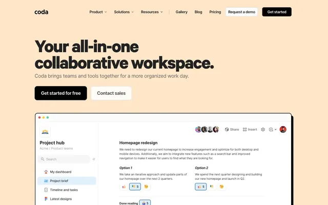
Coda's design system revolves around a crisp, functional aesthetic, emphasizing readability and clear interaction. It pairs a stark monochrome palette with a warm, inviting accent background for key sections. Typography is confident and impactful for headlines, complemented by a versatile sans-serif for body text. Components are well-defined with consistent border radii and subtle elevations, guiding users through structured content.
The page model is primarily a max-width contained layout, likely around 1200px, centered on a White Canvas background. The hero section often features a full-bleed Amber Glow background (#fff6ec) with a prominent, centered headline and primary actions. Section rhythm is managed through alternating background colors (White Canvas and Amber Glow) and consistent vertical spacing. Content is arranged in alternating text-left/image-right or text-right/image-left patterns, as well as stacked, centered blocks for calls to action or feature lists. Navigation is a sticky top bar with a clear primary action button.
Product screenshots are frequently used, often framed within a minimalist device UI or presented in an overlapping, layered fashion to convey dynamism and feature richness. These are typically contained within the primary content area, not full-bleed. Icons are simple, filled, and monochromatic, often using Midnight Ink (#212121), serving a functional role as visual aids rather than decorative elements. There is minimal use of standalone photography or complex illustrations, emphasizing the core UI and product experience.
Reminiscent of Notion, Asana, Figma, Linear.
# Coda — Style Reference
> Crisp canvas, structured workspace.

**Theme:** light

**Site:** https://coda.io

Coda's design system revolves around a crisp, functional aesthetic, emphasizing readability and clear interaction. It pairs a stark monochrome palette with a warm, inviting accent background for key sections. Typography is confident and impactful for headlines, complemented by a versatile sans-serif for body text. Components are well-defined with consistent border radii and subtle elevations, guiding users through structured content.

## Tokens — Colors

| Name | Value | Token | Role |
|------|------|------|------|
| Sunset Orange | `#ee5a29` | `--color-sunset-orange` | Highlight elements, specific headings, decorative accents — a strong, vivid punctuation mark |
| Midnight Ink | `#212121` | `--color-midnight-ink` | Primary text, strong borders, dark icons, structural elements |
| White Canvas | `#ffffff` | `--color-white-canvas` | Page backgrounds, card surfaces, ghost button backgrounds, primary action text |
| Amber Glow | `#fff6ec` | `--color-amber-glow` | Accent surface for hero sections and footers, creating a warm contrast |
| Soft Gray | `#e0e0e0` | `--color-soft-gray` | Subtle borders, button shadows, secondary dividers |
| Slate Text | `#666666` | `--color-slate-text` | Muted body text, secondary borders |
| Ash Text | `#8e8e8e` | `--color-ash-text` | Helper text, tertiary navigation links, fine borders |
| Obsidian | `#000000` | `--color-obsidian` | Primary action button background, deep shadows, bold icons |
| Warm Gray Text | `#444444` | `--color-warm-gray-text` | Secondary button text, specific UI elements |

## Tokens — Typography

### Calibre-R
- **Substitute:** Montserrat
- **Weights:** 700
- **Sizes:** 38px, 52px, 72px
- **Line height:** 1, 1.1
- **Letter spacing:** -0.045em at 72px, -0.035em at 52px, -0.025em at 38px
- **Role:** Dominant headlines, creating impact with strong, heavy presence.

### Inter
- **Substitute:** Inter
- **Weights:** 400, 600, 700
- **Sizes:** 10px, 14px, 16px, 20px, 22px
- **Line height:** 1.2, 1.38, 1.43, 1.5, 1.55
- **Letter spacing:** -0.03em at 22px, -0.01em at 20px, 0.01em at 14px and 16px
- **Role:** Versatile text for body copy, navigation, buttons, and detailed UI elements. Optimized for readability across sizes.

### Tiempos-Headline
- **Substitute:** Playfair Display
- **Weights:** 300
- **Sizes:** 38px
- **Line height:** 1.37
- **Letter spacing:** -0.01em
- **Role:** Subtler, elegant headlines, delivering authority through restraint rather than visual weight.

## Tokens — Type Scale

Perfect Fourth (1.333) from 16px base.

| Role | Size | Line height | Letter spacing |
|------|------|------|------|
| caption | 10px | 1.55 | — |
| body-sm | 14px | 1.5 | 0.01em |
| body | 16px | 1.43 | 0.01em |
| subheading | 20px | 1.38 | -0.01em |
| heading-sm | 22px | 1.2 | -0.03em |
| heading | 38px | 1.37 | -0.025em |
| heading-lg | 52px | 1.1 | -0.035em |
| display | 72px | 1 | -0.045em |

## Tokens — Spacing

- **Section gap:** 113px
- **Card padding:** 16px
- **Element gap:** 8px

## Tokens — Radius

- **Buttons:** 8px
- **Cards:** 8px
- **icons:** 44px
- **smallElements:** 4px

## Tokens — Elevation

- **Ghost Button (focused/active):** `rgb(33, 33, 33) 0px 0px 0px 1.5px inset`
- **Tertiary White Button (focused/active):** `rgb(224, 224, 224) 0px 0px 0px 1.5px inset`
- **Feature Card:** `rgba(0, 0, 0, 0.06) 0px 12px 24px -5px, rgba(0, 0, 0, 0.06) 0px 5px 10px -6px`
- **Decorative Block Shadow:** `rgb(0, 0, 0) 8px 8px 0px 0px`
- **Modal/Overlay Card:** `rgba(0, 0, 0, 0.06) 0px 18px 36px -6px, rgba(0, 0, 0, 0.06) 0px 6px 12px -6px`

## Layout

The page model is primarily a max-width contained layout, likely around 1200px, centered on a White Canvas background. The hero section often features a full-bleed Amber Glow background (#fff6ec) with a prominent, centered headline and primary actions. Section rhythm is managed through alternating background colors (White Canvas and Amber Glow) and consistent vertical spacing. Content is arranged in alternating text-left/image-right or text-right/image-left patterns, as well as stacked, centered blocks for calls to action or feature lists. Navigation is a sticky top bar with a clear primary action button.

## Imagery

Product screenshots are frequently used, often framed within a minimalist device UI or presented in an overlapping, layered fashion to convey dynamism and feature richness. These are typically contained within the primary content area, not full-bleed. Icons are simple, filled, and monochromatic, often using Midnight Ink (#212121), serving a functional role as visual aids rather than decorative elements. There is minimal use of standalone photography or complex illustrations, emphasizing the core UI and product experience.

## Components

### Primary Filled Button
*Primary call to action.*

Solid Obsidian background (#000000), White Canvas text (#ffffff), 8px border-radius, 12px horizontal padding, 8px vertical padding. Inset shadow on focus: rgb(33, 33, 33) 0px 0px 0px 1.5px inset.

### Ghost Button
*Secondary action or navigation.*

Transparent background (rgba(0,0,0,0)), Midnight Ink text and border (#212121), 8px border-radius, varied padding (8-12px horizontal, 8px vertical). Inset shadow on focus: rgb(33, 33, 33) 0px 0px 0px 1.5px inset.

### Tertiary White Button
*Less prominent actions on contrasting backgrounds.*

White Canvas background (#ffffff), Midnight Ink text and border (#212121), 8px border-radius, 12px horizontal padding, 8px vertical padding. Inset shadow on focus: rgb(224, 224, 224) 0px 0px 0px 1.5px inset.

### Compact Ghost Button
*Smaller, less emphatic actions, often within product UI.*

Semi-transparent White Canvas background (rgba(255, 255, 255, 0.85)), Warm Gray Text (#444444) for text and border, 8px border-radius, 20px horizontal padding, 8px vertical padding.

### Feature Card
*Content container for showcasing features or information.*

White Canvas background (#ffffff), 8px border-radius, 16px internal padding. Subtle elevation: rgba(0, 0, 0, 0.06) 0px 12px 24px -5px, rgba(0, 0, 0, 0.06) 0px 5px 10px -6px.

### Modal Overlay Card
*Elevated content like pop-ups or detailed views.*

White Canvas background (#ffffff), 8px border-radius. Pronounced elevation: rgba(0, 0, 0, 0.06) 0px 18px 36px -6px, rgba(0, 0, 0, 0.06) 0px 6px 12px -6px.

## Guidelines

### Do

- Prioritize a clean, spacious layout using White Canvas (#ffffff) for primary backgrounds and Amber Glow (#fff6ec) for accent sections.
- Use Calibre-R (or Montserrat) 700 for all major headings, applying precise negative letter-spacing for impact.
- Limit the use of Sunset Orange (#ee5a29) to specific highlight elements or decorative text, preventing overuse.
- Employ consistent 8px border-radius for all interactive elements and content containers (buttons, cards, images).
- Use Obsidian (#000000) for primary call-to-action buttons; for secondary actions, use either Ghost Buttons (Midnight Ink #212121 outline) or Tertiary White Buttons.
- Maintain a comfortable element gap of 8px (base unit 4px) for most UI components and content structures.
- Apply subtle shadow styles from the component list for cards and elevated elements to imply hierarchy without heavy visuals.

### Don't

- Avoid arbitrary color choices; all colors must map to a defined role within the palette.
- Do not use generic system fonts; stick to Inter for body and UI text, and Montserrat (or Calibre-R) for headlines.
- Do not vary border-radius on buttons or cards; maintain the strict 8px rounding.
- Avoid clutter; ensure page content has sufficient negative space, adhering to a comfortable density.
- Do not use highly saturated colors other than Sunset Orange (#ee5a29); the system favors a monochrome base.
- Do not create new shadow styles; use the defined elevation tokens for consistency.
- Do not use arbitrary padding values; adhere to the 4px base unit and derived spacing tokens like 12px, 16px horizontal, and 8px vertical for buttons.

## Agent Prompt Guide

primary action: #000000 (filled action)
Create a Primary Action Button: #000000 background, #ffffff text, 9999px radius, compact pill padding. Use this filled treatment for the main CTA.

Example Component Prompts:

Create a feature card: White Canvas background (#ffffff), 8px radius, 16px padding. Title 'Productivity Hub' using Inter 600 at 22px, #212121, letter-spacing -0.03em. Body text 'Centralize your workflow.' using Inter 400 at 16px, #666666.
More like this








Keep what you find
A free account saves references to boards and can send you a weekly email of picks based on what you save.
To see every result, go Pro.