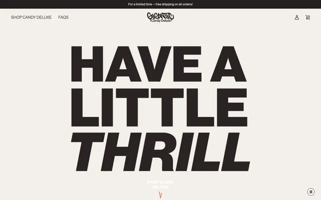
Preview image. Unlock full-res
Raw Urban Energy: Oversized typography and high-contrast visuals on a clean backdrop evoke direct, impactful communication.
Color palette
Orange outline accent for tags, dividers, and focused UI edges
Page backgrounds, product cards, general surface areas, button text on filled buttons
Primary text, button backgrounds, borders, navigation elements. Almost black, it provides strong contrast
Subtle background panels, muted text, decorative elements offering a slight visual break from pure white
Body text, secondary button borders, icons, providing maximum contrast where needed
Typography
- Weights
- 400, 450, 500, 700
- Sizes
- 12px, 14px, 16px, 18px, 24px, 25px, 32px
- Line height
- 1, 1.2, 1.3, 1.44, 1.56, 1.7, 1.8
- Letter spacing
- 0.0160em, 0.0250em, 0.0280em, 0.0310em, 0.0360em, 0.0440em, 0.0500em, 0.0570em, 0.0580em
- Fallback
- Inter
All primary headings, body text, links, and UI elements. The condensed and impactful letterforms define the brand's direct communication style.
- Weights
- 400
- Sizes
- 16px
- Line height
- 1.5
- Letter spacing
- 0.0310em
- Fallback
- Roboto Mono
Specialized decorative text treatments, often seen in custom graphics or specific callouts. Its distinct character adds a unique texture when used sparingly.
- Weights
- 400
- Sizes
- 13px
- Line height
- 1.2
Arial — detected in extracted data but not described by AI
Spacing & shape
Components
Solid Asphalt Black background, Canvas White text. No border-radius, creating a sharp, blocky feel. Padding of 30px on left/right and 0px on top/bottom. Often appears in conjunction with hero text or product listings.
Ghost button with Asphalt Black text and a 1px Asphalt Black underline. No explicit padding, intended to blend into text while remaining interactive. Used for secondary actions like 'Shop Candy Deluxe'.
Ghost button with Ink Black text and a 1px Ink Black border. Features minimal 6px horizontal padding and 1px vertical padding, creating a compact, understated interactive element.
Solid Asphalt Black background with Canvas White text, similar to the primary button but often smaller. Used for direct product interaction, like 'Shop Salty', 'Shop Crispy'. Features 0px border-radius and 30px horizontal padding.
A thin band at the very top of the page with Asphalt Black background and Canvas White text for announcements (e.g., 'Free Shipping'). Full-width, minimal height.
Guidelines
- Use Asphalt Black (#231f20) for all primary text and button backgrounds to ensure strong contrast against Canvas White (#ffffff).
- Apply 0px border-radius to all interactive elements, cards, and containers to maintain the blocky, direct aesthetic.
- Employ `neue-haas-grotesk-display` at large sizes (24px, 32px) and heavy weights (700) for headlines, with aggressive letter-spacing to create maximum impact.
- Introduce Flavor Burst Red (#ff634b) sparingly as an accent for brand elements, hover states, or small decorative graphic details.
- Maintain a clear visual hierarchy with generous vertical spacing (sectionGap 32px) between content blocks, balanced by a comfortable elementGap of 19px.
- Keep backgrounds predominantly Canvas White (#ffffff) or Street Chalk (#f0ede7), ensuring text remains highly legible.
- Avoid using multiple chromatic colors; limit vibrant hues to the singular Flavor Burst Red (#ff634b) accent.
- Do not use subtle shadows or gradients; rely on stark color contrast and flat surfaces for visual hierarchy.
- Refrain from rounded corners or soft edges; all visual elements should adhere to sharp, angular forms dictated by 0px border-radius.
- Do not dilute headline impact with light weights or small sizes; prioritize bold, expansive typography for maximum presence.
- Avoid decorative imagery that clashes with the high-contrast, text-dominant, urban aesthetic. Product shots should be clean and direct.
- Do not introduce complex UI components or overlays; keep layouts direct and information presented upfront.
About this system
ShowHide
Gigantic's design system pulses with a bold, high-contrast energy, centered on a dominant black and white palette punctuated by a single vivid red accent. Typography is oversized and impactful, often leaning into condensed and italicized forms to create a sense of dynamic urgency, balanced by generous spacing. The overall aesthetic is raw and direct, reminiscent of street art or bold industrial signage, with minimal decorative elements, focusing instead on stark visual statements.
The site uses a full-bleed page model, with content often centered but spanning the full width, especially for hero sections or full-page typographic statements. The hero features an immense, centered headline against a Street Chalk background, immediately setting a bold typographic tone. Sections alternate between a high-contrast white background and the subtle Street Chalk background, creating a rhythmic visual flow. Content arrangement is primarily centered stacks for headlines and subtext, transitioning to a distinct two-column layout for product descriptions (text-left/image-right, then reversed). Product listings typically utilize a 4-column grid. The layout prioritizes ample space around key elements, presenting information in impactful, self-contained blocks. Navigation is a sticky top bar with minimal links.
The site uses a combination of sharp product photography and bold, graphic illustrations. Product shots are clean, brightly lit, and often feature the product unwrapped or broken to showcase inner textures, set against pure white or subtly textured backgrounds. Illustrations are geometric and distressed (e.g., 'VARIETY BOX') or abstract, often using Ink Black with subtle texture. Icons are predominantly filled and blocky, adhering to the sharp-edged aesthetic. Imagery plays a dual role: directly showcasing product appeal and reinforcing the brand's impactful, slightly rugged visual identity. Density is balanced, with images occupying significant blocks but always complementary to large typographic statements rather than overwhelming them.
Reminiscent of Oatly, Magic Spoon Cereal, Brumate, Liquid Death.
# Gigantic — Style Reference
> Raw Urban Energy: Oversized typography and high-contrast visuals on a clean backdrop evoke direct, impactful communication.

**Theme:** light

**Site:** https://giganticcandy.com

Gigantic's design system pulses with a bold, high-contrast energy, centered on a dominant black and white palette punctuated by a single vivid red accent. Typography is oversized and impactful, often leaning into condensed and italicized forms to create a sense of dynamic urgency, balanced by generous spacing. The overall aesthetic is raw and direct, reminiscent of street art or bold industrial signage, with minimal decorative elements, focusing instead on stark visual statements.

## Tokens — Colors

| Name | Value | Token | Role |
|------|------|------|------|
| Flavor Burst Red | `#ff634b` | `--color-flavor-burst-red` | Orange outline accent for tags, dividers, and focused UI edges |
| Canvas White | `#ffffff` | `--color-canvas-white` | Page backgrounds, product cards, general surface areas, button text on filled buttons |
| Asphalt Black | `#231f20` | `--color-asphalt-black` | Primary text, button backgrounds, borders, navigation elements. Almost black, it provides strong contrast |
| Street Chalk | `#f0ede7` | `--color-street-chalk` | Subtle background panels, muted text, decorative elements offering a slight visual break from pure white |
| Ink Black | `#000000` | `--color-ink-black` | Body text, secondary button borders, icons, providing maximum contrast where needed |

## Tokens — Typography

### neue-haas-grotesk-display
- **Substitute:** Inter
- **Weights:** 400, 450, 500, 700
- **Sizes:** 12px, 14px, 16px, 18px, 24px, 25px, 32px
- **Line height:** 1, 1.2, 1.3, 1.44, 1.56, 1.7, 1.8
- **Letter spacing:** 0.0160em, 0.0250em, 0.0280em, 0.0310em, 0.0360em, 0.0440em, 0.0500em, 0.0570em, 0.0580em
- **Role:** All primary headings, body text, links, and UI elements. The condensed and impactful letterforms define the brand's direct communication style.

### GTStandard-M
- **Substitute:** Roboto Mono
- **Weights:** 400
- **Sizes:** 16px
- **Line height:** 1.5
- **Letter spacing:** 0.0310em
- **Role:** Specialized decorative text treatments, often seen in custom graphics or specific callouts. Its distinct character adds a unique texture when used sparingly.

### Arial
- **Weights:** 400
- **Sizes:** 13px
- **Line height:** 1.2
- **Role:** Arial — detected in extracted data but not described by AI

## Tokens — Type Scale

Minor Third (1.2) from 14px base.

| Role | Size | Line height | Letter spacing |
|------|------|------|------|
| caption | 12px | 1.2 | 0.43px |
| body | 14px | 1.56 | 0.49px |
| body-lg | 16px | 1.44 | 0.58px |
| subheading | 18px | 1.3 | 0.65px |
| heading | 24px | 1.2 | 0.6px |
| display | 32px | 1 | 0.5px |

## Tokens — Spacing

- **Section gap:** 32px
- **Card padding:** 30px
- **Element gap:** 19px

## Tokens — Radius

- **none:** 0px

## Layout

The site uses a full-bleed page model, with content often centered but spanning the full width, especially for hero sections or full-page typographic statements. The hero features an immense, centered headline against a Street Chalk background, immediately setting a bold typographic tone. Sections alternate between a high-contrast white background and the subtle Street Chalk background, creating a rhythmic visual flow. Content arrangement is primarily centered stacks for headlines and subtext, transitioning to a distinct two-column layout for product descriptions (text-left/image-right, then reversed). Product listings typically utilize a 4-column grid. The layout prioritizes ample space around key elements, presenting information in impactful, self-contained blocks. Navigation is a sticky top bar with minimal links.

## Imagery

The site uses a combination of sharp product photography and bold, graphic illustrations. Product shots are clean, brightly lit, and often feature the product unwrapped or broken to showcase inner textures, set against pure white or subtly textured backgrounds. Illustrations are geometric and distressed (e.g., 'VARIETY BOX') or abstract, often using Ink Black with subtle texture. Icons are predominantly filled and blocky, adhering to the sharp-edged aesthetic. Imagery plays a dual role: directly showcasing product appeal and reinforcing the brand's impactful, slightly rugged visual identity. Density is balanced, with images occupying significant blocks but always complementary to large typographic statements rather than overwhelming them.

## Components

### Filled Primary Button
*Call to action*

Solid Asphalt Black background, Canvas White text. No border-radius, creating a sharp, blocky feel. Padding of 30px on left/right and 0px on top/bottom. Often appears in conjunction with hero text or product listings.

### Text Link Button
*Secondary action*

Ghost button with Asphalt Black text and a 1px Asphalt Black underline. No explicit padding, intended to blend into text while remaining interactive. Used for secondary actions like 'Shop Candy Deluxe'.

### Outlined Text Button
*Tertiary action*

Ghost button with Ink Black text and a 1px Ink Black border. Features minimal 6px horizontal padding and 1px vertical padding, creating a compact, understated interactive element.

### Product Shop Buttons
*Product navigation action*

Solid Asphalt Black background with Canvas White text, similar to the primary button but often smaller. Used for direct product interaction, like 'Shop Salty', 'Shop Crispy'. Features 0px border-radius and 30px horizontal padding.

### Utility Top Bar
*Informational banner*

A thin band at the very top of the page with Asphalt Black background and Canvas White text for announcements (e.g., 'Free Shipping'). Full-width, minimal height.

## Guidelines

### Do

- Use Asphalt Black (#231f20) for all primary text and button backgrounds to ensure strong contrast against Canvas White (#ffffff).
- Apply 0px border-radius to all interactive elements, cards, and containers to maintain the blocky, direct aesthetic.
- Employ `neue-haas-grotesk-display` at large sizes (24px, 32px) and heavy weights (700) for headlines, with aggressive letter-spacing to create maximum impact.
- Introduce Flavor Burst Red (#ff634b) sparingly as an accent for brand elements, hover states, or small decorative graphic details.
- Maintain a clear visual hierarchy with generous vertical spacing (sectionGap 32px) between content blocks, balanced by a comfortable elementGap of 19px.
- Keep backgrounds predominantly Canvas White (#ffffff) or Street Chalk (#f0ede7), ensuring text remains highly legible.

### Don't

- Avoid using multiple chromatic colors; limit vibrant hues to the singular Flavor Burst Red (#ff634b) accent.
- Do not use subtle shadows or gradients; rely on stark color contrast and flat surfaces for visual hierarchy.
- Refrain from rounded corners or soft edges; all visual elements should adhere to sharp, angular forms dictated by 0px border-radius.
- Do not dilute headline impact with light weights or small sizes; prioritize bold, expansive typography for maximum presence.
- Avoid decorative imagery that clashes with the high-contrast, text-dominant, urban aesthetic. Product shots should be clean and direct.
- Do not introduce complex UI components or overlays; keep layouts direct and information presented upfront.

## Agent Prompt Guide

Quick Color Reference:
text: #231f20
background: #ffffff
border: #231f20
accent: #ff634b
primary action: #231f20 (filled action)

Example Component Prompts:
1. Create a hero section: Street Chalk (#f0ede7) background. Headline 'HAVE A LITTLE THRILL' at largest possible size using `neue-haas-grotesk-display` weight 700 letter spacing 0.5px in Asphalt Black (#231f20), centered on the page. Below it, a Text Link Button with text 'SHOP CANDY DELUXE' in Asphalt Black (#231f20) with a 1px underline.
2. Create a Primary Action Button: #231f20 background, #ffffff text, 9999px radius, compact pill padding. Use this filled treatment for the main CTA.
3. Implement a informational ribbon: Full-width Asphalt Black (#231f20) background with Canvas White (#ffffff) text 'For a limited time -- free shipping on all orders!' at 12px `neue-haas-grotesk-display` weight 400, centered. No padding, fixed to the top edge of the viewport.
4. Build a section title: Heading 'VARIETY BOX' in Ink Black (#000000) at 32px `neue-haas-grotesk-display` weight 700, followed by a descriptive paragraph in Asphalt Black (#231f20) at 16px `neue-haas-grotesk-display` weight 400. Ensure 32px spacing between this block and subsequent content.
More like this









Keep what you find
A free account saves references to boards and can send you a weekly email of picks based on what you save.
To see every result, go Pro.