Preview image. Unlock full-res
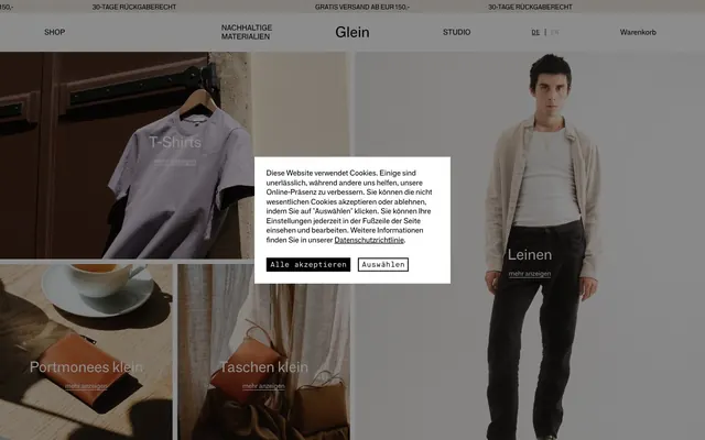
Monochromatic architectural clarity: product as sculpture, framed by pure light and shadow.
Color palette
Primary text, interactive elements, section borders, button backgrounds, accent details — a deep, true black creates strong contrast against light surfaces, grounding the UI
Primary page and card backgrounds, default text for dark buttons — provides a clean, expansive foundation for content
Secondary background accent, subtle surface differentiation — a warm, desaturated off-white softens larger content blocks without introducing overt color
Light secondary text, subtle borders — used for less prominent text elements or decorative navigation elements where a full contrast is not desired
Typography
- Weights
- 400
- Sizes
- 13px, 15px, 20px, 30px, 111px
- Line height
- 1, 1.19, 1.2, 1.3
- Fallback
- Inter
Headlines, body text, general UI elements — a custom grotesque sans-serif provides a sturdy, direct, and highly legible voice. Its geometric simplicity reinforces the brand's 'product as sculpture' ethos.
- Weights
- 400
- Sizes
- 13px, 15px, 20px
- Line height
- 1, 1.19, 1.2, 1.3
- Fallback
- Space Mono
Callouts, metadata, navigation, button labels — a custom monospaced sans-serif offers a technical, precise counterpoint to F-Grotesk, lending an artisanal, craft-focused feel to functional text.
Spacing & shape
Components
Solid Raven Black background (#000000) with Canvas White text (#ffffff). Features 2.25px vertical padding and 6px horizontal padding. No border radius, maintaining a sharp, utilitarian edge.
Transparent background with Raven Black text (#000000). Used for subtle actions or navigation elements that should not dominate the visual hierarchy. No padding or border radius for a seamless integration with text.
Raven Black text (#000000) with no background or border. Text is typically Maison-Neue-Mono at 15px. Emphasizes content over interactive chrome.
Maison-Neue-Mono 400 text, 13px size, with no background, intended for short informational text like 'mehr anzeigen'. It appears frequently as a text label overlaying images or section titles.
A rectangular overlay with Canvas White background (#ffffff) and Raven Black text (#000000). Contains primary and secondary buttons for user input, displaying a sharp 0px border-radius to match the overall aesthetic.
Guidelines
- Always use Raven Black (#000000) for primary text and interactive elements to maintain high contrast and legibility.
- Prioritize Canvas White (#ffffff) as the base background for main content areas, reserving Warm Parchment (#ebe6dc) for subtle content block distinctions.
- Employ F-Grotesk for all primary headings and body text to convey a direct, sculptural presence.
- Utilize Maison-Neue-Mono for nav links and button labels, leveraging its monospaced character for a precise, crafted feel.
- Maintain hard, 0px border-radii for all buttons and interactive elements, reinforcing the sharp, architectural visual language.
- Structure layouts with implied grid systems and strong vertical rhythm, using minimal explicit dividers where possible.
- Ensure all interactive elements maintain a hover state that aligns with the Raven Black and Canvas White contrast, such as a background fill on Raven Black from a ghost element.
- Avoid introducing any saturated colors; the system is strictly achromatic, with no accent hues beyond brand neutrals.
- Do not soften edges with border-radii; all interactive elements and contained components should maintain crisp, 0px corners.
- Refrain from using drop shadows or heavy elevation styles; rely on color contrast and subtle background changes for layering.
- Do not use generic sans-serif fonts; custom F-Grotesk and Maison-Neue-Mono are essential to the brand's unique typographic fingerprint.
- Avoid decorative gradients or complex overlays; maintain a flat, stark aesthetic for backgrounds and surfaces.
- Do not break rhythm with irregular spacing; adhere to the defined base unit of 6px and derived element/section gaps.
- Do not use any iconography that deviates from simple, single-color line art in Raven Black or Muted Ash.
About this system
ShowHide
Glein embraces a stark, high-contrast aesthetic reminiscent of black-and-white photography, presenting product with minimal visual distraction. The design prioritizes readability and directness through utilitarian custom typography and a precise, monochromatic color palette. Surfaced content often features a muted, off-white background, creating subtle depth while maintaining an overall light theme. Components are frequently borderless or use fine, dark strokes to delineate elements, emphasizing content through clear separation rather than heavy ornamentation. Layouts are structured and rectilinear, relying on robust typographic hierarchy to guide the eye.
The page primarily follows a max-width contained model with sections flowing vertically, but often features full-bleed hero sections or large image blocks that break this convention to create visual impact. The hero section frequently uses large background imagery with centered overlay text or split-screen layouts. Sections maintain a consistent vertical rhythm, often alternating between large image blocks and cleaner text-dominant areas. Content is arranged in flexible grid patterns, frequently two-column for text alongside visuals, or implicit grids for product displays. The overall density is balanced, allowing breathing room around large images while maintaining readable text blocks. Navigation is a sticky top bar, minimal and unembellished, emphasizing direct links.
This site uses large, editorial-style product photography, often featuring models against minimalist, neutral backgrounds. Images are typically full-bleed within their section or occupy significant visual space, acting as primary content elements rather than mere decorations. The photography style is high-key and focused, with clean crops and natural lighting that emphasizes product textures and forms. There are no overt illustrations or abstract graphics; instead, imagery directly showcases the product. Icons are minimal, single-color (Raven Black), and functional, receding into the UI rather than drawing attention. The density is image-heavy, with large product visuals dominating sections and text used sparingly to frame or narrate.
Reminiscent of Acne Studios, COS (Collection of Style), A.P.C..
# Glein — Style Reference
> Monochromatic architectural clarity: product as sculpture, framed by pure light and shadow.

**Theme:** light

**Site:** https://glein.wien

Glein embraces a stark, high-contrast aesthetic reminiscent of black-and-white photography, presenting product with minimal visual distraction. The design prioritizes readability and directness through utilitarian custom typography and a precise, monochromatic color palette. Surfaced content often features a muted, off-white background, creating subtle depth while maintaining an overall light theme. Components are frequently borderless or use fine, dark strokes to delineate elements, emphasizing content through clear separation rather than heavy ornamentation. Layouts are structured and rectilinear, relying on robust typographic hierarchy to guide the eye.

## Tokens — Colors

| Name | Value | Token | Role |
|------|------|------|------|
| Raven Black | `#000000` | `--color-raven-black` | Primary text, interactive elements, section borders, button backgrounds, accent details — a deep, true black creates strong contrast against light surfaces, grounding the UI |
| Canvas White | `#ffffff` | `--color-canvas-white` | Primary page and card backgrounds, default text for dark buttons — provides a clean, expansive foundation for content |
| Warm Parchment | `#ebe6dc` | `--color-warm-parchment` | Secondary background accent, subtle surface differentiation — a warm, desaturated off-white softens larger content blocks without introducing overt color |
| Muted Ash | `#b3b3b3` | `--color-muted-ash` | Light secondary text, subtle borders — used for less prominent text elements or decorative navigation elements where a full contrast is not desired |

## Tokens — Typography

### F-Grotesk
- **Substitute:** Inter
- **Weights:** 400
- **Sizes:** 13px, 15px, 20px, 30px, 111px
- **Line height:** 1, 1.19, 1.2, 1.3
- **Role:** Headlines, body text, general UI elements — a custom grotesque sans-serif provides a sturdy, direct, and highly legible voice. Its geometric simplicity reinforces the brand's 'product as sculpture' ethos.

### Maison-Neue-Mono
- **Substitute:** Space Mono
- **Weights:** 400
- **Sizes:** 13px, 15px, 20px
- **Line height:** 1, 1.19, 1.2, 1.3
- **Role:** Callouts, metadata, navigation, button labels — a custom monospaced sans-serif offers a technical, precise counterpoint to F-Grotesk, lending an artisanal, craft-focused feel to functional text.

## Tokens — Type Scale

| Role | Size | Line height | Letter spacing |
|------|------|------|------|
| caption | 13px | 1 | — |
| body | 15px | 1 | — |
| subheading | 20px | 1.19 | — |
| heading | 30px | 1.2 | — |
| display | 111px | 1.3 | — |

## Tokens — Spacing

- **Section gap:** 42px
- **Card padding:** 24px
- **Element gap:** 13px

## Tokens — Radius

- **Default:** 0px

## Layout

The page primarily follows a max-width contained model with sections flowing vertically, but often features full-bleed hero sections or large image blocks that break this convention to create visual impact. The hero section frequently uses large background imagery with centered overlay text or split-screen layouts. Sections maintain a consistent vertical rhythm, often alternating between large image blocks and cleaner text-dominant areas. Content is arranged in flexible grid patterns, frequently two-column for text alongside visuals, or implicit grids for product displays. The overall density is balanced, allowing breathing room around large images while maintaining readable text blocks. Navigation is a sticky top bar, minimal and unembellished, emphasizing direct links.

## Imagery

This site uses large, editorial-style product photography, often featuring models against minimalist, neutral backgrounds. Images are typically full-bleed within their section or occupy significant visual space, acting as primary content elements rather than mere decorations. The photography style is high-key and focused, with clean crops and natural lighting that emphasizes product textures and forms. There are no overt illustrations or abstract graphics; instead, imagery directly showcases the product. Icons are minimal, single-color (Raven Black), and functional, receding into the UI rather than drawing attention. The density is image-heavy, with large product visuals dominating sections and text used sparingly to frame or narrate.

## Components

### Filled Primary Button
*Primary Call to Action*

Solid Raven Black background (#000000) with Canvas White text (#ffffff). Features 2.25px vertical padding and 6px horizontal padding. No border radius, maintaining a sharp, utilitarian edge.

### Ghost Button
*Secondary Action*

Transparent background with Raven Black text (#000000). Used for subtle actions or navigation elements that should not dominate the visual hierarchy. No padding or border radius for a seamless integration with text.

### Navigation Link
*Primary Navigation*

Raven Black text (#000000) with no background or border. Text is typically Maison-Neue-Mono at 15px. Emphasizes content over interactive chrome.

### Callout Badge
*Informational Display*

Maison-Neue-Mono 400 text, 13px size, with no background, intended for short informational text like 'mehr anzeigen'. It appears frequently as a text label overlaying images or section titles.

### Cookie Consent Modal
*Privacy Notice*

A rectangular overlay with Canvas White background (#ffffff) and Raven Black text (#000000). Contains primary and secondary buttons for user input, displaying a sharp 0px border-radius to match the overall aesthetic.

## Guidelines

### Do

- Always use Raven Black (#000000) for primary text and interactive elements to maintain high contrast and legibility.
- Prioritize Canvas White (#ffffff) as the base background for main content areas, reserving Warm Parchment (#ebe6dc) for subtle content block distinctions.
- Employ F-Grotesk for all primary headings and body text to convey a direct, sculptural presence.
- Utilize Maison-Neue-Mono for nav links and button labels, leveraging its monospaced character for a precise, crafted feel.
- Maintain hard, 0px border-radii for all buttons and interactive elements, reinforcing the sharp, architectural visual language.
- Structure layouts with implied grid systems and strong vertical rhythm, using minimal explicit dividers where possible.
- Ensure all interactive elements maintain a hover state that aligns with the Raven Black and Canvas White contrast, such as a background fill on Raven Black from a ghost element.

### Don't

- Avoid introducing any saturated colors; the system is strictly achromatic, with no accent hues beyond brand neutrals.
- Do not soften edges with border-radii; all interactive elements and contained components should maintain crisp, 0px corners.
- Refrain from using drop shadows or heavy elevation styles; rely on color contrast and subtle background changes for layering.
- Do not use generic sans-serif fonts; custom F-Grotesk and Maison-Neue-Mono are essential to the brand's unique typographic fingerprint.
- Avoid decorative gradients or complex overlays; maintain a flat, stark aesthetic for backgrounds and surfaces.
- Do not break rhythm with irregular spacing; adhere to the defined base unit of 6px and derived element/section gaps.
- Do not use any iconography that deviates from simple, single-color line art in Raven Black or Muted Ash.

## Agent Prompt Guide

**Quick Color Reference:**
text: #000000
background: #ffffff
border: #000000
accent: no distinct accent color
primary action: no distinct CTA color

**3-5 Example Component Prompts:**
No distinct primary action color was observed; use the extracted neutral button treatments instead of inventing a filled CTA color.
2. Design a `Navigation Link` for 'Nachhaltige Materialien'. Text color is Raven Black (#000000), using Maison-Neue-Mono, weight 400, size 15px. No background, no border, no padding.
4. Create a product listing section. The section background is Warm Parchment (#ebe6dc). The product title 'T-Shirts' should use F-Grotesk, weight 400, size 30px, in Raven Black (#000000). Below the title, include a `Callout Badge` 'mehr anzeigen' in Maison-Neue-Mono, weight 400, size 13px, Raven Black (#000000).
More like this









Keep what you find
A free account saves references to boards and can send you a weekly email of picks based on what you save.
To see every result, go Pro.