Preview image. Unlock full-res
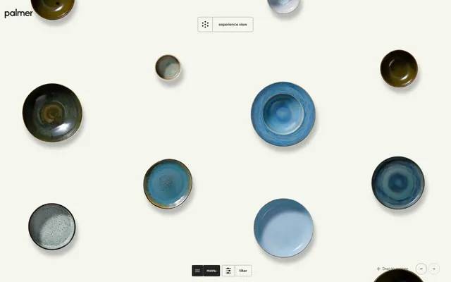
Warm gallery space
Color palette
Page backgrounds, card surfaces, ghost button backgrounds – a soft, warm off-white that creates an expansive, inviting backdrop for the dinnerware
Dark borders and separators for elevated surfaces and inverted UI. Do not promote it to the primary CTA color
Decorative highlights, text on dark backgrounds when contrast is critical – a crisp white used sparingly to provide visual lift or ensure readability on darker elements
Medium-contrast borders, control outlines, and structural separators. Do not promote it to the primary CTA color
Dark borders and separators for elevated surfaces and inverted UI. Do not promote it to the primary CTA color
Typography
- Weights
- 300, 400, 500, 600, 700
- Sizes
- 11px, 12px, 14px, 16px, 18px, 120px
- Line height
- 0.9, 1.4
- Letter spacing
- -0.0400em, -0.0300em, -0.0200em
- Fallback
- Inter
All textual content, from headings to body text and interactive elements. Its custom nature and varying letter-spacing contribute to Palmer's distinctive typographic voice, feeling refined and spacious.
Spacing & shape
Elevation
Components
Transparent background with Inkwell text and a 1px Inkwell border. Padding is minimal or zero for a light, minimalist look. Letter-spacing is typically -0.0200em for a refined appearance. Ex: 'experience view' button
Deep Licorice background with Chalk White text and a 3px border-radius. Padding is 7px for a compact yet solid presence. Used for main navigation items like 'menu' and 'filter'.
These cards appear transparent, allowing the Canvas Creme background to show through. Some instances feature a subtle 9px border-radius to soften their edges, while others are sharp 0px. They have no explicit padding or shadow, relying on the imagery and its drop shadow for visual separation.
Implicitly defined by a 100px border-radius, these tags take on a pill-like or circular shape. Text is Inkwell, typically with generous letter-spacing. Background is often Canvas Creme with a subtle Inkwell border.
Guidelines
- Prioritize Canvas Creme (#f5f6ee) as the primary background for all content, creating an airy, gallery-like feel.
- Use Inkwell (#222222) for all primary body text, headings, and interactive element borders.
- Apply TWK Lausanne with generous letter-spacing (-0.0200em to -0.0400em) to all textual elements, emphasizing its custom, refined character.
- Employ ghosted button styles for most interactive elements, using `background-color: transparent` and a thin Inkwell (#222222) border.
- Maintain a clear elementGap of 12px for spacing between most UI elements, supporting a comfortable density.
- Utilize a 9px border-radius for softer contained elements, otherwise prefer 0px for sharp, clean edges as seen on some cards and buttons.
- For top-level navigation, use Deep Licorice (#000000) as background for strong visual anchors. They should be compact with 7px padding and a 3px border radius.
- Avoid strong, saturated colors for UI elements; color should primarily come from product photography.
- Do not use heavy shadows or distinct background colors for product cards; let the product imagery and its built-in shadows define elevation.
- Resist using tight letter-spacing on any font; the ample spacing of TWK Lausanne is a core part of the brand identity.
- Do not introduce complex gradients or textures into UI backgrounds or components; surfaces should remain flat and monochromatic.
- Refrain from using bold type weights for emphasis in body copy; weight 300-500 should dominate to maintain the delicate aesthetic.
About this system
ShowHide
Palmer embraces a tactile, gallery-like aesthetic, presenting dinnerware as curated art objects on an expansive, warm off-white canvas. The visual system is anchored by deep, earthy neutrals that provide a grounded contrast to the product photography. Typography is delicate yet authoritative, using generous letter-spacing to emphasize its custom font. Interaction elements are subtle and demure, blending into the background through ghosted styles and soft, rounded edges, allowing the product to remain the sole focal point.
Reminiscent of Figma, Stripe, Apple (product pages).
# Palmer — Style Reference
> Warm gallery space

**Theme:** light

**Site:** https://www.palmer-dinnerware.com

Palmer embraces a tactile, gallery-like aesthetic, presenting dinnerware as curated art objects on an expansive, warm off-white canvas. The visual system is anchored by deep, earthy neutrals that provide a grounded contrast to the product photography. Typography is delicate yet authoritative, using generous letter-spacing to emphasize its custom font. Interaction elements are subtle and demure, blending into the background through ghosted styles and soft, rounded edges, allowing the product to remain the sole focal point.

## Tokens — Colors

| Name | Value | Token | Role |
|------|------|------|------|
| Canvas Creme | `#f5f6ee` | `--color-canvas-creme` | Page backgrounds, card surfaces, ghost button backgrounds – a soft, warm off-white that creates an expansive, inviting backdrop for the dinnerware |
| Inkwell | `#222222` | `--color-inkwell` | Dark borders and separators for elevated surfaces and inverted UI. Do not promote it to the primary CTA color |
| Chalk White | `#ffffff` | `--color-chalk-white` | Decorative highlights, text on dark backgrounds when contrast is critical – a crisp white used sparingly to provide visual lift or ensure readability on darker elements |
| Shadow Grey | `#a1a19c` | `--color-shadow-grey` | Medium-contrast borders, control outlines, and structural separators. Do not promote it to the primary CTA color |
| Deep Licorice | `#000000` | `--color-deep-licorice` | Dark borders and separators for elevated surfaces and inverted UI. Do not promote it to the primary CTA color |

## Tokens — Typography

### TWK Lausanne
- **Substitute:** Inter
- **Weights:** 300, 400, 500, 600, 700
- **Sizes:** 11px, 12px, 14px, 16px, 18px, 120px
- **Line height:** 0.9, 1.4
- **Letter spacing:** -0.0400em, -0.0300em, -0.0200em
- **Role:** All textual content, from headings to body text and interactive elements. Its custom nature and varying letter-spacing contribute to Palmer's distinctive typographic voice, feeling refined and spacious.

## Tokens — Type Scale

| Role | Size | Line height | Letter spacing |
|------|------|------|------|
| caption | 11px | 1.4 | -0.44px |
| body | 14px | 1.4 | -0.42px |
| heading | 18px | 1.4 | -0.36px |
| display | 120px | 0.9 | -4.8px |

## Tokens — Spacing

- **Section gap:** 80px
- **Card padding:** 16px
- **Element gap:** 12px

## Tokens — Radius

- **Buttons:** 0px
- **Cards:** 9px
- **nav:** 3px
- **tags:** 100px

## Tokens — Elevation

- **Product Card (implied):** `The product images themselves have embedded soft drop shadows, creating an illusion of depth without explicit UI element shadows. Actual CSS shadows on page elements are not detected as distinct design system tokens.`

## Components

### Ghost Button
*Default interactive element, secondary actions*

Transparent background with Inkwell text and a 1px Inkwell border. Padding is minimal or zero for a light, minimalist look. Letter-spacing is typically -0.0200em for a refined appearance. Ex: 'experience view' button

### Dark Overlay Button
*Navigation and primary controls*

Deep Licorice background with Chalk White text and a 3px border-radius. Padding is 7px for a compact yet solid presence. Used for main navigation items like 'menu' and 'filter'.

### Product Card
*Displaying individual dinnerware pieces*

These cards appear transparent, allowing the Canvas Creme background to show through. Some instances feature a subtle 9px border-radius to soften their edges, while others are sharp 0px. They have no explicit padding or shadow, relying on the imagery and its drop shadow for visual separation.

### Circular Tag
*Filters and categorization*

Implicitly defined by a 100px border-radius, these tags take on a pill-like or circular shape. Text is Inkwell, typically with generous letter-spacing. Background is often Canvas Creme with a subtle Inkwell border.

## Guidelines

### Do

- Prioritize Canvas Creme (#f5f6ee) as the primary background for all content, creating an airy, gallery-like feel.
- Use Inkwell (#222222) for all primary body text, headings, and interactive element borders.
- Apply TWK Lausanne with generous letter-spacing (-0.0200em to -0.0400em) to all textual elements, emphasizing its custom, refined character.
- Employ ghosted button styles for most interactive elements, using `background-color: transparent` and a thin Inkwell (#222222) border.
- Maintain a clear elementGap of 12px for spacing between most UI elements, supporting a comfortable density.
- Utilize a 9px border-radius for softer contained elements, otherwise prefer 0px for sharp, clean edges as seen on some cards and buttons.
- For top-level navigation, use Deep Licorice (#000000) as background for strong visual anchors. They should be compact with 7px padding and a 3px border radius.

### Don't

- Avoid strong, saturated colors for UI elements; color should primarily come from product photography.
- Do not use heavy shadows or distinct background colors for product cards; let the product imagery and its built-in shadows define elevation.
- Resist using tight letter-spacing on any font; the ample spacing of TWK Lausanne is a core part of the brand identity.
- Do not introduce complex gradients or textures into UI backgrounds or components; surfaces should remain flat and monochromatic.
- Refrain from using bold type weights for emphasis in body copy; weight 300-500 should dominate to maintain the delicate aesthetic.

## Agent Prompt Guide

Quick Color Reference:
text: #222222
background: #f5f6ee
border: #222222
accent: none observed
primary action: no distinct CTA color

3-5 Example Component Prompts:
1. Create a transparent top-left logo area: TWK Lausanne weight 400 heading text 'palmer', color #222222. Above it, a ghost button 'experience view' with TWK Lausanne weight 400 body-sm text, color #222222, 1px border #222222, and 0px padding, 0px radius.
2. Design a minimalist bottom navigation bar: #000000 background, 3px border-radius. Include two ghost buttons side-by-side, each with 'menu' or 'filter' text of TWK Lausanne weight 400 body-sm at #ffffff, with 7px padding.
3. Display a dinnerware product card: The card itself is visually transparent (matches Canvas Creme background #f5f6ee, no border, no shadow, 0px or 9px radius). Its content is a product image which already includes a subtle soft shadow, presented without additional UI elements obscuring it. The text 'collection' below it uses TWK Lausanne weight 400 body text, color #222222, with a 12px gap from the image.
4. Produce a detailed product view heading: TWK Lausanne weight 500 display text, color #222222, line-height 0.9, letter-spacing -4.8px ('E x p l o r e P a l m e').
More like this









Keep what you find
A free account saves references to boards and can send you a weekly email of picks based on what you save.
To see every result, go Pro.