Preview image. Unlock full-res
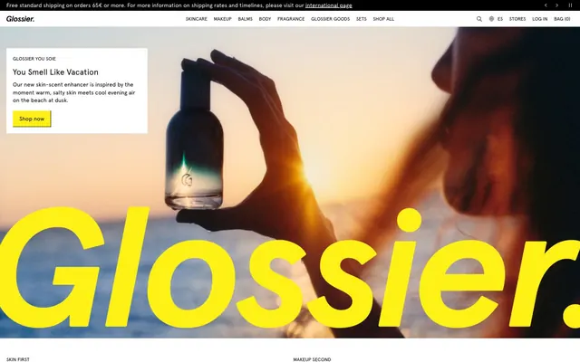
Photographic vibrancy on crisp white canvas. Imagine a brightly lit product shot, vibrant and rich, placed on a pristine white gallery wall.
Color palette
Primary call-to-action buttons, accent highlights, brand logotype. Its vivid saturation provides energetic focal points.
New product badges. Offers a clear, distinct visual indicator for new items.
Primary text, iconography, solid button backgrounds, borders. Establishes a bold and clear presence against light backgrounds.
Page backgrounds, card surfaces, button text. Provides a clean, expansive backdrop.
Secondary text, subtle instructional text, input placeholders. A softer contrast for less prominent information.
Badge backgrounds, input borders. Provides a subtle distinction without visual noise.
Subtle background for navigation or section dividers. Used for delicate background differentiation.
Typography
- Weights
- 400, 500, 700
- Sizes
- 12px, 14px, 16px, 20px, 32px
- Line height
- 1, 1.09, 1.15, 1.17, 1.2, 1.23, 1.3, 1.4, 1.43, 1.46, 1.63, 1.67, 1.7
- Letter spacing
- 0.002em at 12px, 0.003em at 14px, 0.04em at 16px
- Fallback
- system-ui, sans-serif
Primary typeface for all body text, headings, navigational elements, and buttons. Its clean, geometric sans-serif quality maintains a professional yet approachable tone.
- Weights
- 400
- Sizes
- 12px
- Line height
- 1.4
- Letter spacing
- normal
- Fallback
- monospace
Used sparingly for technical or code-like elements where fixed-width spacing is desired, providing subtle typographic variation.
- Weights
- 400
- Sizes
- 16px
- Line height
- 1.5
- Letter spacing
- normal
- Fallback
- system-ui, sans-serif
A secondary display font, used for specific highlighted text blocks, contributing to a distinctive brand voice.
Spacing & shape
Components
Solid black background (Ink #000000), white text (Snow #FFFFFF), 0px border-radius, 8px vertical padding, 16px horizontal padding. Font: Apercu Bold 16px, normal letter-spacing, line-height 1.23.
Transparent background, black text (Ink #000000) and 1px bottom border. 0px padding. Font: Apercu Regular 16px, normal letter-spacing.
Faint gray background (240,240,240), black text (Ink #000000), 0px border-radius, 6px top padding, 5px right/bottom/left padding, 1px black border. Font: Apercu Bold 14px, normal letter-spacing.
White background (Snow #FFFFFF), gray text (Ash #666666), 1px border with Fog (#e8e8e8) color, 0px border-radius, 22px top padding, 8px right/left padding, 6px bottom padding. Font: Apercu Regular 16px.
Dark blue background (Twilight Indigo #0600ff), black text (Ink #000000), 0px border-radius, 1px vertical padding, 8px horizontal padding. Font: Apercu Regular 12px.
Light gray background (Fog #e8e8e8), black text (Ink #000000), 0px border-radius, 1px vertical padding, 8px horizontal padding. Font: Apercu Regular 12px.
Guidelines
- Maintain a primary color palette of Ink (#000000) for text and Snow (#FFFFFF) for backgrounds to ensure high contrast and readability.
- Utilize Apercu for all text elements; vary weights (400, 500, 700) and sizes (12px, 14px, 16px, 20px, 32px) to establish clear hierarchy.
- Apply precise letter-spacing adjustments to Apercu typography: 0.002em at 12px, 0.003em at 14px, and 0.04em at 16px for optimal visual balance.
- Reserve Lemon Zest (#fff116) strictly for primary call-to-action buttons and brand accents to maximize its impact and recognition.
- Implement a consistent 0px border-radius across all buttons, cards, and input fields to uphold the sharp, modern aesthetic.
- Use 8px for element spacing by default, increasing to 14px for more significant separations between related content blocks.
- Avoid introducing gradients or shadows; the aesthetic relies on flat colors and crisp edges to define elements.
- Do not use highly saturated colors other than Lemon Zest (#fff116) or Twilight Indigo (#0600ff) in prominent UI elements, as this dilutes brand identity.
- Refrain from varying border-radius values; all UI elements should consistently use 0px radius.
- Do not deviate from Apercu as the primary brand font; alternative fonts like Apercu Mono or GTStandard-M have highly specific and limited use cases.
- Avoid organic or highly decorative imagery; favor clean, product-focused photography or abstract visuals.
- Do not dilute the Lemon Zest (#fff116) accent by applying it to secondary actions or informational text.
About this system
ShowHide
Glossier's visual style is a 'modern classic' — grounded in a stark, high-contrast black and white palette, then infused with bursts of vibrant, youthful color. The interplay of minimalist typography and photography, punctuated by a signature vivid yellow, creates an aspirational yet approachable feel. Sharp rectangular forms dominate the layout, establishing a sense of order, softened slightly by the inviting warmth of the product imagery.
The page primarily uses a max-width contained model for most content, centered on the page, with some full-bleed hero sections. The hero banner often features a large image with an overlaying text block or brand element, creating visual drama. Section rhythm is fluid, with consistent vertical spacing but alternating content arrangements—sometimes a large hero, then a two-column grid, followed by a multi-column product display. Content is arranged in alternating text-left/image-right or centered stacks. Product grids utilize a 4-column layout. Spacing between sections is comfortable, allowing elements to breathe. Navigation consists of a sticky top bar with clear product categories and utility icons.
The visual language is characterized by high-key, product-focused photography and clean UI. Photography is typically full-bleed or large, emphasizing product details, often with strong directional light and rich but natural color saturation. Images are contained within sharp, rectangular forms, with no visible masking or overlapping. Illustrations, if present (not clearly visible in screenshots), adhere to a flat, clean aesthetic. Icons are simple, outlined, and monochromatic (Ink #000000). The imagery's primary role is to showcase products and evoke an aspirational, lifestyle mood without being overtly staged, balancing product focus with atmospheric context. Imagery dominates hero sections and category blocks, giving the site a visually rich yet uncluttered feel.
Reminiscent of Fenty Beauty, Aesop, Drunk Elephant.
# Glossier — Style Reference
> Photographic vibrancy on crisp white canvas. Imagine a brightly lit product shot, vibrant and rich, placed on a pristine white gallery wall.

**Theme:** light

**Site:** https://glossier.com

Glossier's visual style is a 'modern classic' — grounded in a stark, high-contrast black and white palette, then infused with bursts of vibrant, youthful color. The interplay of minimalist typography and photography, punctuated by a signature vivid yellow, creates an aspirational yet approachable feel. Sharp rectangular forms dominate the layout, establishing a sense of order, softened slightly by the inviting warmth of the product imagery.

## Tokens — Colors

| Name | Value | Token | Role |
|------|------|------|------|
| Lemon Zest | `#fff116` | `--color-lemon-zest` | Primary call-to-action buttons, accent highlights, brand logotype. Its vivid saturation provides energetic focal points. |
| Twilight Indigo | `#0600ff` | `--color-twilight-indigo` | New product badges. Offers a clear, distinct visual indicator for new items. |
| Ink | `#000000` | `--color-ink` | Primary text, iconography, solid button backgrounds, borders. Establishes a bold and clear presence against light backgrounds. |
| Snow | `#ffffff` | `--color-snow` | Page backgrounds, card surfaces, button text. Provides a clean, expansive backdrop. |
| Ash | `#666666` | `--color-ash` | Secondary text, subtle instructional text, input placeholders. A softer contrast for less prominent information. |
| Fog | `#e8e8e8` | `--color-fog` | Badge backgrounds, input borders. Provides a subtle distinction without visual noise. |
| Whisper | `#f7f7f7` | `--color-whisper` | Subtle background for navigation or section dividers. Used for delicate background differentiation. |

## Tokens — Typography

### Apercu
- **Substitute:** system-ui, sans-serif
- **Weights:** 400, 500, 700
- **Sizes:** 12px, 14px, 16px, 20px, 32px
- **Line height:** 1, 1.09, 1.15, 1.17, 1.2, 1.23, 1.3, 1.4, 1.43, 1.46, 1.63, 1.67, 1.7
- **Letter spacing:** 0.002em at 12px, 0.003em at 14px, 0.04em at 16px
- **Role:** Primary typeface for all body text, headings, navigational elements, and buttons. Its clean, geometric sans-serif quality maintains a professional yet approachable tone.

### Apercu Mono
- **Substitute:** monospace
- **Weights:** 400
- **Sizes:** 12px
- **Line height:** 1.4
- **Letter spacing:** normal
- **Role:** Used sparingly for technical or code-like elements where fixed-width spacing is desired, providing subtle typographic variation.

### GTStandard-M
- **Substitute:** system-ui, sans-serif
- **Weights:** 400
- **Sizes:** 16px
- **Line height:** 1.5
- **Letter spacing:** normal
- **Role:** A secondary display font, used for specific highlighted text blocks, contributing to a distinctive brand voice.

## Tokens — Type Scale

Augmented Fourth (1.414) from 14px base.

| Role | Size | Line height | Letter spacing |
|------|------|------|------|
| caption | 12px | 1.4 | 0.24px |
| body | 14px | 1.43 | 0.42px |
| heading | 20px | 1.23 | — |
| display | 32px | 1.09 | — |

## Tokens — Spacing

- **Section gap:** 40-80px
- **Card padding:** 0px
- **Element gap:** 8px

## Tokens — Radius

- **all:** 0px

## Layout

The page primarily uses a max-width contained model for most content, centered on the page, with some full-bleed hero sections. The hero banner often features a large image with an overlaying text block or brand element, creating visual drama. Section rhythm is fluid, with consistent vertical spacing but alternating content arrangements—sometimes a large hero, then a two-column grid, followed by a multi-column product display. Content is arranged in alternating text-left/image-right or centered stacks. Product grids utilize a 4-column layout. Spacing between sections is comfortable, allowing elements to breathe. Navigation consists of a sticky top bar with clear product categories and utility icons.

## Imagery

The visual language is characterized by high-key, product-focused photography and clean UI. Photography is typically full-bleed or large, emphasizing product details, often with strong directional light and rich but natural color saturation. Images are contained within sharp, rectangular forms, with no visible masking or overlapping. Illustrations, if present (not clearly visible in screenshots), adhere to a flat, clean aesthetic. Icons are simple, outlined, and monochromatic (Ink #000000). The imagery's primary role is to showcase products and evoke an aspirational, lifestyle mood without being overtly staged, balancing product focus with atmospheric context. Imagery dominates hero sections and category blocks, giving the site a visually rich yet uncluttered feel.

## Components

### Product Cards with NEW Badge

### Promo Announcement Banner

### Hero Promo Card with CTA

### Primary Action Button
*Main call-to-action*

Solid black background (Ink #000000), white text (Snow #FFFFFF), 0px border-radius, 8px vertical padding, 16px horizontal padding. Font: Apercu Bold 16px, normal letter-spacing, line-height 1.23.

### Secondary Action Button
*Supporting call-to-action*

Transparent background, black text (Ink #000000) and 1px bottom border. 0px padding. Font: Apercu Regular 16px, normal letter-spacing.

### Outlined Product Card Button
*Product interaction button on cards*

Faint gray background (240,240,240), black text (Ink #000000), 0px border-radius, 6px top padding, 5px right/bottom/left padding, 1px black border. Font: Apercu Bold 14px, normal letter-spacing.

### Search Input Field
*Collecting user input for search*

White background (Snow #FFFFFF), gray text (Ash #666666), 1px border with Fog (#e8e8e8) color, 0px border-radius, 22px top padding, 8px right/left padding, 6px bottom padding. Font: Apercu Regular 16px.

### New Badge
*Highlighting new products or features*

Dark blue background (Twilight Indigo #0600ff), black text (Ink #000000), 0px border-radius, 1px vertical padding, 8px horizontal padding. Font: Apercu Regular 12px.

### Info Message Badge
*General information badge*

Light gray background (Fog #e8e8e8), black text (Ink #000000), 0px border-radius, 1px vertical padding, 8px horizontal padding. Font: Apercu Regular 12px.

## Guidelines

### Do

- Maintain a primary color palette of Ink (#000000) for text and Snow (#FFFFFF) for backgrounds to ensure high contrast and readability.
- Utilize Apercu for all text elements; vary weights (400, 500, 700) and sizes (12px, 14px, 16px, 20px, 32px) to establish clear hierarchy.
- Apply precise letter-spacing adjustments to Apercu typography: 0.002em at 12px, 0.003em at 14px, and 0.04em at 16px for optimal visual balance.
- Reserve Lemon Zest (#fff116) strictly for primary call-to-action buttons and brand accents to maximize its impact and recognition.
- Implement a consistent 0px border-radius across all buttons, cards, and input fields to uphold the sharp, modern aesthetic.
- Use 8px for element spacing by default, increasing to 14px for more significant separations between related content blocks.

### Don't

- Avoid introducing gradients or shadows; the aesthetic relies on flat colors and crisp edges to define elements.
- Do not use highly saturated colors other than Lemon Zest (#fff116) or Twilight Indigo (#0600ff) in prominent UI elements, as this dilutes brand identity.
- Refrain from varying border-radius values; all UI elements should consistently use 0px radius.
- Do not deviate from Apercu as the primary brand font; alternative fonts like Apercu Mono or GTStandard-M have highly specific and limited use cases.
- Avoid organic or highly decorative imagery; favor clean, product-focused photography or abstract visuals.
- Do not dilute the Lemon Zest (#fff116) accent by applying it to secondary actions or informational text.

## Agent Prompt Guide

### Quick Color Reference
- Text: #000000 (Ink)
- Background: #FFFFFF (Snow)
- CTA: #fff116 (Lemon Zest)
- Border: #E8E8E8 (Fog)
- Accent: #0600ff (Twilight Indigo)

### 3-5 Example Component Prompts
1. Create a primary call-to-action button: background #fff116 (Lemon Zest), text #000000 (Ink), radius 0px, padding 8px 16px, font Apercu Bold 16px, line-height 1.23.
2. Design a new product badge: background #0600ff (Twilight Indigo), text #000000 (Ink), radius 0px, padding 1px 8px, font Apercu Regular 12px.
3. Implement a standard body text paragraph: color #000000 (Ink), font Apercu Regular 14px, line-height 1.43, letter-spacing 0.42px.
4. Build a product listing card: transparent background, 0px border-radius, 0px padding. Inside, an image above a product title (Apercu Regular 16px, #000000) and price (Apercu Regular 14px, #666666). Add an 'Add to Bag' button (background rgba(240,240,240,1), text #000000, 0px borderRadius, padding 6px 5px, 1px black border) centered at the bottom.
More like this










Keep what you find
A free account saves references to boards and can send you a weekly email of picks based on what you save.
To see every result, go Pro.