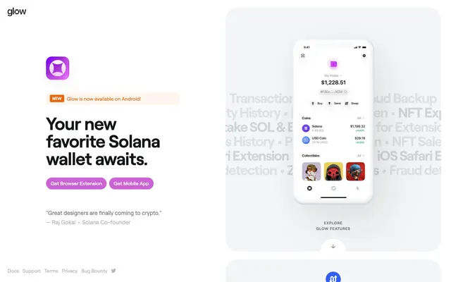
Preview image. Unlock full-res
Vibrant crypto gradient on clean canvas
Color palette
Primary action buttons, active links, interactive elements — a vivid purple that signifies activation
Decorative background element, brand identity visual
Red wash for highlight backgrounds, decorative bands, and soft emphasis behind content. Use as a supporting accent, not as a status color
New feature badges, inline alerts, and decorative accents
Primary text, headings, dark icons, borders
Page backgrounds, elevated card surfaces
Foreground elements, button text, badges
Muted text, secondary icons, subtle borders
Placeholder text, inactive state borders
Secondary button backgrounds, dark UI elements
Typography
- Weights
- 400, 500, 600, 700
- Sizes
- 12px, 13px, 16px, 18px, 24px, 40px, 56px
- Line height
- 1, 1.1, 1.17, 1.2, 1.28, 1.5
- Letter spacing
- -0.0180em, 0.0830em
- Fallback
- Inter
Primary brand typeface for all text. Its unique character delivers a modern, almost technical feel. Weight 700 is used for impactful headlines, while 400 maintains readability in body copy.
- Weights
- 400
- Sizes
- 16px
- Line height
- 1.5
-apple-system — detected in extracted data but not described by AI
Spacing & shape
Components
Solid `Solana Grape` background (#cc62d5) with `Snowdrift` (#ffffff) text, rounded corners of 19px, and generous horizontal padding (14px). Used for primary calls to action like 'Get Browser Extension'.
Solid `Carbon` (#333537) background with `Snowdrift` (#ffffff) text, rounded corners of 19px, and generous horizontal padding (14px). Used for secondary calls to action like 'Get for iOS'.
Large `Cloud Canvas` (#f4f5f6) background card with a dramatically rounded 40px border radius, typically used for showcasing product features. No internal padding is specified; content flows to the edges.
`Highlight Orange` (#ec660d) background with `Snowdrift` (#ffffff) text, small 4px border radius, and tight 2px vertical, 8px horizontal padding. Used to indicate new features or important states.
Guidelines
- Use `Solana Grape` (#cc62d5) exclusively for primary interactive elements, ensuring every click feels significant.
- Apply `Roobert` with a 700 weight and `Ghost Ink` (#131517) for all main headlines to convey clarity and impact.
- Maintain a clear hierarchy of surfaces: `Snowdrift` (#ffffff) for foreground, `Cloud Canvas` (#f4f5f6) for elevated backgrounds.
- Ensure generous `40px` vertical spacing between major sections for comfortable scanning and visual breathing room.
- Pad interactive elements like buttons and badges with at least `10px` vertical and `14px` horizontal padding, maintaining a `19px` border radius.
- Utilize the `Glow Gradient` for decorative brand elements only, never for functional UI components.
- Avoid using `Highlight Orange` (#ec660d) or `Alert Red` (#e83b47) for general UI backgrounds; reserve them for specific semantic alerts or decorative accents.
- Do not introduce additional font families; `Roobert` is the sole brand typeface.
- Refrain from using strong shadows; the design relies on flat layers and subtle transitions, not deep elevation.
- Do not deviate from the established `40px` radius for cards and `19px` for buttons; consistency in shape defines component identity.
- Avoid dense information blocks; instead, use the `8px` `elementGap` and clear typography to create spacious layouts.
About this system
ShowHide
Glow embraces a 'Solana future' aesthetic: clean, spacious interfaces with a vibrant gradient accent that hints at digital energy. The design uses a dominant neutral canvas to ground the playful purple-pink-orange color narrative, focusing attention on key actions and glowing interactive states. Typography is confident and impactful, balancing heavy headlines with readable body text, while generous spacing ensures content breathes and feels light.
The page primarily employs a max-width contained layout, though the hero section extends full-bleed across the screen with a light background and a left-aligned content block. Sections alternate between a prominent heading and explanatory text, often paired with product screenshots on the opposite side (text-left, image-right, then text-right, image-left). Vertical rhythm is established through consistent `40px` section gaps. Call-to-action buttons are clustered together. Feature showcases utilize card grids, while footer links are minimal and left-aligned. The overall density is comfortable, with ample white space around content blocks, creating an open and airy feel.
The site predominantly uses product screenshots of the Glow wallet interface, presented on stark white or lightly textured surfaces. These are cleanly cropped and isolated, focusing on the UI in action rather than lifestyle. Abstract 3D elements, often in 'Solana Grape' or similar gradient hues (#cc62d5 gradient), float around the screenshots, acting as decorative accents without obscuring the product. Iconography is simple, outlined, and uses the neutral palette with occasional brand color fills for emphasis. The visual language emphasizes product functionality and a modern, slightly playful tech aesthetic over hyper-realistic or human-centric photography.
Reminiscent of Rainbow Wallet, Phantom Wallet, Linear.
# Glow — Style Reference
> Vibrant crypto gradient on clean canvas

**Theme:** light

**Site:** https://glow.app

Glow embraces a 'Solana future' aesthetic: clean, spacious interfaces with a vibrant gradient accent that hints at digital energy. The design uses a dominant neutral canvas to ground the playful purple-pink-orange color narrative, focusing attention on key actions and glowing interactive states. Typography is confident and impactful, balancing heavy headlines with readable body text, while generous spacing ensures content breathes and feels light.

## Tokens — Colors

| Name | Value | Token | Role |
|------|------|------|------|
| Solana Grape | `#cc62d5` | `--color-solana-grape` | Primary action buttons, active links, interactive elements — a vivid purple that signifies activation |
| Glow Gradient | `#a732d6` | `--color-glow-gradient` | Decorative background element, brand identity visual |
| Alert Red | `#e83b47` | `--color-alert-red` | Red wash for highlight backgrounds, decorative bands, and soft emphasis behind content. Use as a supporting accent, not as a status color |
| Highlight Orange | `#ec660d` | `--color-highlight-orange` | New feature badges, inline alerts, and decorative accents |
| Ghost Ink | `#131517` | `--color-ghost-ink` | Primary text, headings, dark icons, borders |
| Cloud Canvas | `#f4f5f6` | `--color-cloud-canvas` | Page backgrounds, elevated card surfaces |
| Snowdrift | `#ffffff` | `--color-snowdrift` | Foreground elements, button text, badges |
| Stone Gray | `#737577` | `--color-stone-gray` | Muted text, secondary icons, subtle borders |
| Soft Sterling | `#b3b5b7` | `--color-soft-sterling` | Placeholder text, inactive state borders |
| Carbon | `#333537` | `--color-carbon` | Secondary button backgrounds, dark UI elements |

## Tokens — Typography

### Roobert
- **Substitute:** Inter
- **Weights:** 400, 500, 600, 700
- **Sizes:** 12px, 13px, 16px, 18px, 24px, 40px, 56px
- **Line height:** 1, 1.1, 1.17, 1.2, 1.28, 1.5
- **Letter spacing:** -0.0180em, 0.0830em
- **Role:** Primary brand typeface for all text. Its unique character delivers a modern, almost technical feel. Weight 700 is used for impactful headlines, while 400 maintains readability in body copy.

### -apple-system
- **Weights:** 400
- **Sizes:** 16px
- **Line height:** 1.5
- **Role:** -apple-system — detected in extracted data but not described by AI

## Tokens — Type Scale

Perfect Fourth (1.333) from 16px base.

| Role | Size | Line height | Letter spacing |
|------|------|------|------|
| caption | 12px | 1.5 | 0.99px |
| body | 16px | 1.28 | — |
| subheading | 18px | 1.28 | — |
| heading | 24px | 1.17 | -0.43px |
| heading-lg | 40px | 1.1 | -0.72px |
| display | 56px | 1 | -1px |

## Tokens — Spacing

- **Section gap:** 40px
- **Card padding:** 24px
- **Element gap:** 8px

## Tokens — Radius

- **Buttons:** 19px
- **Cards:** 40px
- **badges:** 4px
- **icons:** 100px

## Layout

The page primarily employs a max-width contained layout, though the hero section extends full-bleed across the screen with a light background and a left-aligned content block. Sections alternate between a prominent heading and explanatory text, often paired with product screenshots on the opposite side (text-left, image-right, then text-right, image-left). Vertical rhythm is established through consistent `40px` section gaps. Call-to-action buttons are clustered together. Feature showcases utilize card grids, while footer links are minimal and left-aligned. The overall density is comfortable, with ample white space around content blocks, creating an open and airy feel.

## Imagery

The site predominantly uses product screenshots of the Glow wallet interface, presented on stark white or lightly textured surfaces. These are cleanly cropped and isolated, focusing on the UI in action rather than lifestyle. Abstract 3D elements, often in 'Solana Grape' or similar gradient hues (#cc62d5 gradient), float around the screenshots, acting as decorative accents without obscuring the product. Iconography is simple, outlined, and uses the neutral palette with occasional brand color fills for emphasis. The visual language emphasizes product functionality and a modern, slightly playful tech aesthetic over hyper-realistic or human-centric photography.

## Components

### Primary Action Button
*Filled button*

Solid `Solana Grape` background (#cc62d5) with `Snowdrift` (#ffffff) text, rounded corners of 19px, and generous horizontal padding (14px). Used for primary calls to action like 'Get Browser Extension'.

### Secondary Action Button
*Filled button*

Solid `Carbon` (#333537) background with `Snowdrift` (#ffffff) text, rounded corners of 19px, and generous horizontal padding (14px). Used for secondary calls to action like 'Get for iOS'.

### Feature Card
*Informational display*

Large `Cloud Canvas` (#f4f5f6) background card with a dramatically rounded 40px border radius, typically used for showcasing product features. No internal padding is specified; content flows to the edges.

### Badge (New)
*Status indicator*

`Highlight Orange` (#ec660d) background with `Snowdrift` (#ffffff) text, small 4px border radius, and tight 2px vertical, 8px horizontal padding. Used to indicate new features or important states.

## Guidelines

### Do

- Use `Solana Grape` (#cc62d5) exclusively for primary interactive elements, ensuring every click feels significant.
- Apply `Roobert` with a 700 weight and `Ghost Ink` (#131517) for all main headlines to convey clarity and impact.
- Maintain a clear hierarchy of surfaces: `Snowdrift` (#ffffff) for foreground, `Cloud Canvas` (#f4f5f6) for elevated backgrounds.
- Ensure generous `40px` vertical spacing between major sections for comfortable scanning and visual breathing room.
- Pad interactive elements like buttons and badges with at least `10px` vertical and `14px` horizontal padding, maintaining a `19px` border radius.
- Utilize the `Glow Gradient` for decorative brand elements only, never for functional UI components.

### Don't

- Avoid using `Highlight Orange` (#ec660d) or `Alert Red` (#e83b47) for general UI backgrounds; reserve them for specific semantic alerts or decorative accents.
- Do not introduce additional font families; `Roobert` is the sole brand typeface.
- Refrain from using strong shadows; the design relies on flat layers and subtle transitions, not deep elevation.
- Do not deviate from the established `40px` radius for cards and `19px` for buttons; consistency in shape defines component identity.
- Avoid dense information blocks; instead, use the `8px` `elementGap` and clear typography to create spacious layouts.

## Agent Prompt Guide

Quick Color Reference:
- text: #131517
- background: #f4f5f6
- border: #b3b5b7
- accent: #ec660d
- primary action: #cc62d5 (filled action)

Example Component Prompts:
1. Create a Primary Action Button: #cc62d5 background, #131517 text, 9999px radius, compact pill padding. Use this filled treatment for the main CTA.
2. Create a feature card: `Cloud Canvas` (#f4f5f6) background, 40px radius. Inside, use a `heading` (24px `Roobert` 700, `Ghost Ink` #131517, letter-spacing -0.43px) for the feature title, and `body` text (16px `Roobert` 400, `Ghost Ink` #131517) for the description.
3. Design a 'New' badge: `Highlight Orange` (#ec660d) background with `Snowdrift` (#ffffff) text, 4px radius, 2px 8px padding, using 12px `Roobert` 500.
More like this









Keep what you find
A free account saves references to boards and can send you a weekly email of picks based on what you save.
To see every result, go Pro.