Preview image. Unlock full-res
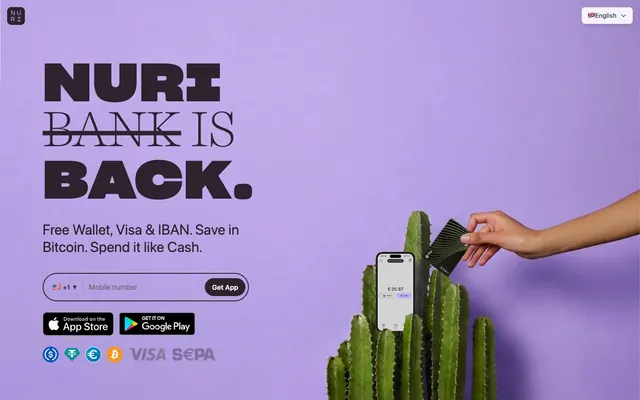
Bitcoin on lavender canvas
Color palette
Hero background, primary brand presence for large visual blocks; Decorative radial gradient for card backgrounds, adding depth with a subtle brand tint
Subtle background for card-like elements, adding a soft, branded surface without being overwhelming
Background for primary call-to-action buttons, drawing immediate attention
Primary text, button backgrounds for filled actions, and prominent headings. Creates a strong contrast against lighter backgrounds
Secondary text and link colors, providing readability while allowing primary text to stand out
Muted body text and less prominent informational elements
Secondary body text, navigation labels, and subdued headings. Do not promote it to the primary CTA color
Page backgrounds, button text on filled actions, and general surface elevation
Canvas background, providing a slightly warmer and softer base than pure white
Secondary background for footer sections or differentiating content blocks
Hairline borders and dividers, maintaining visual separation without heavy lines
Subtle borders for outlined components
Supporting neutral for secondary UI, dividers, and muted labels. Do not promote it to the primary CTA color
Typography
- Weights
- 900
- Sizes
- 72px, 118px
- Line height
- 0.9, 1
- Letter spacing
- -0.02, 0.018
- Fallback
- Montserrat Black
Display headings. The extreme letter-spacing and heavy weight create a high-impact, almost shouted statement.
- Weights
- 300, 400
- Sizes
- 24px, 30px, 50px, 55px, 62px, 112px
- Line height
- 0.9, 0.94, 1.2, 1.33
- Letter spacing
- normal
- Fallback
- Playfair Display
Large subheadings and decorative text. Its lighter weights at large sizes offer a classic, almost editorial counterpoint to the bold display font.
- Weights
- 400, 500, 600
- Sizes
- 12px, 14px, 15px, 16px, 17px, 20px, 24px, 28px, 32px
- Line height
- 0.9, 1, 1.2, 1.32, 1.33, 1.4, 1.43, 1.5, 1.63
- Letter spacing
- normal
- Fallback
- Inter
All body text, interface labels, and smaller functional elements. It provides legibility and a modern, versatile foundation.
Spacing & shape
Elevation
Components
Filled button with Amber Action (#f97316) background and Gallery White (#ffffff) text. Features 9999px radius for a pill shape, and 10px vertical, 16px horizontal padding. A subtle shadow of rgba(44,35,46,0.16) 0px 0px 0px 1px provides slight elevation.
Transparent background with Charcoal Icon (#374151) text. Features 9999px radius and 0px vertical, 14px horizontal padding. Border is subtle Pale Border (#e2e8f0).
Subtly opaque Gallery White (rgba(255, 255, 255, 0.9)) background with Slate Text (#4b5563) text. Features 8px radius and 8px vertical, 12px horizontal padding. Border in Ash Border (#d1d5db).
Sharp Grotesk Bold font, 118px size, 900 weight, Deep Plum (#2c232e) color, with a pronounced -0.02em letter-spacing. Anchors the hero section with a bold statement.
Background of Powder Violet (#e2d9ff) with an extreme 9999px border-radius, giving it a playful, organic shape. Often employs a Radial Card Highlight gradient effect, from Lavender Mist (#beaaff) to transparent.
Transparent background with Deep Plum (#2c232e) text. Features 8px vertical, 12px horizontal padding. Pale Border (#e2e8f0) bottom border for a minimal, clean appearance.
Guidelines
- Use Sharp Grotesk Bold at 900 weight for high-impact display text, applying -0.02em letter-spacing at large sizes.
- Employ Lavender Mist (#beaaff) for large background sections or as a brand-identifying visual anchor.
- Apply 9999px border-radius to all buttons and card-like elements to maintain the system's friendly, rounded aesthetic.
- Utilize Deep Plum (#2c232e) for all primary text and critical headings to ensure strong legibility and brand presence.
- Maintain generous vertical spacing between sections, primarily using 48px to create an open and spacious layout.
- Apply Amber Action (#f97316) exclusively for primary call-to-action button backgrounds.
- Use Pale Border (#e2e8f0) for all unhovered borders and subtle dividers to keep the interface light and decluttered.
- Avoid using multiple vibrant colors for primary actions; Amber Action (#f97316) is reserved for this purpose to ensure clear hierarchy.
- Do not deviate from the established rounded border-radius values; square corners contradict the system's soft, approachable feel.
- Refrain from using heavy shadows or strong elevation effects; rely on color contrast and typographic scale for hierarchy.
- Do not introduce additional gray tones that are not present in the defined neutral palette, as this will lead to visual inconsistency.
- Avoid overly dense layouts; maintain a spacious design with consistent element and section gaps (24px and 48px respectively).
- Do not use generic system fonts in place of Inter, Harriet Display, or Sharp Grotesk Bold; their specific characteristics define the brand's typographic voice.
- Avoid using Lavender Mist (#beaaff) as a text color; it is intended for large background fills or decorative purposes only.
About this system
ShowHide
Nuri presents a financial clarity aesthetic: clean, spacious layouts with a focus on bold typography and functional accents. The interface marries a muted, almost pastel color story with crisp dark text, creating an approachable yet authoritative tone. Visual hierarchy is established through stark size differences in typography rather than heavy graphic elements, and rounded shapes maintain a friendly, modern feel across interactive components.
The page primarily uses a max-width contained layout, though the hero section often stretches full-bleed. The hero features a large, impactful centered headline against a colored background, sometimes split with a visual element. Section rhythm is generally consistent with substantial vertical spacing (48px section gap). Content is arranged in alternating text-left/image-right or centered stacks. Card-like containers, when present, utilize the distinct 'pill' shape. Navigation is handled by a minimal top bar, with elements pushed to the far corners.
The visual language combines abstract, product-focused illustrations with clean product shots. Illustrations are dimensional and stylized, featuring human figures in everyday tech interactions against subtle background elements, often in brand-aligned purple or green hues. Photography, when present, focuses on tight product crops without extensive lifestyle context. Iconography is clean and outlined, maintaining a light visual weight. Imagery serves to explain product features or create atmospheric context without overwhelming UI elements.
Reminiscent of Revolut, Stripe, Monzo, Wise (formerly TransferWise).
# Nuri — Style Reference
> Bitcoin on lavender canvas

**Theme:** light

**Site:** https://nuri.com

Nuri presents a financial clarity aesthetic: clean, spacious layouts with a focus on bold typography and functional accents. The interface marries a muted, almost pastel color story with crisp dark text, creating an approachable yet authoritative tone. Visual hierarchy is established through stark size differences in typography rather than heavy graphic elements, and rounded shapes maintain a friendly, modern feel across interactive components.

## Tokens — Colors

| Name | Value | Token | Role |
|------|------|------|------|
| Lavender Mist | `#beaaff` | `--color-lavender-mist` | Hero background, primary brand presence for large visual blocks; Decorative radial gradient for card backgrounds, adding depth with a subtle brand tint |
| Powder Violet | `#e2d9ff` | `--color-powder-violet` | Subtle background for card-like elements, adding a soft, branded surface without being overwhelming |
| Amber Action | `#f97316` | `--color-amber-action` | Background for primary call-to-action buttons, drawing immediate attention |
| Deep Plum | `#2c232e` | `--color-deep-plum` | Primary text, button backgrounds for filled actions, and prominent headings. Creates a strong contrast against lighter backgrounds |
| Slate Text | `#4b5563` | `--color-slate-text` | Secondary text and link colors, providing readability while allowing primary text to stand out |
| Phantom Gray | `#6b7280` | `--color-phantom-gray` | Muted body text and less prominent informational elements |
| Charcoal Icon | `#374151` | `--color-charcoal-icon` | Secondary body text, navigation labels, and subdued headings. Do not promote it to the primary CTA color |
| Gallery White | `#ffffff` | `--color-gallery-white` | Page backgrounds, button text on filled actions, and general surface elevation |
| Whisper White | `#f7f2ff` | `--color-whisper-white` | Canvas background, providing a slightly warmer and softer base than pure white |
| Cloud Gray | `#f9fafb` | `--color-cloud-gray` | Secondary background for footer sections or differentiating content blocks |
| Pale Border | `#e2e8f0` | `--color-pale-border` | Hairline borders and dividers, maintaining visual separation without heavy lines |
| Ash Border | `#d1d5db` | `--color-ash-border` | Subtle borders for outlined components |
| Shadow Tint | `#dddcde` | `--color-shadow-tint` | Supporting neutral for secondary UI, dividers, and muted labels. Do not promote it to the primary CTA color |

## Tokens — Typography

### Sharp Grotesk Bold
- **Substitute:** Montserrat Black
- **Weights:** 900
- **Sizes:** 72px, 118px
- **Line height:** 0.9, 1
- **Letter spacing:** -0.02, 0.018
- **Role:** Display headings. The extreme letter-spacing and heavy weight create a high-impact, almost shouted statement.

### Harriet Display
- **Substitute:** Playfair Display
- **Weights:** 300, 400
- **Sizes:** 24px, 30px, 50px, 55px, 62px, 112px
- **Line height:** 0.9, 0.94, 1.2, 1.33
- **Letter spacing:** normal
- **Role:** Large subheadings and decorative text. Its lighter weights at large sizes offer a classic, almost editorial counterpoint to the bold display font.

### Inter
- **Substitute:** Inter
- **Weights:** 400, 500, 600
- **Sizes:** 12px, 14px, 15px, 16px, 17px, 20px, 24px, 28px, 32px
- **Line height:** 0.9, 1, 1.2, 1.32, 1.33, 1.4, 1.43, 1.5, 1.63
- **Letter spacing:** normal
- **Role:** All body text, interface labels, and smaller functional elements. It provides legibility and a modern, versatile foundation.

## Tokens — Type Scale

Augmented Fourth (1.414) from 12px base.

| Role | Size | Line height | Letter spacing |
|------|------|------|------|
| caption | 12px | 1.5 | — |
| body-sm | 14px | 1.43 | — |
| body-lg | 17px | 1.5 | — |
| subheading | 20px | 1.2 | — |
| heading-sm | 24px | 1.2 | — |
| heading | 32px | 1.33 | — |
| heading-lg | 62px | 0.94 | — |
| display | 118px | 0.9 | -0.02em |

## Tokens — Spacing

- **Section gap:** 48px
- **Card padding:** 12px
- **Element gap:** 24px

## Tokens — Radius

- **General:** 9999px
- **Buttons:** 8px
- **Cards:** 9999px
- **tags:** 9999px

## Tokens — Elevation

- **Primary Action Button:** `rgba(0, 0, 0, 0.1) 0px 4px 6px -1px, rgba(0, 0, 0, 0.1) 0px 2px 4px -2px, rgba(44, 35, 46, 0.16) 0px 0px 0px 1px`

## Layout

The page primarily uses a max-width contained layout, though the hero section often stretches full-bleed. The hero features a large, impactful centered headline against a colored background, sometimes split with a visual element. Section rhythm is generally consistent with substantial vertical spacing (48px section gap). Content is arranged in alternating text-left/image-right or centered stacks. Card-like containers, when present, utilize the distinct 'pill' shape. Navigation is handled by a minimal top bar, with elements pushed to the far corners.

## Imagery

The visual language combines abstract, product-focused illustrations with clean product shots. Illustrations are dimensional and stylized, featuring human figures in everyday tech interactions against subtle background elements, often in brand-aligned purple or green hues. Photography, when present, focuses on tight product crops without extensive lifestyle context. Iconography is clean and outlined, maintaining a light visual weight. Imagery serves to explain product features or create atmospheric context without overwhelming UI elements.

## Components

### Primary Action Button
*Call to action*

Filled button with Amber Action (#f97316) background and Gallery White (#ffffff) text. Features 9999px radius for a pill shape, and 10px vertical, 16px horizontal padding. A subtle shadow of rgba(44,35,46,0.16) 0px 0px 0px 1px provides slight elevation.

### Ghost Button
*Secondary action*

Transparent background with Charcoal Icon (#374151) text. Features 9999px radius and 0px vertical, 14px horizontal padding. Border is subtle Pale Border (#e2e8f0).

### Flag Selector Button
*Language or region selection*

Subtly opaque Gallery White (rgba(255, 255, 255, 0.9)) background with Slate Text (#4b5563) text. Features 8px radius and 8px vertical, 12px horizontal padding. Border in Ash Border (#d1d5db).

### Large Hero Heading
*Brand statement*

Sharp Grotesk Bold font, 118px size, 900 weight, Deep Plum (#2c232e) color, with a pronounced -0.02em letter-spacing. Anchors the hero section with a bold statement.

### Subtle Card
*Content container*

Background of Powder Violet (#e2d9ff) with an extreme 9999px border-radius, giving it a playful, organic shape. Often employs a Radial Card Highlight gradient effect, from Lavender Mist (#beaaff) to transparent.

### Input Field
*Data entry*

Transparent background with Deep Plum (#2c232e) text. Features 8px vertical, 12px horizontal padding. Pale Border (#e2e8f0) bottom border for a minimal, clean appearance.

## Guidelines

### Do

- Use Sharp Grotesk Bold at 900 weight for high-impact display text, applying -0.02em letter-spacing at large sizes.
- Employ Lavender Mist (#beaaff) for large background sections or as a brand-identifying visual anchor.
- Apply 9999px border-radius to all buttons and card-like elements to maintain the system's friendly, rounded aesthetic.
- Utilize Deep Plum (#2c232e) for all primary text and critical headings to ensure strong legibility and brand presence.
- Maintain generous vertical spacing between sections, primarily using 48px to create an open and spacious layout.
- Apply Amber Action (#f97316) exclusively for primary call-to-action button backgrounds.
- Use Pale Border (#e2e8f0) for all unhovered borders and subtle dividers to keep the interface light and decluttered.

### Don't

- Avoid using multiple vibrant colors for primary actions; Amber Action (#f97316) is reserved for this purpose to ensure clear hierarchy.
- Do not deviate from the established rounded border-radius values; square corners contradict the system's soft, approachable feel.
- Refrain from using heavy shadows or strong elevation effects; rely on color contrast and typographic scale for hierarchy.
- Do not introduce additional gray tones that are not present in the defined neutral palette, as this will lead to visual inconsistency.
- Avoid overly dense layouts; maintain a spacious design with consistent element and section gaps (24px and 48px respectively).
- Do not use generic system fonts in place of Inter, Harriet Display, or Sharp Grotesk Bold; their specific characteristics define the brand's typographic voice.
- Avoid using Lavender Mist (#beaaff) as a text color; it is intended for large background fills or decorative purposes only.

## Agent Prompt Guide

Quick Color Reference:
text: #2c232e
background: #f7f2ff
border: #e2e8f0
accent: #beaaff
primary action: #f97316 (filled action)

Example Component Prompts:

Create a hero section: Whisper White canvas (#f7f2ff). Centered headline 'YOUR MONEY, REDEFINED.' in Sharp Grotesk Bold, 118px, 900 weight, Deep Plum (#2c232e), letter-spacing -0.02em. Subtext 'Instant, secure, and ready for you.' in Harriet Display, 50px, 300 weight, Deep Plum (#2c232e).

Create a Primary Action Button: #f97316 background, #000000 text, 9999px radius, compact pill padding. Use this filled treatment for the main CTA.

Create a ghost navigation button labeled 'Log In': transparent background, Charcoal Icon (#374151) text (Inter, 16px, 400 weight), 9999px radius, Pale Border (#e2e8f0) border, 0px vertical, 14px horizontal padding.

Create a pricing card: Powder Violet (#e2d9ff) background, 9999px radius, 12px cardPadding. Headline 'Basic Plan' in Deep Plum (#2c232e), Inter, 24px, 600 weight. Body text 'Access essential features.' in Charcoal Icon (#374151), Inter, 16px, 400 weight.
More like this









Keep what you find
A free account saves references to boards and can send you a weekly email of picks based on what you save.
To see every result, go Pro.