Preview image. Unlock full-res
Warm canvas, confident yellow
Color palette
Primary calls to action, accent elements, active states, and headings in dark sections – a bright, active highlight
Primary text, dark backgrounds for hero sections, prominent borders
Secondary text, muted links, subtle borders for less prominent elements
Page backgrounds, light surfaces, ghost button text that reads well on dark backgrounds
Subtle text, tertiary information, lighter borders for dividers and understated elements
Card backgrounds, elevated UI elements, prominent borders when contrasting with dark backgrounds
Footer borders, distinct separators, dark accent details
Typography
- Weights
- 400, 600, 700
- Sizes
- 14px, 16px, 18px, 20px, 24px, 28px, 36px
- Line height
- 1.21, 1.22, 1.33, 1.38, 1.4, 1.43
- Letter spacing
- normal
- Fallback
- Inter
Primary workhorse sans-serif for body text, navigation elements, buttons, and most headings below the display level. Its robust neutrality provides a sturdy base for all core content.
- Weights
- 400
- Sizes
- 18px, 24px
- Line height
- 1.33
- Letter spacing
- normal
- Fallback
- IBM Plex Mono
Monospaced font for code snippets, financial figures, or data-driven content where precise alignment and character distinction are paramount.
- Weights
- 300
- Sizes
- 48px
- Line height
- 1.21
- Letter spacing
- normal
- Fallback
- Open Sans
Lighter weight display font for sub-headings and prominent text blocks that need to convey approachability alongside importance. The light weight ensures a softer impact without losing authority.
- Weights
- 700
- Sizes
- 84px
- Line height
- 1
- Letter spacing
- normal
- Fallback
- Oswald
Impactful, bold display font for hero headlines and key marketing statements. Its heavy weight and tight line height command attention and establish a strong focal point.
Spacing & shape
Components
Filled with Grounded Gold (#f1f252), text in Midnight Ink (#1c1b18), with a 32px border-radius. Padding is 12px vertical and 24px horizontal. Uses Haffer font.
Transparent background with a 1px Midnight Ink (#1c1b18) border, text in Midnight Ink (#1c1b18). 4px border-radius, with 24px vertical and 16px horizontal padding. Uses Haffer font.
Transparent background, text in Midnight Ink (#1c1b18), with a 0px border-radius (square corners). Padding: 0px vertical, 16px horizontal. Uses Haffer font.
Transparent background, text in Canvas Ecru (#efece7), with a 0px border-radius. Padding: 0px vertical, 16px horizontal. Uses Haffer font.
Pure White (#ffffff) background, with a soft 24px border-radius. No box shadow, relying on background contrast for definition. Inner padding varies, but typically starts at 24px.
Pure White (#ffffff) background with a 24px border-radius and a subtle inset shadow `rgb(250, 249, 247) 0px 0px 0px 1px inset`. Contains ghost outline buttons with 4px radius.
Text in Midnight Ink (#1c1b18). Features an inset shadow `rgb(28, 27, 24) 0px 0px 0px 1px inset` upon interaction, suggesting a pressed state. 32px border radius with varying padding.
Guidelines
- Prioritize Canvas Ecru (#efece7) for page backgrounds and Pure White (#ffffff) for card surfaces to establish a clean, layering effect.
- Use Grounded Gold (#f1f252) exclusively for primary calls to action and critical accent points to maintain its high-impact role.
- Apply a 32px border-radius for all primary buttons and prominent navigation pills for a consistent soft, modern feel.
- Implement the Haffer font family for body text and most headings, adjusting weights (400, 600, 700) to create typographic hierarchy.
- Maintain generous spacing with 64px section gaps and at least 24px card padding to ensure visual breathing room.
- Leverage the light weight of Para (300) for large, softer headings and Nudge (700) for impactful display hero titles.
- Ensure Ghost Outline Buttons use a 1px border in Midnight Ink (#1c1b18) and have a 4px radius for click targets, contrasting with larger primary buttons.
- Do not introduce new chromatic colors outside of the Grounded Gold (#f1f252) accent; maintain the warm achromatic base palette.
- Avoid applying harsh or deep shadows; prefer subtle inset shadows or rely on background contrast to differentiate UI elements.
- Do not use letter-spacing adjustments unless specifically defined in a type role; default to `normal` for Haffer, DM Mono, Para, and Nudge.
- Refrain from using rectangular buttons; ensure all buttons have at least a 4px border-radius, with 32px for prominent actions.
- Avoid dense, compact layouts; uphold the comfortable density by respecting the 16px element gap and larger section gaps.
- Do not use different font families for core UI elements; Haffer should handle the majority of text content unless it's code/data (DM Mono) or a display title (Para/Nudge).
- Do not overuse Grounded Gold (#f1f252); its impact comes from its scarcity as a primary accent.
About this system
ShowHide
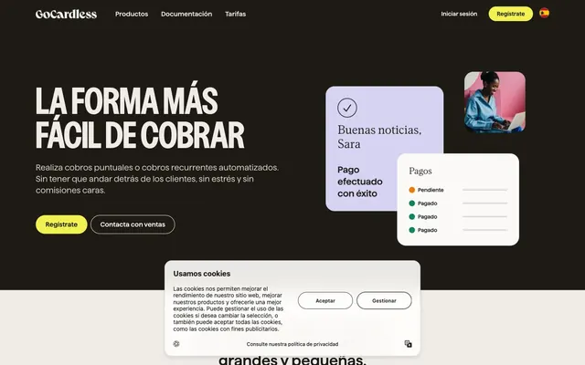
GoCardless employs a subtly sophisticated financial interface, balancing a grounded, warm achromatic palette with a singular, vibrant yellow accent. The design favors a spacious, approachable feel with soft edges, defined by generous padding and rounded corners. Typography is meticulously chosen, utilizing a blend of sturdy, modern sans-serifs and a refined, airy display font to establish a clear hierarchy. Interaction is supported by crisp, focused states rather than heavy ornamentation, ensuring a clean and efficient user experience.
The page primarily uses a max-width contained layout, though the hero section spans full-bleed with a dark background. The initial hero features a prominent, centered headline over the dark background, flanked by descriptive text and action buttons. Subsequent sections alternate between two-column text-left/image-right (or product screenshot right) layouts and centered content blocks. There's a clear vertical rhythm established by the 64px section gaps, leading to a comfortable, unhurried flow. Navigation is managed by a top bar with minimalist links and distinct accent buttons for calls to action, which can feature both light and dark backgrounds depending on the section.
The site predominantly uses product screenshots and abstract UI elements to convey its functionality. Product screenshots are clean, often showing snippets of the GoCardless interface within rounded frames, sometimes subtly overlaid to create depth. Photography, when used, focuses on individuals in professional settings, often with a muted, realistic color treatment, integrated into UI-like cards rather than as expansive background imagery. Icons are generally filled, monochromatic, and maintain a functional, assistive role. Overall, imagery is supportive and explanatory, reinforcing the product's use cases without being overly stylized or decorative, allowing the UI and typography to lead.
Reminiscent of Stripe, Linear, Plaid.
# Gocardless — Style Reference
> Warm canvas, confident yellow

**Theme:** light

**Site:** https://gocardless.com

GoCardless employs a subtly sophisticated financial interface, balancing a grounded, warm achromatic palette with a singular, vibrant yellow accent. The design favors a spacious, approachable feel with soft edges, defined by generous padding and rounded corners. Typography is meticulously chosen, utilizing a blend of sturdy, modern sans-serifs and a refined, airy display font to establish a clear hierarchy. Interaction is supported by crisp, focused states rather than heavy ornamentation, ensuring a clean and efficient user experience.

## Tokens — Colors

| Name | Value | Token | Role |
|------|------|------|------|
| Grounded Gold | `#f1f252` | `--color-grounded-gold` | Primary calls to action, accent elements, active states, and headings in dark sections – a bright, active highlight |
| Midnight Ink | `#1c1b18` | `--color-midnight-ink` | Primary text, dark backgrounds for hero sections, prominent borders |
| Stone Slate | `#545048` | `--color-stone-slate` | Secondary text, muted links, subtle borders for less prominent elements |
| Canvas Ecru | `#efece7` | `--color-canvas-ecru` | Page backgrounds, light surfaces, ghost button text that reads well on dark backgrounds |
| Pebble Gray | `#d4d1cd` | `--color-pebble-gray` | Subtle text, tertiary information, lighter borders for dividers and understated elements |
| Pure White | `#ffffff` | `--color-pure-white` | Card backgrounds, elevated UI elements, prominent borders when contrasting with dark backgrounds |
| Rich Umber | `#3c3428` | `--color-rich-umber` | Footer borders, distinct separators, dark accent details |

## Tokens — Typography

### Haffer
- **Substitute:** Inter
- **Weights:** 400, 600, 700
- **Sizes:** 14px, 16px, 18px, 20px, 24px, 28px, 36px
- **Line height:** 1.21, 1.22, 1.33, 1.38, 1.4, 1.43
- **Letter spacing:** normal
- **Role:** Primary workhorse sans-serif for body text, navigation elements, buttons, and most headings below the display level. Its robust neutrality provides a sturdy base for all core content.

### DM Mono
- **Substitute:** IBM Plex Mono
- **Weights:** 400
- **Sizes:** 18px, 24px
- **Line height:** 1.33
- **Letter spacing:** normal
- **Role:** Monospaced font for code snippets, financial figures, or data-driven content where precise alignment and character distinction are paramount.

### Para
- **Substitute:** Open Sans
- **Weights:** 300
- **Sizes:** 48px
- **Line height:** 1.21
- **Letter spacing:** normal
- **Role:** Lighter weight display font for sub-headings and prominent text blocks that need to convey approachability alongside importance. The light weight ensures a softer impact without losing authority.

### Nudge
- **Substitute:** Oswald
- **Weights:** 700
- **Sizes:** 84px
- **Line height:** 1
- **Letter spacing:** normal
- **Role:** Impactful, bold display font for hero headlines and key marketing statements. Its heavy weight and tight line height command attention and establish a strong focal point.

## Tokens — Type Scale

Perfect Fourth (1.333) from 16px base.

| Role | Size | Line height | Letter spacing |
|------|------|------|------|
| body-sm | 14px | 1.43 | — |
| body | 16px | 1.4 | — |
| body-lg | 18px | 1.33 | — |
| subheading | 20px | 1.33 | — |
| heading | 24px | 1.22 | — |
| heading-lg | 36px | 1.21 | — |
| display | 84px | 1 | — |

## Tokens — Spacing

- **Section gap:** 64px
- **Card padding:** 24px
- **Element gap:** 16px

## Tokens — Radius

- **Buttons:** 32px
- **Inputs:** 4px
- **Cards:** 24px
- **actions-small:** 4px

## Layout

The page primarily uses a max-width contained layout, though the hero section spans full-bleed with a dark background. The initial hero features a prominent, centered headline over the dark background, flanked by descriptive text and action buttons. Subsequent sections alternate between two-column text-left/image-right (or product screenshot right) layouts and centered content blocks. There's a clear vertical rhythm established by the 64px section gaps, leading to a comfortable, unhurried flow. Navigation is managed by a top bar with minimalist links and distinct accent buttons for calls to action, which can feature both light and dark backgrounds depending on the section.

## Imagery

The site predominantly uses product screenshots and abstract UI elements to convey its functionality. Product screenshots are clean, often showing snippets of the GoCardless interface within rounded frames, sometimes subtly overlaid to create depth. Photography, when used, focuses on individuals in professional settings, often with a muted, realistic color treatment, integrated into UI-like cards rather than as expansive background imagery. Icons are generally filled, monochromatic, and maintain a functional, assistive role. Overall, imagery is supportive and explanatory, reinforcing the product's use cases without being overly stylized or decorative, allowing the UI and typography to lead.

## Components

### Primary Action Button
*The main call-to-action button for conversion and key user flows.*

Filled with Grounded Gold (#f1f252), text in Midnight Ink (#1c1b18), with a 32px border-radius. Padding is 12px vertical and 24px horizontal. Uses Haffer font.

### Ghost Outline Button
*Secondary action button, typically paired with a primary button or for less critical actions.*

Transparent background with a 1px Midnight Ink (#1c1b18) border, text in Midnight Ink (#1c1b18). 4px border-radius, with 24px vertical and 16px horizontal padding. Uses Haffer font.

### Navigation Link Button
*Button-like links within navigation.*

Transparent background, text in Midnight Ink (#1c1b18), with a 0px border-radius (square corners). Padding: 0px vertical, 16px horizontal. Uses Haffer font.

### Navigation Accent Button
*High-visibility navigation item, often a 'Sign Up' or 'Register' type of action.*

Transparent background, text in Canvas Ecru (#efece7), with a 0px border-radius. Padding: 0px vertical, 16px horizontal. Uses Haffer font.

### Information Card
*Container for content, features, or product showcases.*

Pure White (#ffffff) background, with a soft 24px border-radius. No box shadow, relying on background contrast for definition. Inner padding varies, but typically starts at 24px.

### Cookie Consent Banner
*Persistent notification for cookie usage and consent options.*

Pure White (#ffffff) background with a 24px border-radius and a subtle inset shadow `rgb(250, 249, 247) 0px 0px 0px 1px inset`. Contains ghost outline buttons with 4px radius.

### Icon Link with Inset Shadow
*Interactive elements with icon and text, often found in footers or detailed content sections.*

Text in Midnight Ink (#1c1b18). Features an inset shadow `rgb(28, 27, 24) 0px 0px 0px 1px inset` upon interaction, suggesting a pressed state. 32px border radius with varying padding.

## Guidelines

### Do

- Prioritize Canvas Ecru (#efece7) for page backgrounds and Pure White (#ffffff) for card surfaces to establish a clean, layering effect.
- Use Grounded Gold (#f1f252) exclusively for primary calls to action and critical accent points to maintain its high-impact role.
- Apply a 32px border-radius for all primary buttons and prominent navigation pills for a consistent soft, modern feel.
- Implement the Haffer font family for body text and most headings, adjusting weights (400, 600, 700) to create typographic hierarchy.
- Maintain generous spacing with 64px section gaps and at least 24px card padding to ensure visual breathing room.
- Leverage the light weight of Para (300) for large, softer headings and Nudge (700) for impactful display hero titles.
- Ensure Ghost Outline Buttons use a 1px border in Midnight Ink (#1c1b18) and have a 4px radius for click targets, contrasting with larger primary buttons.

### Don't

- Do not introduce new chromatic colors outside of the Grounded Gold (#f1f252) accent; maintain the warm achromatic base palette.
- Avoid applying harsh or deep shadows; prefer subtle inset shadows or rely on background contrast to differentiate UI elements.
- Do not use letter-spacing adjustments unless specifically defined in a type role; default to `normal` for Haffer, DM Mono, Para, and Nudge.
- Refrain from using rectangular buttons; ensure all buttons have at least a 4px border-radius, with 32px for prominent actions.
- Avoid dense, compact layouts; uphold the comfortable density by respecting the 16px element gap and larger section gaps.
- Do not use different font families for core UI elements; Haffer should handle the majority of text content unless it's code/data (DM Mono) or a display title (Para/Nudge).
- Do not overuse Grounded Gold (#f1f252); its impact comes from its scarcity as a primary accent.

## Agent Prompt Guide

### Quick Color Reference
text: #1c1b18
background: #efece7
border: #1c1b18
accent: #f1f252
primary action: #f1f252 (filled action)

### 3-5 Example Component Prompts
1. Create a Primary Action Button: #f1f252 background, #1c1b18 text, 9999px radius, compact pill padding. Use this filled treatment for the main CTA.
2. Create a feature card: Background Pure White (#ffffff), border-radius 24px, no shadow. Headline inside in Haffer 600 at 24px, color #1c1b18. Body text in Haffer 400 at 16px, color #545048. Internal padding 24px.
3. Create a cookie consent banner: Background Pure White (#ffffff), border-radius 24px, inset shadow `rgb(250, 249, 247) 0px 0px 0px 1px inset`. Text in Haffer 400 at 16px, color #1c1b18. Include a 'Guardar preferencias' (Save preferences) ghost button (background: transparent, border: 1px #1c1b18, text: #1c1b18, radius: 4px, padding: 24px 16px).
More like this









Keep what you find
A free account saves references to boards and can send you a weekly email of picks based on what you save.
To see every result, go Pro.