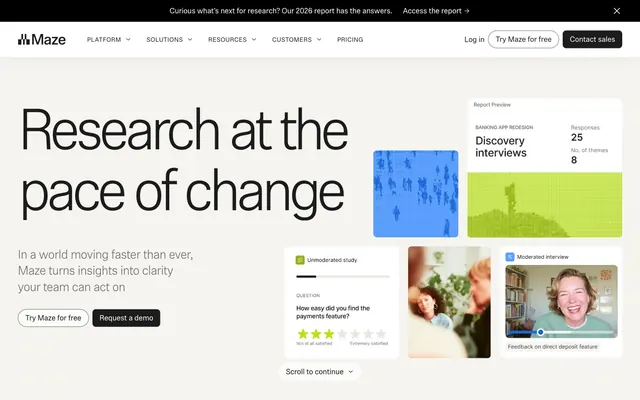
Preview image. Unlock full-res
Whiteboard clarity, green highlight
Color palette
Brand accent, link hover states, decorative elements – provides a natural, authoritative pop against neutrals
Badge backgrounds, card highlights – a vivid and energetic accent that draws immediate attention
Page backgrounds, subtle card backgrounds, footer background – provides a soft, warm white base
Card backgrounds, elevated UI elements, input fills – maintains a crisp white surface for content
Primary text, strong headings, button text, icon default color – ensures high contrast and legibility
Body text, secondary headings, darker button backgrounds – provides a slightly softer dark tone than pure black
Hairline borders, subtle dividers, footer borders – provides definition without visual weight
Hover states for backgrounds, subtle button fills – creates a soft, almost imperceptible interaction feedback
Muted body text, helper text, subtle outlines – for less prominent information
Neutral form states, badge text, and quiet UI feedback where color should stay understated. Do not promote it to the primary CTA color
Typography
- Weights
- 300, 400
- Sizes
- 12px, 14px, 15px, 17px, 22px, 28px, 46px, 58px, 90px, 130px
- Line height
- 1, 1.05, 1.1, 1.15, 1.3, 1.4, 1.41
- Letter spacing
- -0.0900em at 130px, -0.0700em at 90px, -0.0600em at 58px, -0.0500em at 46px, -0.0400em at 28px, -0.0300em at 22px, -0.0200em at 17px, -0.0100em at 15px, 0.0300em at 12px
- Fallback
- system-ui, sans-serif
Headings and key callouts. The light weights (300) combined with expansive letter spacing on larger sizes create a sense of modern confidence and space. The wider tracking on smaller sizes is an unusual but intentional choice to maintain visual airiness.
- Weights
- 400
- Sizes
- 16px
- Line height
- 1.5
- Fallback
- system-ui, sans-serif
Body text, navigation, and all functional UI labels. It serves as a neutral, highly legible counterpart to the expressive Phonic headings.
Spacing & shape
Components
Text: Surface White (#ffffff), Background: Granite Text (#1c1c1c), Border: none. Padding: 12px vertical, 16px horizontal. Border Radius: 8px. Text: ui-sans-serif 16px, weight 400.
Text: Ink Black (#000000), Background: transparent. Border: 1px Ink Black (#000000). Padding: 12px vertical, 16px horizontal. Border Radius: 8px. Text: ui-sans-serif 16px, weight 400.
Text: Granite Text (#1c1c1c), Background: transparent. Border: 1px Forest Green (#4b5b0a) for hover/active, transparent otherwise. Padding: 8px vertical, 16px horizontal. Border Radius: 1.67772e+07px (pill shape). Text: ui-sans-serif 16px, weight 400.
Background: Surface White (#ffffff), Shadow: none (flat). Padding: 16px. Border Radius: 12px.
Background: Surface White (#ffffff), Shadow: none (flat). Padding: 40px vertical, 0px horizontal. Border Radius: 16px. Used for full-width content sections.
Background: Surface White (#ffffff), Text: Granite Text (#1c1c1c). Border: 1px Slate Input Border (#9e9b94). Padding: 0px vertical, 8px horizontal. Border Radius: 8px. Text: ui-sans-serif 16px, weight 400. Placeholder text is Muted Text Gray (#706f6c).
Background: Lime Highlight (#dbf570), Text: Granite Text (#1c1c1c). Padding: 1px vertical, 4px horizontal. Border Radius: 4px. Text: Phonic 12px, weight 400.
Background: Ink Black (#000000), Text: Surface White (#ffffff). Padding: 8px vertical, 16px horizontal (implied). Text: ui-sans-serif 16px, weight 400. Contains a Forest Green (#4b5b0a) link.
Guidelines
- Use Canvas (#f5f4f0) as the primary page background for all sections, providing a warm, neutral base.
- Apply Phonic font with its light weights (300, 400) and specific letter-spacing variations for all headings to create an expansive, modern feel.
- Maintain a clear functional hierarchy for buttons using Primary Dark Button for main actions and Outline Ghost Button for secondary actions.
- Implement an 8px border radius consistently across all buttons, input fields, and most cards, establishing a soft, approachable feel.
- Utilize Forest Green (#4b5b0a) sparingly, primarily for functional links and subtle decorative strokes, to act as a focused brand accent.
- Employ Lime Highlight (#dbf570) exclusively for small, vivid elements like badges or critical highlights, ensuring its impact is maximized.
- Use Ink Black (#000000) for all primary, high-contrast text elements, especially navigation and call-to-action labels.
- Do not introduce new saturated primary colors; adhere to the existing Forest Green (#4b5b0a) and Lime Highlight (#dbf570) as the only chromatic accents.
- Avoid heavy shadows or gradients on UI components; maintain the flat, clean aesthetic with minimal elevation.
- Do not use letter-spacing on ui-sans-serif text sizes; it should remain normal unless explicitly specified on Phonic headings.
- Do not deviate from the established 8px border radius for interactive elements and cards; inconsistent rounding will break the visual cohesion.
- Do not use dark backgrounds for main content sections; the system is built on a light canvas with dark text for optimal readability.
- Avoid overly dense layouts; maintain comfortable element (8px) and card (16px) padding, and generous section spacing (48-64px) to preserve visual breathing room.
- Do not use full-width background colors that are saturated or stark; stick to the Canvas (#f5f4f0) and Surface White (#ffffff) for large background areas.
About this system
ShowHide
Maze implements a focused, professional workspace aesthetic with a predominantly achromatic palette, accented sparingly by a vivid lime green and a forest green. Large, confident typography provides strong hierarchy against a light, airy canvas. Components are lightweight with subtle card treatments and soft rounded corners, emphasizing content clarity and swift interaction without heavy ornamentation. The overall layout balances information density with generous breathing room, creating an experience that feels both powerful and approachable.
Reminiscent of Figma, Vercel, Linear, Stripe.
# Maze — Style Reference
> Whiteboard clarity, green highlight

**Theme:** light

**Site:** https://maze.co

Maze implements a focused, professional workspace aesthetic with a predominantly achromatic palette, accented sparingly by a vivid lime green and a forest green. Large, confident typography provides strong hierarchy against a light, airy canvas. Components are lightweight with subtle card treatments and soft rounded corners, emphasizing content clarity and swift interaction without heavy ornamentation. The overall layout balances information density with generous breathing room, creating an experience that feels both powerful and approachable.

## Tokens — Colors

| Name | Value | Token | Role |
|------|------|------|------|
| Forest Green | `#4b5b0a` | `--color-forest-green` | Brand accent, link hover states, decorative elements – provides a natural, authoritative pop against neutrals |
| Lime Highlight | `#dbf570` | `--color-lime-highlight` | Badge backgrounds, card highlights – a vivid and energetic accent that draws immediate attention |
| Canvas | `#f5f4f0` | `--color-canvas` | Page backgrounds, subtle card backgrounds, footer background – provides a soft, warm white base |
| Surface White | `#ffffff` | `--color-surface-white` | Card backgrounds, elevated UI elements, input fills – maintains a crisp white surface for content |
| Ink Black | `#000000` | `--color-ink-black` | Primary text, strong headings, button text, icon default color – ensures high contrast and legibility |
| Granite Text | `#1c1c1c` | `--color-granite-text` | Body text, secondary headings, darker button backgrounds – provides a slightly softer dark tone than pure black |
| Stone Gray Border | `#d2cec6` | `--color-stone-gray-border` | Hairline borders, subtle dividers, footer borders – provides definition without visual weight |
| Ash Button | `#eae6e1` | `--color-ash-button` | Hover states for backgrounds, subtle button fills – creates a soft, almost imperceptible interaction feedback |
| Muted Text Gray | `#706f6c` | `--color-muted-text-gray` | Muted body text, helper text, subtle outlines – for less prominent information |
| Slate Input Border | `#9e9b94` | `--color-slate-input-border` | Neutral form states, badge text, and quiet UI feedback where color should stay understated. Do not promote it to the primary CTA color |

## Tokens — Typography

### Phonic
- **Substitute:** system-ui, sans-serif
- **Weights:** 300, 400
- **Sizes:** 12px, 14px, 15px, 17px, 22px, 28px, 46px, 58px, 90px, 130px
- **Line height:** 1, 1.05, 1.1, 1.15, 1.3, 1.4, 1.41
- **Letter spacing:** -0.0900em at 130px, -0.0700em at 90px, -0.0600em at 58px, -0.0500em at 46px, -0.0400em at 28px, -0.0300em at 22px, -0.0200em at 17px, -0.0100em at 15px, 0.0300em at 12px
- **Role:** Headings and key callouts. The light weights (300) combined with expansive letter spacing on larger sizes create a sense of modern confidence and space. The wider tracking on smaller sizes is an unusual but intentional choice to maintain visual airiness.

### ui-sans-serif
- **Substitute:** system-ui, sans-serif
- **Weights:** 400
- **Sizes:** 16px
- **Line height:** 1.5
- **Role:** Body text, navigation, and all functional UI labels. It serves as a neutral, highly legible counterpart to the expressive Phonic headings.

## Tokens — Type Scale

Augmented Fourth (1.414) from 12px base.

| Role | Size | Line height | Letter spacing |
|------|------|------|------|
| caption | 12px | 1.4 | 0.36px |
| body-sm | 14px | 1.5 | -0.28px |
| heading-sm | 22px | 1.15 | -0.66px |
| heading | 28px | 1.1 | -1.12px |
| heading-lg | 46px | 1.05 | -2.3px |
| display | 58px | 1.05 | -3.48px |
| display-lg | 90px | 1 | -6.3px |
| display-xl | 130px | 1 | -11.7px |

## Tokens — Spacing

- **Section gap:** 48-64px
- **Card padding:** 16px
- **Element gap:** 8px

## Tokens — Radius

- **Buttons:** 8px
- **Inputs:** 8px
- **Cards:** 8px
- **badges:** 4px
- **round:** 1.67772e+07px

## Components

### Primary Dark Button
*Call-to-action button for primary actions.*

Text: Surface White (#ffffff), Background: Granite Text (#1c1c1c), Border: none. Padding: 12px vertical, 16px horizontal. Border Radius: 8px. Text: ui-sans-serif 16px, weight 400.

### Outline Ghost Button
*Secondary call-to-action or navigational options.*

Text: Ink Black (#000000), Background: transparent. Border: 1px Ink Black (#000000). Padding: 12px vertical, 16px horizontal. Border Radius: 8px. Text: ui-sans-serif 16px, weight 400.

### Pill Ghost Button
*Small, less prominent actions or filters.*

Text: Granite Text (#1c1c1c), Background: transparent. Border: 1px Forest Green (#4b5b0a) for hover/active, transparent otherwise. Padding: 8px vertical, 16px horizontal. Border Radius: 1.67772e+07px (pill shape). Text: ui-sans-serif 16px, weight 400.

### Default Card
*Content containers for features, data, or product previews.*

Background: Surface White (#ffffff), Shadow: none (flat). Padding: 16px. Border Radius: 12px.

### Hero Card
*Prominent display cards for key product features or testimonials.*

Background: Surface White (#ffffff), Shadow: none (flat). Padding: 40px vertical, 0px horizontal. Border Radius: 16px. Used for full-width content sections.

### Input Field
*User input elements.*

Background: Surface White (#ffffff), Text: Granite Text (#1c1c1c). Border: 1px Slate Input Border (#9e9b94). Padding: 0px vertical, 8px horizontal. Border Radius: 8px. Text: ui-sans-serif 16px, weight 400. Placeholder text is Muted Text Gray (#706f6c).

### Lime Badge
*Small informational labels, typically for 'New' features.*

Background: Lime Highlight (#dbf570), Text: Granite Text (#1c1c1c). Padding: 1px vertical, 4px horizontal. Border Radius: 4px. Text: Phonic 12px, weight 400.

### Dark Top Banner
*Promotional banner across the top of the page.*

Background: Ink Black (#000000), Text: Surface White (#ffffff). Padding: 8px vertical, 16px horizontal (implied). Text: ui-sans-serif 16px, weight 400. Contains a Forest Green (#4b5b0a) link.

## Guidelines

### Do

- Use Canvas (#f5f4f0) as the primary page background for all sections, providing a warm, neutral base.
- Apply Phonic font with its light weights (300, 400) and specific letter-spacing variations for all headings to create an expansive, modern feel.
- Maintain a clear functional hierarchy for buttons using Primary Dark Button for main actions and Outline Ghost Button for secondary actions.
- Implement an 8px border radius consistently across all buttons, input fields, and most cards, establishing a soft, approachable feel.
- Utilize Forest Green (#4b5b0a) sparingly, primarily for functional links and subtle decorative strokes, to act as a focused brand accent.
- Employ Lime Highlight (#dbf570) exclusively for small, vivid elements like badges or critical highlights, ensuring its impact is maximized.
- Use Ink Black (#000000) for all primary, high-contrast text elements, especially navigation and call-to-action labels.

### Don't

- Do not introduce new saturated primary colors; adhere to the existing Forest Green (#4b5b0a) and Lime Highlight (#dbf570) as the only chromatic accents.
- Avoid heavy shadows or gradients on UI components; maintain the flat, clean aesthetic with minimal elevation.
- Do not use letter-spacing on ui-sans-serif text sizes; it should remain normal unless explicitly specified on Phonic headings.
- Do not deviate from the established 8px border radius for interactive elements and cards; inconsistent rounding will break the visual cohesion.
- Do not use dark backgrounds for main content sections; the system is built on a light canvas with dark text for optimal readability.
- Avoid overly dense layouts; maintain comfortable element (8px) and card (16px) padding, and generous section spacing (48-64px) to preserve visual breathing room.
- Do not use full-width background colors that are saturated or stark; stick to the Canvas (#f5f4f0) and Surface White (#ffffff) for large background areas.

## Agent Prompt Guide

Quick Color Reference:
text: #000000
background: #f5f4f0
border: #d2cec6
accent: #dbf570
primary action: #1c1c1c (filled action)

Example Component Prompts:
1. Create a Primary Dark Button: Background #1c1c1c, text #ffffff. Text: ui-sans-serif 16px weight 400. Padding: 12px vertical, 16px horizontal. Border radius: 8px.
2. Design a Default Card: Background #ffffff, border none, shadow none. Padding: 16px. Border radius: 12px. Contain an h3 heading Phonic 28px weight 300, #000000, letter-spacing -1.12px.
3. Create a Primary Action Button: #1c1c1c background, #ffffff text, 9999px radius, compact pill padding. Use this filled treatment for the main CTA.
4. Generate a Lime Badge: Background #dbf570, text #1c1c1c. Text: Phonic 12px weight 400. Padding: 1px vertical, 4px horizontal. Border radius: 4px.
More like this









Keep what you find
A free account saves references to boards and can send you a weekly email of picks based on what you save.
To see every result, go Pro.