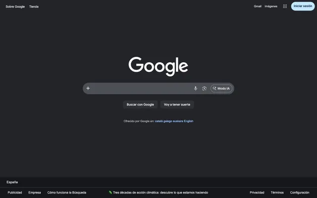
Preview image. Unlock full-res
Midnight command center
Color palette
Link text, active button borders, interactive highlights
Navigation item active state indicators, strong accent borders
Page background, primary canvas
Elevated surfaces, card backgrounds, muted interactive elements
Button backgrounds, input fields, secondary elevated surfaces
Subtle borders and dividers
Primary text, icon fill, outline button borders
Secondary text, subtle icon fill, decorative borders
Navigation backgrounds, subtle accent surfaces
Typography
- Weights
- 400
- Sizes
- 13px, 14px
- Line height
- 1.2, 1.85, 2.15
- Letter spacing
- normal
- Fallback
- system-ui
Body text, navigation links, and button labels, prioritizing clarity and system-font ubiquity.
- Weights
- 400, 500
- Sizes
- 14px, 16px
- Line height
- 1.2, 1.38, 1.43
- Letter spacing
- normal
- Fallback
- Roboto, sans-serif
Primary headings, prominent labels, and call-to-action text, providing a distinctive brand voice through its slightly rounded, modern sans-serif form.
- Weights
- 500
- Sizes
- 14px
- Line height
- 1.29
- Letter spacing
- normal
- Fallback
- Roboto, sans-serif
Specific navigation elements, offering a slightly more compact and functional feel than regular Google Sans.
Spacing & shape
Components
Text uses Arial 400 at 14px, color Light Ghost (#e8e8e8), normal letter spacing.
Background Dark Cement (#303134), text Light Ghost (#e8e8e8), Google Sans 400 at 14px. Padding 0px top/bottom, 16px left/right. Border radius 8px.
Background transparent, text Light Ghost (#BFBFBF / #e8e8e8 as observed), Arial 400. Padding 0px top/bottom, 8px left/right.
Background transparent, icon color Primary Blue (#99c3ff) for active states. Padding 8px all around, border radius 9999px.
Background Dark Cement (#303134), text Light Ghost (#e8e8e8), Google Sans 400. Placeholder text is the same. Border radius 100px.
Background transparent, text Primary Blue (#99c3ff). Border is 1px solid Primary Blue (#99c3ff). Border radius 9999px.
Background Arctic Mist (#c2e7ff), text Deep Ocean Blue (#001d35). Google Sans Text 500 at 14px. Border radius 100px, 10px padding top/bottom, 15px left/right.
Guidelines
- Prioritize Deep Midnight (#16171a) as the dominant background color for all primary canvas areas.
- Use Light Ghost (#e8e8e8) for all primary body text and main iconography.
- Apply Primary Blue (#99c3ff) for all links, active states, and interactive accents to denote functionality.
- Style buttons with a Dark Cement (#303134) background, Light Ghost (#e8e8e8) text, and 8px border-radius.
- Separate distinct content sections using a minimum vertical gap of 20px.
- Maintain a border-radius of 100px for large interactive elements like the search bar and primary account buttons.
- Use Google Sans for all prominent headings and calls to action, ensuring a weight of 400 or 500.
- Avoid using bright, saturated colors for backgrounds; maintain a dark, muted palette for surfaces.
- Do not introduce unnecessary borders or shadows; keep surfaces relatively flat with subtle elevation.
- Refrain from drastically changing font families or weights unless specifically outlined for a component or role.
- Do not deviate from the established spacing unit base of 4px; avoid arbitrary pixel values.
- Never use Primary Blue (#99c3ff) as a solid background fill for primary content areas.
- Do not use square corners on interactive elements (buttons, search bars); apply a minimum of 8px radius.
- Avoid making text too small or too low contrast; ensure all text is at least 13px Arial with Light Ghost (#e8e8e8) on dark backgrounds.
About this system
ShowHide
The Google Dark theme embraces a deep, muted aesthetic, creating a 'command center' feel. Primary text is bright white, contrasted against dark charcoal and slate backgrounds, minimizing eye strain for extended use. Interaction elements are clearly defined through shape and subtle elevation, with a focused accent blue for clickable states and status indicators. The typography is direct and functional, supporting a dense yet organized information display.
The page follows a classic centered, max-width layout, approximately 960px wide, despite no explicit max-width token. The hero section is dominated by the large, centered Google logo and the central search input field. Vertical rhythm is established through consistent spacing between the header, search area, and footer navigation. The header and footer are full-width dark bands, segmenting the page content. Components like search buttons and links are often horizontally centered stacks, with key navigation (Gmail, Images) aligned to the top right and utility links (About, Store) to the top left.
The site primarily uses UI elements and iconography rather than rich imagery. Icons are generally outlined or filled in Light Ghost on dark backgrounds, with occasional Primary Blue accents for interactive states. The Google logo is prominent as a central graphic element. Imagery is used minimally and functionally, often as small, clear vector graphics within components, or in the case of the AI Mode button, an icon and text combination. Density is low, with more focus on typography and interaction elements.
Reminiscent of DuckDuckGo, Bing, Brave Search.
# Google — Style Reference
> Midnight command center

**Theme:** dark

**Site:** https://billi.app

The Google Dark theme embraces a deep, muted aesthetic, creating a 'command center' feel. Primary text is bright white, contrasted against dark charcoal and slate backgrounds, minimizing eye strain for extended use. Interaction elements are clearly defined through shape and subtle elevation, with a focused accent blue for clickable states and status indicators. The typography is direct and functional, supporting a dense yet organized information display.

## Tokens — Colors

| Name | Value | Token | Role |
|------|------|------|------|
| Primary Blue | `#99c3ff` | `--color-primary-blue` | Link text, active button borders, interactive highlights |
| Deep Ocean Blue | `#001d35` | `--color-deep-ocean-blue` | Navigation item active state indicators, strong accent borders |
| Deep Midnight | `#16171a` | `--color-deep-midnight` | Page background, primary canvas |
| Charcoal Slate | `#4d5156` | `--color-charcoal-slate` | Elevated surfaces, card backgrounds, muted interactive elements |
| Dark Cement | `#303134` | `--color-dark-cement` | Button backgrounds, input fields, secondary elevated surfaces |
| Ash Gray | `#444746` | `--color-ash-gray` | Subtle borders and dividers |
| Light Ghost | `#e8e8e8` | `--color-light-ghost` | Primary text, icon fill, outline button borders |
| Muted Silver | `#bfbfbf` | `--color-muted-silver` | Secondary text, subtle icon fill, decorative borders |
| Arctic Mist | `#c2e7ff` | `--color-arctic-mist` | Navigation backgrounds, subtle accent surfaces |

## Tokens — Typography

### Arial
- **Substitute:** system-ui
- **Weights:** 400
- **Sizes:** 13px, 14px
- **Line height:** 1.2, 1.85, 2.15
- **Letter spacing:** normal
- **Role:** Body text, navigation links, and button labels, prioritizing clarity and system-font ubiquity.

### Google Sans
- **Substitute:** Roboto, sans-serif
- **Weights:** 400, 500
- **Sizes:** 14px, 16px
- **Line height:** 1.2, 1.38, 1.43
- **Letter spacing:** normal
- **Role:** Primary headings, prominent labels, and call-to-action text, providing a distinctive brand voice through its slightly rounded, modern sans-serif form.

### Google Sans Text
- **Substitute:** Roboto, sans-serif
- **Weights:** 500
- **Sizes:** 14px
- **Line height:** 1.29
- **Letter spacing:** normal
- **Role:** Specific navigation elements, offering a slightly more compact and functional feel than regular Google Sans.

## Tokens — Spacing

- **Section gap:** 20px
- **Card padding:** 14px
- **Element gap:** 15px

## Tokens — Radius

- **Buttons:** 8px
- **actionIcon:** 9999px
- **input:** 0px
- **searchBar:** 100px

## Layout

The page follows a classic centered, max-width layout, approximately 960px wide, despite no explicit max-width token. The hero section is dominated by the large, centered Google logo and the central search input field. Vertical rhythm is established through consistent spacing between the header, search area, and footer navigation. The header and footer are full-width dark bands, segmenting the page content. Components like search buttons and links are often horizontally centered stacks, with key navigation (Gmail, Images) aligned to the top right and utility links (About, Store) to the top left.

## Imagery

The site primarily uses UI elements and iconography rather than rich imagery. Icons are generally outlined or filled in Light Ghost on dark backgrounds, with occasional Primary Blue accents for interactive states. The Google logo is prominent as a central graphic element. Imagery is used minimally and functionally, often as small, clear vector graphics within components, or in the case of the AI Mode button, an icon and text combination. Density is low, with more focus on typography and interaction elements.

## Components

### Navigation Link
*Top-level navigation and utility links.*

Text uses Arial 400 at 14px, color Light Ghost (#e8e8e8), normal letter spacing.

### Primary Search Button
*Main search action buttons.*

Background Dark Cement (#303134), text Light Ghost (#e8e8e8), Google Sans 400 at 14px. Padding 0px top/bottom, 16px left/right. Border radius 8px.

### Ghost Action Button
*Secondary and tertiary actions, such as 'I'm Feeling Lucky'.*

Background transparent, text Light Ghost (#BFBFBF / #e8e8e8 as observed), Arial 400. Padding 0px top/bottom, 8px left/right.

### Circular Icon Button
*Icon-only interactive elements in the header.*

Background transparent, icon color Primary Blue (#99c3ff) for active states. Padding 8px all around, border radius 9999px.

### Search Input Field
*The central search bar input element.*

Background Dark Cement (#303134), text Light Ghost (#e8e8e8), Google Sans 400. Placeholder text is the same. Border radius 100px.

### AI Mode Tag
*Indicates special AI features.*

Background transparent, text Primary Blue (#99c3ff). Border is 1px solid Primary Blue (#99c3ff). Border radius 9999px.

### Primary Account Button
*User account sign-in action.*

Background Arctic Mist (#c2e7ff), text Deep Ocean Blue (#001d35). Google Sans Text 500 at 14px. Border radius 100px, 10px padding top/bottom, 15px left/right.

## Guidelines

### Do

- Prioritize Deep Midnight (#16171a) as the dominant background color for all primary canvas areas.
- Use Light Ghost (#e8e8e8) for all primary body text and main iconography.
- Apply Primary Blue (#99c3ff) for all links, active states, and interactive accents to denote functionality.
- Style buttons with a Dark Cement (#303134) background, Light Ghost (#e8e8e8) text, and 8px border-radius.
- Separate distinct content sections using a minimum vertical gap of 20px.
- Maintain a border-radius of 100px for large interactive elements like the search bar and primary account buttons.
- Use Google Sans for all prominent headings and calls to action, ensuring a weight of 400 or 500.

### Don't

- Avoid using bright, saturated colors for backgrounds; maintain a dark, muted palette for surfaces.
- Do not introduce unnecessary borders or shadows; keep surfaces relatively flat with subtle elevation.
- Refrain from drastically changing font families or weights unless specifically outlined for a component or role.
- Do not deviate from the established spacing unit base of 4px; avoid arbitrary pixel values.
- Never use Primary Blue (#99c3ff) as a solid background fill for primary content areas.
- Do not use square corners on interactive elements (buttons, search bars); apply a minimum of 8px radius.
- Avoid making text too small or too low contrast; ensure all text is at least 13px Arial with Light Ghost (#e8e8e8) on dark backgrounds.

## Agent Prompt Guide

Quick Color Reference:
text: #e8e8e8
background: #16171a
border: #4d5156
accent: #99c3ff
primary action: #303134 (filled action)

Example Component Prompts:
Create a primary button 'Buscar con Google': background Dark Cement #303134, text Light Ghost #e8e8e8, Google Sans 400 at 14px, 8px border-radius, 0px vertical padding, 16px horizontal padding.
Create a Primary Action Button: #303134 background, #e8e8e8 text, 9999px radius, compact pill padding. Use this filled treatment for the main CTA.
Generate a search input field: background Dark Cement #303134, text Light Ghost #e8e8e8, Google Sans 400, 100px border-radius, 14px top padding.
Construct a circular icon button for 'Iniciar sesión': background Arctic Mist #c2e7ff, text Deep Ocean Blue #001d35, Google Sans Text 500 at 14px, 100px border-radius, 10px vertical padding, 15px horizontal padding.
More like this









Keep what you find
A free account saves references to boards and can send you a weekly email of picks based on what you save.
To see every result, go Pro.