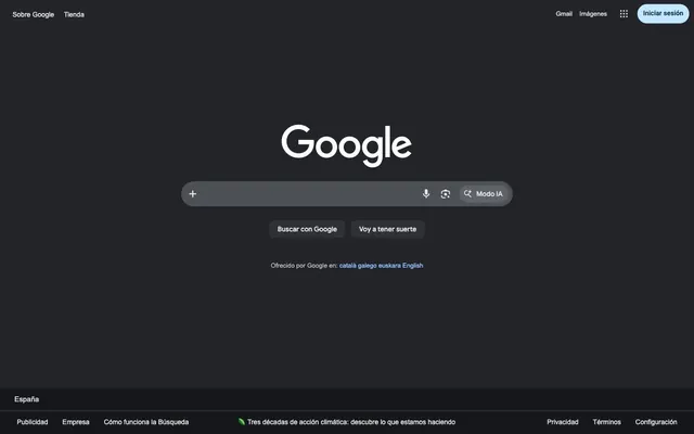
Preview image. Unlock full-res
anthracite quietude with luminous blue
Color palette
Interactive link text, outlined button borders, and active states—a soft, luminous blue to signify interactivity
Subtle background highlight for active navigation elements, indicating selection with a gentle wash of color
Page backgrounds, base surface for content sections
Primary UI element backgrounds like search bars and default buttons — a slightly lighter surface against the canvas
Secondary background surfaces and borders, creating subtle depth transitions
Hover states for interactive elements and subtle distinctions between UI layers
Primary text, headers, and essential iconography for maximum legibility on dark surfaces
Muted text, helper text, and subtle borders, providing hierarchical contrast without distraction
Blue outline accent for tags, dividers, and focused UI edges. Do not promote it to the primary CTA color
Dividers for footer sections and other structural separations
Typography
- Weights
- 400, 500
- Sizes
- 14px, 16px
- Line height
- 1.2, 1.38, 1.43
- Fallback
- Product Sans
Main branding text, prominent call-to-actions, and UI labels that require a clean, modern feel.
- Weights
- 500
- Sizes
- 14px
- Line height
- 1.29
- Fallback
- Roboto
Navigation links and secondary UI elements, providing a consistent, legible voice.
- Weights
- 400
- Sizes
- 13px, 14px
- Line height
- 1.2, 1.85, 2.15
- Fallback
- sans-serif
Standard body text, helper text, and small print details, prioritizing universal readability.
Spacing & shape
Components
A prominent, rounded input field with '#303134' background and '#e8e8e8' text. It features a 26px border-radius, 14px internal padding, and subtle icons to the right.
Utilizes a '#303134' background with an 8px border-radius and '#e8e8e8' text. Padding is 0px top/bottom and 16px left/right, giving it a compact, wide appearance.
Text in '#e8e8e8', with zero background or border. Interactivity is subtle, just a text color change on hover. Padding is 0px, with 8px horizontal spacing from neighboring links.
Transparent background with a '#99c3ff' border and '#99c3ff' text, conveying a softer, yet still interactive, feel. It has a pill-shaped 9999px radius and 8px padding.
A pill-shaped element with a 100px border-radius and '#c2e7ff' as its background, indicating an active or highlighted state. Text is in '#001d35'.
Plain text in '#e8e8e8' with no background. Underlines appear on hover. Uses 15px internal horizontal spacing.
A distinct background color of '#c2e7ff' for emphasis, with text in '#001d35', and a 100px border-radius for a rounded, approachable feel. Padding is 8px all around.
Guidelines
- Maintain a predominantly dark theme using 'Twilight Canvas' (#16171a) for page backgrounds and 'Charcoal Surface' (#303134) for interactive elements.
- Use '#e8e8e8' (Platinum Text) for primary text and headings to ensure high contrast and readability.
- Apply 'Azure Glow' (#99c3ff) exclusively for interactive elements like links and outlined button borders to signify interactivity.
- Prioritize smooth, organic shapes with 26px or 100px border-radii for containers like search inputs, and 8px for standard buttons.
- Ensure generous but comfortable spacing, with an approximate 15px element gap to maintain visual breathing room.
- Use Google Sans for prominent UI labels and Google Sans Text for navigation, reserving Arial for body copy and detailed text.
- Elevate interactive states subtly; use 'Ghost Gray' (#5f6368) on hover for a gentle visual feedback.
- Avoid using harsh, saturated primary colors for large background areas; color should primarily be used for accents and states.
- Do not introduce sharp, angular corners; maintain the softened, rounded aesthetic across all components.
- Refrain from heavy drop shadows or strong borders; components should feel integrated and subtly layered.
- Do not deviate from the established typefaces; Arial is for body text, not headlines.
- Avoid dense, information-packed layouts without sufficient padding and element spacing.
- Do not use 'Platinum Text' (#e8e8e8) for unclickable, decorative elements; reserve it for essential information and primary interactions.
- Never use the browser default link color #0000ee; all links should use 'Azure Glow' (#99c3ff).
About this system
ShowHide
Google's dark-mode visual system emphasizes clarity and quiet efficiency. It features a deep anthracite canvas, with softened, rounded search surfaces and interaction elements that appear subtly elevated. Typography is direct and legible, maintaining a balanced hierarchy. The system primarily uses monochromatic tones, punctuated by a soft, luminous blue for active states and critical information, adding a gentle glow rather than stark contrast.
The site primarily features a text and UI-dominant style with minimal decorative imagery. Where present, icons are outlined or simple solid fills, using the system's 'Platinum Text' (#e8e8e8) or 'Azure Glow' (#99c3ff) to maintain a cohesive, clean aesthetic. The visual style is functional and illustrative, not photographic or abstract. Imagery serves to augment UI rather than create atmosphere, appearing as small, contained visual cues.
Reminiscent of DuckDuckGo, Dark-themed Stack Overflow, Notion (dark mode), GitHub (dark mode).
# Google — Style Reference
> anthracite quietude with luminous blue

**Theme:** dark

**Site:** https://stojo.co

Google's dark-mode visual system emphasizes clarity and quiet efficiency. It features a deep anthracite canvas, with softened, rounded search surfaces and interaction elements that appear subtly elevated. Typography is direct and legible, maintaining a balanced hierarchy. The system primarily uses monochromatic tones, punctuated by a soft, luminous blue for active states and critical information, adding a gentle glow rather than stark contrast.

## Tokens — Colors

| Name | Value | Token | Role |
|------|------|------|------|
| Azure Glow | `#99c3ff` | `--color-azure-glow` | Interactive link text, outlined button borders, and active states—a soft, luminous blue to signify interactivity |
| Winter Sky | `#c2e7ff` | `--color-winter-sky` | Subtle background highlight for active navigation elements, indicating selection with a gentle wash of color |
| Twilight Canvas | `#16171a` | `--color-twilight-canvas` | Page backgrounds, base surface for content sections |
| Charcoal Surface | `#303134` | `--color-charcoal-surface` | Primary UI element backgrounds like search bars and default buttons — a slightly lighter surface against the canvas |
| Stone Accent | `#4d5156` | `--color-stone-accent` | Secondary background surfaces and borders, creating subtle depth transitions |
| Ghost Gray | `#5f6368` | `--color-ghost-gray` | Hover states for interactive elements and subtle distinctions between UI layers |
| Platinum Text | `#e8e8e8` | `--color-platinum-text` | Primary text, headers, and essential iconography for maximum legibility on dark surfaces |
| Silver Muted | `#bfbfbf` | `--color-silver-muted` | Muted text, helper text, and subtle borders, providing hierarchical contrast without distraction |
| Deep Midnight | `#001d35` | `--color-deep-midnight` | Blue outline accent for tags, dividers, and focused UI edges. Do not promote it to the primary CTA color |
| Pewter Border | `#444746` | `--color-pewter-border` | Dividers for footer sections and other structural separations |

## Tokens — Typography

### Google Sans
- **Substitute:** Product Sans
- **Weights:** 400, 500
- **Sizes:** 14px, 16px
- **Line height:** 1.2, 1.38, 1.43
- **Role:** Main branding text, prominent call-to-actions, and UI labels that require a clean, modern feel.

### Google Sans Text
- **Substitute:** Roboto
- **Weights:** 500
- **Sizes:** 14px
- **Line height:** 1.29
- **Role:** Navigation links and secondary UI elements, providing a consistent, legible voice.

### Arial
- **Substitute:** sans-serif
- **Weights:** 400
- **Sizes:** 13px, 14px
- **Line height:** 1.2, 1.85, 2.15
- **Role:** Standard body text, helper text, and small print details, prioritizing universal readability.

## Tokens — Spacing

- **Card padding:** 16px
- **Element gap:** 15px

## Tokens — Radius

- **Buttons:** 8px
- **Inputs:** 26px
- **pillForms:** 9999px
- **roundElements:** 100px

## Imagery

The site primarily features a text and UI-dominant style with minimal decorative imagery. Where present, icons are outlined or simple solid fills, using the system's 'Platinum Text' (#e8e8e8) or 'Azure Glow' (#99c3ff) to maintain a cohesive, clean aesthetic. The visual style is functional and illustrative, not photographic or abstract. Imagery serves to augment UI rather than create atmosphere, appearing as small, contained visual cues.

## Components

### Search Input Bar
*Primary interactive element for search functionality*

A prominent, rounded input field with '#303134' background and '#e8e8e8' text. It features a 26px border-radius, 14px internal padding, and subtle icons to the right.

### Default Action Button
*Standard calls to action and form submissions*

Utilizes a '#303134' background with an 8px border-radius and '#e8e8e8' text. Padding is 0px top/bottom and 16px left/right, giving it a compact, wide appearance.

### Ghost Header Link
*Top navigation and utility links*

Text in '#e8e8e8', with zero background or border. Interactivity is subtle, just a text color change on hover. Padding is 0px, with 8px horizontal spacing from neighboring links.

### Outlined CTA Button
*Secondary or alternative calls to action*

Transparent background with a '#99c3ff' border and '#99c3ff' text, conveying a softer, yet still interactive, feel. It has a pill-shaped 9999px radius and 8px padding.

### AI Mode Tag
*Special feature indicator or interactive tag*

A pill-shaped element with a 100px border-radius and '#c2e7ff' as its background, indicating an active or highlighted state. Text is in '#001d35'.

### Footer Text Link
*Informational links in the footer section*

Plain text in '#e8e8e8' with no background. Underlines appear on hover. Uses 15px internal horizontal spacing.

### Sign In Button
*Primary login or account access call to action*

A distinct background color of '#c2e7ff' for emphasis, with text in '#001d35', and a 100px border-radius for a rounded, approachable feel. Padding is 8px all around.

## Guidelines

### Do

- Maintain a predominantly dark theme using 'Twilight Canvas' (#16171a) for page backgrounds and 'Charcoal Surface' (#303134) for interactive elements.
- Use '#e8e8e8' (Platinum Text) for primary text and headings to ensure high contrast and readability.
- Apply 'Azure Glow' (#99c3ff) exclusively for interactive elements like links and outlined button borders to signify interactivity.
- Prioritize smooth, organic shapes with 26px or 100px border-radii for containers like search inputs, and 8px for standard buttons.
- Ensure generous but comfortable spacing, with an approximate 15px element gap to maintain visual breathing room.
- Use Google Sans for prominent UI labels and Google Sans Text for navigation, reserving Arial for body copy and detailed text.
- Elevate interactive states subtly; use 'Ghost Gray' (#5f6368) on hover for a gentle visual feedback.

### Don't

- Avoid using harsh, saturated primary colors for large background areas; color should primarily be used for accents and states.
- Do not introduce sharp, angular corners; maintain the softened, rounded aesthetic across all components.
- Refrain from heavy drop shadows or strong borders; components should feel integrated and subtly layered.
- Do not deviate from the established typefaces; Arial is for body text, not headlines.
- Avoid dense, information-packed layouts without sufficient padding and element spacing.
- Do not use 'Platinum Text' (#e8e8e8) for unclickable, decorative elements; reserve it for essential information and primary interactions.
- Never use the browser default link color #0000ee; all links should use 'Azure Glow' (#99c3ff).

## Agent Prompt Guide

Quick Color Reference: text: #e8e8e8, background: #16171a, border: #001d35, accent: #99c3ff, primary action: #303134 (filled action)

Example Component Prompts:
1. Create a search bar: background #303134, text #e8e8e8, border-radius 26px, padding 14px vertical, with a subtle microphone icon and a magnifying glass icon.
2. Create a default button labeled 'Buscar con Google': background #303134, text #e8e8e8, border-radius 8px, padding 0px vertical, 16px horizontal.
3. Create a header navigation link labeled 'Gmail': text #e8e8e8, no background, 0px padding, 8px right margin.
4. Create a 'Modo IA' tag: background #c2e7ff, text #001d35, border-radius 100px (pill-shaped), subtle icon on the left.
5. Create a 'Iniciar sesión' button: background #c2e7ff, text #001d35, border-radius 100px, 8px padding all sides.
More like this









Keep what you find
A free account saves references to boards and can send you a weekly email of picks based on what you save.
To see every result, go Pro.