
Preview image. Unlock full-res
White canvas, teal commitment
Color palette
Primary action buttons for key interactions, significant headings, strong brand identifiers. A moderate teal signifying growth and environmental focus
Decorative highlights, underlined text accents, footer styling – a vivid secondary brand color
Page backgrounds, card surfaces, form input fills – the primary content canvas
Primary text, prominent headings, borders for inactive elements
Secondary text, link hovers, outlines for ghost buttons, providing a slightly softer contrast than Deep Slate
Muted text, descriptive labels, secondary information. Softer than Ink Wash
Input field borders, divider lines, subtle UI separations
Background for the footer section, providing a dark contrast to the main content
Typography
- Weights
- 400, 500, 700
- Sizes
- 12px, 13px, 14px, 15px, 16px, 20px, 32px, 56px
- Line height
- 1, 1.1, 1.2, 1.5
- Letter spacing
- -0.0300em at 56px, -0.0200em at 32px, 0.0180em at 12-16px, normal at other sizes
- Fallback
- system-ui, sans-serif
The sole typeface for all text content, from body text to headlines and navigation, ensuring consistency. Varied weights and sizes create strong hierarchy. Tighter tracking at larger sizes maintains visual density.
Spacing & shape
Elevation
Components
Filled with Teal Accent (#0f766e), Canvas White (#ffffff) text, 6px border-radius, 12px vertical padding, 24px horizontal padding.
No background, Ink Wash (#171730) text, no border-radius or padding by default. Underlines on hover.
Canvas White (#ffffff) background, 16px border-radius, subtle shadow rgba(0, 0, 0, 0.06) 0px 1px 2px 0px, rgba(0, 0, 0, 0.1) 0px 1px 3px 0px. No explicit internal padding, content controls spacing.
Canvas White (#ffffff) background, 8px border-radius, prominent shadow rgba(96, 97, 98, 0.15) 0px 4px 16px 0px. No explicit internal padding, content controls spacing.
Transparent background, 0px border-radius, no shadow, 16px internal padding.
Canvas White (#ffffff) background, Black (#000000) text (on keypress), Border Grey (#767676) border, 0px border-radius, 8px padding. Placeholder text is the default font color.
Guidelines
- Prioritize Canvas White (#ffffff) for all main content backgrounds to maintain a clean, open feel.
- Use Deep Slate (#1e293b) for all primary text and main headings to ensure readability and authority.
- Apply Teal Accent (#0f766e) exclusively for primary call-to-action buttons and critical brand emphasis.
- Utilize Inter font consistently across all text elements, relying on weight and size variations for hierarchy.
- Implement a 6px border-radius for all interactive elements like buttons for a consistent soft touch.
- Maintain a comfortable density with 8px element gaps and 16px card padding for internal component spacing.
- Employ the subtle shadow rgba(0, 0, 0, 0.06) 0px 1px 2px 0px, rgba(0, 0, 0, 0.1) 0px 1px 3px 0px for most cards, reserving the stronger rgba(96, 97, 98, 0.15) 0px 4px 16px 0px for elevated, focused elements.
- Do not introduce new typefaces; rely solely on Inter's weights and sizes.
- Avoid using Teal Accent (#0f766e) for decorative purposes or extensive text; it is reserved for key actions.
- Refrain from heavy, solid backgrounds within content sections; maintain Canvas White (#ffffff) as the dominant background.
- Do not use dark text colors against dark backgrounds; ensure high contrast ratios (e.g., #1e293b on #ffffff).
- Avoid arbitrary border-radii; adhere to 6px for buttons, 16px for most cards, and 52px for tags.
- Do not deviate from the established spacing system; use 8px or multiples for consistent rhythm.
- Do not use highly saturated colors for text or backgrounds unless it's the specified Blush Pink (#ec4899) accent for specific highlights.
About this system
ShowHide
Green Angel Syndicate employs a clear, confident aesthetic blending corporate professionalism with a vibrant, eco-conscious identity. A crisp white canvas serves as the backdrop for substantial, dark typography, ensuring high readability. The brand's commitment is articulated through a distinctive teal accent color that highlights key actions and investment opportunities, with a playful pink used for sub-brand elements. Layouts are spacious and structured, using subtle elevation to differentiate content blocks while maintaining an overall light and airy feel.
The page primarily uses a max-width contained layout, approximately 1200px, centered on the screen. The hero section is full-width with a generous pink-tinted background, featuring a prominent, centered headline and a left-aligned descriptive paragraph. Content sections below often follow a three-column card grid pattern for features or alternating text-left/image-right blocks. Vertical spacing between sections is generous, ensuring comfortable readability and breathing room. A sticky header with minimal navigation is present at the top, and the footer is a distinct dark teal block with copyright information and secondary links.
The imagery focuses on a mix of authentic, often slightly desaturated, photography depicting people in professional settings (collaborating, meeting) and natural landscapes with an environmental focus (snow-capped mountains). These are typically contained within rectangular frames, sometimes with subtle rounded corners, and are used to convey both human connection and the environmental mission. Icons are simple, outlined, and monochromatic, used sparingly for quantitative metrics and visual reinforcement.
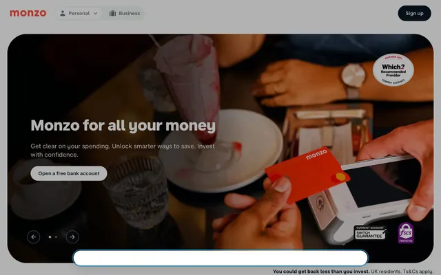
Reminiscent of Ecosia, Seedrs, Monzo, Climeworks.
# Green Angel Syndicate — Style Reference
> White canvas, teal commitment

**Theme:** light

**Site:** https://greenangelsyndicate.com

Green Angel Syndicate employs a clear, confident aesthetic blending corporate professionalism with a vibrant, eco-conscious identity. A crisp white canvas serves as the backdrop for substantial, dark typography, ensuring high readability. The brand's commitment is articulated through a distinctive teal accent color that highlights key actions and investment opportunities, with a playful pink used for sub-brand elements. Layouts are spacious and structured, using subtle elevation to differentiate content blocks while maintaining an overall light and airy feel.

## Tokens — Colors

| Name | Value | Token | Role |
|------|------|------|------|
| Teal Accent | `#0f766e` | `--color-teal-accent` | Primary action buttons for key interactions, significant headings, strong brand identifiers. A moderate teal signifying growth and environmental focus |
| Blush Pink | `#ec4899` | `--color-blush-pink` | Decorative highlights, underlined text accents, footer styling – a vivid secondary brand color |
| Canvas White | `#ffffff` | `--color-canvas-white` | Page backgrounds, card surfaces, form input fills – the primary content canvas |
| Deep Slate | `#1e293b` | `--color-deep-slate` | Primary text, prominent headings, borders for inactive elements |
| Ink Wash | `#171730` | `--color-ink-wash` | Secondary text, link hovers, outlines for ghost buttons, providing a slightly softer contrast than Deep Slate |
| Subtle Gray | `#475569` | `--color-subtle-gray` | Muted text, descriptive labels, secondary information. Softer than Ink Wash |
| Border Grey | `#767676` | `--color-border-grey` | Input field borders, divider lines, subtle UI separations |
| Dark Teal Footer | `#115e59` | `--color-dark-teal-footer` | Background for the footer section, providing a dark contrast to the main content |

## Tokens — Typography

### Inter
- **Substitute:** system-ui, sans-serif
- **Weights:** 400, 500, 700
- **Sizes:** 12px, 13px, 14px, 15px, 16px, 20px, 32px, 56px
- **Line height:** 1, 1.1, 1.2, 1.5
- **Letter spacing:** -0.0300em at 56px, -0.0200em at 32px, 0.0180em at 12-16px, normal at other sizes
- **Role:** The sole typeface for all text content, from body text to headlines and navigation, ensuring consistency. Varied weights and sizes create strong hierarchy. Tighter tracking at larger sizes maintains visual density.

## Tokens — Type Scale

| Role | Size | Line height | Letter spacing |
|------|------|------|------|
| caption | 12px | 1.5 | 0.22px |
| heading | 20px | 1.2 | — |
| heading-lg | 32px | 1.1 | -0.64px |
| display | 56px | 1 | -1.68px |

## Tokens — Spacing

- **Max width:** 1200px
- **Section gap:** 40px
- **Card padding:** 16px
- **Element gap:** 8px

## Tokens — Radius

- **Buttons:** 6px
- **Cards:** 16px
- **tags:** 52px

## Tokens — Elevation

- **Feature Card:** `rgba(0, 0, 0, 0.06) 0px 1px 2px 0px, rgba(0, 0, 0, 0.1) 0px 1px 3px 0px`
- **Elevated Content Card:** `rgba(96, 97, 98, 0.15) 0px 4px 16px 0px`

## Layout

The page primarily uses a max-width contained layout, approximately 1200px, centered on the screen. The hero section is full-width with a generous pink-tinted background, featuring a prominent, centered headline and a left-aligned descriptive paragraph. Content sections below often follow a three-column card grid pattern for features or alternating text-left/image-right blocks. Vertical spacing between sections is generous, ensuring comfortable readability and breathing room. A sticky header with minimal navigation is present at the top, and the footer is a distinct dark teal block with copyright information and secondary links.

## Imagery

The imagery focuses on a mix of authentic, often slightly desaturated, photography depicting people in professional settings (collaborating, meeting) and natural landscapes with an environmental focus (snow-capped mountains). These are typically contained within rectangular frames, sometimes with subtle rounded corners, and are used to convey both human connection and the environmental mission. Icons are simple, outlined, and monochromatic, used sparingly for quantitative metrics and visual reinforcement.

## Components

### Primary Action Button
*Main call-to-action for user interactions.*

Filled with Teal Accent (#0f766e), Canvas White (#ffffff) text, 6px border-radius, 12px vertical padding, 24px horizontal padding.

### Ghost Navigation Link
*Standard navigation and text links.*

No background, Ink Wash (#171730) text, no border-radius or padding by default. Underlines on hover.

### Detailed Feature Card
*Displays key information or offers in a structured block.*

Canvas White (#ffffff) background, 16px border-radius, subtle shadow rgba(0, 0, 0, 0.06) 0px 1px 2px 0px, rgba(0, 0, 0, 0.1) 0px 1px 3px 0px. No explicit internal padding, content controls spacing.

### Elevated Content Card
*Highlights important content or form fields with more visual emphasis.*

Canvas White (#ffffff) background, 8px border-radius, prominent shadow rgba(96, 97, 98, 0.15) 0px 4px 16px 0px. No explicit internal padding, content controls spacing.

### Informational Card
*Simple containers for grouped content without strong visual emphasis.*

Transparent background, 0px border-radius, no shadow, 16px internal padding.

### Form Input Field
*Standard input for user data.*

Canvas White (#ffffff) background, Black (#000000) text (on keypress), Border Grey (#767676) border, 0px border-radius, 8px padding. Placeholder text is the default font color.

## Guidelines

### Do

- Prioritize Canvas White (#ffffff) for all main content backgrounds to maintain a clean, open feel.
- Use Deep Slate (#1e293b) for all primary text and main headings to ensure readability and authority.
- Apply Teal Accent (#0f766e) exclusively for primary call-to-action buttons and critical brand emphasis.
- Utilize Inter font consistently across all text elements, relying on weight and size variations for hierarchy.
- Implement a 6px border-radius for all interactive elements like buttons for a consistent soft touch.
- Maintain a comfortable density with 8px element gaps and 16px card padding for internal component spacing.
- Employ the subtle shadow rgba(0, 0, 0, 0.06) 0px 1px 2px 0px, rgba(0, 0, 0, 0.1) 0px 1px 3px 0px for most cards, reserving the stronger rgba(96, 97, 98, 0.15) 0px 4px 16px 0px for elevated, focused elements.

### Don't

- Do not introduce new typefaces; rely solely on Inter's weights and sizes.
- Avoid using Teal Accent (#0f766e) for decorative purposes or extensive text; it is reserved for key actions.
- Refrain from heavy, solid backgrounds within content sections; maintain Canvas White (#ffffff) as the dominant background.
- Do not use dark text colors against dark backgrounds; ensure high contrast ratios (e.g., #1e293b on #ffffff).
- Avoid arbitrary border-radii; adhere to 6px for buttons, 16px for most cards, and 52px for tags.
- Do not deviate from the established spacing system; use 8px or multiples for consistent rhythm.
- Do not use highly saturated colors for text or backgrounds unless it's the specified Blush Pink (#ec4899) accent for specific highlights.

## Agent Prompt Guide

primary action: #0f766e (filled action)
Create a Primary Action Button: #0f766e background, #ffffff text, 9999px radius, compact pill padding. Use this filled treatment for the main CTA.
Example Component Prompts:
1. Create a primary call-to-action button: text 'Join now', Teal Accent (#0f766e) background, Canvas White (#ffffff) text, 6px radius, 12px vertical padding, 24px horizontal padding, Inter font weight 400.
2. Design a feature card: Canvas White (#ffffff) background, 16px border-radius, default subtle shadow, use Deep Slate (#1e293b) for title (Inter weight 700, 20px) and Subtle Gray (#475569) for body text (Inter weight 400, 14px).
3. Create an input field: Canvas White (#ffffff) background, Border Grey (#767676) border, 0px radius, 8px padding, Inter font weight 400, text color Ink Wash (#171730).
4. Generate a hero section headline using Inter font: 'The UK’s largest angel syndicate', Deep Slate (#1e293b) text, 56px size, weight 700, letter-spacing -1.68px. Underline 'largest angel syndicate' with Blush Pink (#ec4899).
5. Create a footer section: Dark Teal Footer (#115e59) background, Canvas White (#ffffff) text (Inter weight 400, 13px), centered navigation links, with a small Blush Pink (#ec4899) logo underline.
More like this









Keep what you find
A free account saves references to boards and can send you a weekly email of picks based on what you save.
To see every result, go Pro.