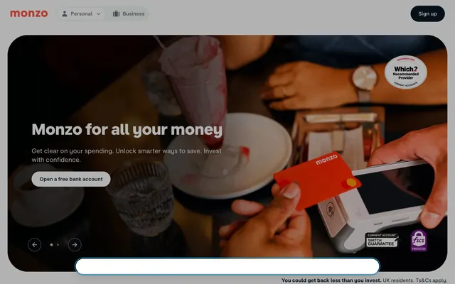
Preview image. Unlock full-res
Hot Coral Digital Craftsmanship — a meticulously crafted digital experience with vibrant accents.
Color palette
Primary calls-to-action, brand accents, interactive elements – injects energy and guides user attention as a distinct brand identifier.
Primary text, prominent UI elements, button backgrounds – establishes a deep, authoritative base against light surfaces.
Primary background for cards, buttons, and sections – provides a clean, expansive canvas for content.
Dominant page background, secondary card backgrounds – offers a subtle off-white that prevents harshness and provides relief from pure white.
Accent backgrounds and specific UI elements – a slightly cooler, darker neutral that adds depth.
Subtle UI backgrounds, dividers – a very light gray providing minimal contrast for separating elements.
Secondary text, muted links, icons – provides readability for supporting information without competing with primary headings.
Subtle button backgrounds, inactive states – a lighter neutral for less prominent interactive elements.
Tertiary button backgrounds with low prominence – a desaturated, cool color for background functions.
Typography
- Weights
- 400, 600, 700
- Sizes
- 13px, 16px, 20px, 24px, 32px, 36px
- Line height
- 0.81, 1.15, 1.38, 1.4, 1.5
- Letter spacing
- -0.0500em
- Fallback
- Inter, Arial
Body copy, links, navigation, buttons, and general UI text. The uniform letter spacing contributes to a consistent, crisp text block, even at smaller sizes.
- Weights
- 600, 700, 800
- Sizes
- 16px, 20px, 25px, 31px, 39px, 44px, 49px, 61px
- Line height
- 1, 1.2, 1.4
- Letter spacing
- normal
- Fallback
- Inter, Arial
Headlines and prominent display text. Its natural letter spacing ensures headings hold presence without feeling overly tight.
Spacing & shape
Elevation
Components
Solid 'Midnight Charcoal' (#091723) background with 'Snow White' (#ffffff) text, using a 500px border-radius for a pill shape. Padding is 12px vertical, 24px horizontal. Text is MonzoSansText weight 400.
Transparent background with 'Midnight Charcoal' (#091723) text and border. No border-radius, resembling a link. No padding.
Transparent background with 'Steel Gray' (rgba(9, 23, 35, 0.6)) text and border. Uses a 24px border-radius, with 20px padding on all sides. Text is MonzoSansText weight 400.
Background 'Snow White' (#ffffff), with a 32px border-radius and a subtle shadow (rgba(0, 0, 0, 0.1) 0px 0px 10px 0px). Inner padding is 30px.
Background 'Slate Blue' (#112231), with a 32px border-radius and a subtle shadow (rgba(0, 0, 0, 0.1) 0px 0px 10px 0px). Inner padding is 30px.
Background 'Mist Gray' (#f2f8f3), with a large 64px border-radius and no shadow. Generous vertical padding of 128px.
Background 'Mist Gray' (#f2f8f3) with 'Steel Gray' (rgba(9, 23, 35, 0.6)) text. Rounded 4px corners, 4px vertical, 12px horizontal padding. Text is MonzoSansText weight 400.
Guidelines
- Prioritize 'Midnight Charcoal' (#091723) for all primary text and calls-to-action against light backgrounds to ensure AAA contrast.
- Utilize 'Hot Coral' (#ff4f40) exclusively for primary interactive states or brand-specific elements, reserving its impact.
- Implement 500px radius for all primary buttons and interactive pill-shaped elements.
- Apply 'Mist Gray' (#f2f8f3) as the default page background and use 'Snow White' (#ffffff) for distinct content blocks or cards.
- Maintain a clear visual hierarchy by employing MonzoSansDisplay for headlines and MonzoSansText for all body copy and UI elements.
- Ensure all card elements use a 32px border-radius, accompanied by rgba(0, 0, 0, 0.1) 0px 0px 10px 0px shadow for subtle depth.
- Use 24px for all standard element and grid gaps to maintain consistent breathing room between components.
- Avoid using multiple chromatic colors; 'Hot Coral' (#ff4f40) is the dominant accent hue.
- Do not deviate from the specified typography sizes, line heights, or letter spacings to preserve brand readability and scale.
- Refrain from using hard-edged borders or square elements where a rounded alternative exists, especially for interactive components.
- Do not introduce complex gradient backgrounds; the system relies on solid color blocks and subtle surface variations.
- Avoid excessive shadow layers or high-contrast shadows; only use the specified light shadow for cards.
- Do not use dark backgrounds without contrasting light text; maintain high readability scores for all content.
- Resist using grayscale or desaturated versions of 'Hot Coral' for functional interactions; use it vividly or not at all.
About this system
ShowHide
Monzo's visual style evokes 'Digital Craftsmanship,' where vibrant and professional is achieved through a carefully balanced suite of design choices. The core is a confident yet approachable dark charcoal text against a pristine paper-white background, creating high contrast. This is punctuated by a singular, vivid hot coral for primary calls-to-action and brand accents, preventing the design from feeling sterile. Signature choices like generously rounded 'pill' buttons and soft shadows on cards hint at a user-friendly, empathetic digital experience, while strict adherence to a clean, spacious layout grounds the design in reliability.
The page primarily employs a max-width contained layout, centering content within a 'Mist Gray' (#f2f8f3) canvas, likely around 1200px. The hero section is full-bleed, featuring a dark atmospheric image with central overlay content. Sections maintain a consistent vertical rhythm, primarily defined by the 'sectionGap' of 64px. Content arrangement varies: some sections feature a centered stack, while others use a flexible two-column layout for text and image pairings. There is a clear use of card-based grids for features and information grouping, leveraging the 'Snow White' (#ffffff) and 'Slate Blue' (#112231) surfaces. The navigation is a sticky top bar with clearly segmented 'Personal' and 'Business' options.
The visual language combines expressive full-bleed photography with clean, contained product shots and illustrative elements. Photography features human elements but also focuses on the product (the card). Product imagery is tightly cropped, often showcasing the Hot Coral card against dark, slightly blurred backgrounds. Icons are monoline, 'Graphite Stroke' colored outlines with a moderate stroke weight, used for navigation and feature differentiation. The overall density leans towards balanced, using imagery to establish atmosphere and convey product function without overwhelming text content.
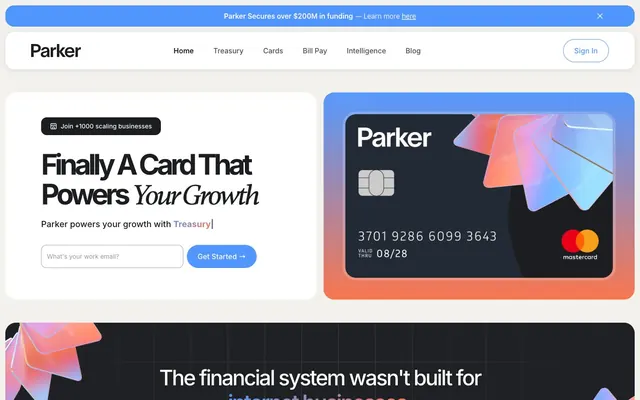
Reminiscent of Revolut, Starling Bank, N26, Wise (formerly TransferWise).
# Monzo — Style Reference
> Hot Coral Digital Craftsmanship — a meticulously crafted digital experience with vibrant accents.

**Theme:** light

**Site:** https://monzo.com

Monzo's visual style evokes 'Digital Craftsmanship,' where vibrant and professional is achieved through a carefully balanced suite of design choices. The core is a confident yet approachable dark charcoal text against a pristine paper-white background, creating high contrast. This is punctuated by a singular, vivid hot coral for primary calls-to-action and brand accents, preventing the design from feeling sterile. Signature choices like generously rounded 'pill' buttons and soft shadows on cards hint at a user-friendly, empathetic digital experience, while strict adherence to a clean, spacious layout grounds the design in reliability.

## Tokens — Colors

| Name | Value | Token | Role |
|------|------|------|------|
| Hot Coral | `#ff4f40` | `--color-hot-coral` | Primary calls-to-action, brand accents, interactive elements – injects energy and guides user attention as a distinct brand identifier. |
| Midnight Charcoal | `#091723` | `--color-midnight-charcoal` | Primary text, prominent UI elements, button backgrounds – establishes a deep, authoritative base against light surfaces. |
| Snow White | `#ffffff` | `--color-snow-white` | Primary background for cards, buttons, and sections – provides a clean, expansive canvas for content. |
| Mist Gray | `#f2f8f3` | `--color-mist-gray` | Dominant page background, secondary card backgrounds – offers a subtle off-white that prevents harshness and provides relief from pure white. |
| Slate Blue | `#112231` | `--color-slate-blue` | Accent backgrounds and specific UI elements – a slightly cooler, darker neutral that adds depth. |
| Silver Dust | `#e3ebe4` | `--color-silver-dust` | Subtle UI backgrounds, dividers – a very light gray providing minimal contrast for separating elements. |
| Steel Gray | `#6b747b` | `--color-steel-gray` | Secondary text, muted links, icons – provides readability for supporting information without competing with primary headings. |
| Ash Gray | `#b5b9bd` | `--color-ash-gray` | Subtle button backgrounds, inactive states – a lighter neutral for less prominent interactive elements. |
| Muted Olive | `#3b4c54` | `--color-muted-olive` | Tertiary button backgrounds with low prominence – a desaturated, cool color for background functions. |

## Tokens — Typography

### MonzoSansText
- **Substitute:** Inter, Arial
- **Weights:** 400, 600, 700
- **Sizes:** 13px, 16px, 20px, 24px, 32px, 36px
- **Line height:** 0.81, 1.15, 1.38, 1.4, 1.5
- **Letter spacing:** -0.0500em
- **Role:** Body copy, links, navigation, buttons, and general UI text. The uniform letter spacing contributes to a consistent, crisp text block, even at smaller sizes.

### MonzoSansDisplay
- **Substitute:** Inter, Arial
- **Weights:** 600, 700, 800
- **Sizes:** 16px, 20px, 25px, 31px, 39px, 44px, 49px, 61px
- **Line height:** 1, 1.2, 1.4
- **Letter spacing:** normal
- **Role:** Headlines and prominent display text. Its natural letter spacing ensures headings hold presence without feeling overly tight.

## Tokens — Type Scale

Major Third (1.25) from 20px base.

| Role | Size | Line height | Letter spacing |
|------|------|------|------|
| caption | 13px | 1.5 | -0.65px |
| body-sm | 16px | 1.4 | -0.8px |
| body | 20px | 1.38 | -1px |
| subheading | 24px | 1.4 | — |
| heading-sm | 32px | 1.15 | -1.6px |
| heading | 36px | 1.15 | -1.8px |
| heading-lg | 49px | 1.2 | — |
| display | 61px | 1 | — |

## Tokens — Spacing

- **Max width:** 1200px
- **Section gap:** 64px
- **Card padding:** 30px
- **Element gap:** 24px

## Tokens — Radius

- **General:** 64px
- **Buttons:** 500px
- **Cards:** 32px
- **badges:** 4px

## Tokens — Elevation

- **Card:** `rgba(0, 0, 0, 0.1) 0px 0px 10px 0px`

## Layout

The page primarily employs a max-width contained layout, centering content within a 'Mist Gray' (#f2f8f3) canvas, likely around 1200px. The hero section is full-bleed, featuring a dark atmospheric image with central overlay content. Sections maintain a consistent vertical rhythm, primarily defined by the 'sectionGap' of 64px. Content arrangement varies: some sections feature a centered stack, while others use a flexible two-column layout for text and image pairings. There is a clear use of card-based grids for features and information grouping, leveraging the 'Snow White' (#ffffff) and 'Slate Blue' (#112231) surfaces. The navigation is a sticky top bar with clearly segmented 'Personal' and 'Business' options.

## Imagery

The visual language combines expressive full-bleed photography with clean, contained product shots and illustrative elements. Photography features human elements but also focuses on the product (the card). Product imagery is tightly cropped, often showcasing the Hot Coral card against dark, slightly blurred backgrounds. Icons are monoline, 'Graphite Stroke' colored outlines with a moderate stroke weight, used for navigation and feature differentiation. The overall density leans towards balanced, using imagery to establish atmosphere and convey product function without overwhelming text content.

## Components

### Primary Filled Button
*Call to action*

Solid 'Midnight Charcoal' (#091723) background with 'Snow White' (#ffffff) text, using a 500px border-radius for a pill shape. Padding is 12px vertical, 24px horizontal. Text is MonzoSansText weight 400.

### Primary Outlined Button
*Secondary action or ghost button*

Transparent background with 'Midnight Charcoal' (#091723) text and border. No border-radius, resembling a link. No padding.

### Ghost Button with Icon
*Navigation or interactive element with subtle styling*

Transparent background with 'Steel Gray' (rgba(9, 23, 35, 0.6)) text and border. Uses a 24px border-radius, with 20px padding on all sides. Text is MonzoSansText weight 400.

### Light Mode Card
*Information container, features*

Background 'Snow White' (#ffffff), with a 32px border-radius and a subtle shadow (rgba(0, 0, 0, 0.1) 0px 0px 10px 0px). Inner padding is 30px.

### Dark Mode Card
*Information container, features*

Background 'Slate Blue' (#112231), with a 32px border-radius and a subtle shadow (rgba(0, 0, 0, 0.1) 0px 0px 10px 0px). Inner padding is 30px.

### Section Background Card
*Hero or large content block backgrounds*

Background 'Mist Gray' (#f2f8f3), with a large 64px border-radius and no shadow. Generous vertical padding of 128px.

### Status Badge
*Informational tag*

Background 'Mist Gray' (#f2f8f3) with 'Steel Gray' (rgba(9, 23, 35, 0.6)) text. Rounded 4px corners, 4px vertical, 12px horizontal padding. Text is MonzoSansText weight 400.

## Guidelines

### Do

- Prioritize 'Midnight Charcoal' (#091723) for all primary text and calls-to-action against light backgrounds to ensure AAA contrast.
- Utilize 'Hot Coral' (#ff4f40) exclusively for primary interactive states or brand-specific elements, reserving its impact.
- Implement 500px radius for all primary buttons and interactive pill-shaped elements.
- Apply 'Mist Gray' (#f2f8f3) as the default page background and use 'Snow White' (#ffffff) for distinct content blocks or cards.
- Maintain a clear visual hierarchy by employing MonzoSansDisplay for headlines and MonzoSansText for all body copy and UI elements.
- Ensure all card elements use a 32px border-radius, accompanied by rgba(0, 0, 0, 0.1) 0px 0px 10px 0px shadow for subtle depth.
- Use 24px for all standard element and grid gaps to maintain consistent breathing room between components.

### Don't

- Avoid using multiple chromatic colors; 'Hot Coral' (#ff4f40) is the dominant accent hue.
- Do not deviate from the specified typography sizes, line heights, or letter spacings to preserve brand readability and scale.
- Refrain from using hard-edged borders or square elements where a rounded alternative exists, especially for interactive components.
- Do not introduce complex gradient backgrounds; the system relies on solid color blocks and subtle surface variations.
- Avoid excessive shadow layers or high-contrast shadows; only use the specified light shadow for cards.
- Do not use dark backgrounds without contrasting light text; maintain high readability scores for all content.
- Resist using grayscale or desaturated versions of 'Hot Coral' for functional interactions; use it vividly or not at all.

## Agent Prompt Guide

### Quick Color Reference
- Primary Text: #091723
- Background: #f2f8f3
- CTA Button: #ff4f40
- Card Background: #ffffff
- Secondary Text: #6b747b
- Border: #75817e

### Example Component Prompts
1. Create a `Primary Filled Button` with the text 'Sign Up Now'. Use `Midnight Charcoal` background, `Snow White` text, and `500px` radius. Padding 12px vertical, 24px horizontal. Text should be `MonzoSansText weight 400`.
2. Build a `Light Mode Card` containing a headline and a paragraph. Use `Snow White` background, `32px` border-radius, and the card shadow `rgba(0, 0, 0, 0.1) 0px 0px 10px 0px`. Inner padding is `30px`. Headline should be `MonzoSansDisplay size 39 weight 700`, paragraph `MonzoSansText size 16 weight 400` with `Steel Gray` text.
3. Design a hero section background using the `Section Background Card` variant (`Mist Gray` background, `64px` border-radius, 128px vertical padding). Overlay a `MonzoSansDisplay size 61 weight 800` headline in `Midnight Charcoal`, and a `MonzoSansText size 20 weight 400` body text in `Midnight Charcoal`.
4. Create a `Status Badge` with the text 'New Feature'. Use `Mist Gray` background, `Steel Gray` text, `4px` border-radius, and `4px` vertical, `12px` horizontal padding. Text is `MonzoSansText weight 400`.
More like this









Keep what you find
A free account saves references to boards and can send you a weekly email of picks based on what you save.
To see every result, go Pro.