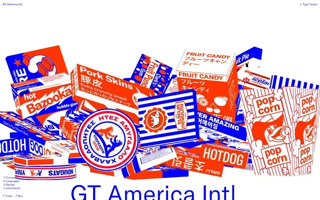
Preview image. Unlock full-res
Vivid Pop-Art Canvas
Color palette
Primary UI accents, navigation text, interactive states, borders for text inputs, decorative elements, and as an active state for button outlines and ghost buttons
Primary action backgrounds, key informational accents, specific button outlines (when not filled), and prominent graphic elements within the overall design
Violet decorative accent for icons, marks, and small graphic details. Do not promote it to the primary CTA color
Page backgrounds, prominent card surfaces, primary text on dark backgrounds, internal borders and box shadows creating an almost tactile, cut-out effect
General text, secondary navigation items, and small icons, used sparingly for strong contrast against white or orange backgrounds
Typography
- Weights
- 400
- Sizes
- 12px, 14px, 16px, 18px, 21px, 22px, 24px, 32px, 36px, 39px, 54px, 58px, 60px, 65px, 79px, 88px, 101px, 108px, 115px, 130px, 135px, 144px, 158px, 171px, 230px, 287px, 338px, 346px, 900px
- Line height
- 0.74, 0.8, 0.95, 1, 1.11, 1.12, 1.14, 1.15, 1.17, 1.2, 1.22, 1.23, 1.3, 1.35, 1.45, 1.5, 1.6
- Letter spacing
- -0.0400em, -0.0250em, 0.0050em, 0.0300em
- Fallback
- system-ui, sans-serif
The primary typeface for all textual content, including headings, body text, and interactive elements. Its wide range of sizes and feature settings allows it to function as both functional text and bold graphic elements.
- Weights
- 400
- Sizes
- 12px, 18px, 60px, 65px, 101px, 255px, 338px, 346px
- Line height
- 0.95, 1, 1.12, 1.15, 1.17, 1.22, 1.35
- Letter spacing
- 0.0200em, 0.0600em
- Fallback
- monospace
Used for specific tabular data, code samples, or stylistic emphasis where a monospaced and slightly tracked look is desired, especially at larger sizes for graphic impact.
- Weights
- 400
- Sizes
- 16px, 32px, 65px, 108px, 130px, 900px
- Line height
- 0.8, 1.11, 1.22, 1.5
GT America Japanese — detected in extracted data but not described by AI
- Weights
- 400
- Sizes
- 18px, 36px, 101px, 108px, 115px, 346px
- Line height
- 0.8, 1, 1.11, 1.2, 1.45
- Letter spacing
- -0.025
GT America Thai Looped — detected in extracted data but not described by AI
- Weights
- 400
- Sizes
- 16px, 108px, 121px, 346px
- Line height
- 0.8, 1.1, 1.2
- Letter spacing
- -0.025
GT America Thai Loopless — detected in extracted data but not described by AI
- Weights
- 400
- Sizes
- 16px, 195px
- Line height
- 1
GT America Contrast — detected in extracted data but not described by AI
- Weights
- 400
- Sizes
- 32px, 108px, 130px
- Line height
- 0.8, 1.11, 1.22
GT America TradChinese — detected in extracted data but not described by AI
- Weights
- 400
- Sizes
- 32px, 86px
- Line height
- 1
GT America Intl Italic — detected in extracted data but not described by AI
- Weights
- 400
- Sizes
- 65px, 108px
- Line height
- 0.8, 1.11
GT America SimpChinese — detected in extracted data but not described by AI
- Weights
- 400
- Sizes
- 12px
- Line height
- 1.17
- Letter spacing
- 0.03
GT America Intl Latin Subset — detected in extracted data but not described by AI
Spacing & shape
Components
Background transparent, text color Electric Blue (#0000ff), border color Electric Blue (#0000ff). No border-radius. Padding is 0px.
Background transparent, text color Orange Punch (#ff3500), border color Orange Punch (#ff3500). No border-radius. Padding is 3px top, 0px right, 0px bottom, 0px left.
Background Orange Punch (#ff3500), text color Canvas White (#ffffff), border color Canvas White (#ffffff). Border-radius 9999px. Padding 60px all sides.
Background Canvas White (#ffffff), text color Electric Blue (#0000ff), border color Electric Blue (#0000ff). No border-radius. Padding 0px all sides.
Background Canvas White (#ffffff), text color Electric Blue (#0000ff), border color Electric Blue (#0000ff). No border-radius. Left padding 12px.
Background Electric Blue (#0000ff), text color Electric Blue (#0000ff), border color Electric Blue (#0000ff). No border-radius. Padding 0px all sides.
Background Electric Blue (#0000ff), text color Electric Blue (#0000ff), border color Electric Blue (#0000ff). Border-radius 9999px. Padding 0px all sides.
Background transparent, text color Electric Blue (#0000ff), border color Electric Blue (#0000ff). Border-radius 9999px. Padding 0px all sides.
Guidelines
- Prioritize GT America Intl typeface for all textual content, leveraging its diverse sizes and stylistic alternates for both readability and graphic impact.
- Use Electric Blue (#0000ff) as the primary accent for interactive elements, links, and borders to create a cohesive interactive language.
- Implement Orange Punch (#ff3500) exclusively for primary call-to-action buttons and critical information to ensure high visual urgency.
- Employ Canvas White (#ffffff) as the default background for most page sections and as the primary text color on dark backgrounds.
- Apply 9999px border-radius to all buttons and input fields that require a 'pill' shape, creating a consistent playful edge.
- Utilize 12px as the standard element gap to create comfortable breathing room between components on the page.
- Emphasize content through strong outlines and borders using brand colors, rather than relying on subtle shadows or gradients for separation.
- Avoid using standard drop shadows for UI elements; instead, use white 1px borders and inner box shadows if elevation is necessary to maintain the graphic, outlined aesthetic.
- Do not introduce additional chromatic colors; the palette is explicitly limited to Electric Blue and Orange Punch as accents.
- Refrain from using gradients for backgrounds or components, as the design system relies on flat, high-contrast color blocks.
- Do not deviate from the specified GT America font families or their provided feature settings; these are critical to the brand identity.
- Avoid subtle, low-contrast text for body copy; ensure sufficient contrast with Ink Black (#000000) or Electric Blue (#0000ff) on Canvas White (#ffffff).
- Do not use generic padding or spacing values; adhere strictly to the `spacing` tokens to maintain the established rhythm and density.
- Do not add decorative flourishes or complex imagery that breaks from the strict two-tone primary color scheme and graphic, type-driven approach.
About this system
ShowHide
The GT America visual system is a stark, high-contrast exploration of primary colors, mimicking vintage packaging and pop-art aesthetics. It deploys a limited palette of white, vibrant blue, and punchy orange against a dominant white canvas. Type is paramount, often oversized and serving as graphic elements, with borders and outlines heavily used to delineate content rather than subtle shadows. The aesthetic is bold, playful, and intentionally draws attention through its raw, unfiltered color usage and maximalist typographic approach.
The page primarily uses a full-bleed layout, particularly for large typographical hero sections and the overall wrapper. Content within these sections tends to be loosely centered or arranged in a dynamic, overlapping collage style, especially with the 'packaging' elements. There isn't a strict grid for content arrangement, rather a dynamic, somewhat chaotic, yet visually unified composition, as seen in the overlapping product boxes. Vertical rhythm is established through consistent section gaps, but individual elements within sections may have varied spacing for graphic effect. Navigation is minimal, likely a fixed top bar or subtle overlay. The page avoids conventional card grids or complex structural elements in favor of a simpler, more expressive arrangement.
Imagery is almost entirely absent, replaced instead by typography as the dominant visual element. When graphics are present, they are either simple, high-contrast line art or solid color shapes, often abstract or iconic, using the brand's Electric Blue and Orange Punch. Illustrations are flat, outlined, and minimal, serving decorative and atmospheric roles rather than explanatory content. Icons, if visible, maintain a bold, filled style consistent with the graphic typography. The density is very text-dominant, with oversized type acting as large-scale visual elements or even full-bleed backgrounds.
Reminiscent of AIGA Eye on Design, Grilli Type, Monotype Imaging, Swiss Typefaces.
# Gt-america — Style Reference
> Vivid Pop-Art Canvas

**Theme:** light

**Site:** https://www.gt-america.com

The GT America visual system is a stark, high-contrast exploration of primary colors, mimicking vintage packaging and pop-art aesthetics. It deploys a limited palette of white, vibrant blue, and punchy orange against a dominant white canvas. Type is paramount, often oversized and serving as graphic elements, with borders and outlines heavily used to delineate content rather than subtle shadows. The aesthetic is bold, playful, and intentionally draws attention through its raw, unfiltered color usage and maximalist typographic approach.

## Tokens — Colors

| Name | Value | Token | Role |
|------|------|------|------|
| Electric Blue | `#0000ff` | `--color-electric-blue` | Primary UI accents, navigation text, interactive states, borders for text inputs, decorative elements, and as an active state for button outlines and ghost buttons |
| Orange Punch | `#ff3500` | `--color-orange-punch` | Primary action backgrounds, key informational accents, specific button outlines (when not filled), and prominent graphic elements within the overall design |
| Vivid Indigo | `#0028ff` | `--color-vivid-indigo` | Violet decorative accent for icons, marks, and small graphic details. Do not promote it to the primary CTA color |
| Canvas White | `#ffffff` | `--color-canvas-white` | Page backgrounds, prominent card surfaces, primary text on dark backgrounds, internal borders and box shadows creating an almost tactile, cut-out effect |
| Ink Black | `#000000` | `--color-ink-black` | General text, secondary navigation items, and small icons, used sparingly for strong contrast against white or orange backgrounds |

## Tokens — Typography

### GT America Intl
- **Substitute:** system-ui, sans-serif
- **Weights:** 400
- **Sizes:** 12px, 14px, 16px, 18px, 21px, 22px, 24px, 32px, 36px, 39px, 54px, 58px, 60px, 65px, 79px, 88px, 101px, 108px, 115px, 130px, 135px, 144px, 158px, 171px, 230px, 287px, 338px, 346px, 900px
- **Line height:** 0.74, 0.8, 0.95, 1, 1.11, 1.12, 1.14, 1.15, 1.17, 1.2, 1.22, 1.23, 1.3, 1.35, 1.45, 1.5, 1.6
- **Letter spacing:** -0.0400em, -0.0250em, 0.0050em, 0.0300em
- **Role:** The primary typeface for all textual content, including headings, body text, and interactive elements. Its wide range of sizes and feature settings allows it to function as both functional text and bold graphic elements.

### GT America Intl Mono
- **Substitute:** monospace
- **Weights:** 400
- **Sizes:** 12px, 18px, 60px, 65px, 101px, 255px, 338px, 346px
- **Line height:** 0.95, 1, 1.12, 1.15, 1.17, 1.22, 1.35
- **Letter spacing:** 0.0200em, 0.0600em
- **Role:** Used for specific tabular data, code samples, or stylistic emphasis where a monospaced and slightly tracked look is desired, especially at larger sizes for graphic impact.

### GT America Japanese
- **Weights:** 400
- **Sizes:** 16px, 32px, 65px, 108px, 130px, 900px
- **Line height:** 0.8, 1.11, 1.22, 1.5
- **Role:** GT America Japanese — detected in extracted data but not described by AI

### GT America Thai Looped
- **Weights:** 400
- **Sizes:** 18px, 36px, 101px, 108px, 115px, 346px
- **Line height:** 0.8, 1, 1.11, 1.2, 1.45
- **Letter spacing:** -0.025
- **Role:** GT America Thai Looped — detected in extracted data but not described by AI

### GT America Thai Loopless
- **Weights:** 400
- **Sizes:** 16px, 108px, 121px, 346px
- **Line height:** 0.8, 1.1, 1.2
- **Letter spacing:** -0.025
- **Role:** GT America Thai Loopless — detected in extracted data but not described by AI

### GT America Contrast
- **Weights:** 400
- **Sizes:** 16px, 195px
- **Line height:** 1
- **Role:** GT America Contrast — detected in extracted data but not described by AI

### GT America TradChinese
- **Weights:** 400
- **Sizes:** 32px, 108px, 130px
- **Line height:** 0.8, 1.11, 1.22
- **Role:** GT America TradChinese — detected in extracted data but not described by AI

### GT America Intl Italic
- **Weights:** 400
- **Sizes:** 32px, 86px
- **Line height:** 1
- **Role:** GT America Intl Italic — detected in extracted data but not described by AI

### GT America SimpChinese
- **Weights:** 400
- **Sizes:** 65px, 108px
- **Line height:** 0.8, 1.11
- **Role:** GT America SimpChinese — detected in extracted data but not described by AI

### GT America Intl Latin Subset
- **Weights:** 400
- **Sizes:** 12px
- **Line height:** 1.17
- **Letter spacing:** 0.03
- **Role:** GT America Intl Latin Subset — detected in extracted data but not described by AI

## Tokens — Type Scale

| Role | Size | Line height | Letter spacing |
|------|------|------|------|
| caption | 12px | 1.17 | 0.36px |
| body-sm | 14px | 1.23 | — |
| body | 16px | 1.22 | — |
| subheading | 24px | 1.2 | — |
| heading-sm | 32px | 1.15 | — |
| heading | 60px | 1.12 | — |
| heading-lg | 108px | 1.11 | -2.7px |
| display | 900px | 0.74 | -36px |

## Tokens — Spacing

- **Section gap:** 96px
- **Card padding:** 12px
- **Element gap:** 12px

## Tokens — Radius

- **Buttons:** 9999px
- **input:** 9999px

## Layout

The page primarily uses a full-bleed layout, particularly for large typographical hero sections and the overall wrapper. Content within these sections tends to be loosely centered or arranged in a dynamic, overlapping collage style, especially with the 'packaging' elements. There isn't a strict grid for content arrangement, rather a dynamic, somewhat chaotic, yet visually unified composition, as seen in the overlapping product boxes. Vertical rhythm is established through consistent section gaps, but individual elements within sections may have varied spacing for graphic effect. Navigation is minimal, likely a fixed top bar or subtle overlay. The page avoids conventional card grids or complex structural elements in favor of a simpler, more expressive arrangement.

## Imagery

Imagery is almost entirely absent, replaced instead by typography as the dominant visual element. When graphics are present, they are either simple, high-contrast line art or solid color shapes, often abstract or iconic, using the brand's Electric Blue and Orange Punch. Illustrations are flat, outlined, and minimal, serving decorative and atmospheric roles rather than explanatory content. Icons, if visible, maintain a bold, filled style consistent with the graphic typography. The density is very text-dominant, with oversized type acting as large-scale visual elements or even full-bleed backgrounds.

## Components

### Ghost Button - Blue Type
*Interactive controls with minimal visual footprint, often in navigation or secondary actions, emphasized by type color and a hairline border.*

Background transparent, text color Electric Blue (#0000ff), border color Electric Blue (#0000ff). No border-radius. Padding is 0px.

### Ghost Button - Orange Type
*Interactive controls for less critical actions, using the secondary brand color for text and border, maintaining a minimalist appearance.*

Background transparent, text color Orange Punch (#ff3500), border color Orange Punch (#ff3500). No border-radius. Padding is 3px top, 0px right, 0px bottom, 0px left.

### Pill Button - Orange Filled
*Primary call-to-action buttons, highly prominent with a filled brand color and large, playful padding, suggesting interactive delight.*

Background Orange Punch (#ff3500), text color Canvas White (#ffffff), border color Canvas White (#ffffff). Border-radius 9999px. Padding 60px all sides.

### Ghost Button - White BG Blue Type
*A subtle interactive control primarily for navigation or utility, used when the background demands a distinct white container.*

Background Canvas White (#ffffff), text color Electric Blue (#0000ff), border color Electric Blue (#0000ff). No border-radius. Padding 0px all sides.

### Text Input - White BG Blue Border
*Standard text input field on a light background, outlined with the primary brand blue to maintain visual consistency.*

Background Canvas White (#ffffff), text color Electric Blue (#0000ff), border color Electric Blue (#0000ff). No border-radius. Left padding 12px.

### Text Input - Solid Blue
*Monochromatic text input designed to integrate with backgrounds, where the input field is the primary Electric Blue.*

Background Electric Blue (#0000ff), text color Electric Blue (#0000ff), border color Electric Blue (#0000ff). No border-radius. Padding 0px all sides.

### Pill Input - Solid Blue
*A decorative or interactive input field that adopts a pill shape and solid blue background for visual distinctiveness.*

Background Electric Blue (#0000ff), text color Electric Blue (#0000ff), border color Electric Blue (#0000ff). Border-radius 9999px. Padding 0px all sides.

### Pill Input - Ghost Blue
*An outlined, pill-shaped input, serving as a filter or search bar, maintaining the brand's graphic, outlined aesthetic.*

Background transparent, text color Electric Blue (#0000ff), border color Electric Blue (#0000ff). Border-radius 9999px. Padding 0px all sides.

## Guidelines

### Do

- Prioritize GT America Intl typeface for all textual content, leveraging its diverse sizes and stylistic alternates for both readability and graphic impact.
- Use Electric Blue (#0000ff) as the primary accent for interactive elements, links, and borders to create a cohesive interactive language.
- Implement Orange Punch (#ff3500) exclusively for primary call-to-action buttons and critical information to ensure high visual urgency.
- Employ Canvas White (#ffffff) as the default background for most page sections and as the primary text color on dark backgrounds.
- Apply 9999px border-radius to all buttons and input fields that require a 'pill' shape, creating a consistent playful edge.
- Utilize 12px as the standard element gap to create comfortable breathing room between components on the page.
- Emphasize content through strong outlines and borders using brand colors, rather than relying on subtle shadows or gradients for separation.

### Don't

- Avoid using standard drop shadows for UI elements; instead, use white 1px borders and inner box shadows if elevation is necessary to maintain the graphic, outlined aesthetic.
- Do not introduce additional chromatic colors; the palette is explicitly limited to Electric Blue and Orange Punch as accents.
- Refrain from using gradients for backgrounds or components, as the design system relies on flat, high-contrast color blocks.
- Do not deviate from the specified GT America font families or their provided feature settings; these are critical to the brand identity.
- Avoid subtle, low-contrast text for body copy; ensure sufficient contrast with Ink Black (#000000) or Electric Blue (#0000ff) on Canvas White (#ffffff).
- Do not use generic padding or spacing values; adhere strictly to the `spacing` tokens to maintain the established rhythm and density.
- Do not add decorative flourishes or complex imagery that breaks from the strict two-tone primary color scheme and graphic, type-driven approach.

## Agent Prompt Guide

### Quick Color Reference
text: #000000
background: #ffffff
border: #0000ff
accent: #0000ff
primary action: #ff3500 (filled action)

### 3-5 Example Component Prompts
1. Create a page header: 'GT America Intl' headline (GT America Intl, 108px, #0000ff, letter-spacing -2.7px, line-height 1.11). Below it on the right side, a ghost button with 'Type Tester' text (GT America Intl, 12px, #0000ff, transparent background, #0000ff border).
2. Create a primary call-to-action section: A large 'Download' button (Pill Button - Orange Filled, GT America Intl, 60px padding, #ff3500 background, #ffffff text, 9999px border-radius). Below it, a subtle text link to 'Learn More' (GT America Intl, 16px, #0000ff).
3. Create an interactive input field: A text input (Text Input - White BG Blue Border, GT America Intl, 16px, #0000ff text, #ffffff background, #0000ff border, 12px left padding). Next to it, a small search icon (Electric Blue, filled, 20px size).
More like this









Keep what you find
A free account saves references to boards and can send you a weekly email of picks based on what you save.
To see every result, go Pro.